Awkward
Client: Awkward
Work done: Logo-type design, custom lettering
Custom Logo-type
Awkward is a small independent product design company with a focus on building simple, useful digital products. With a name that pokes fun at the nerdy/geeky stereotype, the team had been working on a fitting character illustration and were looking for some lettering as an accompaniment. The goal with the logo-type was to convey a sense of youthfulness and a hand-crafted yet minimal aesthetic. Originally, the brief called for using the character's bow-tie as the 'w' in the name and we discussed ways in which to incorporate this so as to not detract from either the image or the type.
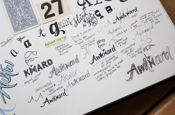
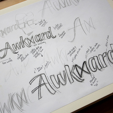
Above: A few early sketchbook pages with notes and rough sketches, often amidst other doodles.
Idea Development
We worked primarily with rough drafts during the idea development, focusing on capturing the right general concept rather than specific details. Initial sketches focused on un-connected lettering to allow the bow-tie to retain a lot of its original shape, while the subsequent exploration aimed to simplify the lettering, making it more minimalist and elegant with more subdued stroke contrast. Moving to a consistent baseline was another important change to emphasise the subtlety of the design and we also focused on improving a sense of smooth, confident flow through the word.
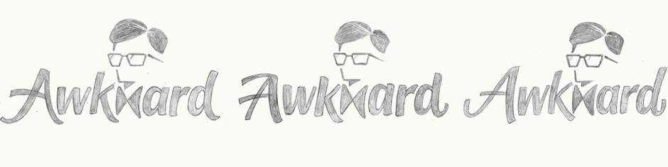
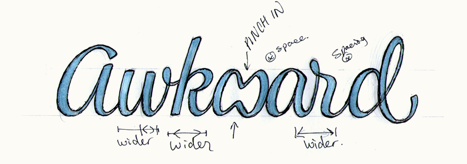
Above: Idea development and progressive changes, all done in rough sketch form until the direction was established.
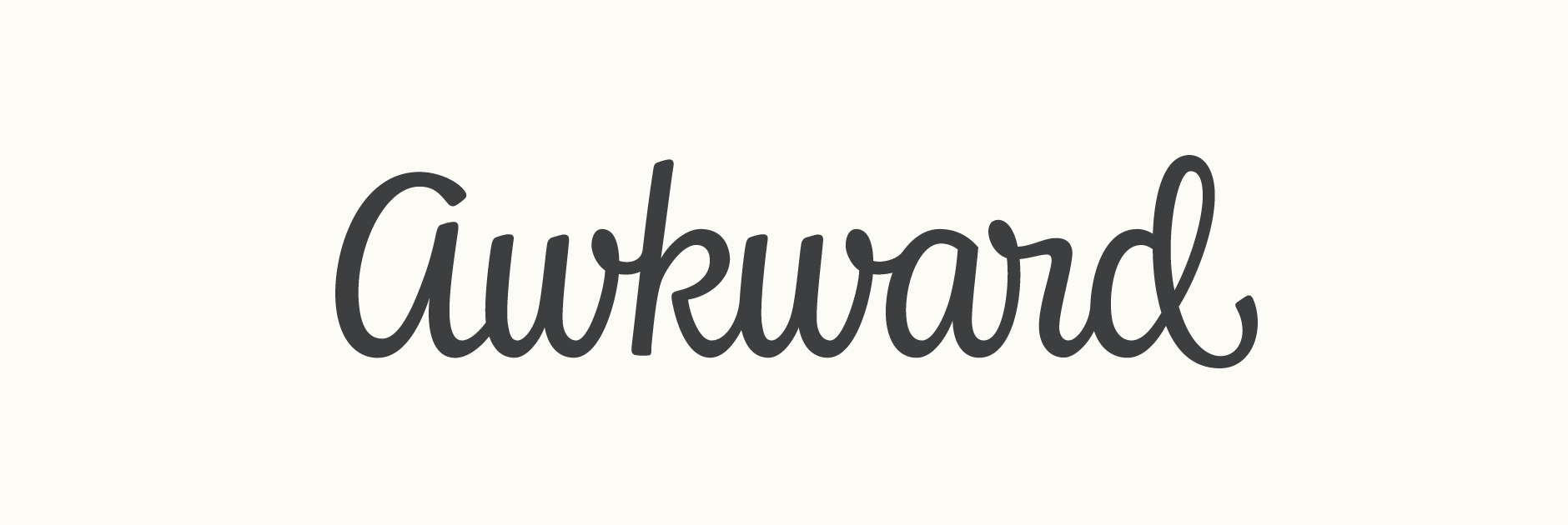
Initial Vectoring
The final direction uses a more elegant, refined style with with a rounded bow-tie shape that is better integrated thanks in part to smooth junctions between the characters (as opposed to an angled connecting stroke). At this stage, the head had also been revised to be more rounded in line with the script approach.
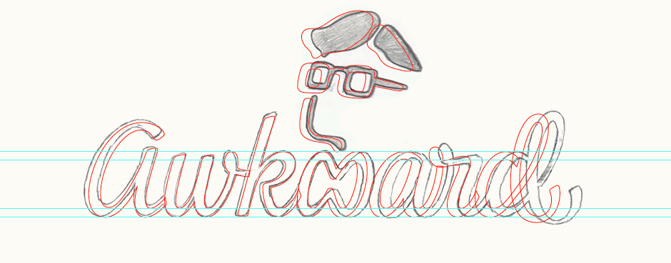
Above: Screenshot of the first vector outlines, created based on the final sketch but with significant adjustments.
Changes
With some reflection over the winter break, the team suggested separating the head and type apart as their integration makes the concept more complicated, something that goes against their philosophy and work approach. We therefore revised the logo-type to feature a standard 'w' instead and also reduced the letter slant to make it a little more sturdy.
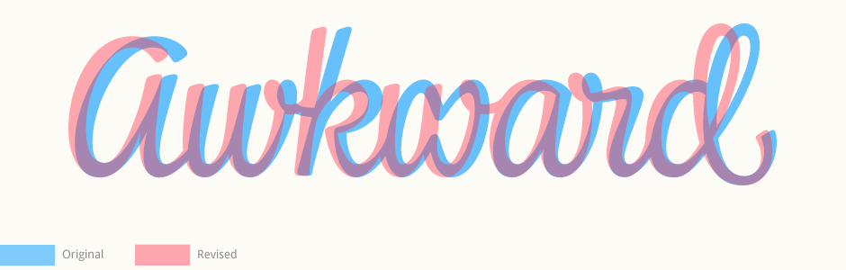
Above: The revised lettering (red) over the initial version (blue).
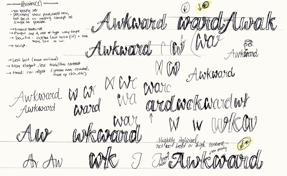
Letter Variations
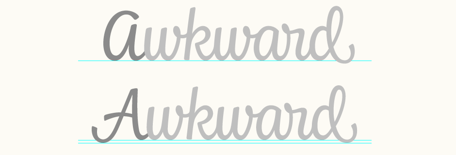
From the early exploration, two main alternatives for the 'A' had emerged: one which is fully rounded and the other which has a more conventional angled structure. While finalising, we reviewed both options in context of the full lettering and compared how each interacts with the lowercase, in particular the alignment of the 'd'.
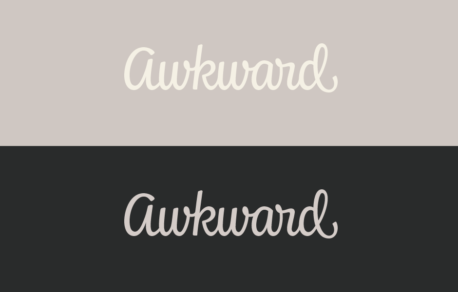
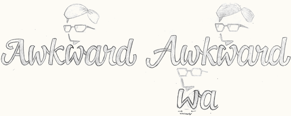
Final Logo
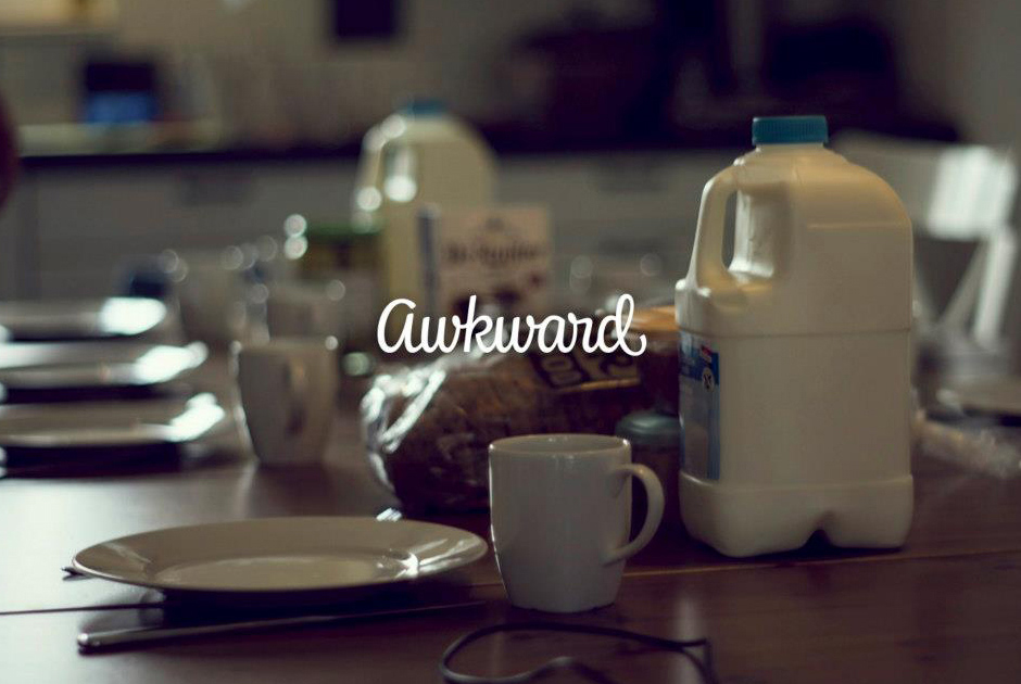
The final logo-type uses the rounded 'A' as it is a more unique, memorable shape that fits better with the curvature of the other letters. Photograph below courtesy of Awkward, from one of the team's weekend retreats.