Bidwith.me & Vicesus.com
Client: HOF GROUP LLC
Work done: Logo-type designs, custom lettering, brand colour palettes
Logo-type system
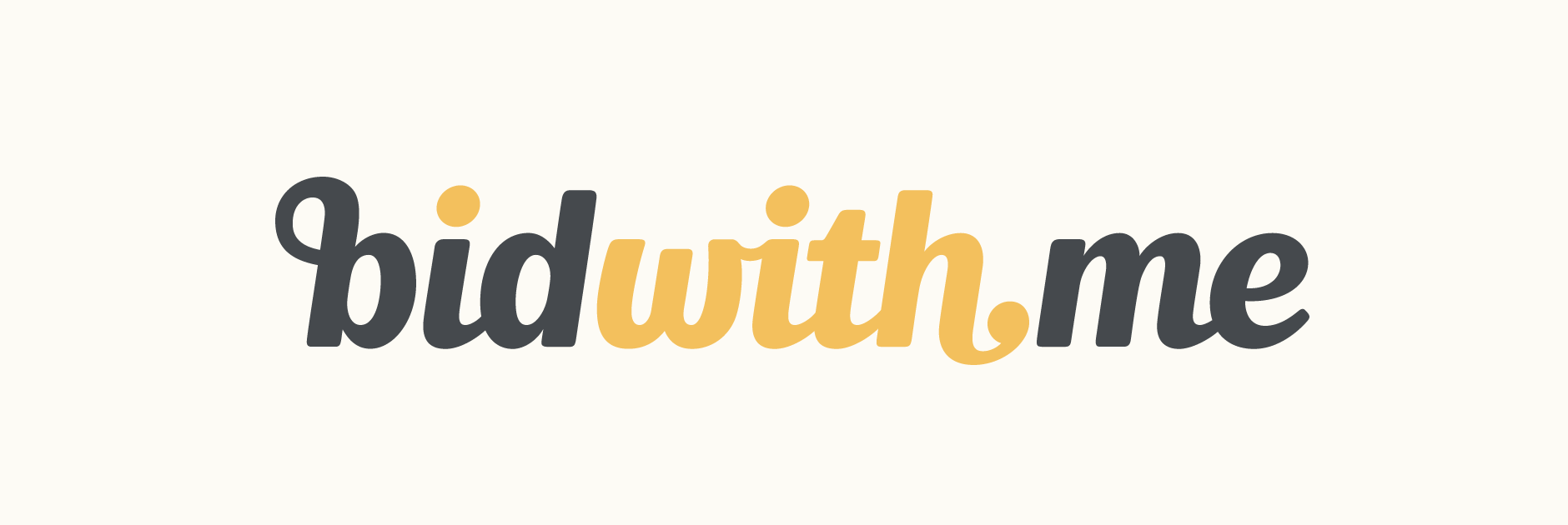
Logo-types for bidwith.me, an entertainment auction website and the network marketing company behind it, vicesus.com. Bidwith.me is directly for the customers interested in the auctions so an element of fun was important, while Vicesus.com is aimed at the business opportunity offered through its affiliate program and is more corporate in nature.
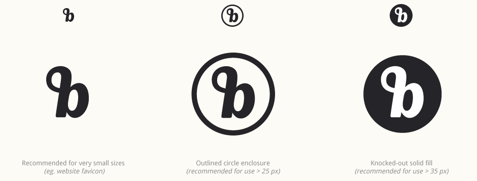
Initially working on the bidwith.me logo, the overall aim was to capture the right balance between fun & entertaining and professional & reliable. It was also important that the 'b' could function as a stand alone icon, with a simple and sturdy enough shape to easily fit inside a coin illustration or small circle and still remain recognisable.
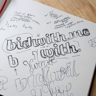
Above: Brainstorming two possible directions at once in order to visualise how they can each approach the brief in their individual ways.
Sketch Development
When exploring multiple concepts, as well as the overall style and approach, I also like to look at different designs for the more defining individual letters. For example, a 'w' can take on many completely distinct shapes that significantly contribute to the style and feeling evoked by the piece as a whole. The diagonal lines of the first 'w' clearly accentuate the more geometric feel of the sans serif approach while the second 'w' with its curved strokes immediately suggests a warmer, more gestural quality.
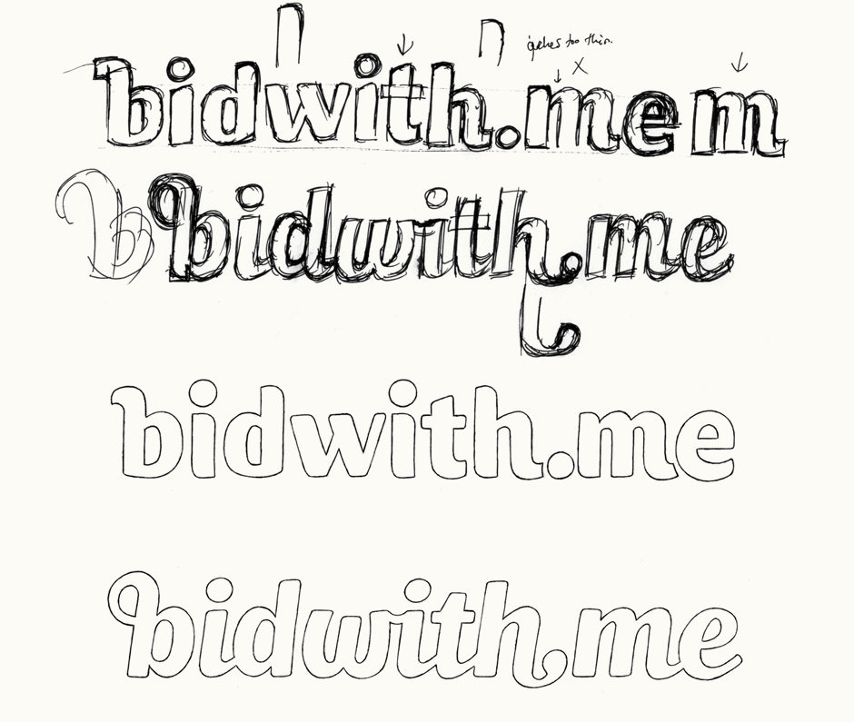
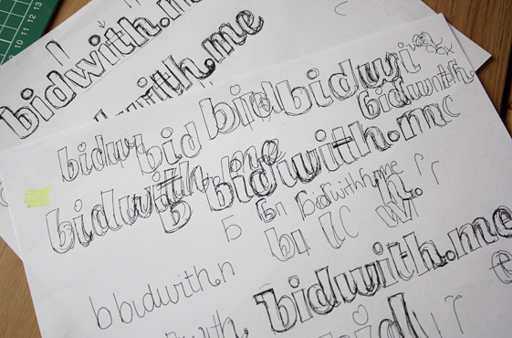
Above: The very rough sketches that led to the final, neater drawings.
Vectoring
We went with the second concept as it felt a little more unique, as much in its general style as in its various details. The italicisation of the lettering gives it a sense of movement right from the start, while the predominantly straight letter stems ensure the overall look is sturdy and reliable. While vectoring, I focused on making sure the individual words were clear enough as well as emphasising the dot and its connection with the 'h' before it.
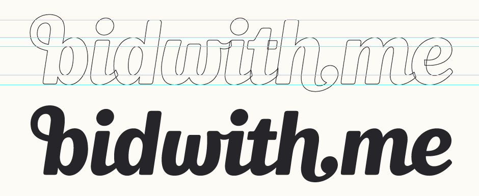
Above: Screenshot of the vector outlines (un-merged while in progress) and solid fill.
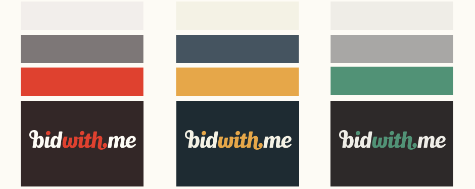
Colour Palettes
From early on in the idea development, we considered the use of colours to build on emphasising the separate words and play on the use of the three dots. The colour schemes needed to be quite subtle and exclusive, without any tones that were overly bright or flashy.
Initial
The 'b' alone needed to be versatile for a range of different situations: website favicon, business cards, background image, and within various illustrations and symbols throughout the website.
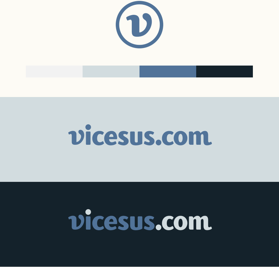
Vicesus.com
On finishing the bidwith.me logo, I was then commissioned to create a logo-type for the network marketing company, vicesus.com. The style of the unused earlier concept proved the ideal direction as it fits the the more corporate orientation of the business and its purpose. This new logo would also need to feature a distinctive initial letter that could be used much in the same way as the bidwith.me 'b'.
Working from the earlier sketch, I created some rough drafts of the missing letters before moving quite quickly to the vector development. The first 'v' option has quite a strong, unique shape with an initial curve that mirrors the final 'm' tail. As an alternative, I also drew a more standardised 'v' which results in a more serious look.
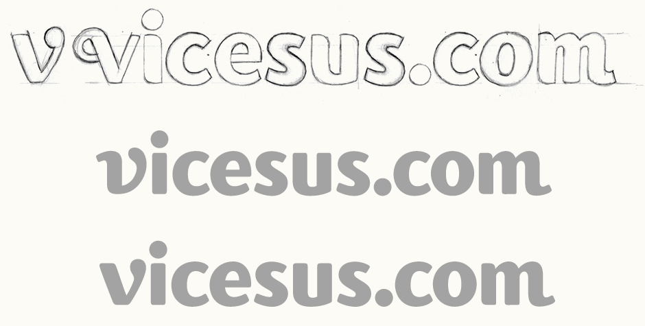
Above: Here, I only did a rough pencil draft and used the outlines just as a loose guideline for vectoring.
Finalising
The distinctiveness of the original 'v' makes it more suited to use by itself and it also has a lot of potential for creating some continuity with the 'b' – something that is further emphasised through the use of colour.