Bloovi
Client: Bloovi
Work done: Logo-type designs, custom lettering, branding, print design
Identity re-branding
Bloovi, the name stemming from blooming vision, is a Belgium-based communication platform that focus on the digital and interactive communications markets. Founded in 2010, it offers daily industry news, articles, jobs, events, etc. through various pathways, such as the company website, social channels, conferences and workshops. Within the Bloovi brand, there is also BlooviStar, a division which produces original audiovisual content for companies and distributes the content through channels with the highest impact. The main company logo therefore needed to be adaptable for this second design.
The current Bloovi logo featured a speech bubble and one of the requirements was to keep this idea for continuity, but look at different ways to implement it. BlooviStar needed to incorporate a star and emphasise the name's similarity with movie star. Overall, the brand visual design needed to be playful while remaining professional and simple with a unique, memorable touch.
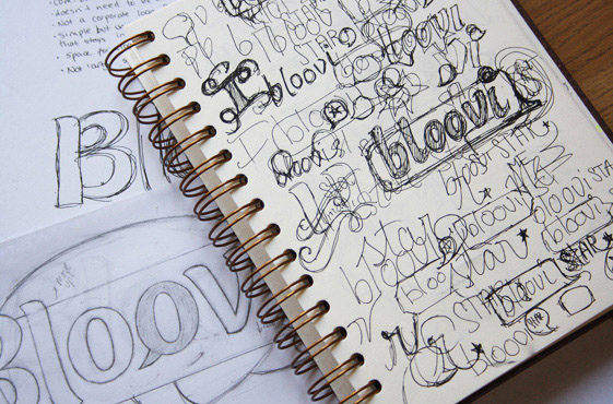
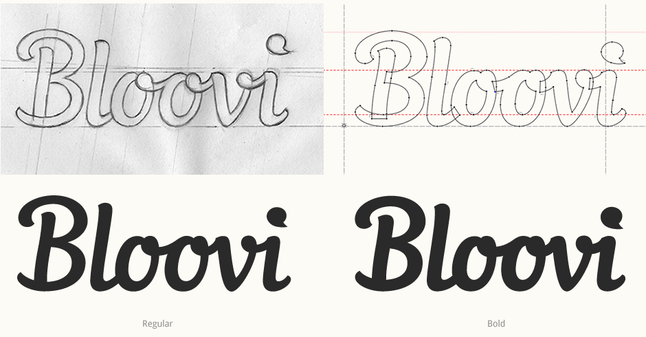
Above: Early exploration sketchbook pages and revised drawings.
Initial Version
The first versions I designed featured solid, bold lettering to impart the playful, friendly impression. Without being connected, the letters are nonetheless designed to visual fit together so as to create a compact, cohesive piece. I explored different ideas for the integration of the speech bubble, focusing on ways that would allow it to be an integral part of the logo, rather than a separate component.
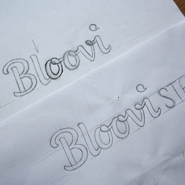
Above: First proposal drafts with un-connected lettering.
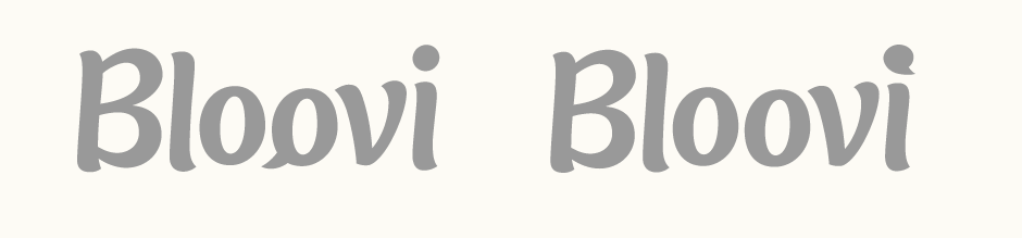
Revised Lettering
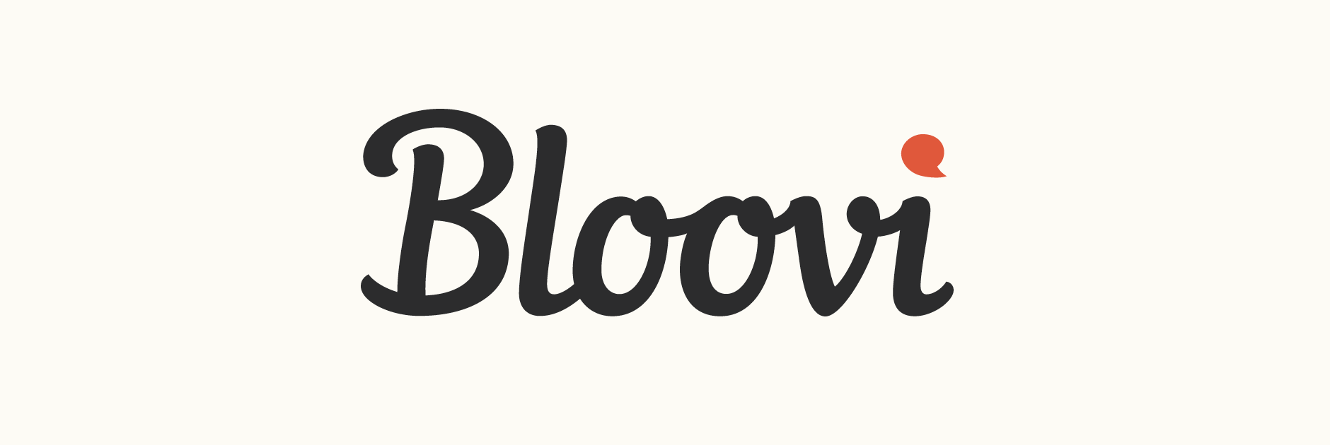
Having the speech bubble as the 'i' dot proved to be the most effective solution as it's quite subtle and is a more natural detail than modifiying the 'o' shape. Furthermore, it had better potential for further extensions as the shape itself could be used as part of an icon and other visual elements. The lettering style itself however was coming across a little to child-like, so I drew a revised version this time using a connected script to emphasise the strength and impact of the relatively short name. An bolder alternate version was also created for comparison.
Further Development
Working from the regular version, the next steps were to build on the logo itself: accompanying typeface, colours, icon variants and tagline integration. Aller by Dalton Maag is used as it has a good balance between having a strong personality with particular features (for instance, the 'y, the 'K' and the ampersand) and looking clean, professional and unobtrusive.
The speech bubble/'i' dot was lightly modified so that its shape was well suited to being the container shape for the icon: taller and a little less wide. The colour palette uses a bright orange to highlight the concept while the particular shade of blue further complements the lively, contemporary feel.
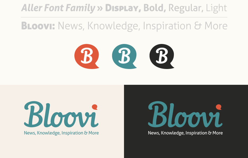
Above: Summary of some of the visual assets: brand typeface, icons, colour palette and tagline lock-ups.
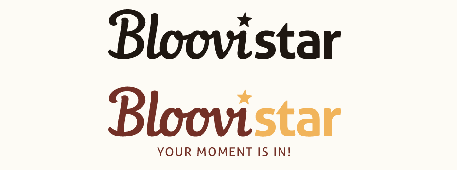
Bloovi Star
My initial thought for the Bloovi Star brand extension was some custom lettering for "Star" in a style that would heavily contrast the more organic nature of the first name. A tall, condensed sans-serif using a consistent line weight would add a distinctive and contemporary touch, while the slightly rounded edges would allow for some continuity with the script. While the execution as a stand alone piece was relatively successful, it simply didn't fit as well with the main logo.
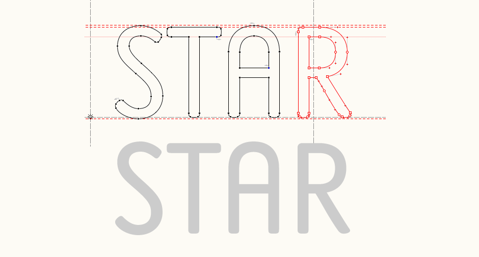
Above: Early rough custom type, unused.
While the execution as a stand alone piece was relatively successful, it simply didn't fit very well with the main logo and looked quite awkward. Instead, bringing in the Aller typeface worked much better as it was not only effective in terms of visual aesthetics, but also in the sense that it really helped to build brand continuity.
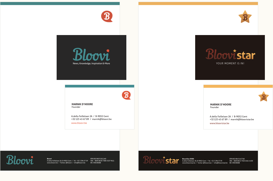
Stationery
I also designed business cards and letterheads that would build on the characteristics introduced by the logos. It was crucial to create a visual style and layout that would be adaptable for both materials and both divisions, while also allowing the individuality of the separate brands to emerge. I used the similarity between the set-up of the colour palettes (bright accent colour, main colour and dark background) and icon formats (identical 'B' within appropriate shape) to achieve a sense of continuity without simply using repetition.