Bookouture
Client: Bookouture
Work done: Logo-type design, custom lettering, brand colour palette
Custom Logo-type
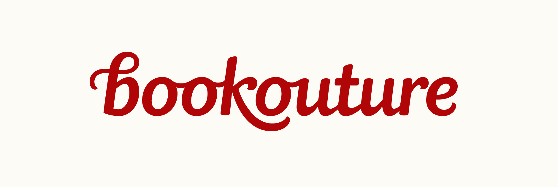
Custom typography logo design for Bookouture, an independent eBook publisher. Based in the UK, they publish smart, feel-good fiction for primarily female readers. The company was looking for a stylish, clean and distinctive typographic logo with an eye-catching and timeless quality. The name stems from a play on the words 'book' and 'couture', referencing the idea that the books are perfectly tailored to their customers - something they were also interested in linking within the lettering.
With the primary intended use of the logo being the upcoming company website, the lettering needed to be clear and easily legible when at smaller sizes. The 'b' in particular had to be unique and own-able in order to use as an icon. Based on our early discussions, we decided to look at varying degrees of expressiveness, from lettering that is relatively restrained, on a straight baseline, etc. to more organic compositions with an emphasis on the hand-drawn quality.
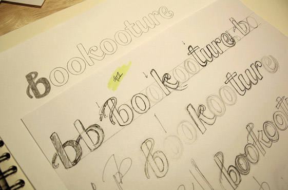
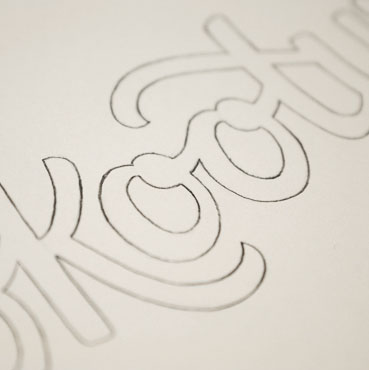
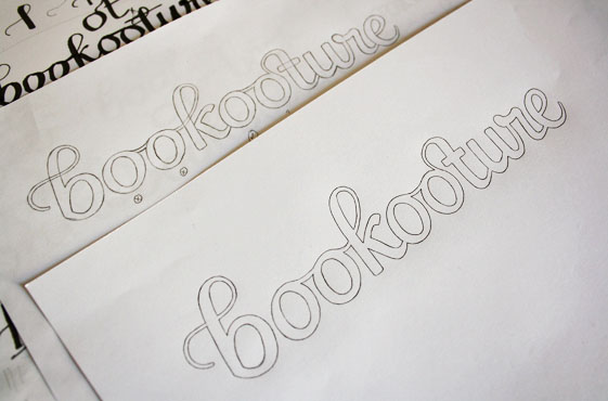
Above: Progression of early rough ideas through to more refined concepts.
Concept Sketches
The 1st version below combines loosely italicised sans serif letterforms with the distinctive characteristics of script style lettering. This is results in a clean, feminine design with a strong rhythmic, harmonious look across the relatively long word. The curved line in the 'b' is suggestive of thread, with the letter's straight stem subtly referencing the form of a needle. The thin weight of the initial stroke contrasted with the heavier main letters accentuates its visual shape and helps the 'b' stand out as a unique, memorable element.
The 2nd design has a bold and dynamic visual quality to it, accentuated by brush style stroke terminals and original letterforms. The variation between individual characters is also more prominent, enhancing the hand-rendered and expressive nature of the lettering.
The 3rd concept is in a similar vein to first one in that the overall idea is to suggest the movement and shape of thread throughout, as if connecting all the letters (starting with the 'b', the thin stroke is continued throughout, particularly on the 'k', 'o-t' and end tail of 'e'). Furthermore, the 'o-t' ligature also adds a visually compelling, unique element in a simple yet recognisable way.
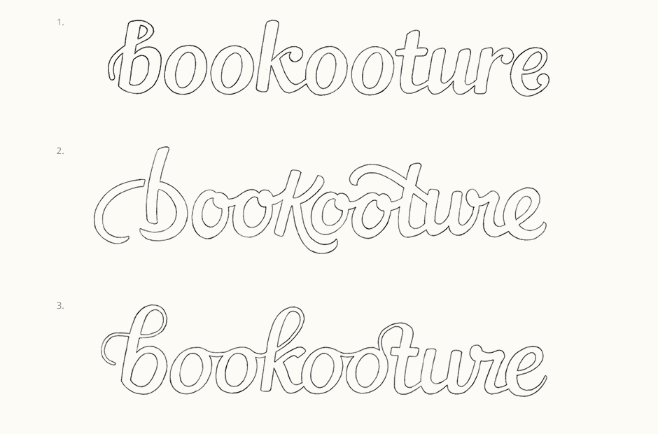
Above: The initial designs focused on overall style, tone and idea development, with weight, counter balance and typographic colour then refined progressively.
Further Development
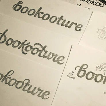
Having discussed the pros and cons of each, we used the first version as the overall approach for its solidity, sense of confidence and clear legibility. With that as the base, we then explored ways in which to incorporate the stronger aspects of the other two. At this stage, the spelling of the name (which was 'Bookooture' originally) was modified slightly in order to make the concept more readily identifiable.
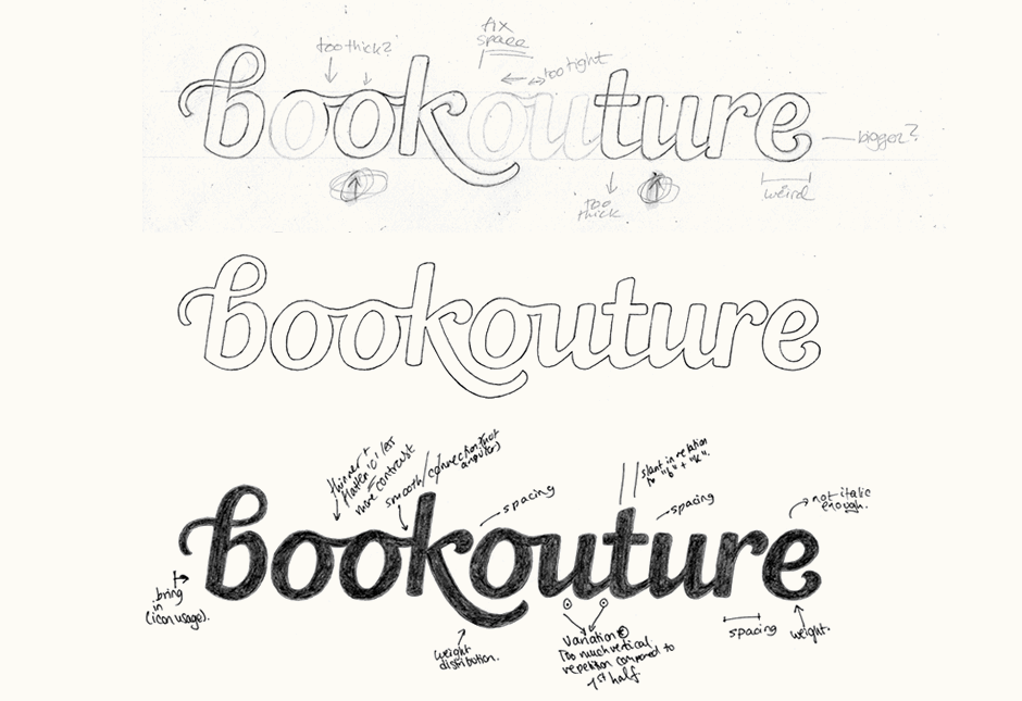
Above: A few of the steps in the development of the last sketch, with notes highlighting areas to fix digitally.
Vectoring & Revisions
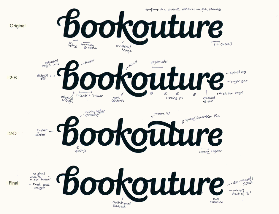
From the approved final sketch, I then created the digital draft (first version below). We discussed the possibilities of adding something extra or accentuating existing characteristics to see how the overall design could look with a little more of a distinctive edge. At this stage, I also worked on tweaking and revising the details; in particular, creating a better balance both halves of the word. This was a little tricky due to the predominantly rounded letters of 'booko' against the comparatively strong vertical nature of 'uture'. An extensive discussion and some really thoughtful feedback on Dribbble gave us plenty of things to take into consideration and incorporate into the extended development.
After adjusting the weight and spacing, I developed a couple of variations for the second version. Looking at the 'b', I tested ways in which to blend it more cohesively with the other letterforms without losing its sense of distinctiveness (printed tests below). As the 'e' was seeming a little disconnected, one variation tried out an extended middle stroke that would help to fill the gap left under the 'r' (version 2-B). We also tested bringing back the swash crossbar of the 't' from the 2nd initial sketch.
The final design brings back the thin curve of the original 'b' as its stroke weight remains the most distinctive and better emphasises the thread idea. To better integrate it however, the tail of the 'e' was changed from its initial strong brush terminal to a thinner stroke reminiscent of the one in 'b'.
Icon Versions & Colours
I tested various colour palettes to enhance the characteristics of the design and a bold, strong red was the clear favourite. Two versions of the icon were created: one in a simple circle for use at very small sizes and the other featuring a thin dashed line border suggestive of stitching.

Final Logo
Below is the finalised design in both regular and reversed light-on-dark colours.
Bookouture, Oliver Rhodes:
I have worked with A LOT of designers and I can honestly say that Claire is one of the very best. I got three completely different routes in the first round and that really helped in shaping the direction that we went. At every stage in the design process Claire intelligently critiqued her own work and was very open to the views of others, with the clear goal of making my company's logo the best it could be. Couple that with her undoubted creativity and you've got one of the very best in the business, and someone I'd wholeheartedly recommend. I was delighted with the final result.
