Captain Josh Hill
Client: Captain Josh Hill
Work done: Logotype design, custom lettering, tagline lettering
Custom Logotype
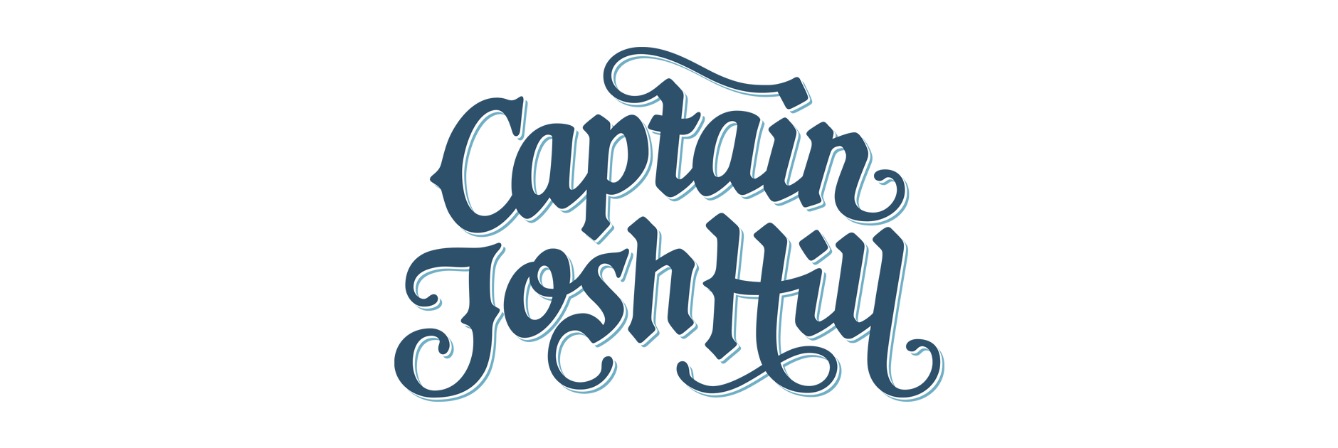
Custom logotype for a small start up rum business. The logo needed to have an adventurous, exotic, hand-made feel that would also evoke the Caribbean region it was to be produced in. Using his own name, the owner was looking to instill a fun old-school pirate theme to stir up a sense of adventure and living life to the full.
The lettering style was loosely influenced by cartography and the classic look of treasure maps. I aimed to mix informal script and blackletter styles to make sure to also capture the casual, playful and inviting nature of the brand.
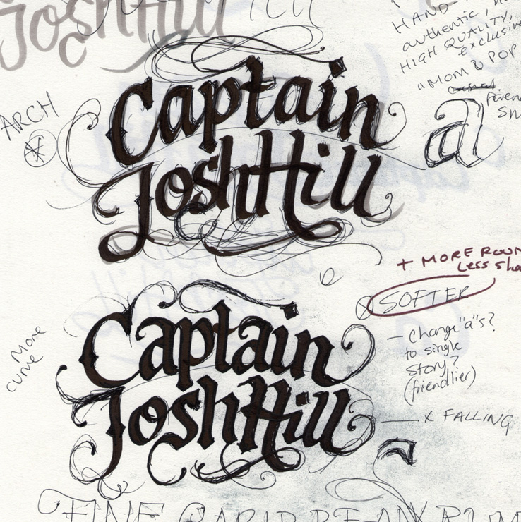
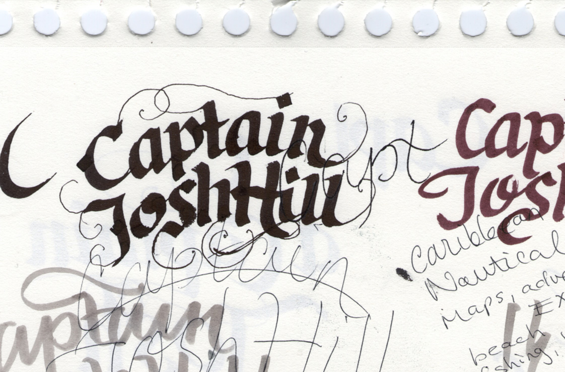
Above: Snippets of early sketchbook pages.
Sketch Development
To get the right shapes and contrast, I used a broad nib calligraphy marker pen for the base, held at a consistent angle. I then filled in some of the details with a thin pen and tried out some ideas for swashes and various stroke extensions to see what kind of interactions might work.
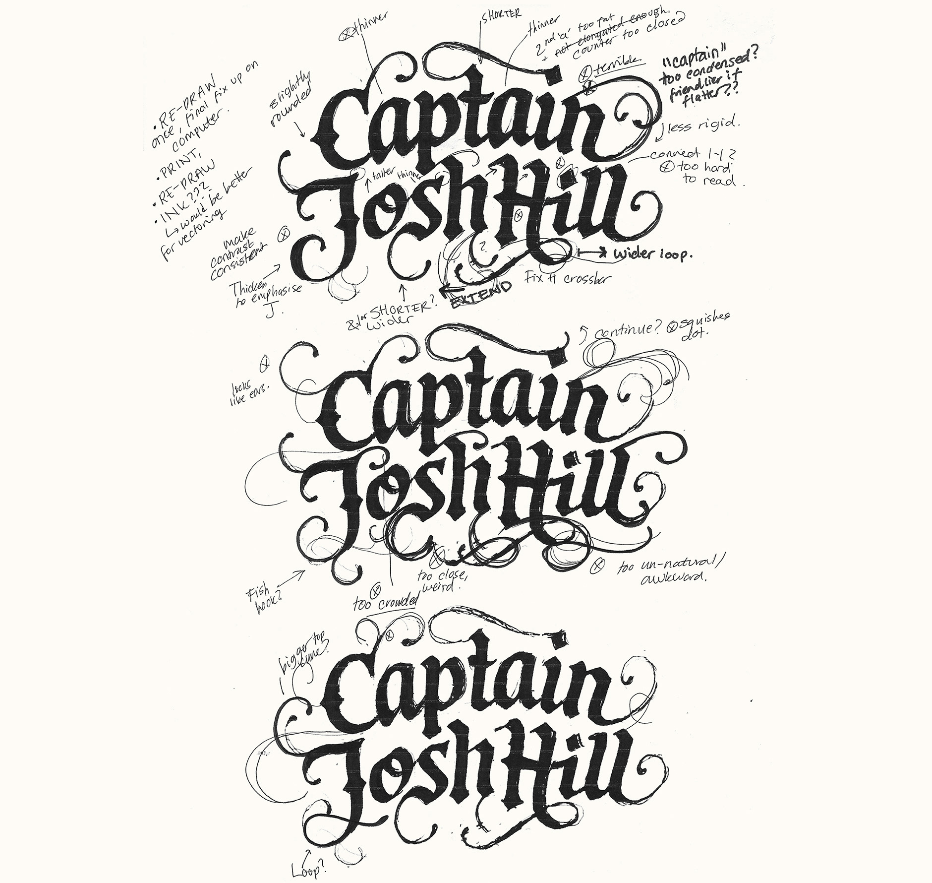
Above: Progression of some of the rough drawings.
Final Sketch
The composition came quite naturally thanks to the length of the words and how they logically split up. To focus on creating a really visual, compact shape, I used an arched baseline for the top word and very loose alignment on the bottom (although in this sketch, the last word was still ‘falling off’ too much). The overall style of the letters themselves and all the angles are balanced out by the wide swashes and softly rounded stroke terminals.
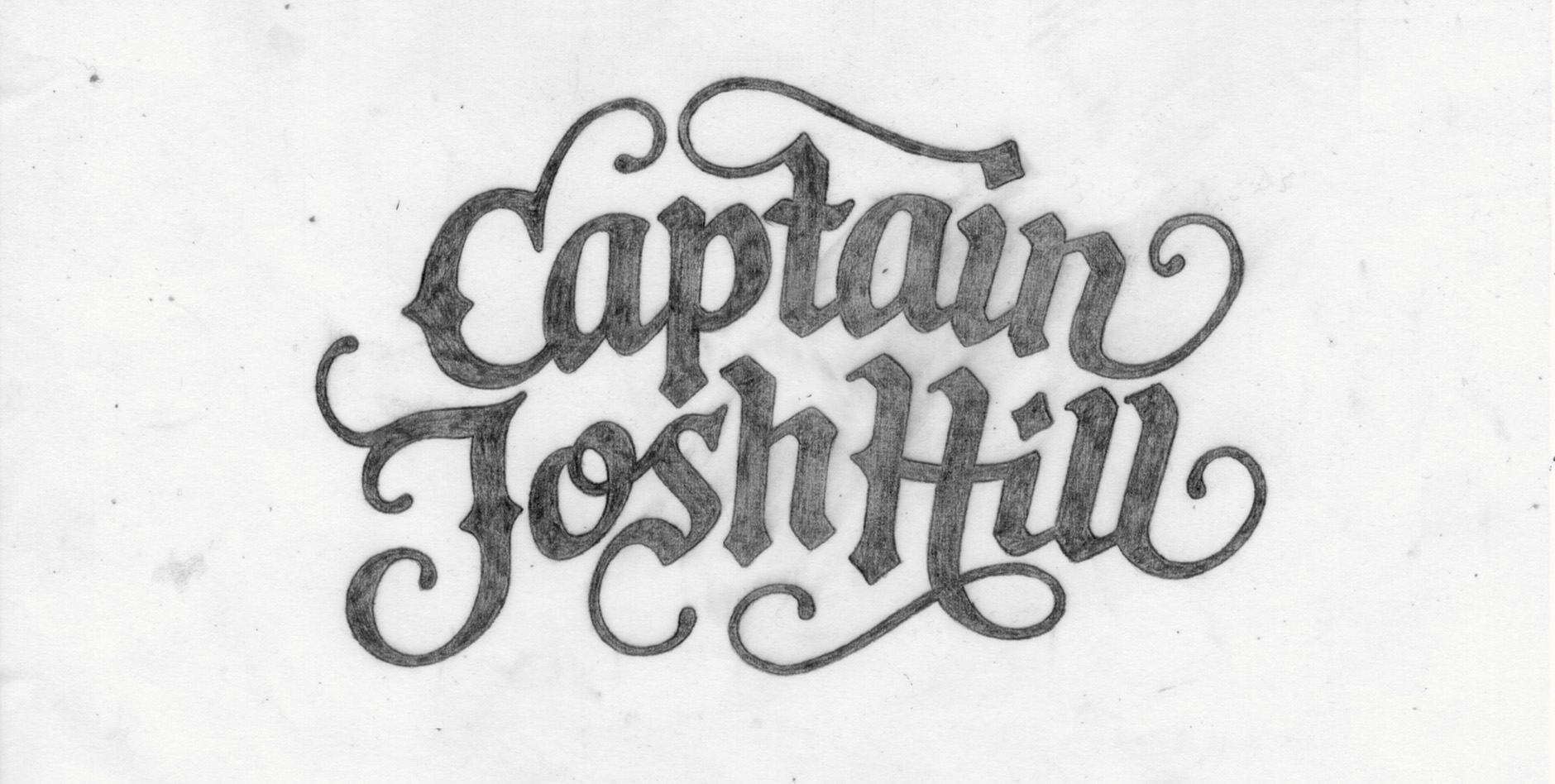
Above: First full concept sketch, still with quite uneven and rough letter shapes.
Digital Version
When making the initial vector, most of the changes affected the positioning and inclination of the letters, as well as a new dropped 'l'. I also decided to tone down the sharpness in areas like the bottom of the 'a', 'i' and 'n' as the original drawing proved too harsh when copied directly, simply because of the crispness of digital lines vs softer pencil. At this stage, I also kept the paths as individual segments so that things like spacing and precise positioning (of crossbars and loops) could be more easily revised.
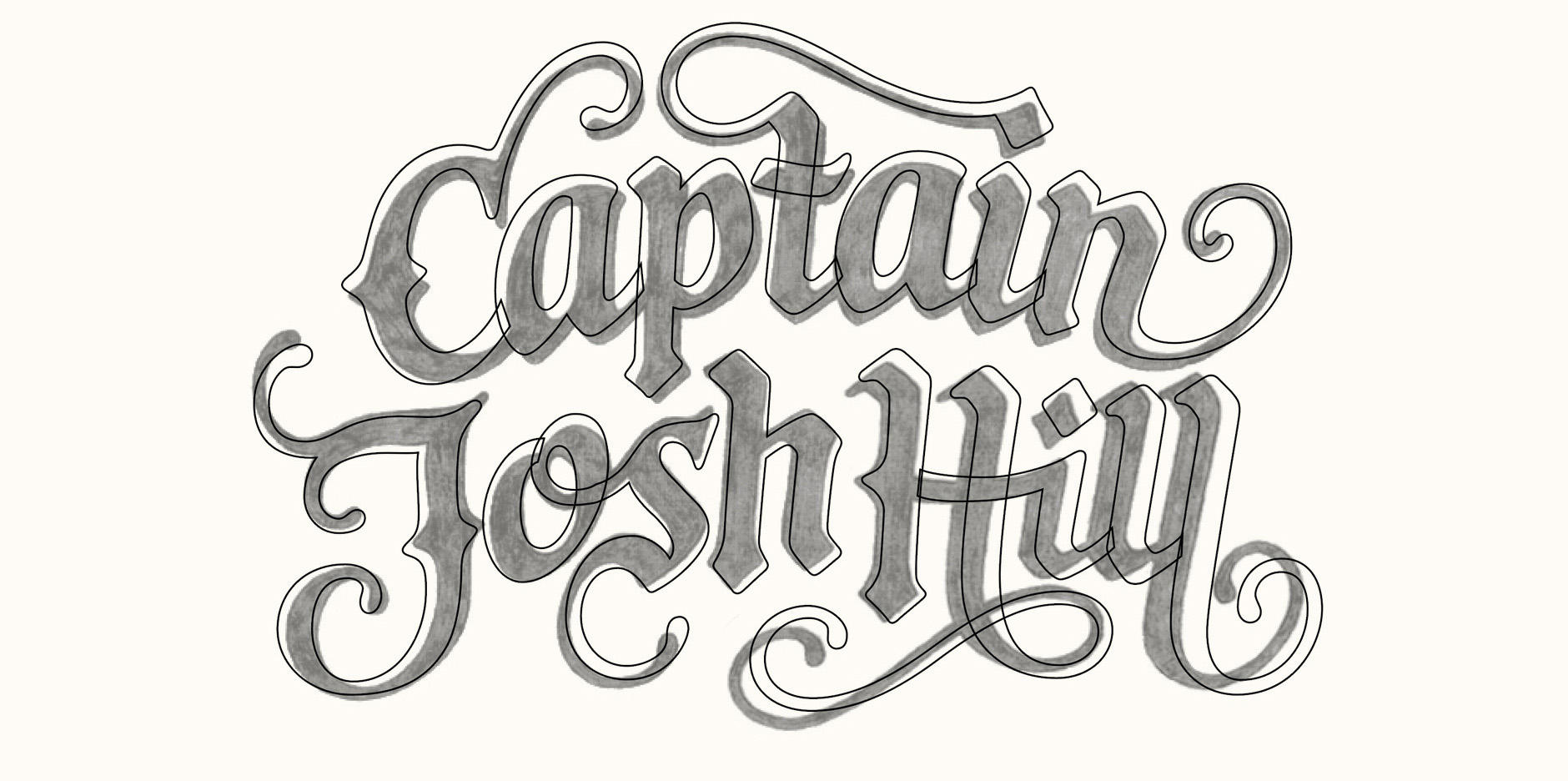
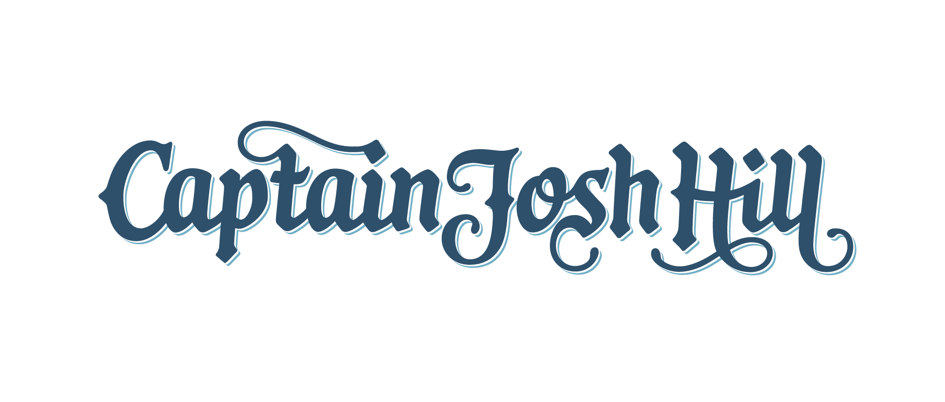
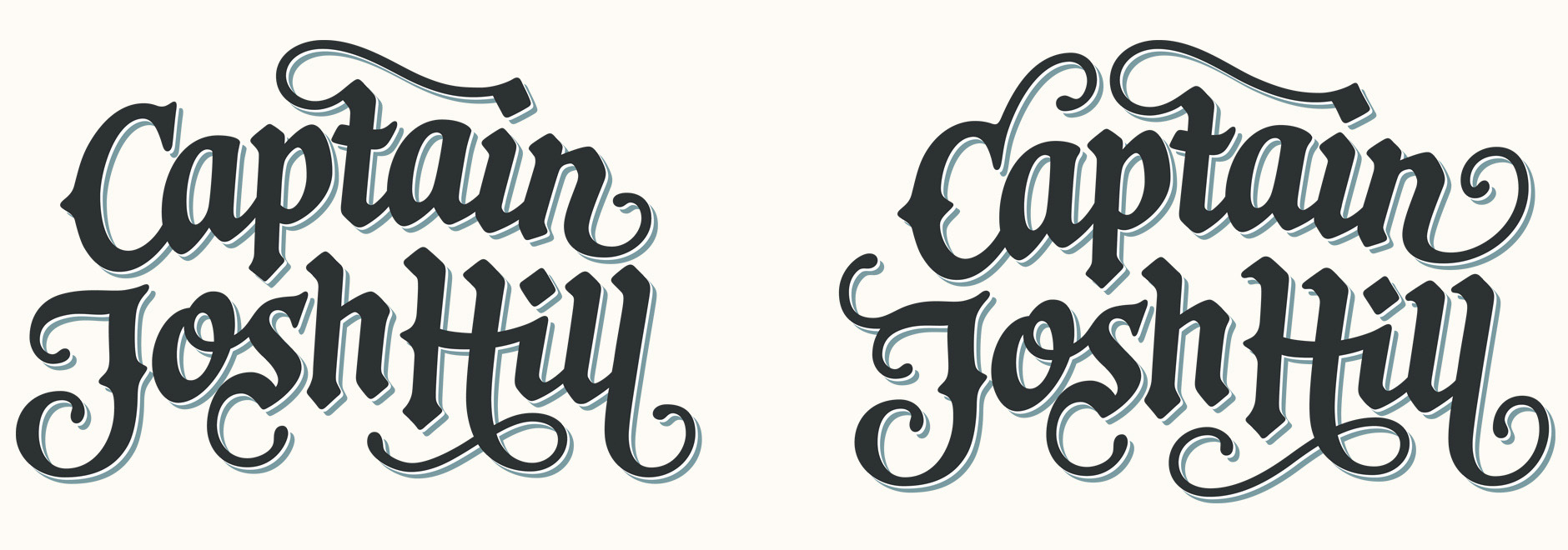
The original sketch featured a quite heavy use of swashes, often stretching out in unusual shapes and directions, like on the 'C' and 'J'. Wondering if these were a little over the top, I also tried out a simpler version that had no extensions on those letters as well as shorter 'H' and 'l' swashes. Some of the other little details were also toned down, such as the little serif-like strokes on top of the 'H' and 'l', some angles on the 'a' etc. This version translated well to a secondary logo set in a horizontal composition for use when the stacked version might be impractical.

Tagline
To go with the overall aesthetic, there was also a custom lettered tagline in a thin, elongated, quirky serif style with a clearly hand-made look.

Above: Sketch work for the custom lettered tagline.
Final Logo
The logotype and tagline work were unfortunately never finalised as the client didn't pursue his project, but a good conversation on Dribbble brought up some interesting thoughts on both the original version and the toned down one, as well as a discussion on certain features.
