Chakula

Client: Chakula
Work done: Logotype design, custom lettering, icon, branding development, branding guidelines.
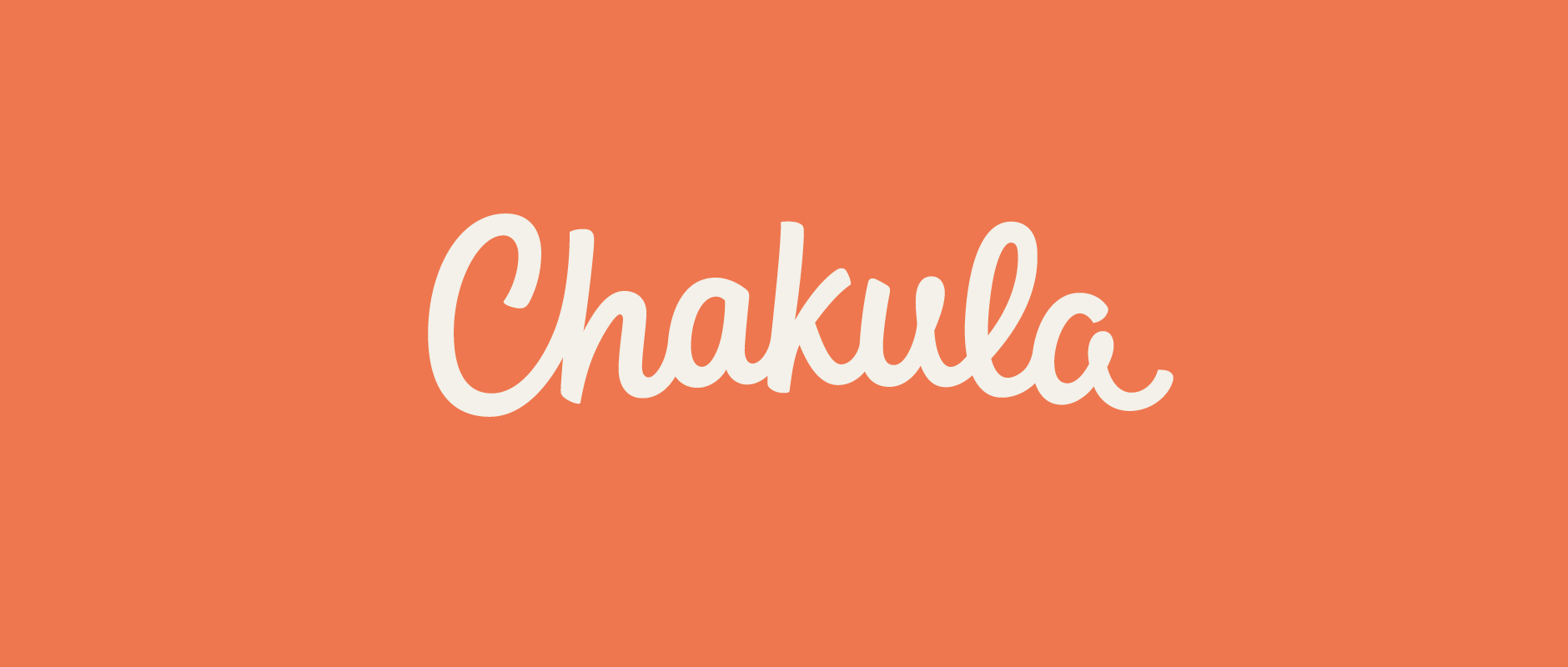
Custom Logotype & Branding
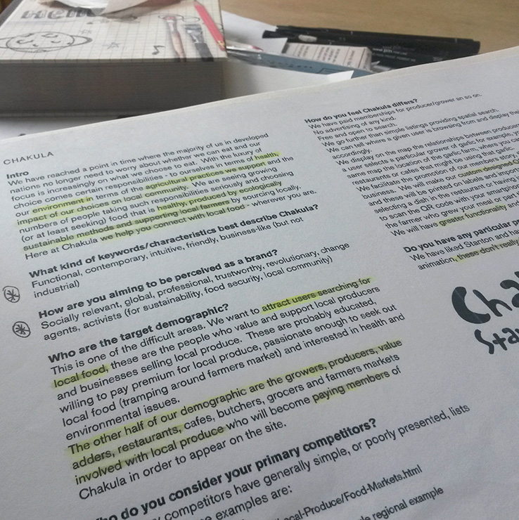
Chakula is a new platform about responsible food sourcing. Chakula helps you to learn the story of your food and those producing it, with a goal to increase awareness about food choices, locally sourced products and responsibilities in terms of sustainable agricultural practices. It’s aimed both people searching for local food and for businesses selling local produce, with key features to help connect the two.
Together we we developed the design brief, building from a discussion about the brand's background, fundamental concepts, perception, how it stands out, requirements, etc. The logotype needed to have a fresh, natural, trustworthy feel that was also evocative of a brand that is progressive and socially relevant.
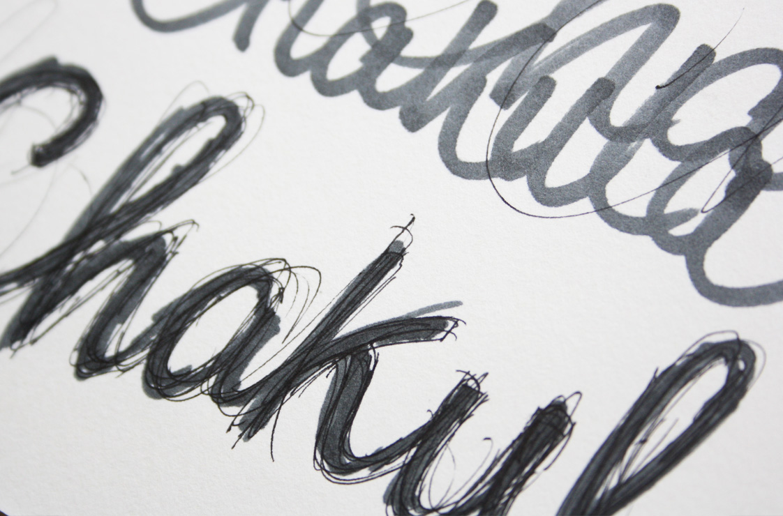
Above: Early sketchbook pages.
Concept Development
From writing the name over and over, certain shapes and stroke movements starting emerging: the arch of the 'C' hook, the high connecting stroke to the 'h', the junctions in the 'k', the closed loops in the 'u' and 'a'... At this point, I generally like to choose a design to draw over in pencil using tracing paper, then go back over with pen to start looking at more precise lines.
Once the overall idea is right, I corrected things like spacing, alignment and character width digitally before printing out an outline version and drawing the final sketch over the top.
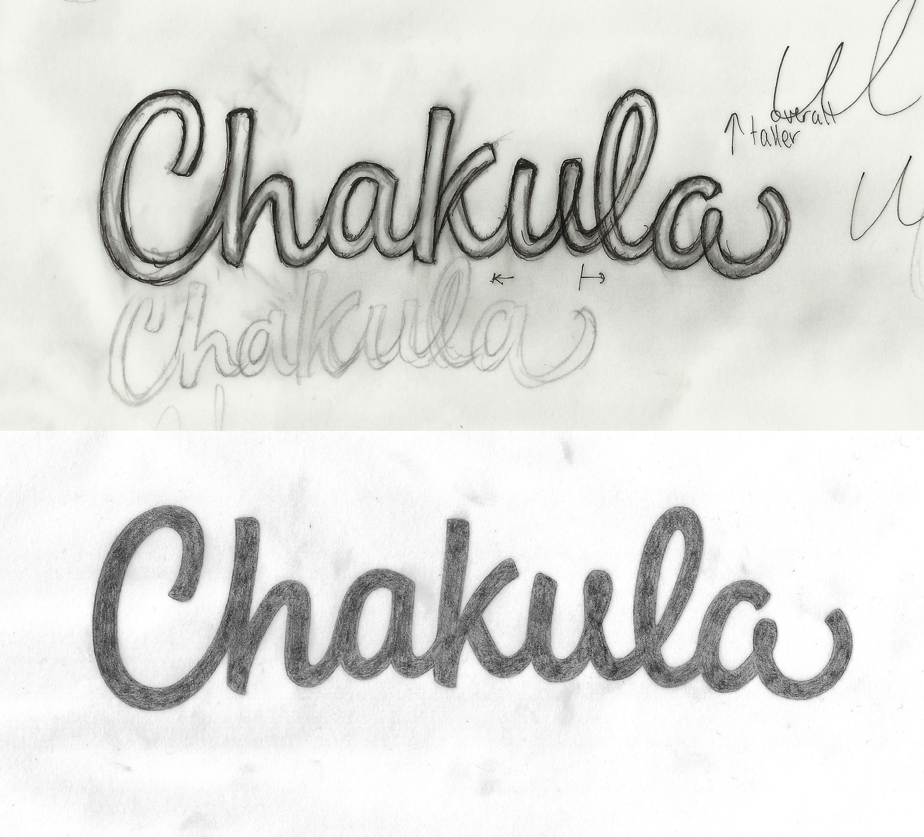
Above: Progression of sketch concept.
Digitising
We were happy with the overall concept so digitising focused on improving and refining the details of the design, rather than any conceptual changes. The screenshot below shows the working Illustrator file with the letters as mostly separate vector shapes, with the exception of pairs where the shape and smoothness of the connecting stroke is essential (the ‘C-h’ in particular).
I also worked on optical adjustments like shifting the junction of the ‘u-l’ connecting stroke to ensure that visually, the loop appears to flow correctly (without any adjustments, the right side of the loop tends to appear unnaturally high up, even though it’s geometrically correct).
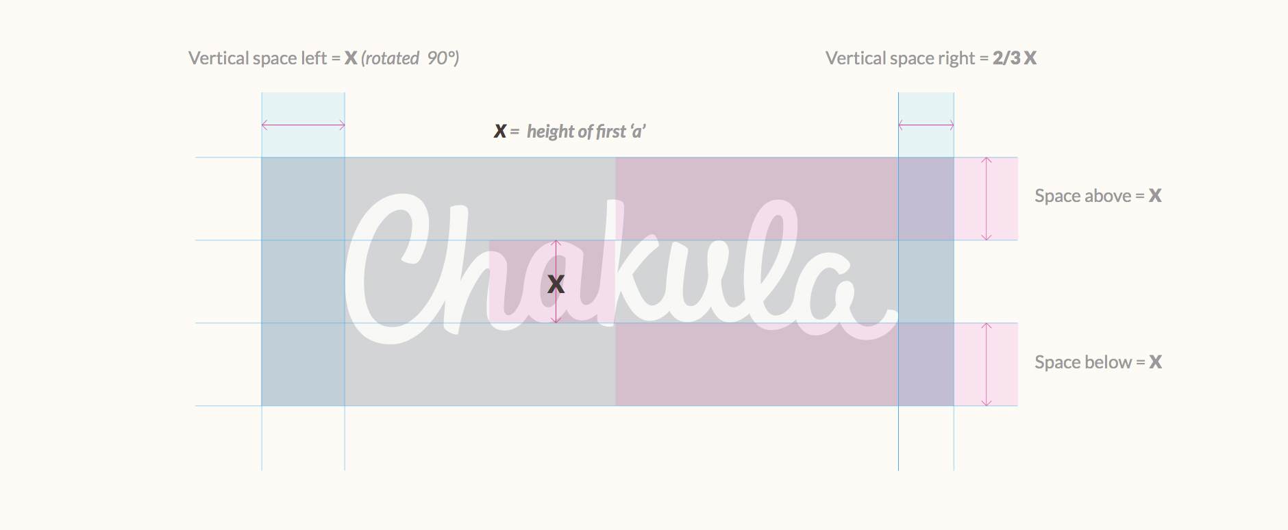
The baseline to this design is along a loose arch but I used a few guidelines to make sure that the overall shape remains relatively contained: the 'C' isn't very much taller than the 'h' and 'l' ascenders, nor does it fall much further below the tail of the 'a' at the end.
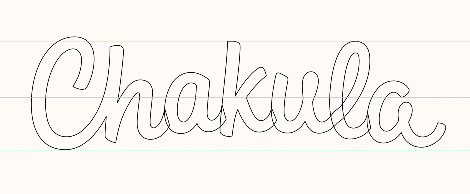
Above: Screenshot of vector shapes.
Icon Work
As part of the company’s original design work, they had an icon that featured a combination of a location marker and a wheat branch (below left). I created a new version based on the same concept but designed to be more in line with the desired aesthetic and also address technical issues, such as proportions and scalability.
Rather than a mark + type combination for the logo, I recommended keeping the use of both elements separate, but within the same overall visual environment. The mark would be the company icon (favicon, social media avatars, symbol to use throughout the website, etc.) and it acts as a concise, visual representation of the brand.
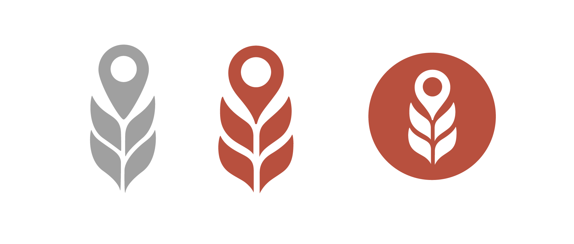
The logotype would then be used as the full logo version (whereas the mark would be the shortened version) and through its lettering style and execution, it addresses the fundamental emotional characteristics of the brand. It is more evocative of feelings and impressions, while the mark is more literal.
Through testing, I realised the mark would need some adjustments for use at extremely small sizes, such as the 16px height required for a favicon. The final work therefore also includes an alternate version optimised for very small sizes:
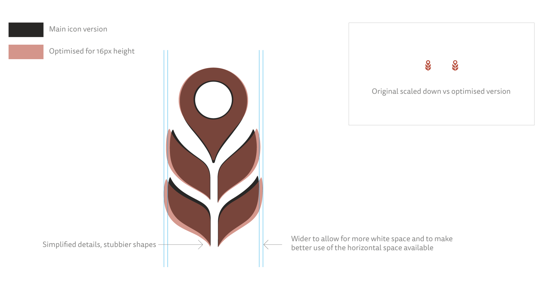
Above: Alternate icon version for very small sizes.
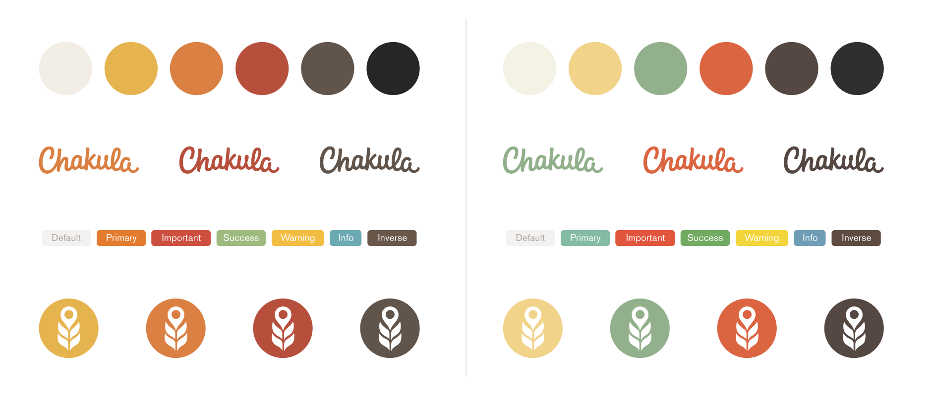
Colours
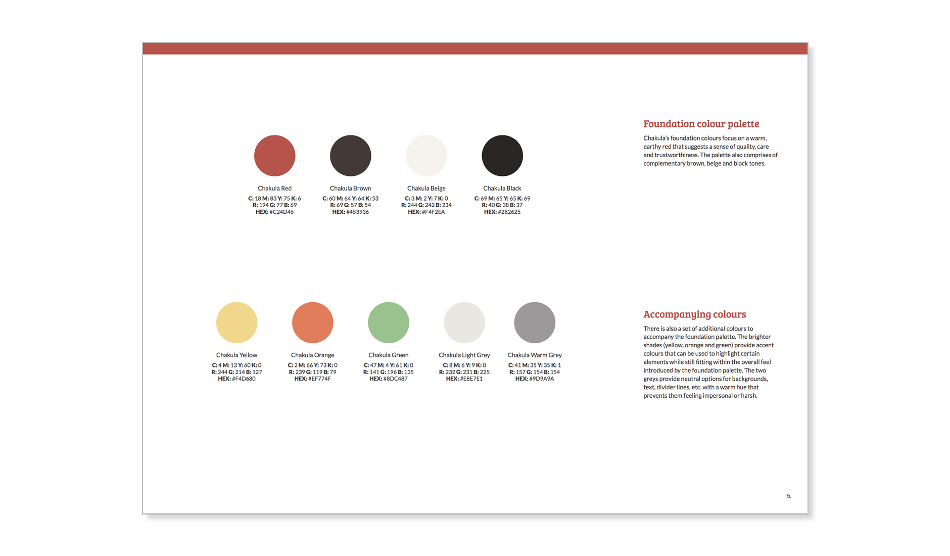
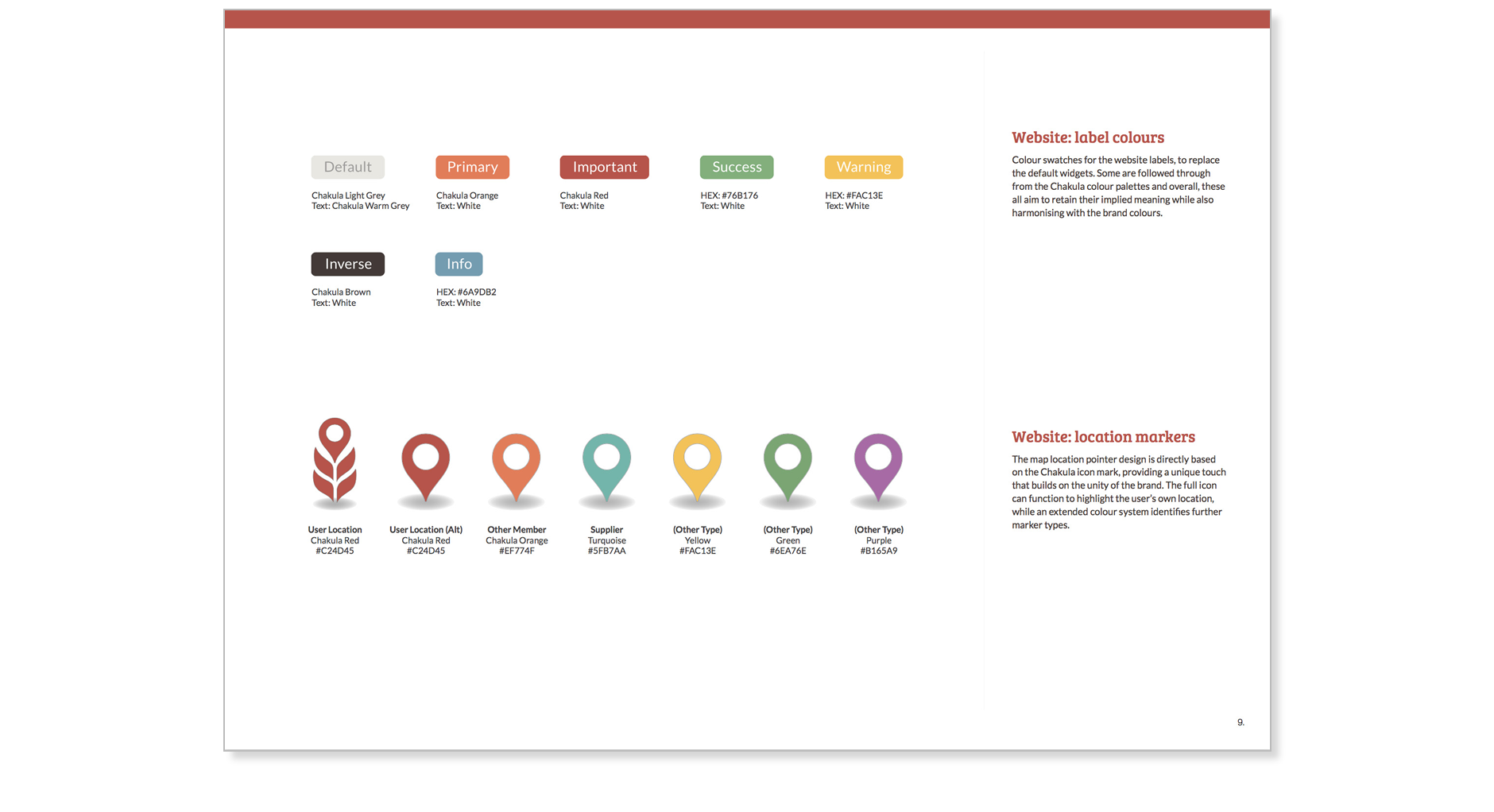
Colour exploration focused on creating a colour palette that feels natural, earthy, rich and warm. As the company were also planning to use a specific template as a starting point for the website, I also suggested modified default colours for the label tags which aim to retain their implied meaning while also harmonising with the main colour palette.
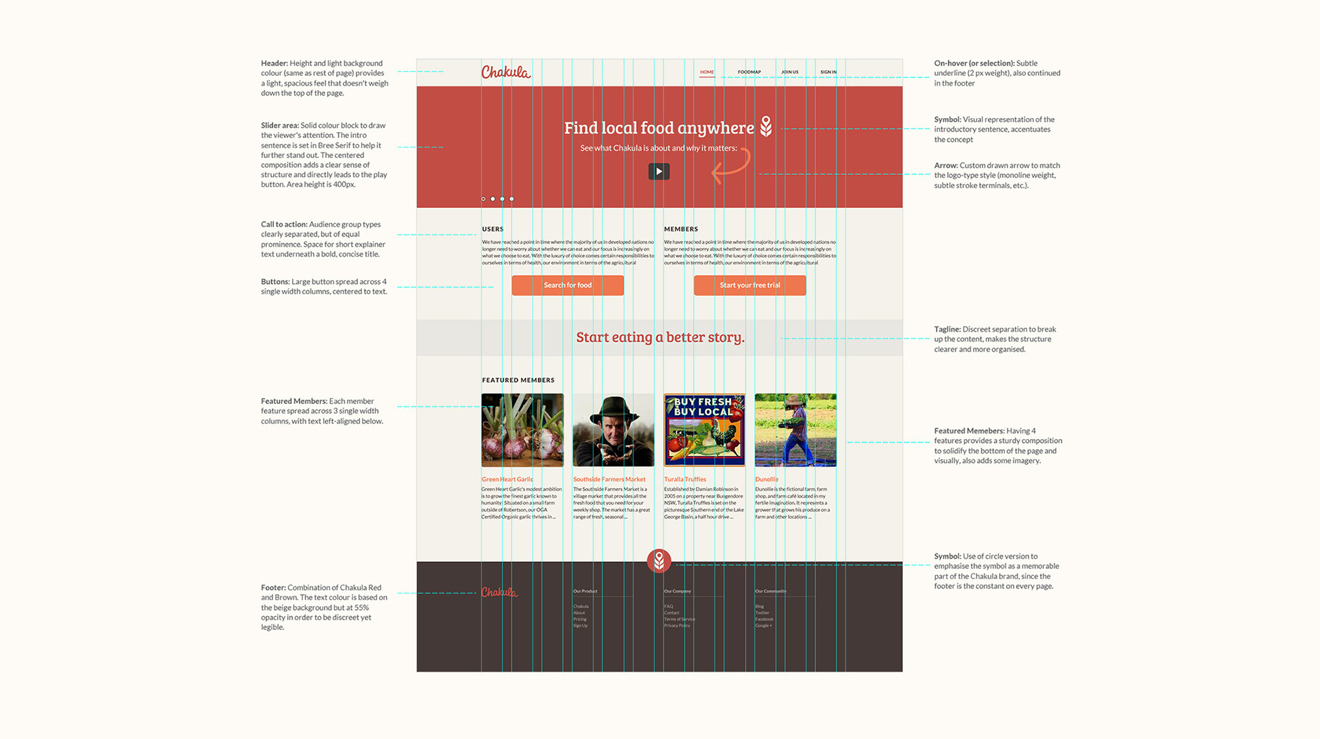
Website Layout
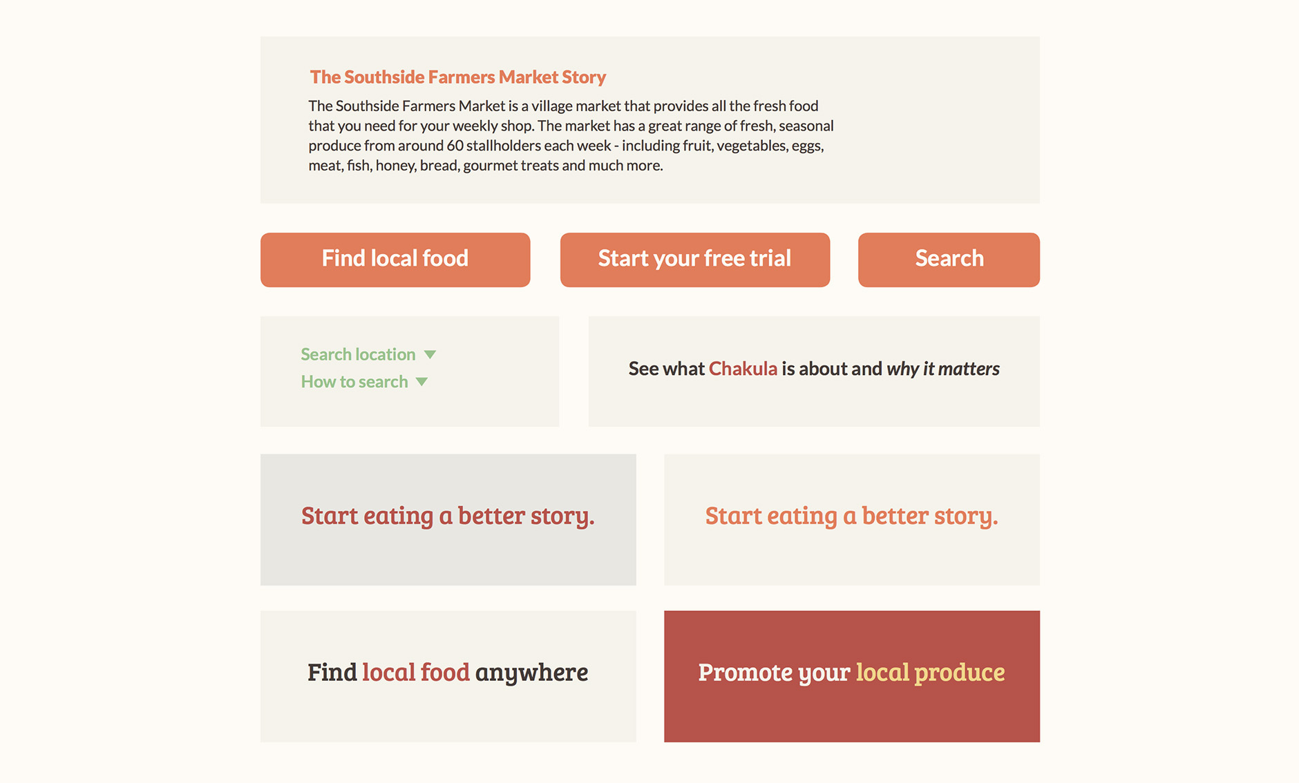
I also helped with guidance on ideas for the structure, hierarchy and visual look of the website's home page. Starting with some simple wireframes, we looked over some sample visuals that showed how the brand could use typography, colours and a clear structure to immediately convey the essential aspects of the brand. Early ideas used photography visual focus of the front page, but we later swapped it for a slider area that would also incorporate an animation that Chakula had had made.
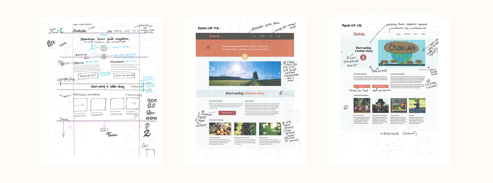
The goal with this stage wasn't to have a final design, but to compile a set of ideas and visual elements that would be used as a the guideline for the full website design.
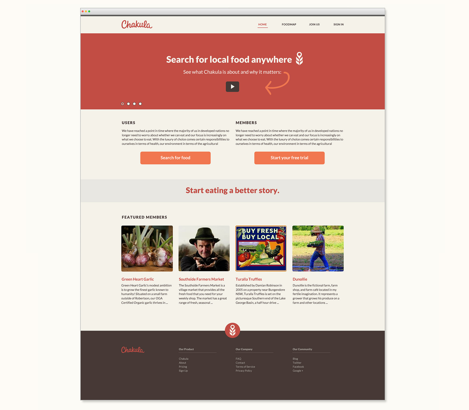
Along with the visuals, I outlined some notes describing key points to keep in mind, covering things like an intro statement, call to action, colour combinations and overall hierarchy.
Additional Elements
Based on the planned specific functionality of the Chakula brand, I also worked on some additional design elements. One important feature of the website is an interactive food network map allowing users to see which members are close to them. I adapted the icon mark to work as a location maker on the map, with the user's identifying marker being the Chakula icon mark.
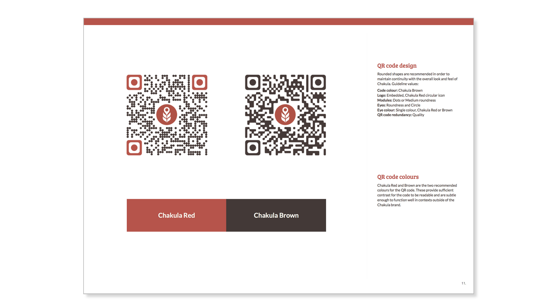
Each member also has a personalised Chakula QR code which, when scanned, sends a user directly to the member’s profile page so they can immediately engage with the story behind a product. As these would be used on products, packaging and menus, they needed to be distinctive and fit with the over brand aesthetic (colours, soft corners, etc.)
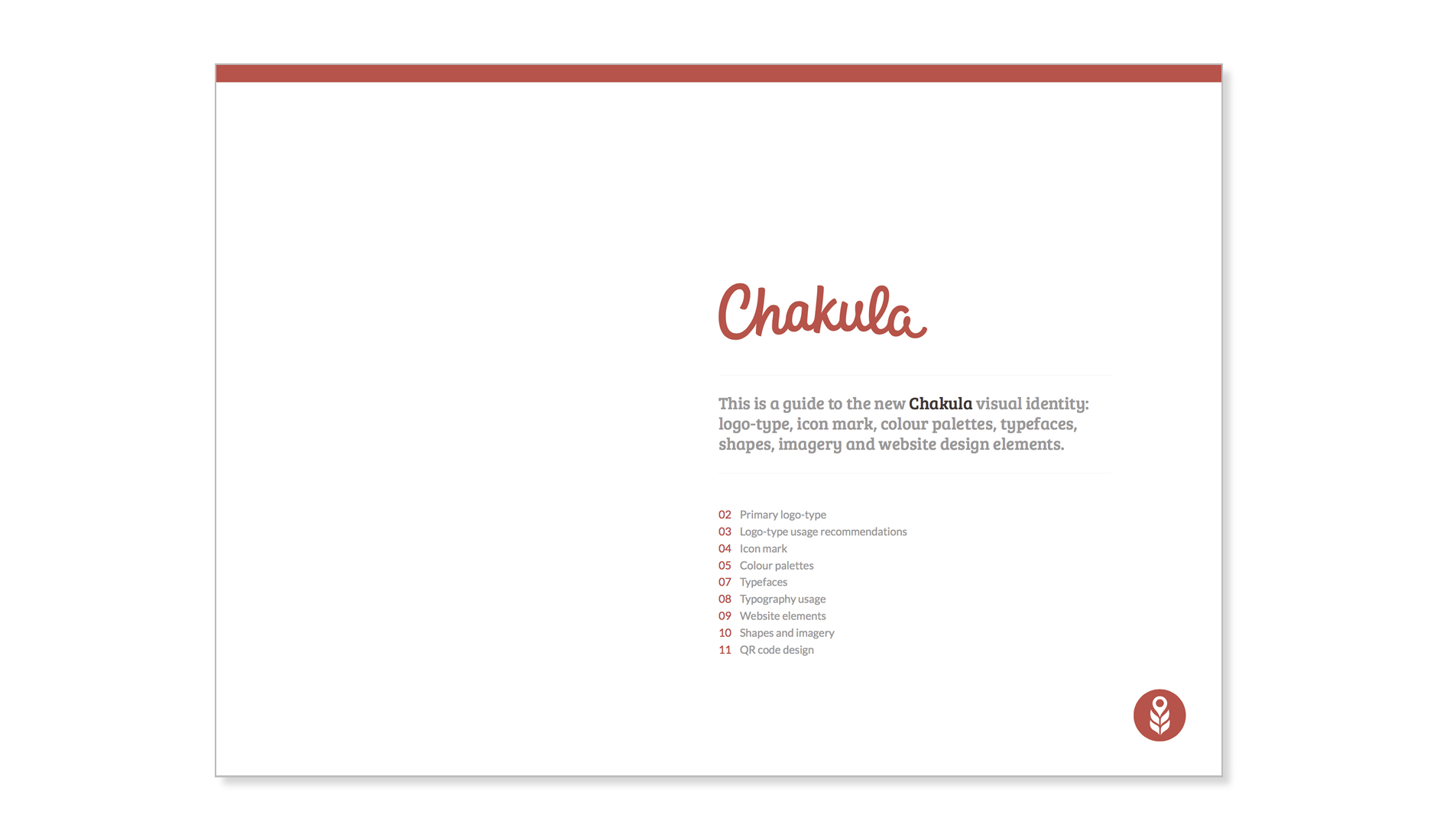
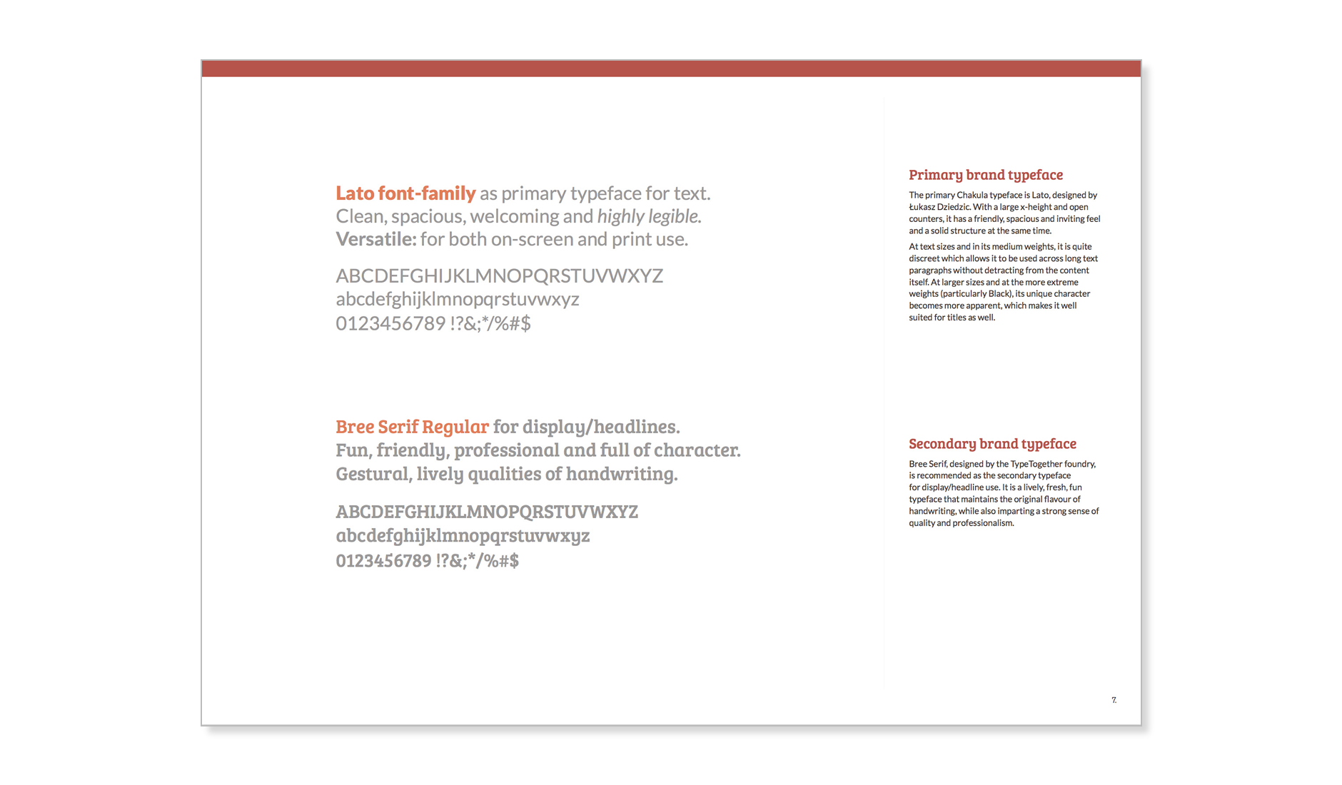
Branding Guidelines
The branding guidelines brings together all the visual identity work: from logotype usage recommendations, notes on the mark, the colour and the typefaces to sample website elements, and overall guidelines on shapes and imagery. As the company and website is currently being developed, the goal with the guidelines wasn’t to detail strict rules but rather, to provide general recommendations that could be built on in a strong, consistent way.