Class Atlas
Client: Class Atlas
Work done: Logo-type design, custom lettering, colour exploration
Additional credit: Logo-mark by Michael Spitz
Custom Logo-type
Logo-type design for Class Atlas, an upcoming academic network for high school and college students. The central themes were cartography, maritime exploration and navigation, so the lettering needed to reflect these motifs and fit with the overall brand aesthetics and materials currently in development.
Early research focused on the typography drawn on old maps, very often set in all uppercase with distinctive proportions and visually compelling serif styles, outlines, fill effects, etc.
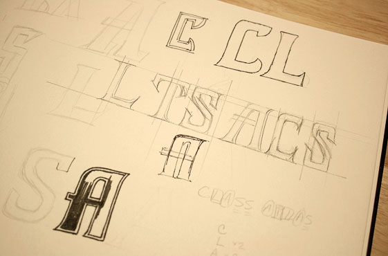
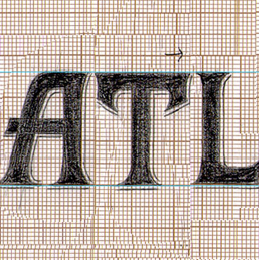
Above: Very rough exploration for an all caps setting.
First Proposal
My initial idea referenced the old map lettering combined with the classic 'college' style typesetting of school names. The prominent and slightly unusual serif style has a distinctive cartography feel and the shape of the first 'A' in 'Atlas' adds variation and allows it to be differentiated from the other two. The softly rounded corners bring in a subtle contemporary touch without detracting from the overall aspect. In addition to the primary version, the different visual treatments were intended to be highly evocative of college style fonts (below middle) and old map header lettering (below bottom).
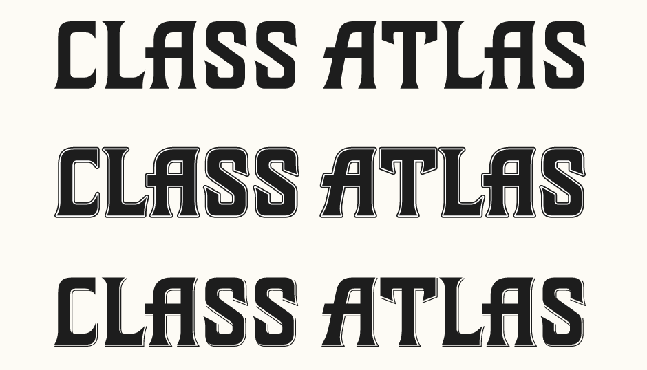
Above: Primary version (top) followed by two stylised versions.
Second Proposal
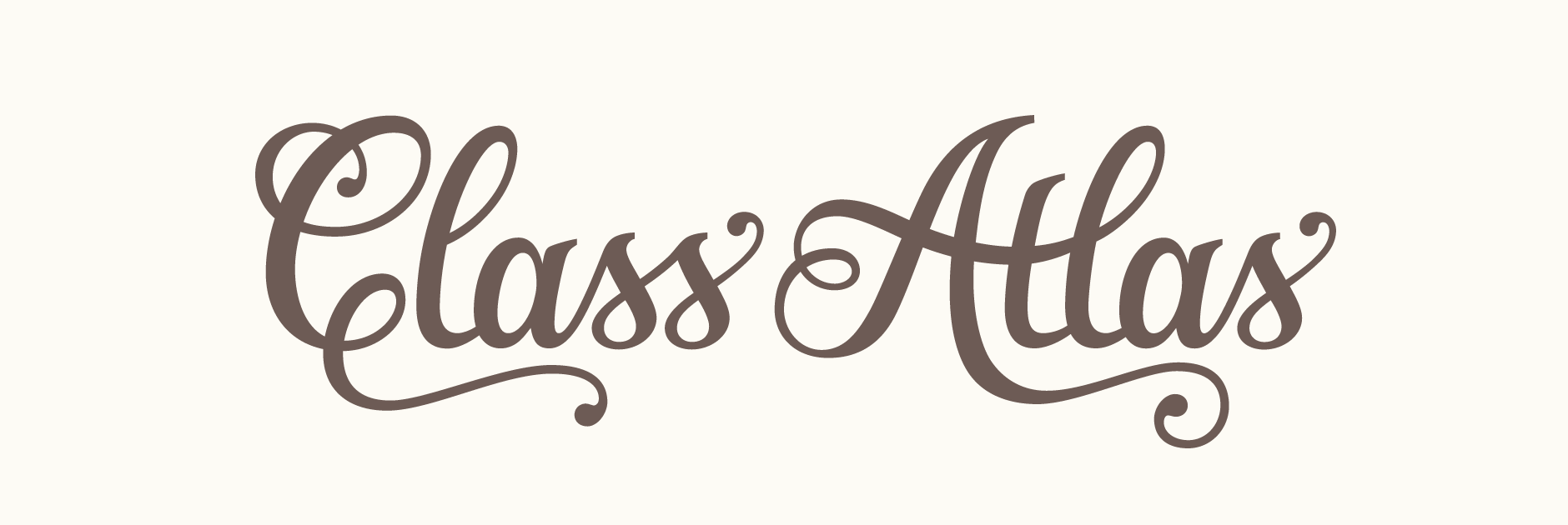
Upon discussing the initial design with the client, they expressed interest in seeing a more elegant, cursive style in order to use the calligraphy itself to suggest academia. My second idea then focused on finding a way to convey the cartographic theme through a classic script that was also appropriate to the target audience. I used swashes, ball terminals and long serifs to bring a touch of old world charm, while keeping the main body of the letters quite structured to maintain a sense of classicism.
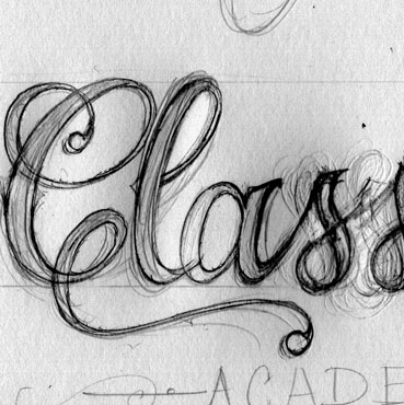
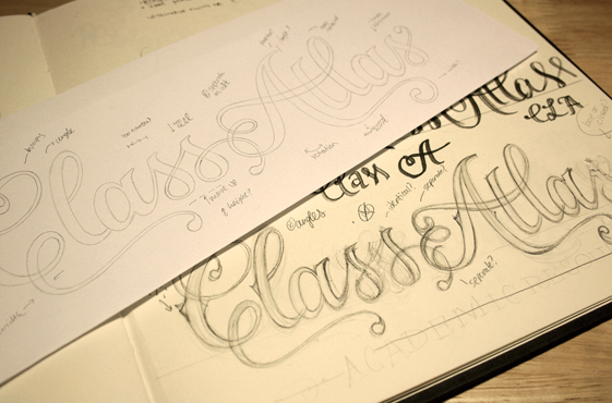
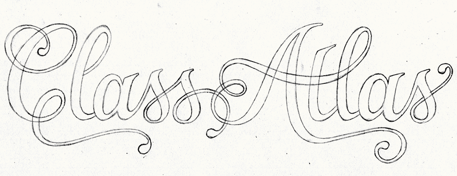
Above: Development sketches, notes and final rough draft for a script approach.
Development
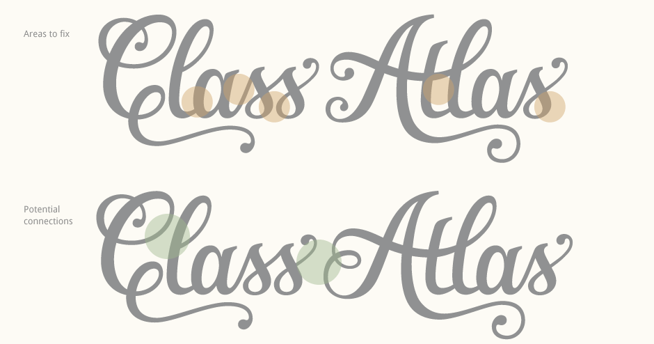
The initial vector version (below top) focused on a separate 'A' with a simpler crossbar as the connected words were a little harder to read. After a first round of tweaks and a further test of the original 'A', a Dribbble discussion helped to pinpoint additional issues as well as possible alternate letter interactions.
Colour Development
Alongside the further development the lettering, I also explored some colour palettes in keeping with the overall theme.
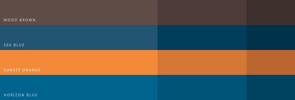
Above: Four main colours, each with accompanying darker tones.
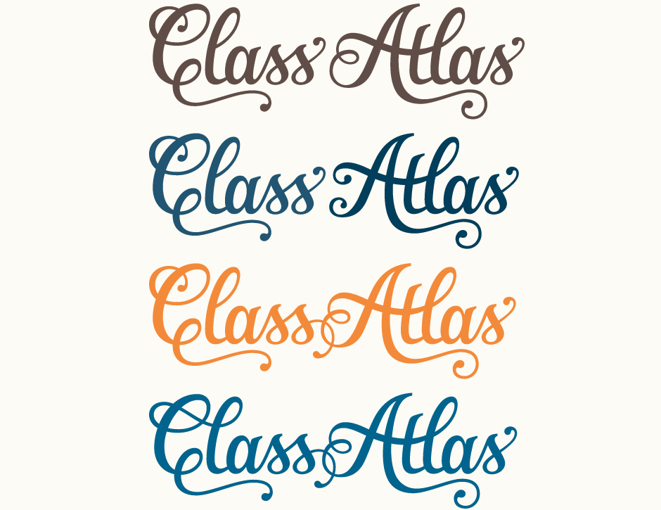
Final Versions
In the end, four variations were kept as final designs. For the third and fourth variations, I re-drew an improved connecting stroke between both words in order to be more consistent with the rest of the design. The idea is to mirror the left side loop of the 'A', both in terms of size/proportions as well as line weight. This symmetry helps the center area look neater and more cohesive. The extended 's' swash is now also slightly thinner and the ball terminal mirrors the one on the very last 's'.
Full Composition
The logo-type will also exist alongside a 'CA' mark designed by Michael Spitz. See the development of the mark on Michael's Dribbble page and his final composition below.
Class Atlas, Dorian Erskine:
Essentially – brand design is tantamount to tailoring – one must research, size, cut, pattern, and make sure that not only is the finished product stylishly beautiful but that it fits like a dream. In this regard, my brand has been dressed by no finer tailors than to be found at Op45. Claire and Darren created a wonder in Logo-design fashion, a mark that looks beautiful and current at any occasion! To paraphrase Einstein, “If you are out to [fashion your brand], leave elegance to the tailor.” Nuff Said!
