Type@Cooper Condensed Program
In the summer of 2014, I was accepted onto the Type@Cooper Condensed Program, an intensive postgraduate program on typeface design. It took place at The Cooper Union in New York City and ran for 5 weeks, from 9am to 9:30pm.
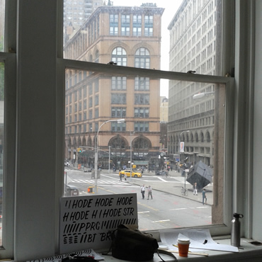
Above: Inside the studios in The Cooper Union's historic Foundation Building.
Getting Started
Our first project was to study the Latin letters on an Iguvine Tablet (shown below) dating from around the end of the 2nd century BCE or 1st century CE. Using translucent paper, we drew skeleton letters based on the Latin inscriptions, trying to capture the “essential forms” for the letters. This also involved making decisions about which features to follow through with, as there were many natural variations in inclination, angles, closed vs. open forms, etc. We were using the string ‘VERBSGOHUMAN’ as the base but the ‘U’ didn't exist yet in the Latin alphabet, so we had to come up with a form that would fit.
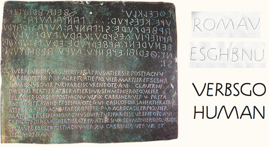
Above: The Iguvine Tablet with the Latin letters on its lower half, alongside the skeleton letters in pencil and monolinear vector form.
Working in Robofont
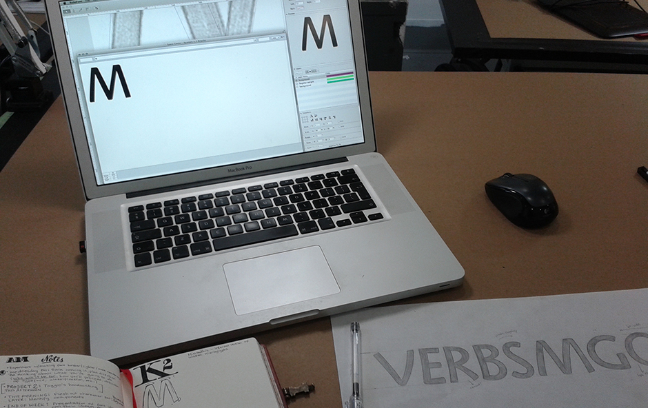
The second step focused on bringing the pencil skeleton letters into Robofont and digitising the outlines (shown above right). Here, we were still focusing on the essential structure rather than weight or contrast, so the vectoring was done as a single stroke only, comprised of individual components. We then used the Outliner RoboFont extension to play around with the stroke weight and eventually settle on a weight that would suit a Regular style.
The next task was to use the skeleton letters as a base and develop a design that was either more or less formal than the reference material. Working on top of a printed copy of the skeletons, we drew new versions while making progressively more refined decisions about fundamental characteristics such as weight, contrast and stroke terminals.
Above: Pencil sketch of some of the key letters with added weight.
Interpretation
I aimed for a friendly and casual style that was predominantly monoweight in order to maintain some of the feel of the original inscription but conveyed in a more contemporary way. I kept the inclination and light stem curvature that were major features of the inscriptions but made it more subtle and even to create more consistency. I chose to avoid flat, straight-edged terminals and instead, have the strokes instead cut off at right angles to the line direction. I also combined a lightly rounded corner and an angled point for each terminal. To avoid everything being too regular, I kept the idea of imprecise alignment and varying letter widths.
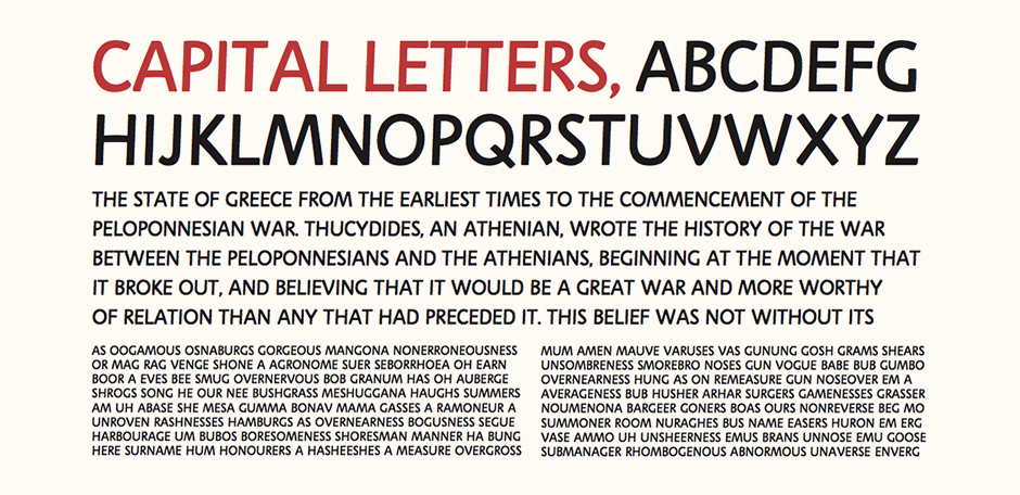
Above: Sample text settings of the final, all-caps font created over a few days.
Finalising
Overall, I thought the individual letters themselves were a little too childlike and too soft, but that they worked better than I expected in text setting (shown above). What I found the most interesting was a very quick automatic Outliner test to create a much heavier version, as it showed how the overall personality could be accentuated with more weight:
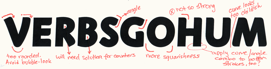
Above: Bolder version test proof. I liked the idea of the stroke terminals, although felt they were too prominent here.
Poggio Bracciolini Project
While we were working on the uppercase letters based on the Iguvine tablet, our evening sessions focused on calligraphy. The second major project of the program started as a study of 15th century Italian scholar Poggio Bracciolini’s handwriting, which was based on the Carolingian miniscule.
Using enlarged copies of a script sample from 1425, we calculated the x-height using the nib width and practiced tracing over the letterforms using a Speedball C2 nib at an angle of about 45°. Having been enlarged to a much bigger size than the original, part of the challenge was visually identifying the component parts of individual letters and taking into account natural variation. Working on layout paper was particularly tricky as it picked up natural oils really easily and the ink didn't seem to flow as well.
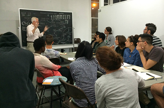
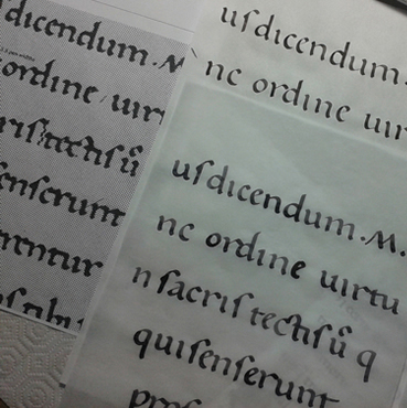
Above: Lecture by calligrapher Ewan Clayton and some of my traced letters alongside the reference material.
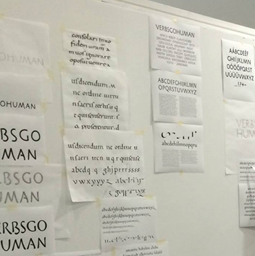
Building Components
We then studied the ductus of the alphabet - the order and direction of strokes - in order to identify the repeated shapes and movements throughout the script and a compile a repertoire of strokes that could be used as components to form a wider character set.
I scanned my inked letters and enlarged them on the computer to be able to look at them more closely and pick out repeated strokes. These components were digitised in Robofont and then built up into an almost complete lowercase character set. Some letters lend themselves quite well to this sort of construction, such as the ‘n’, while other more complex letters like the ‘c’ need heavier refinement.
Above: Text proofs at different sizes to look at the colour and spacing.
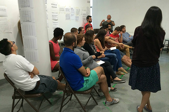
Critiques
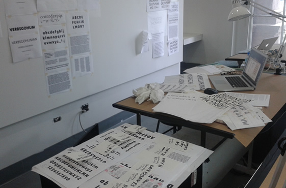
At the end of the second week, both the upper and lowercase alphabets were presented in a group critique. Thanks to the tight deadlines, one of the main things I took away from these projects was the realisation that it is actually possible to build up a font file with rough spacing in minimal time.
Above: Presentation a.
Typeface Ideas
Before starting the program, I had been noticing that many of my clients were looking for custom lettering that has a noticeable personality and friendliness while also remaining sturdy, clean and reliable. Personally, I also really enjoy working with a combination of warmth and a hand-made sensibility with an overall simple, careful and subtle execution. I also wanted to create a typeface that would work as a versatile family across different contexts without having an overly loud tone of voice that would quickly get tiresome.
In the 1st project, I'd used the idea of forming stroke terminals by combining a rounded corner with a sharp angle. This is something that had initially arisen in a previous logotype I'd designed and the idea is to insinuate the shape of a brush. Similarly, I also liked the use of a continuous curve for the top and bottom of letters like the ‘u’ and ‘n’ as it creates a smooth, fluid shape.
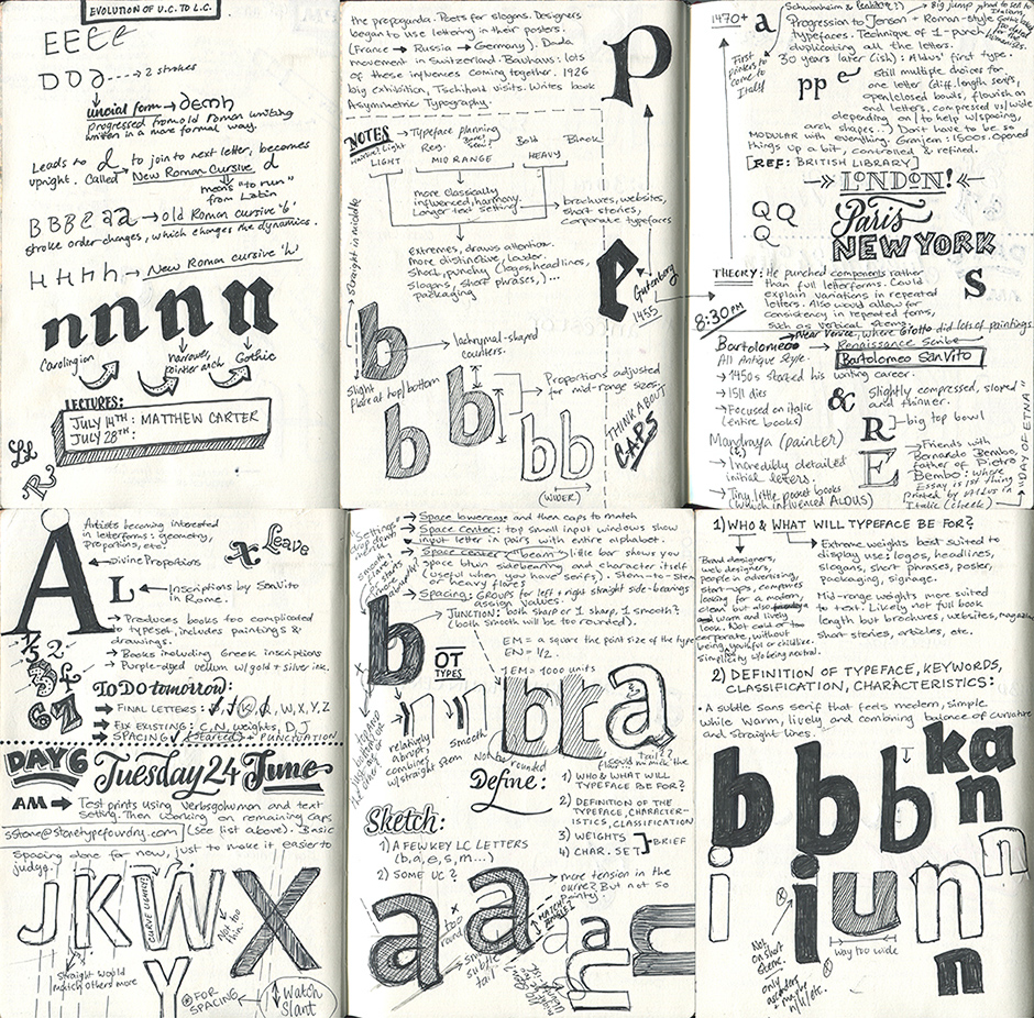
Above: Sketchbook pages with early planning notes alongside lectures and other things.
Developing the Concept
With these things in mind, early planning focused on defining the purpose of the typeface, who would use it, what it would be used for, what its characteristics would be and how it would expand as a full family. I was very interested in avoiding anything too mechanical or systematic and exploring the possibility of each weight having a slightly differnet personality – in particular, the extreme weights compared to the mid-range weights.
I wanted the black and light weights to be for display use and the regular weights to be more suited to longer text setting. The features of the letterforms would therefore change throughout the weights. From the very beginning, I loosely planned out how this would actually work and translate to the typographic characteristics.