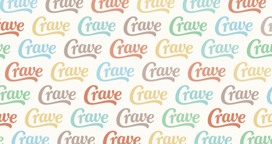
Crave
Client: Sideorder Inc
Work done: Logo-type design, custom lettering, colour exploration
Custom Logo-type
Custom logo-type design for Crave (originally CraveCart), an commerce platform being created by Sideorder Inc, specifically built for restaurants to sell food online. In order to help establish the brand, the logo was to evoke a warm, friendly and positive feel to suggest a home-made, organic quality. It was also important to hint at a nostalgic touch reminiscent of enduring iconic brands while remaining extremely legible at a range of sizes. We also talked about integrating a unique and distinctive 'C' that could be used as an optional mark.
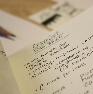
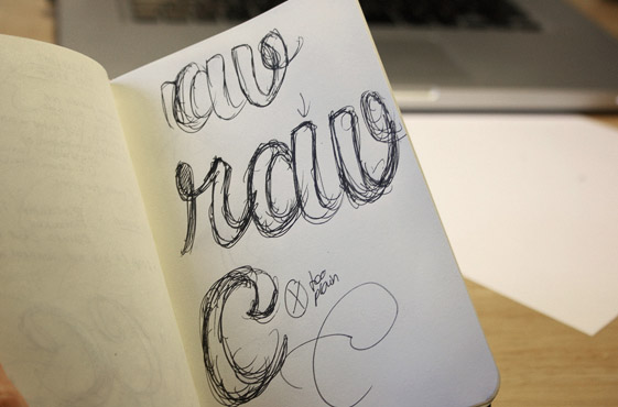
Above: Notes and a few quick doodles exploring some initial ideas.
Sketch Development
In order to build on the natural, organic look, I thought of ways to highlight the custom nature of the lettering without detracting from its overall simplicity or easy of reading. Having a different first 'C' not only ensures a distinctive individual character, but its uppermost curve creates a sense of movement and encourages the eye to follow through into the rest of the logo.
The letter styling I worked with was bold and lightly italicised, with the influence of hand-drawing coming through in the shape and direction of the strokes, rounded features, stroke terminals and subtle baseline variations.
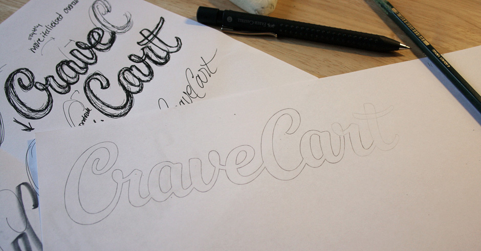
Above: Going over the lighter outlines for the final sketch.
Alternatives & Vectoring
We then looked at ways in which to add some extra flair within the overall design by emphasising the start and end letters. This new swash elements also allow for an emphasised balance between the beginning and end of the logo as the shapes act as subtle mirrors of each other. On further deliberation, we chose to move forward with the original version, working instead of improving the overall legibility (in particular, the relationship between the 'C-r').
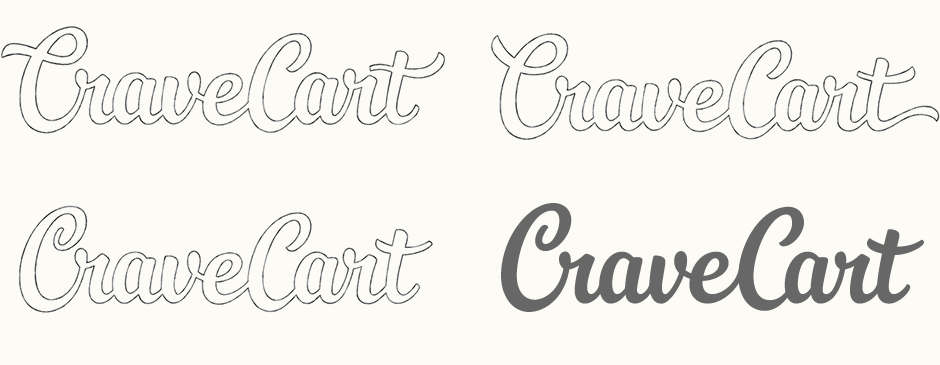
Above: Pencil mock-up of alternative start and end letters and the initial vector version.
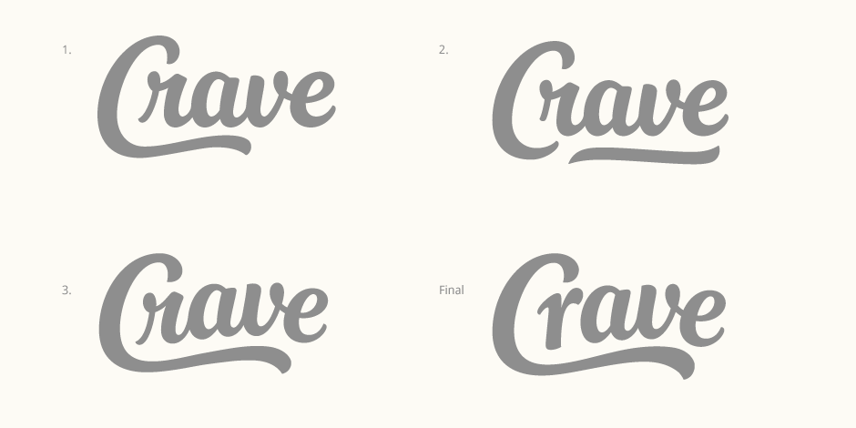
Further Exploration
As we progressed with the digital development, one major issue starting emerging; specifically, the lettering wasn't looking hand-drawn enough and was losing some of its personality. Looking over the work so far, we tried to pinpoint what was causing this and how to make it a little more playful. As an alternative to the full name, using just "Crave" allows for a much more concise visual word that has more impact and a more appealing combination of letters. While we did also try a few new ideas with the full name, it quickly became apparent that the reduced version could be significantly more effective.
Here, I explored multiple ideas and did some rough tests so we could to get a feel for what was working best. Moving to an arched baseline proved to be the right direction (version 3 below) as it immediately gives the logo a more distinctive and eye-catching look. I was also less strict with the consistency in letter sizes in order to suggest the natural variation present in hand drawn lettering, giving it a more playful appeal. Adjusting the stroke weight, increasing the contrast and accentuating the pointed brush-like terminals (notably in the 'C', 'v' and 'e') all serve to add more flair and curvature.
The final version uses a non cursive 'r' to make it a little less formal and the wave was also exaggerated a little further, in both curve shape and weight.
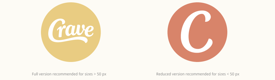
Alternate Mark
The new shorter name could now work well within a circle, making it well suited for use as an icon. I also created a reduced version with a modified stand-alone 'C' for much smaller sizes, where reading the full word would be difficult.
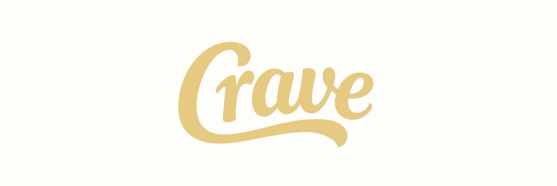
Final Logo
The final logo is much more effective as a unique image and has better flexibility in terms of usage.