Dashleigh
Client: Dashleigh
Work done: Logotype design, custom lettering
Custom Logotype
Dashleigh is a boutique stationery online store specialising in recipe cards and note cards. The company was going through a redesign and looking for a new logotype and icon. The previous logo used a simple sans serif in a bold weight and the new branding was to shift to something a little softer.
From our early chats, we liked the idea of a direction that had flourishes and interesting letter connections to form a single visual shape. One thing to watch out for was the relatively long length of the name and how to make sure it would come together as a coherent form.
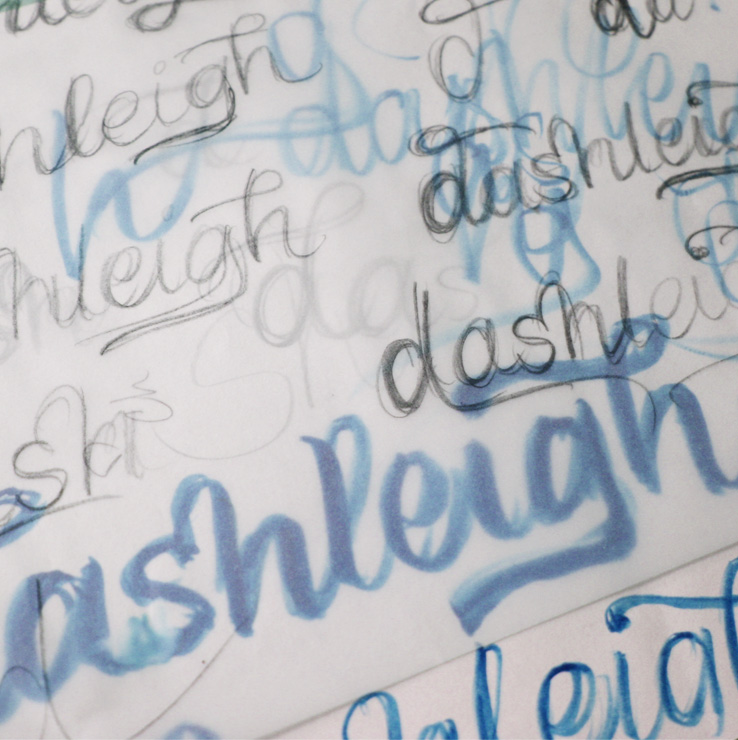
Above: Early scribbles looking at possible swashes and connections.
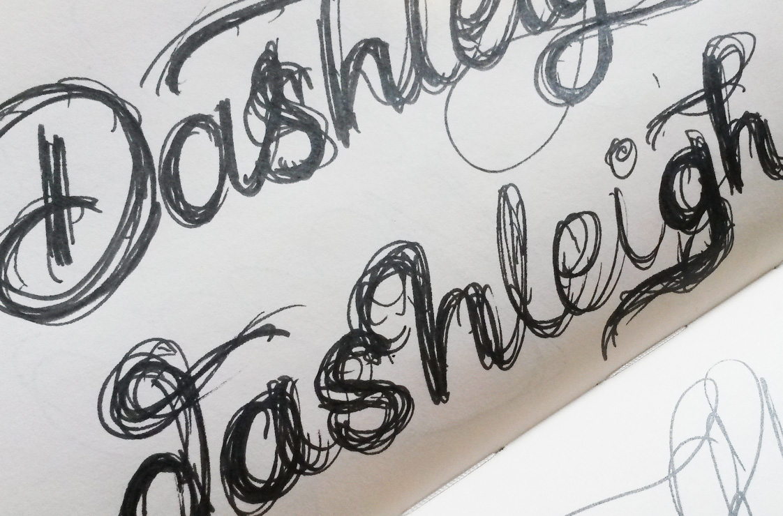
Sketch Development
Once I had worked out a loose direction for 2 concepts, I pieced together the best parts to form skeleton outlines. Using layout paper, I then drew out a second version which added weight and contrast. Once that version was scanned into Photoshop and straightened out, I used it as a base for which to draw the final proposals onto tracing paper.
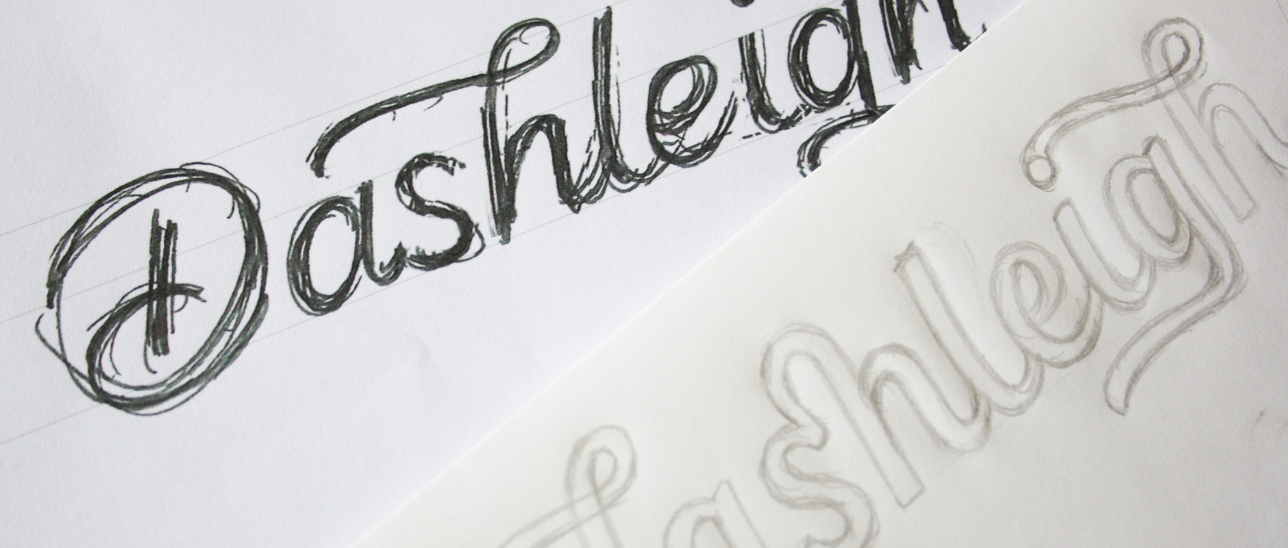
Above: Progression from skeleton outline to rough sketch to final sketch.
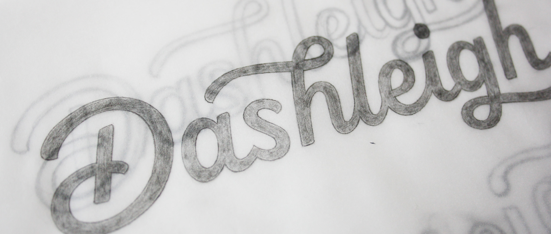
Final Sketch
The aim was to create something that immediately feels personal and unique, with a warm, approachable feel that also feels elegant and high quality. To pinpoint where exactly the logo should fall, the two concepts have varying amounts of elegance vs a little more informal.
The one with the capital ‘D’ (bottom left) was the more elegant direction, with a mid-range weight, lightly slanted letters and sweeping strokes. The all lowercase design (bottom right)is a little more informal, more upright and with slightly bolder weight yet higher contrast to make sure it doesn't appear at all clunky.
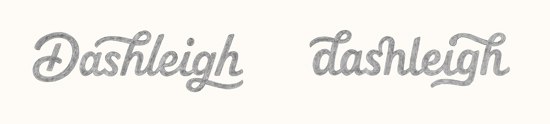
Above: Final concept sketches.
Digital Version
Using some rough tests of the sketch in context on packaging and at the smaller sizes it would ultimately be used at, we felt that the first concept was the best mix of accessibility and elegance. The uppercase was also easier to notice and would translate well to icon use.
When vectoring, I paid particular attention to refining the weight, although even a neat sketch does tend to look a little bolder than its digital version, simply due to the nature of pencil lines. As the logo had some set sizes it would be used at on the products, I used real-size print tests to check and refine the design.
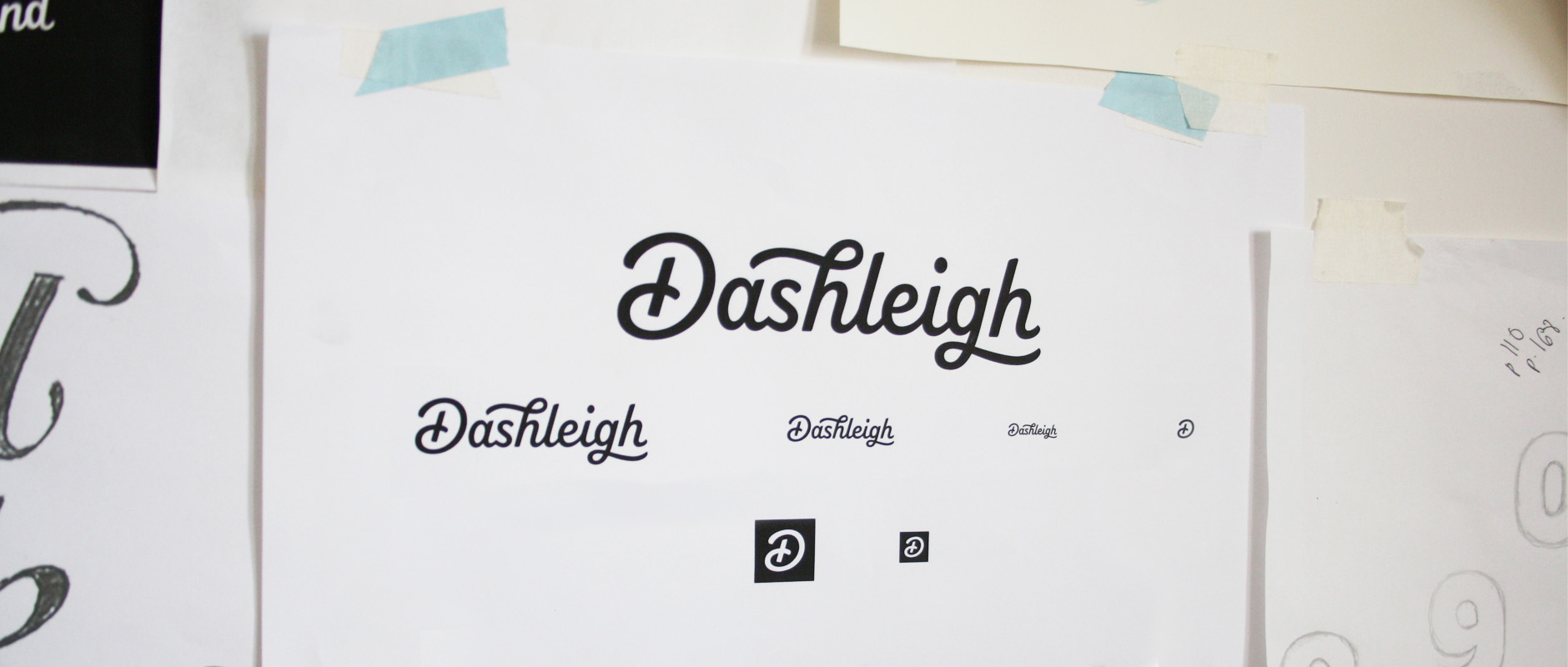
Above: Print tests at different sizes, based on planned usage.
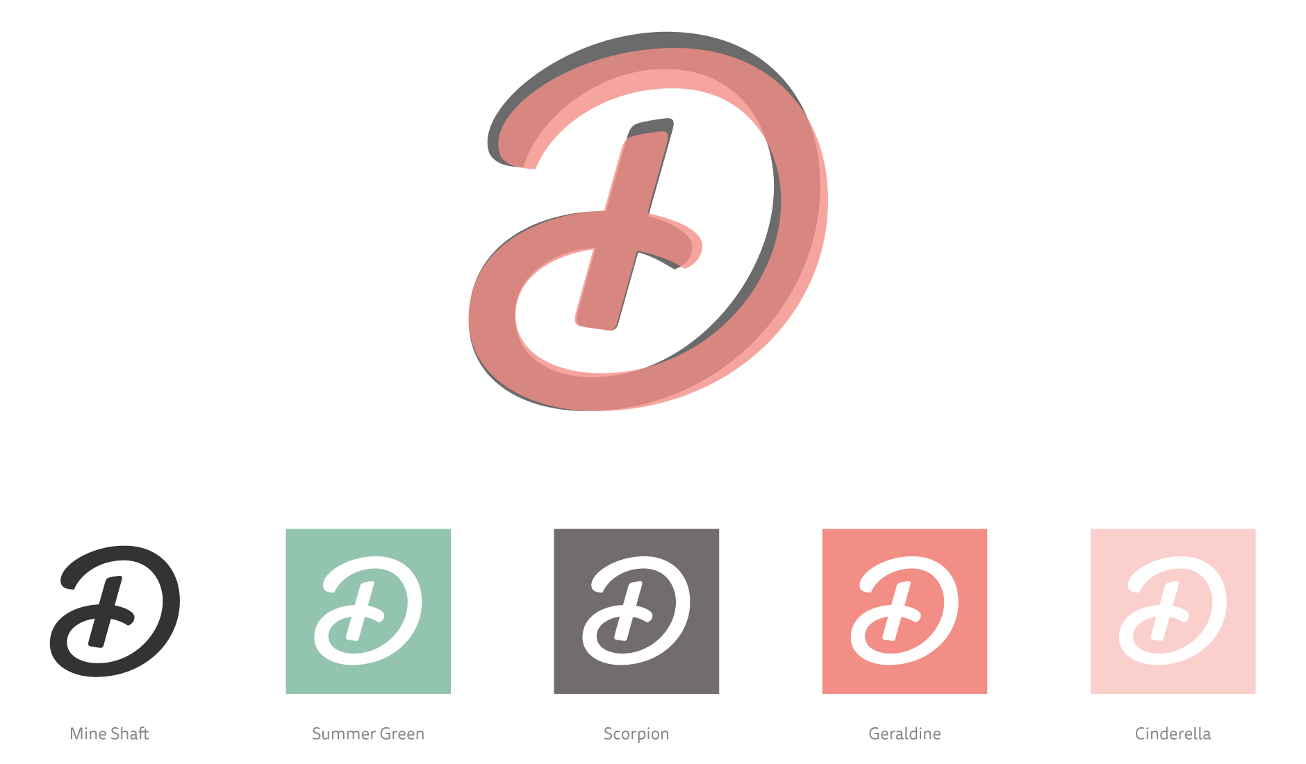
Initial 'D' Icon Version
The stand-alone ‘D’ has adjusted proportions so it’s almost even in terms of width and height, and the space and positioning of its elements has been optimised for very small sizes. The close-up below shows the ‘D’ icon (translucent red) displayed as an overlay on top of the original ‘D’ from full logotype (grey).
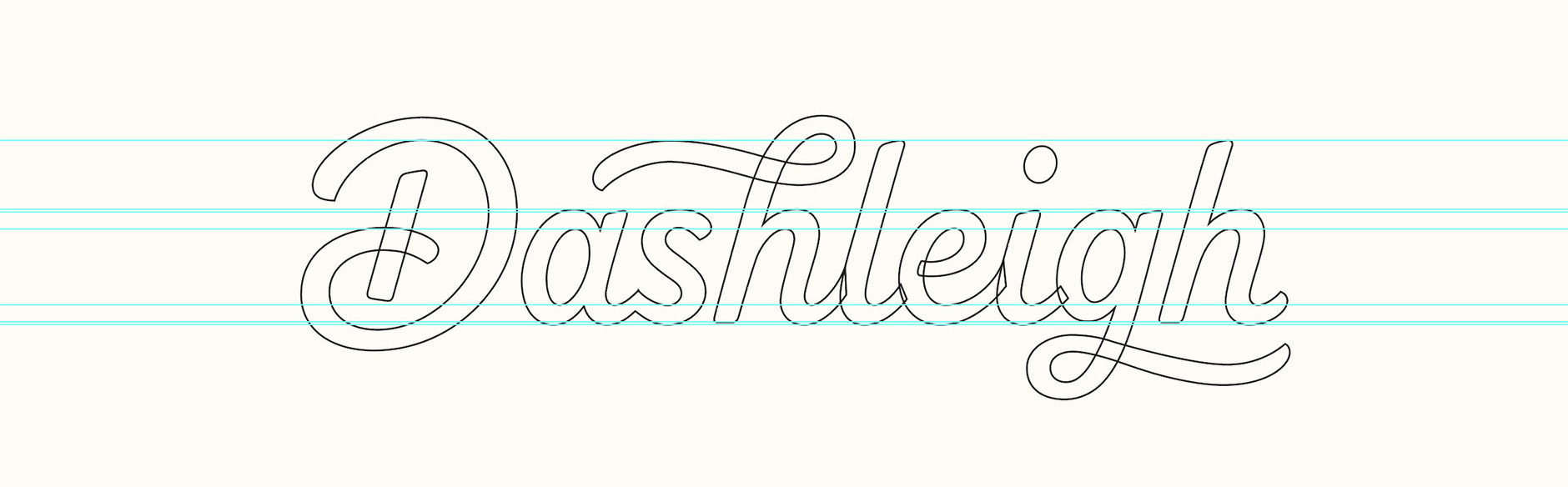
Finalising
The colours had been developed separately as part of a brand style guide, so I tested the logo in the key swatches shown above as well as refining the vector construction (original paths shown in the screenshot below).
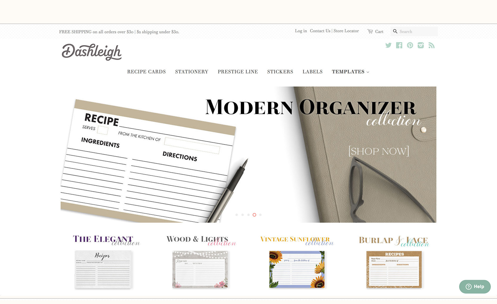
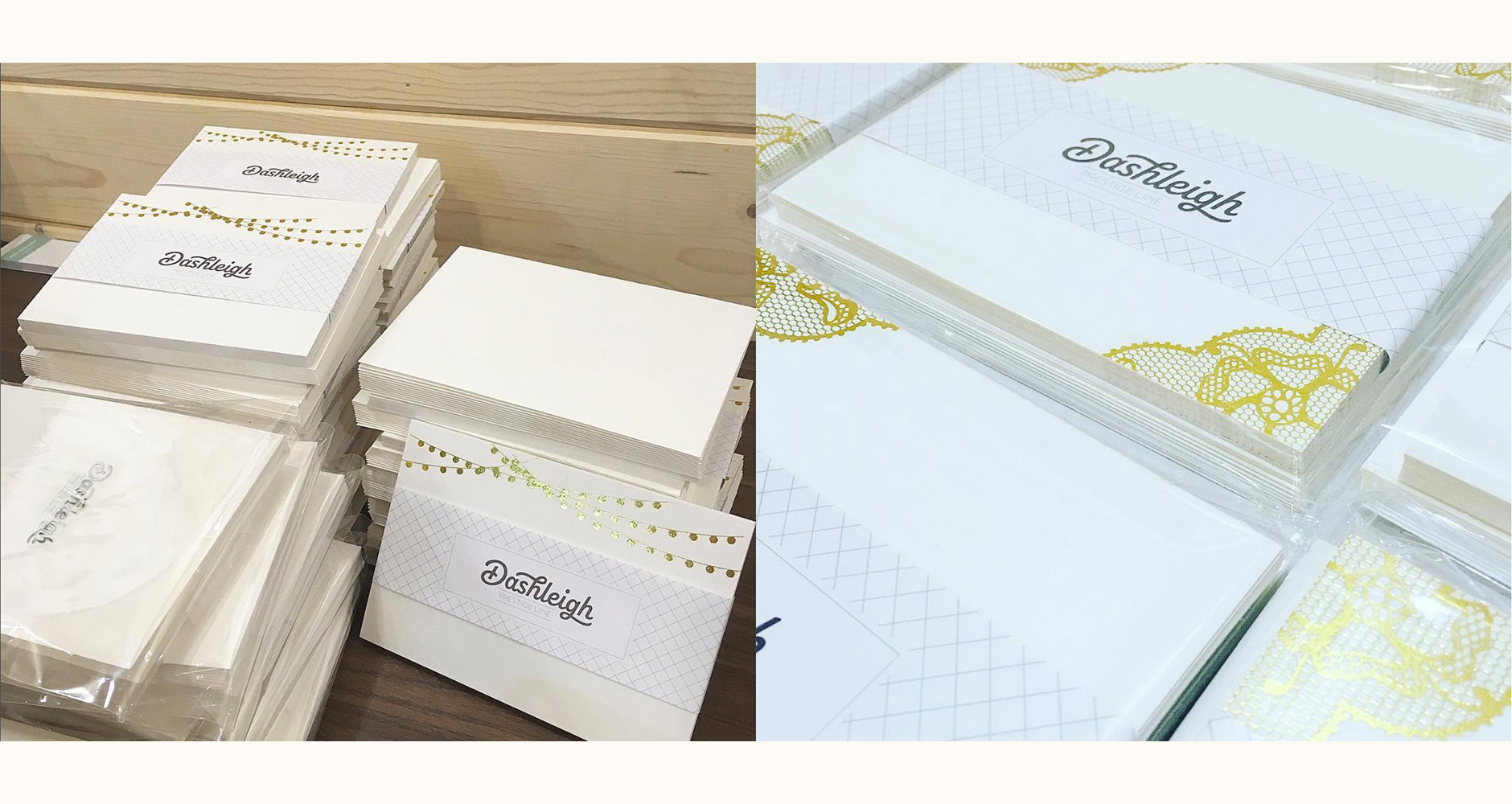
Final Work
The logo is in use on the Dashleigh website, products, stickers as well as packaging. Photographs below courtesy of Dashleigh's Instagram page.