Deal In
Client: Cuberto LLC
Work done: Logo-type design, custom lettering, colour palette
Custom Logo-type
Deal In is a recently launched web and mobile platform offering a new service for purchasing and selling items online. Stylistically, the team were looking for a strong, modern sans serif with quite a rounded and sleek overall feel. In terms of use, an important consideration was that it could potentially be paired with a visual at a later date, so the type itself needed to be a little restrained without an overly distinctive tone of voice.
After doing some initial rough explorations on paper, I spent only a short amount of time sketching as I had quite a good idea of the style and shapes I was going for. The quite geometric nature of the type also made it more suited for mostly digital development.
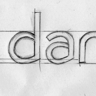
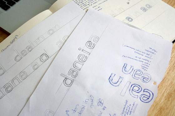
Above: Project notes and mapping out very rough letterform shapes.
Early Progress
As the drawing I was working from was very rough, a lot of development work was required on the computer. I tested different weights, alternatives for the 'n', etc. The initial idea for the 'a' didn't work at all as its shape looked forced and awkward, particularly the counter. Varying the degree of overall roundness helped to come up with alternative forms, not only for the 'a' but for the 'e' and 'l' as well.
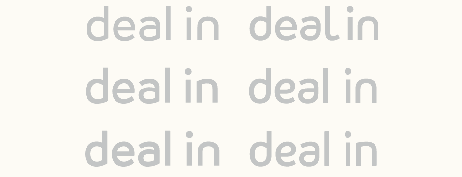
Above: Exploring variations in character shape and weight.
Development
I decided to keep the 'l' simply vertical as it helped to create a sense of cohesion with the vertical stems of "in". To prevent anything feeling too angular, I instead softly rounded all the edges, a detail which becomes more prominent at larger sizes, but adds a slight contemporary feel even when small. The final version uses an 'n' with a slightly angular junction (rather than fully rounded) to create continuity with the 'd'.
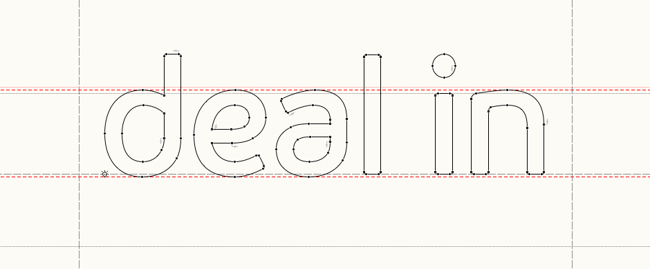
Above: Refining the details in FontLab Studio.
Refining Details
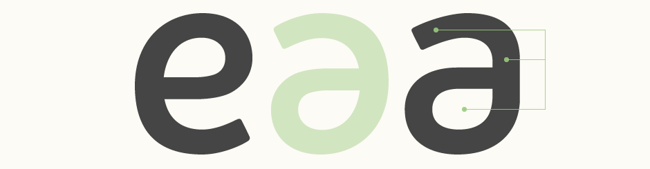
The 'a' was the trickiest glyph to create as it naturally stands out quite a lot, being the character in this set with the most complex shape. I wanted to use a double story 'a' to avoid too much repetition of similar rounded shapes (especially considering the 'd') and also to create some kind of mirror with the 'e'. However, the 'a' isn't simply a reflection of the 'e' as this results in a shape that is very obviously simply rotated (below middle). Rather, it's individually drawn in order to maintain some key elements, but with notable differences allowing it to function as a letter in it's own right: angled upper curve, straight stem, wider counter (below right).
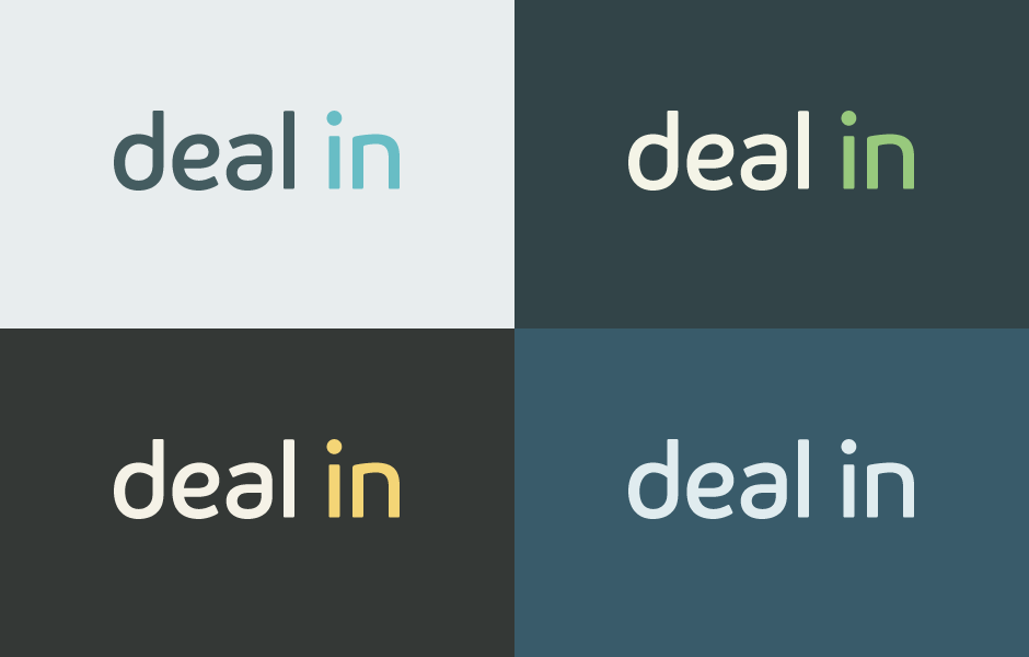
Variants & Colours
In terms of palette, we explored both 2-colour and 3-colour variations on light and dark backgrounds.
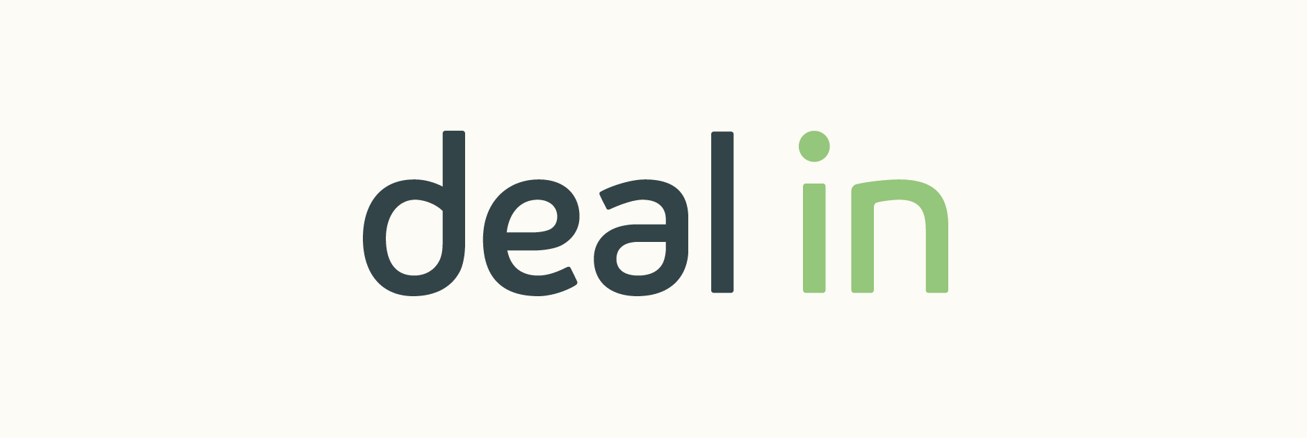
Final Logo
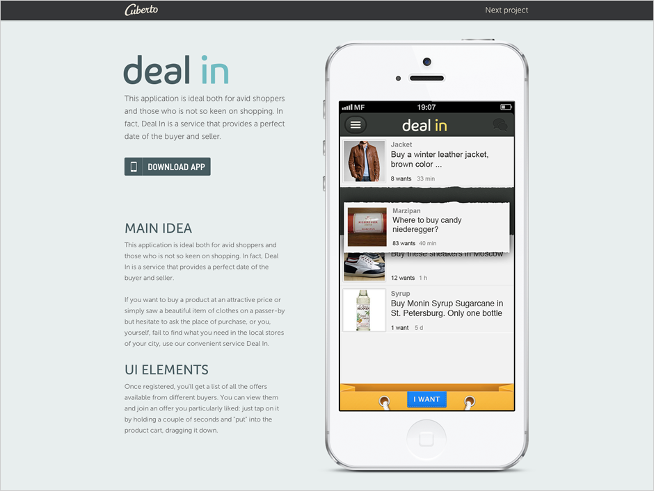
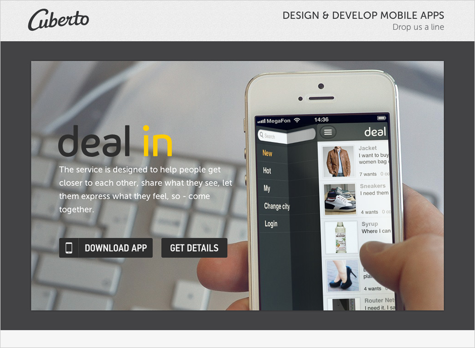
See the final logo in use along with a video of the mobile interface on the Deal In website and the application with screenshots on the iTunes store. Shown below on the Cuberto website, designed by the Cuberto team.