Esquina
Client: Esquina
Work done: Logotype design, custom lettering, colour exploration
Custom Logotype
Custom script logo design for an upcoming project by illustrator Ray Urena. The visual style needed to introduce a warm, individual sensibility with a strong honest character and a high quality feel. In terms of technical requirements, it had to work in a single colour and be flexible in size and usability, with a primary focus on online use.
From initial doodles and first drafts, I opted for a mid-weight script that would allow the overall design to be sturdy without being bulky. The unique 'E-q' connection came quite naturally from the first sketches to ensure it kept a good, natural flow. The extended 'a' swash then serves to visually mirror that element and evenly balance out both sides of the word.
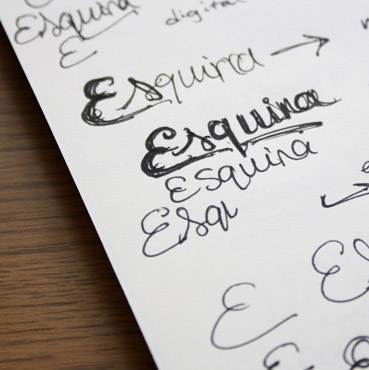
Above: Idea development, starting with very small rough scribbles.
Initial Development
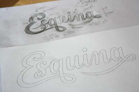
Two main problematic areas I payed particular attention to were the 'E-s' spacing (as a gap naturally arises there) and the 'u-i-n' which has three predominantly vertical letters in a row. To address these, the curvature of the 'E' is specially designed to have the 's' fit within it and the junction between the 'i-n' is raised to visually break up the repetition.
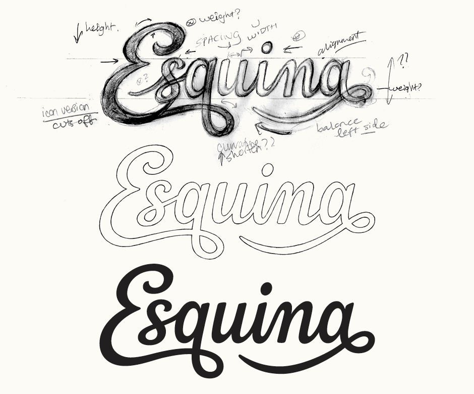
Above: Progression of the design from very rough draft to first vector version.
Revisions
With the overall design going in the right direction, I then worked on revising and adjusting the details. The main focus was how to improve the 's', both its actual shape and how it fits with the 'E'. A discussion on Dribbble helped lead to a better version of this original 's' as well as a completely new one. I also revised the spacing, in particular around the 'q-u' to compensate for the fact that it's the only disconnected pair, as well as other details such as curve shapes (notably the 'a' swash) and inclination.
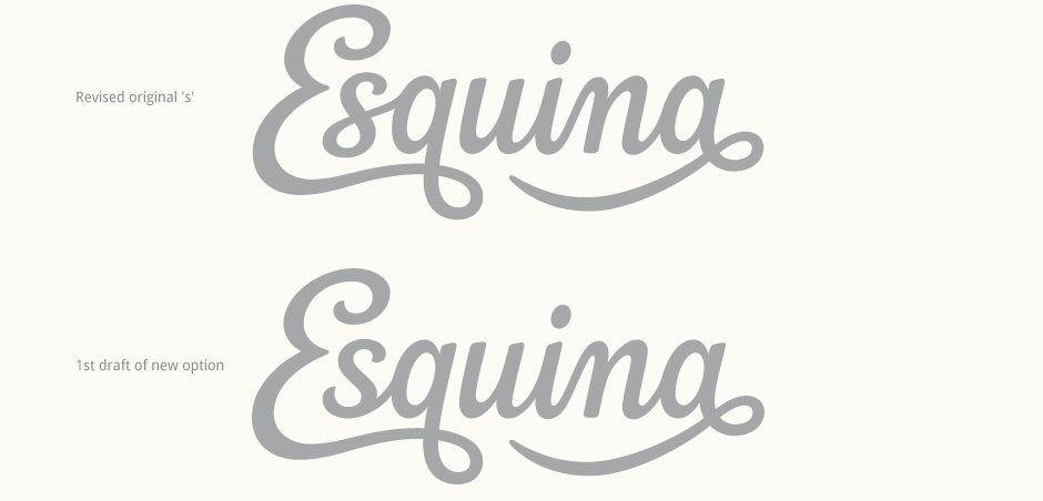
Above: A side-by-side comparison really demonstrates how the revised 's' is much more comfortable and opens up the design visually.
Vectoring & Revisions
The new 's' immediately stood out as the stronger option. It looks more open (in comparison, the original looks quite cramped) and fits much better, both with the 'E' and the following characters.
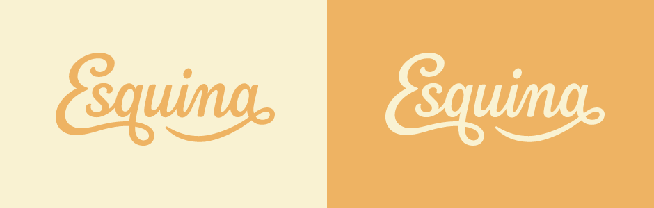
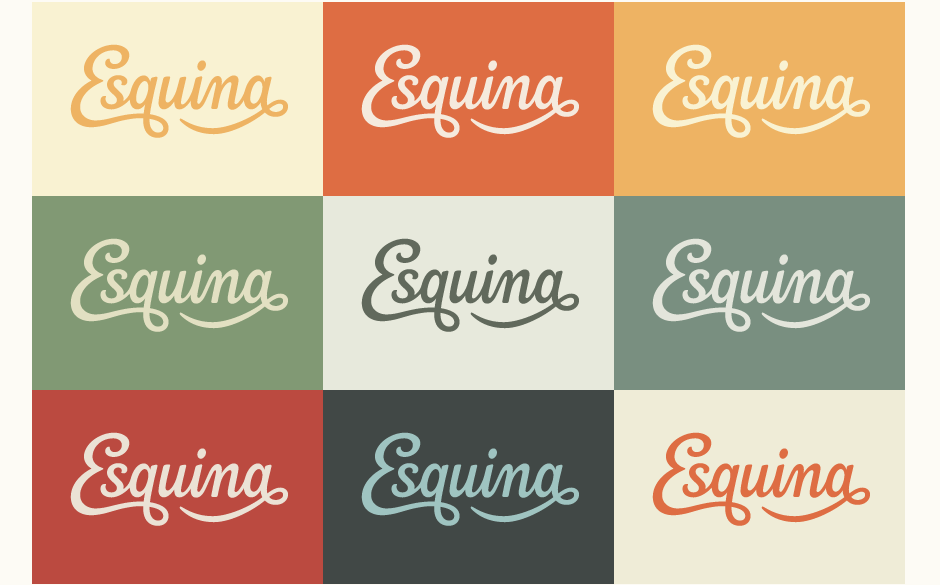
Having discussed colours in the beginning, we knew we were looking for quite muted tones: something that would look distinctive and well considered without being really bright or aggressive. I explored a range of possibilities, our favourite being the yellow combinations.
Icon Version
For avatars and favicon use, I created a modified version of the 'E' alone. While it was tested in many different shapes, an outlined circle was clearly the strongest one as it emulates the curves of the letter shape.
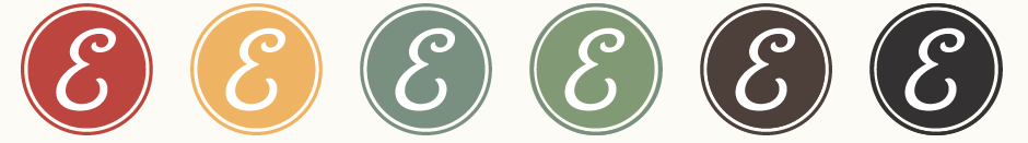
Above: The adapted 'E' uses a wide, spacious lower curve with a pointed stroke terminal to echo its upper stroke.
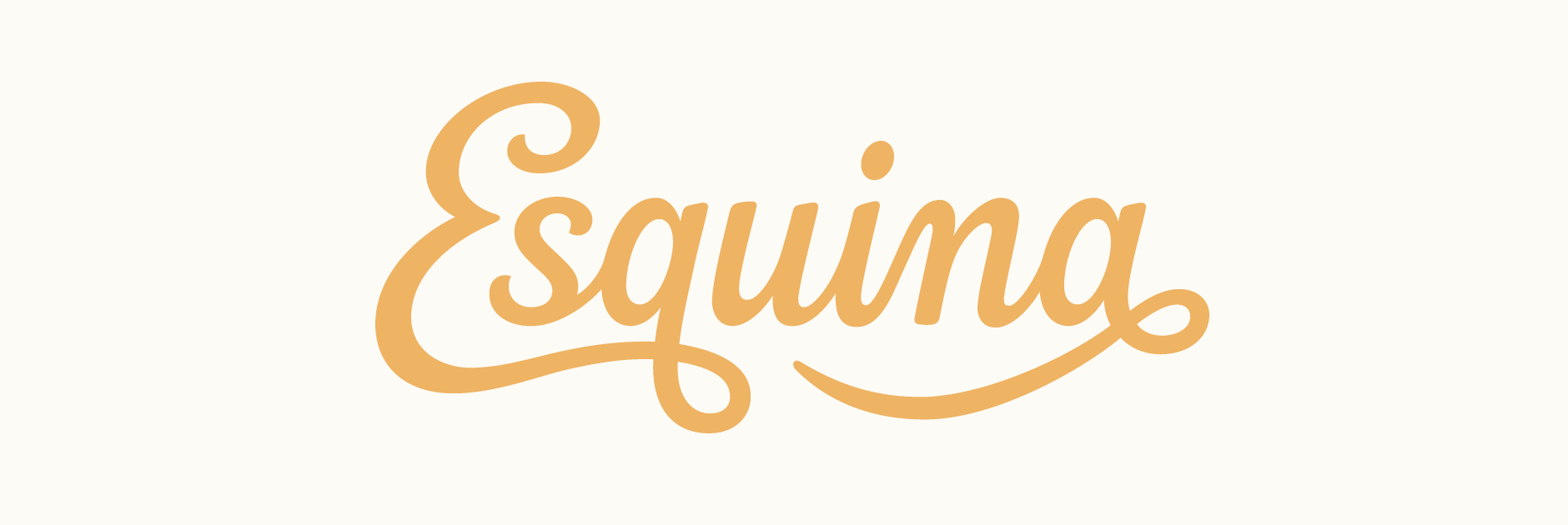
Final Logo
I made some final adjustments to the new version (in particular, the weight of the 's-q' link) and below is the finalised design in the yellow colour combination.
Ray Urena, Esquina:
“Working with Claire on the Esquina logo was an absolute joy. Her elegant and clean aesthetics for lettering was just the right approach I was looking for. She was able to translate my vision very smoothly while at the same time very open to suggestions. The final logo (after a very thorough and detailed work process) left me elated. I would gladly recommend her for anyone seeking a memorable identity.”