Geek
Client: Personal work
Work done: Custom lettering, colour exploration, print design
Custom word design
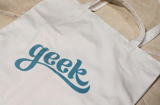
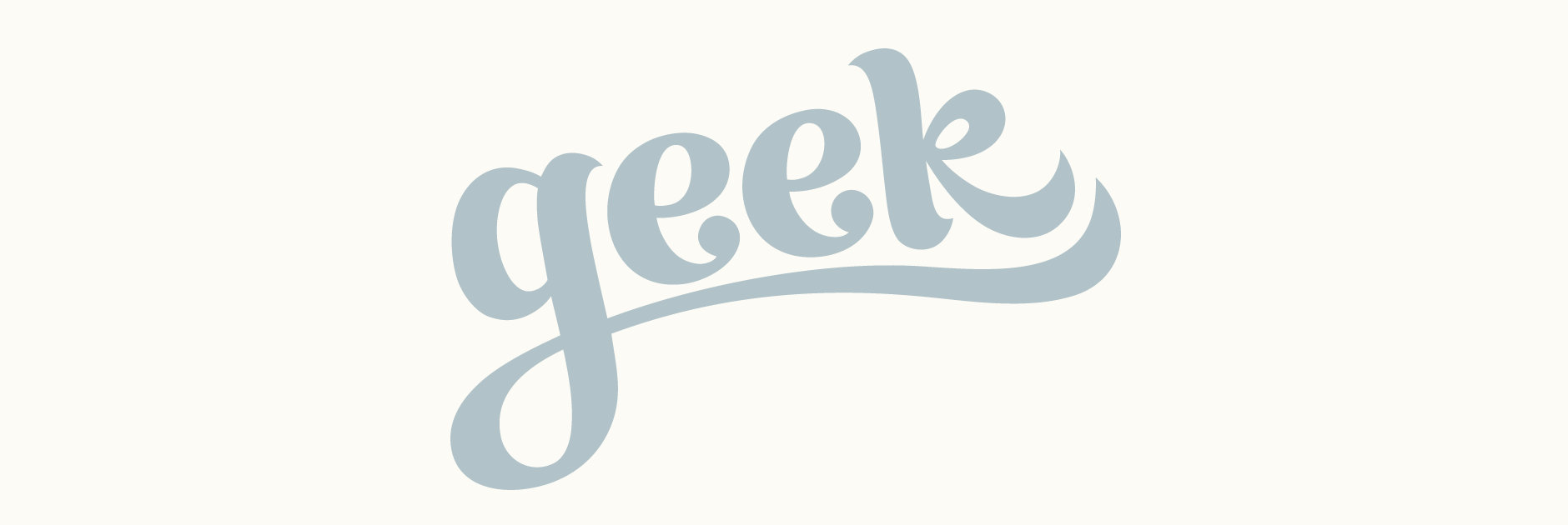
Custom typography word design first drawn to be printed on a cotton tote bag for a gift. I was aiming for something casual, friendly and contemporary with a feminine touch that wasn't girly.
After brainstorming and drawing some initial rough ideas, I felt a brush script would be the best approach as it could be very visual and graphic. Paying particular attention to the stroke terminals, I played around with a couple of options for the individual letters as well as how they could interact with each other. As it was to be printed on fabric, I kept the lines relatively simple and gave the strokes quite a heavy weight.
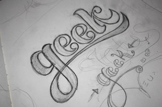
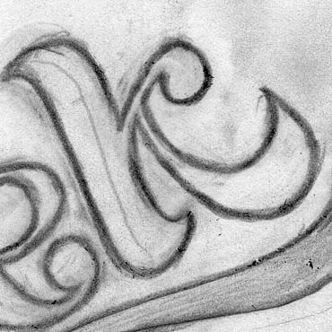
Above: Rough sketchbook drawings done with a heavy pencil.
Development
While the 'k' was the first letter I was initially happy with when drawing the word out, testing it digitally with a solid colour fill revealed that it didn't work as well as I had imagined. The angle of the diagonals looked a little awkward in relation to the main stem and the whole shape was too imposing compared to the rest of the word. Instead, I drew a looped cursive style 'k' that blends in nicely with the other letters as they now all have counter spaces.
Other adjustments included the bowl of the 'g' which was drooping too much in the rough sketch as well as the counter of the descender so that it was more consistent with the other shapes. I also re-worked the weights at the end of the 'k' and the underline for a more harmonious flow between them.
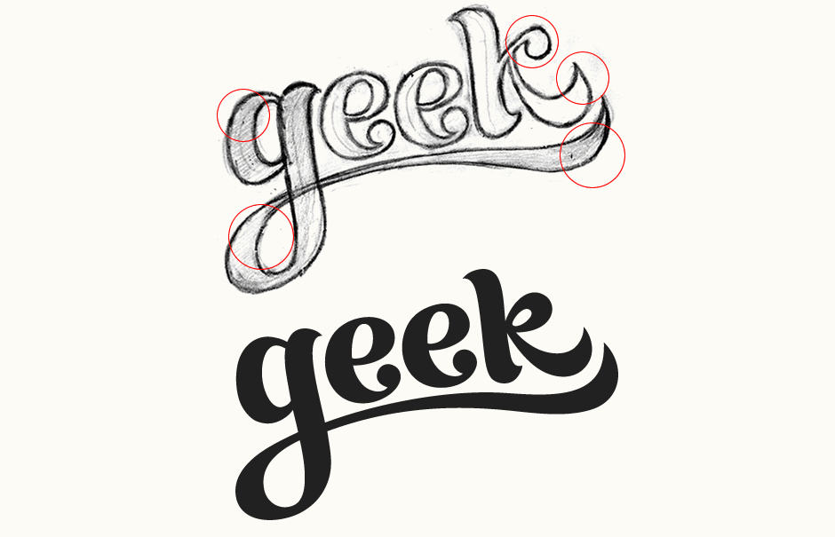
Final Product
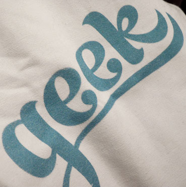
Printed in France on 100% cotton canvas, 36cm x 34cm x 6cm.
