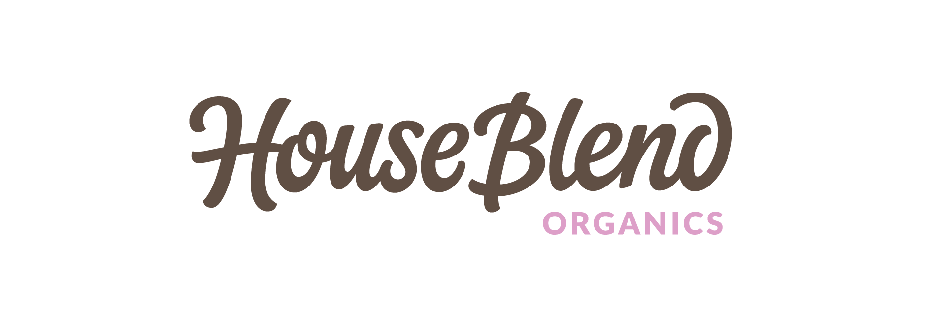
House Blend
Client: House Blend Organics
Work done: Logo-type design, custom lettering
Custom Logo-type
Logo design for House Blend Organics, a company that specialises in certified organic skincare for all ages. We started off by discussing the brand and the sort of feeling it conveys. We looked at plenty of imagery such as hand painted signage, lifestyle photographs, product photography, hand-drawn illustration, etc. and how all these relate to the brand character. In order to convey a family-friendly, organic and somewhat vintage feel, we wanted to explore a script direction with a nice sense of playfulness. Another important point was that the products are sold in many child friendly stores as well as high-end boutique salons, so adaptability was a key factor.
Before starting any drawing, we reviewed various typographic characteristics and how these could be used to address the goals. This helped to direct the lettering approach and give us a solid conceptual ground from which to work from. A mid-weight brush script with moderate contrast, subtle roundness and discreet terminals would help us build a warm, personal feel without creating too much of an overwhelming tone of voice. I started off by working with marker pens and doing quick, 5-seconds rough drafts to see how the letters and words could work together.
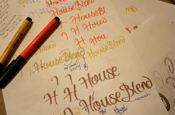
Above: Drawing out the name roughly with bold marker pens, then building on top with thinner ink.
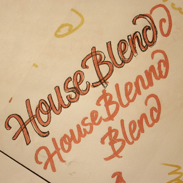
Building the concept
From the initial exploration, the right sort of direction started to emerge: something lightly italicised, vivacious without being too swirly or over-complicated, with distinctive details and natural variation. The idea of combining brush-style stroke terminals and subtly rounded corners serves to form a distinctive, unique feel that wouldn't be out of place in either a child-friendly environment or a high-end boutique as it's neither too playful or childlike, nor too elegant.
Various details throughout are used to emphasise the hand-made aspect of the design and also add playful touches: the 'H-o' connecting stroke, the lightly curved vertical stems, the non-cursive style 's'... The open 'd' in particular was something that I felt worked well for the brand objectives, as it not only suggests a natural hand motion, but also mirrors the open 'H' and 'B' entry strokes while pointing back towards the body of the logo.
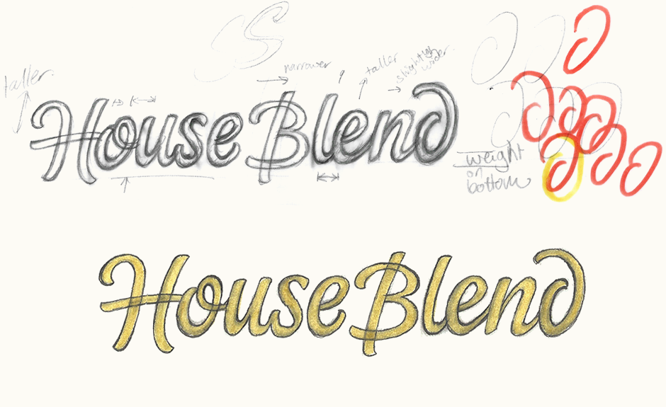
Above: Progressively building the concept from the initial roughs and digital fixing up of the draft.
Final sketch & vectoring
I used the draft version above as the basis for the final sketch, which was drawn onto tracing paper, adjusting details as necessary. The vector version stayed quite close to the initial sketch since we were all happy with the concept and no major changes were needed. I used horizontal rules as approximate guidelines only, just to make sure the letters were roughly the same size and positioning while still maintaining some flexibility.
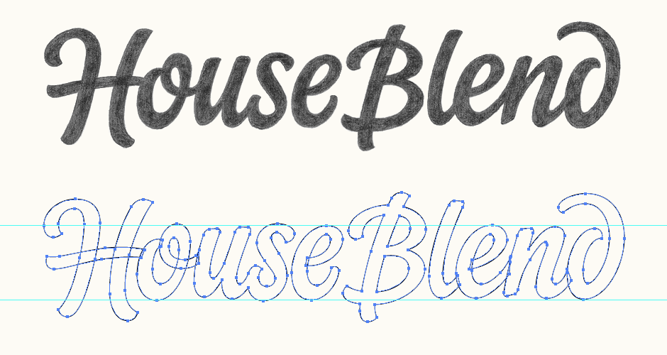
Above: The final sketch and vector construction before finalising.
Accompanying text
"House Blend" being the main part of the logo, we looked for a subtle, unobtrusive typeface to use for the accompanying "Organics" line. The final choice was Lato, set in all caps and at a much smaller size than the main logotype. This helps it to fit in nicely while still being visible as an important part of the name.
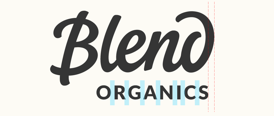
Above: Close up showing manual kerning and optical alignment.
Final Logo
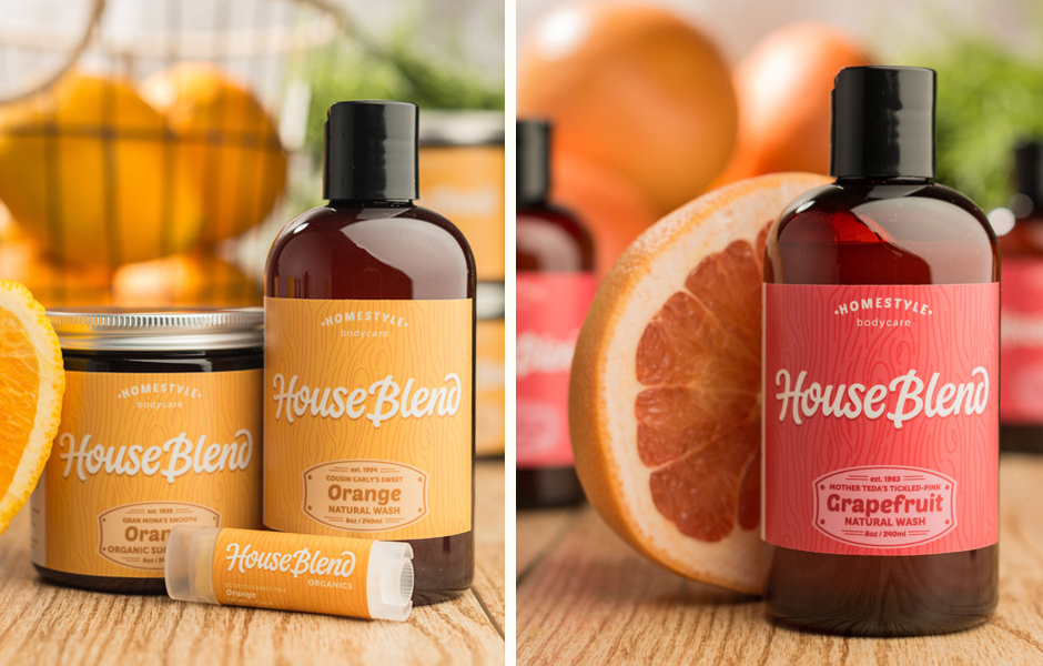
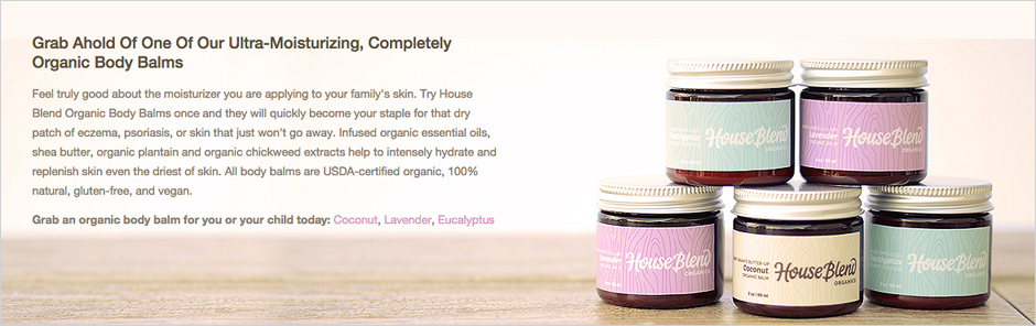
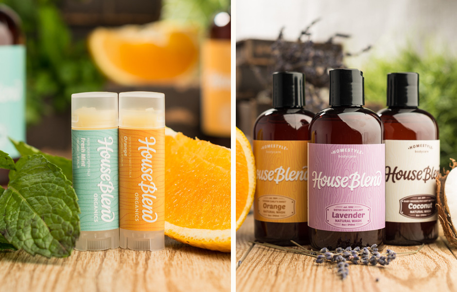
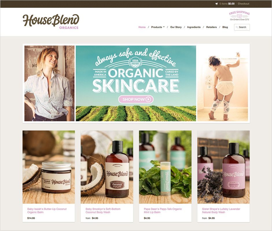
The final design can be seen on the House Blend Organics website and packaging designs for their range of skincare products, including washes, balms, oils, scrubs and lip balms. All website, design and photography work done by the House Blend Organics team.