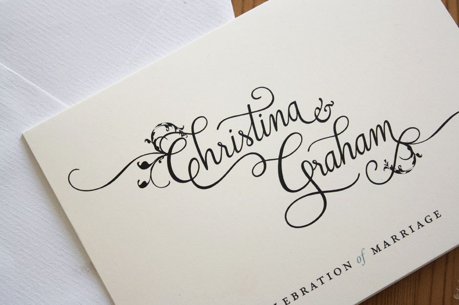
Wedding Invitation
Client: Personal work
Work done: Custom lettering, colour exploration, print design
Wedding lettering & invitation
Custom typography and wedding invitation design done as a gift. I was aiming to focus the design around some custom script lettering for the names that while classically influenced, was also personalised with a strong sense of individuality.
I first drew number of variations in a sketchbook, keeping them very rough and quick in order to work out the dynamics of the letters and their dynamics next to one another. This also helps me to work out where the swashes fit naturally and get a sense of the composition as a whole.
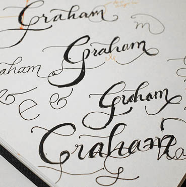
Above: A few sketchbook pages with some rough practice sketches and early drafts.
Developing & Refining
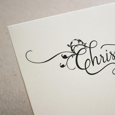
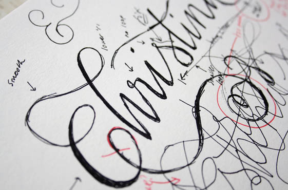
Once I had a good idea of how each name should look, I inked and scanned the neatest sketches, increasing the contrast to highlight the main skeleton of the letters. When developing the digital versions, I kept in mind the problem areas that appeared in the sketches so that I could refine them progressively. The 'C' for instance falls below the baseline, which in itself isn't a problem, but becomes one when compared to the rest of the letters in both names, which themselves remain on a relatively straight line. Adjusting this consequently also affects the 'C-h' ligature which then looks much too tall, so that needs to be revised accordingly too.
The 'a's also proved quite problematic as I wanted them to be identical throughout, but as they were repeated multiple time, they had to fit in each equally well in each position. I also paid particular attention to details like the shapes and the angles and ends of swashes to ensure they remained consistent across the whole design.
Above: The sketches I used as the basis for vectoring, highlighting the main areas that needed attention in the subsequent step.
Final Design
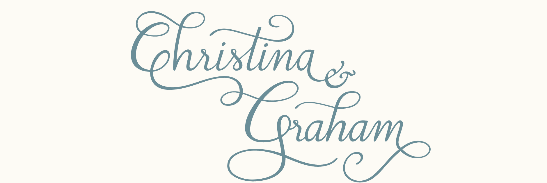
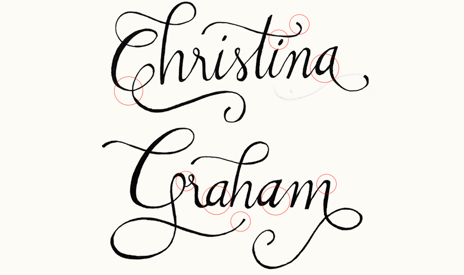
Originally, I had intended to keep both words separate and had been brainstorming ways to connect them, but playing around with the composition, I realized how well they blended together via their initial letters. I wanted to include an ampersand that didn't compete with the lettering or take too much prominence so I incorporated the Garamond italic ampersand, as it ties in with the typeface I was planning for the body text. Ornamental swirls were incorporated at the start and end of the lettering to add a decorative element that adds to the general look without overwhelming it.
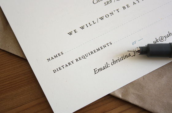
The typesetting of the invitation and matching RSVP slip uses different font styles of Garamond for a visually compelling yet cohesive look. Loosely tracked small capitals differentiate the titles from the main text and prepositions are set in lowercase italic, adding contrast and a touch of elegance. Filled in a light blue, these also serve to add a touch of colour whilst maintaining an overall quietly elegant aesthetic.
Printed in London on Splen Avario 300 gsm stock.