Joacim Nilsson
Client: Joacim Nilsson
Work done: Logo-type design, custom lettering, colour exploration
Custom Logo-type
Personal logo-type for Joacim Nilsson, a young Swedish web developer. Joacim was looking for a typographic representation of his identity, something uniquely individual to him and his personality. While discussing the goals of the logo, positivity emerged as one of the main characteristics to express, as well as a strong sense of drive, motivation, warmth and thoughtfulness. Stylistically, Joacim was interested in a brush script and we talked about ways in which to create an interesting composition using 2 lines.
From quite early on, I felt that the natural shapes of the initial letters offered a lot of potential for a connection across both lines, something that could immediately introduce a distinctive and memorable detail. I also considered the use of ligatures elsewhere in order to build a visually compact logo shape.
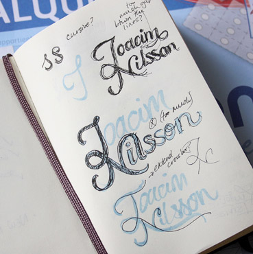
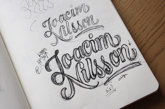
Above: A few sketchbook pages showing some very early test ideas as well as the start of the more refined concept.
Sketch Development
With the general direction in mind, I progressed through a few sketch stages to work out the composition and details. I scanned one of the drafts (below top) and roughly adjusted the alignment and spacing in Photoshop before printing and cleaning it up using a white gel pen (below bottom). This was then used as the basis for the final drawing.
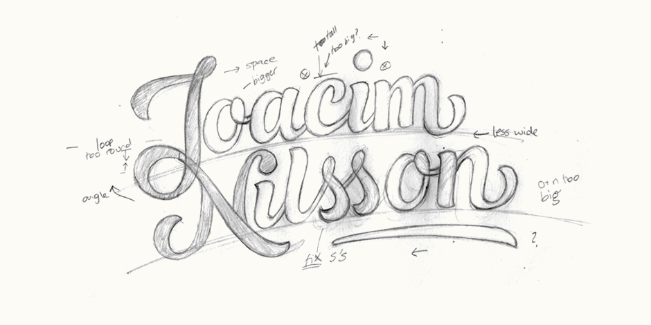
Above: Loose pencil draft drawn from one of the rough inked versions, corrected first in Photoshop then with a white gel pen.
Final Sketch
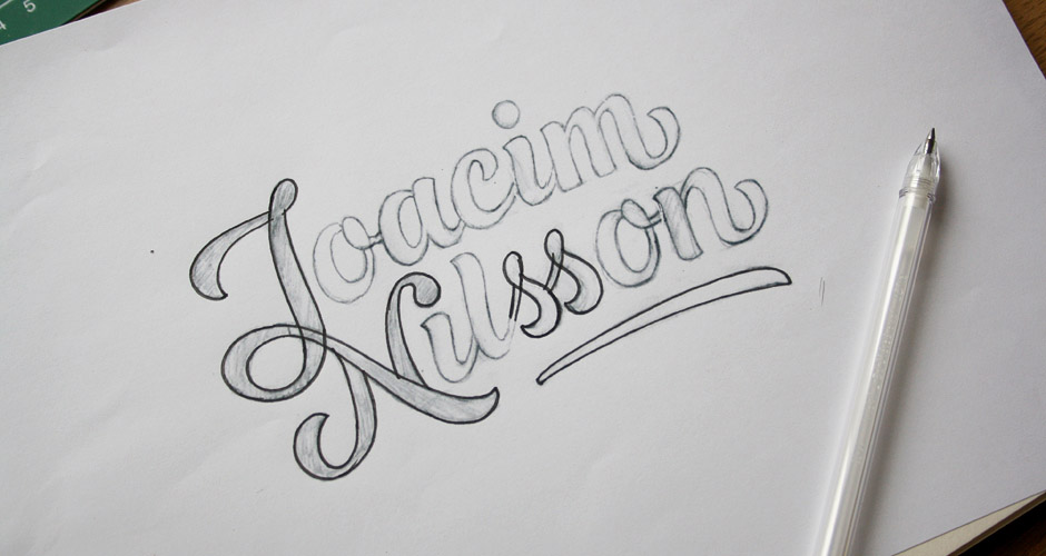
The final drawing is still a little rough in terms of some of the details, but it serves to look at the overall shape, style and impact. I refined the baseline so that it follows a smooth, natural arch to emphasise the dynamic and fun impression already introduced by the brush-style script.
Above: The final sketch drawn from the adjusted print out of the previous draft.
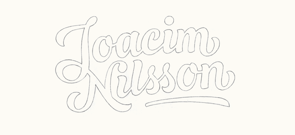
Digital Version
When vectoring, each letter was individually drawn to emphasise the personalised, custom drawn nature of the logo. At the same time, consistency is maintained through similar visual shapes throughout, such as the closed loop at the top of 'J' that is also continued in the 'o' and 's'. I also introduced a version with little gap within the 'J-N' ligature (bottom right). This serves to add an extra sense of depth in a simple way and also lightens a potentially heavy junction.
Above: Testing a potential variation within the 'J-N' ligature.
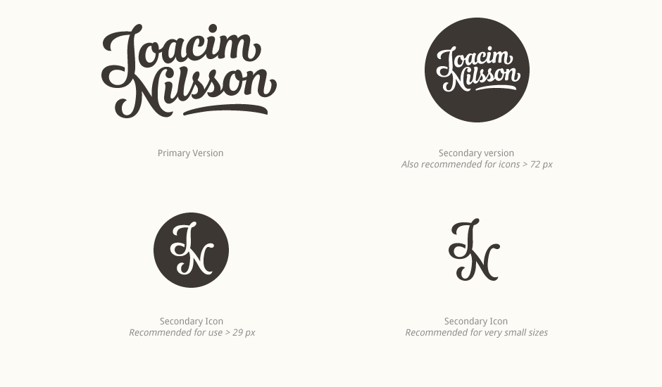
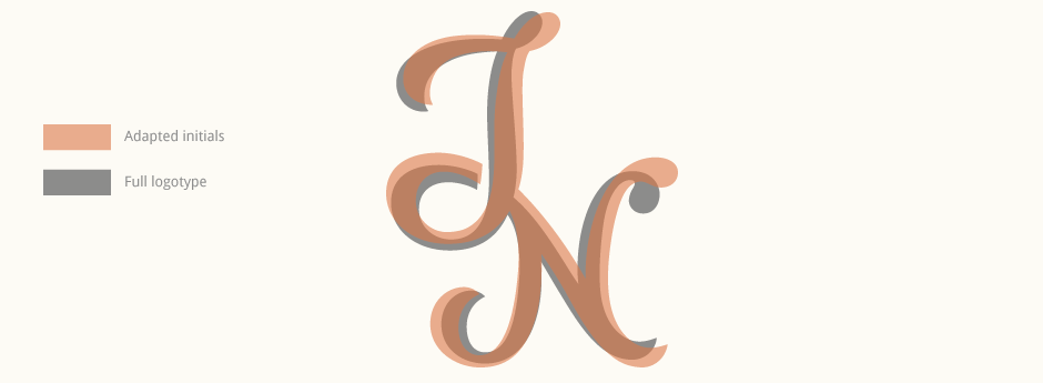
Stand-alone Initials
It was important that the logo could function as an icon, avatar, etc. A version of the full logo in a circle would be used for certain situations, but for very small sizes, I created a modified 'JN' version to use as a possible alternate. As the original characters are specifically designed to work as part of the full name, they need various adjustments to function as a stand-alone element.
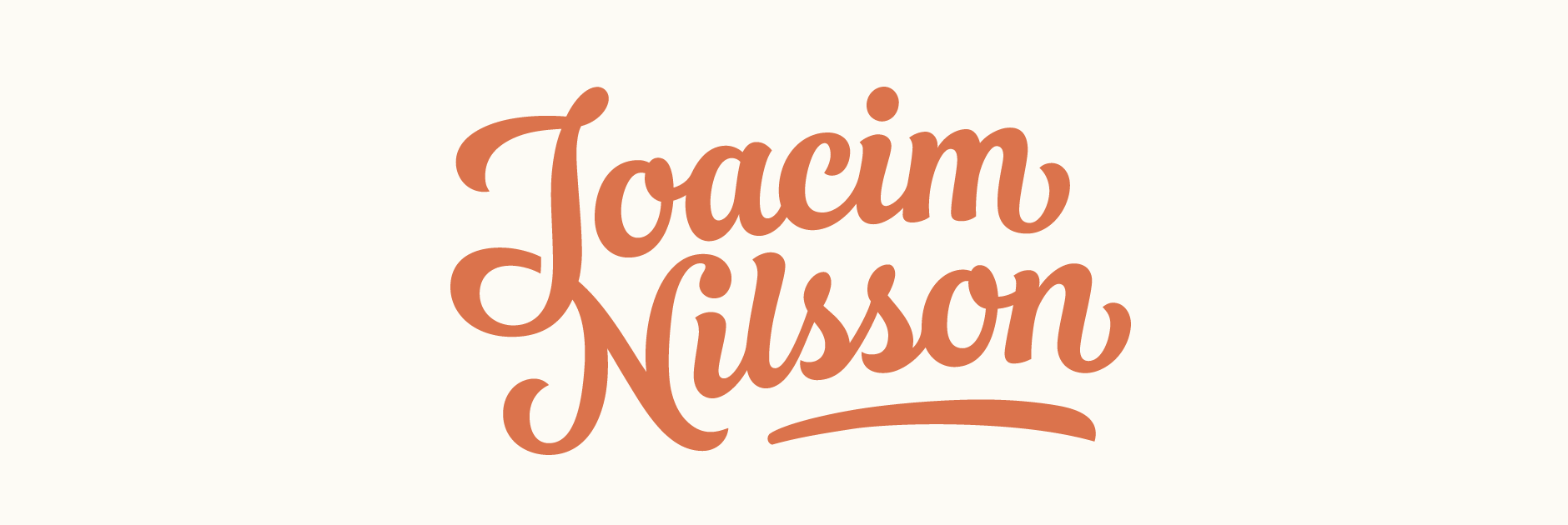
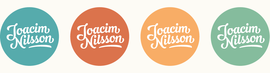
Tweaking & Colours
Circular version of the logo along with four main accent colours I explored. I was looking for a shade that was bright and cheerful without being too flashy.
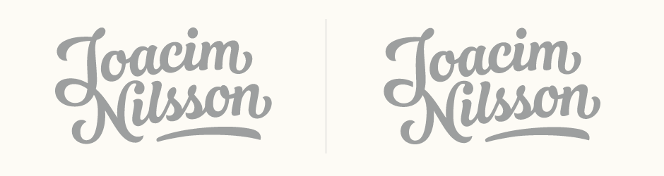
Final Logo
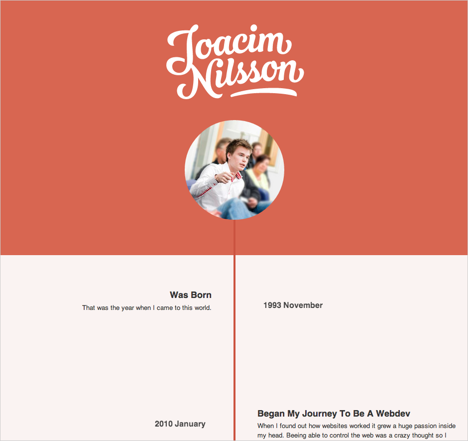
Summary of the finalised lettering and its accompanying versions, along with recommendations for use. The logo can be seen on Joacim's website (screenshot below, design by Joacim).
Joacim Nilsson:
Claire is very good at knowing what her customer wants, also from distance. I'm super pleased with the work she have done for me and I strongly recommend her. The will of truly trying to understand what I wanted and be pixel perfect about it with an passion was the feeling I've got when I worked with Claire. Thanks to Claire I'm proud to show people my name. She Rocks!!