J. Tierra
Client: J. Tierra
Work done: Logo-type design, custom lettering
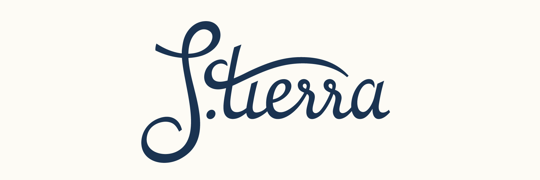
Custom Logo-type
Custom lettered logo created for a USA based brand consultant working on a project called J. Tierra. The brief was to create a clean and sophisticated script typeface to accompany an existing brandmark. Visual style references featured classic script fonts in a relatively thin weight with a refined, discreet feel.
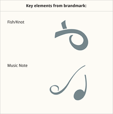
The brandmark being a circular design with distinctive curves and strokes, it was important to mirror the forms of this mark within the lettering itself. Conveying the symbolic meaning of the brandmark was another essential factor; the key elements being a music note and a fish shape that also doubled as a knot. Starting on paper, I explored various ways in which to achieve this in a way that looked natural and cohesive.
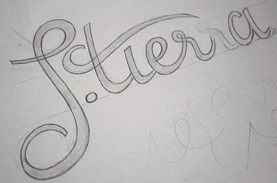
Above: Initial sketch and notes for the features that needed to be integrated.
Development
The most successful solution was using the natural shape of the 'J' to incorporate the two main symbolic elements - its top loop featuring the fish/knot symbol and the descender, the music note. I also integrated the music note into the extended 't' crossbar which helps to further blend symbolic meaning and visual form. In addition to individual letters, the style of the brandmark is also incorporated within the script as a whole through the use of typographic elements such as stroke width and contrast.
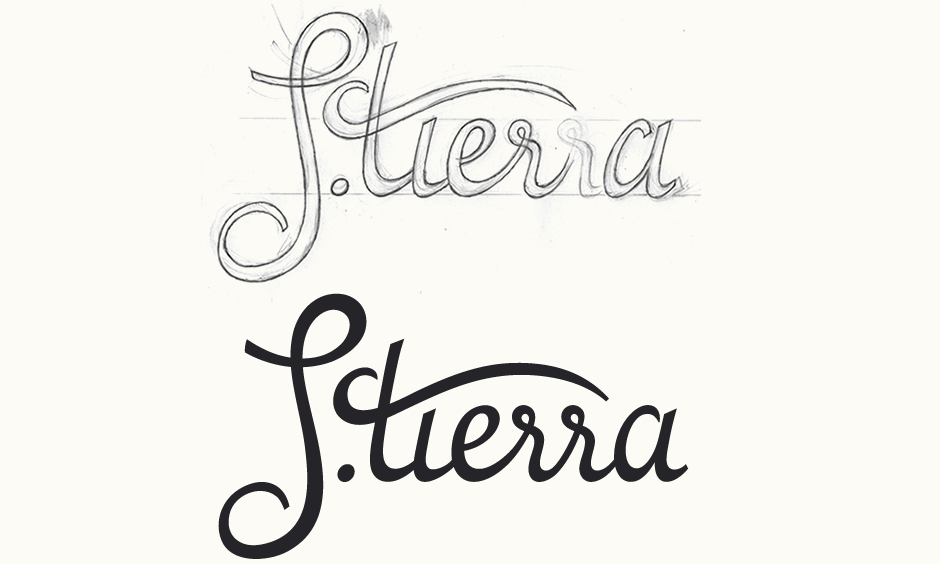
Above: Final sketch followed the initial digital logo, created by manually vectoring over the drawing.
Testing & Refining
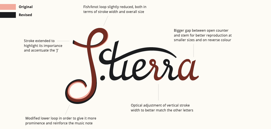
From the first digital draft, I then adjusted various aspects of the design to improve both the conceptual and practical sides of the logo. The 'J' was adjusted to enhance the prominence of the symbols and how it fit with the rest of the design. The major concern with replicating the logo at smaller sizes was the open counter of the 'a'. After testing an alternate with a closed, more conventional 'a', we decided to keep the original as it was more unique and adjusted the counter so it was better scalable.
Final Logo
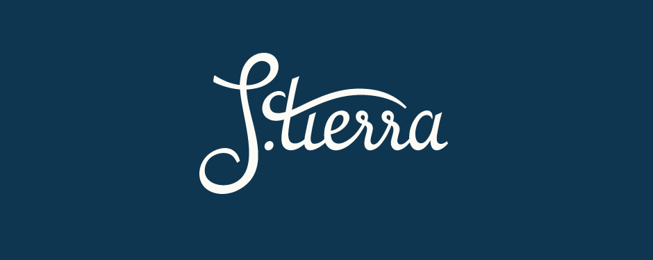
The overall colour scheme defined by the client's existing branding development features primarily dark blue and the lettering will work both alongside the brandmark and as a stand alone name.