Leaf

Client: Leaf
Work done: Logotype design, custom lettering
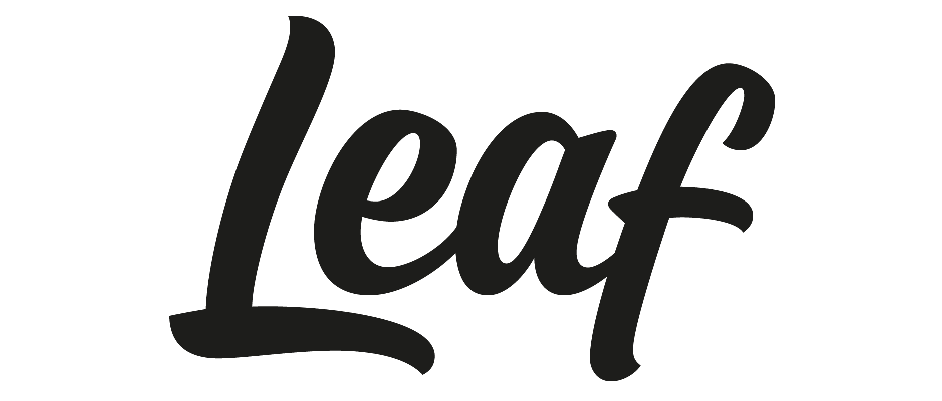
Custom Logotype
Based in Canterbury, UK, Leaf is a web design and development agency specialising in creating digital products. They're a small, 2-man team who work closely with their clients and value long-term, attentive and collaborative working relationships.
Based on our initial chats and reviewing the brief, we quite quickly narrowed down the direction to a modern, relatively bold script in order to convey the very personal and individual character of their approach. The weight would suit the short length of the name and the fact that most of the planned usage would be within the contraint of digital touchpoints. As a software-focused studio, it was also important the logotype not appear overly eccentric, so we were looking for something quite clean and not too complex.
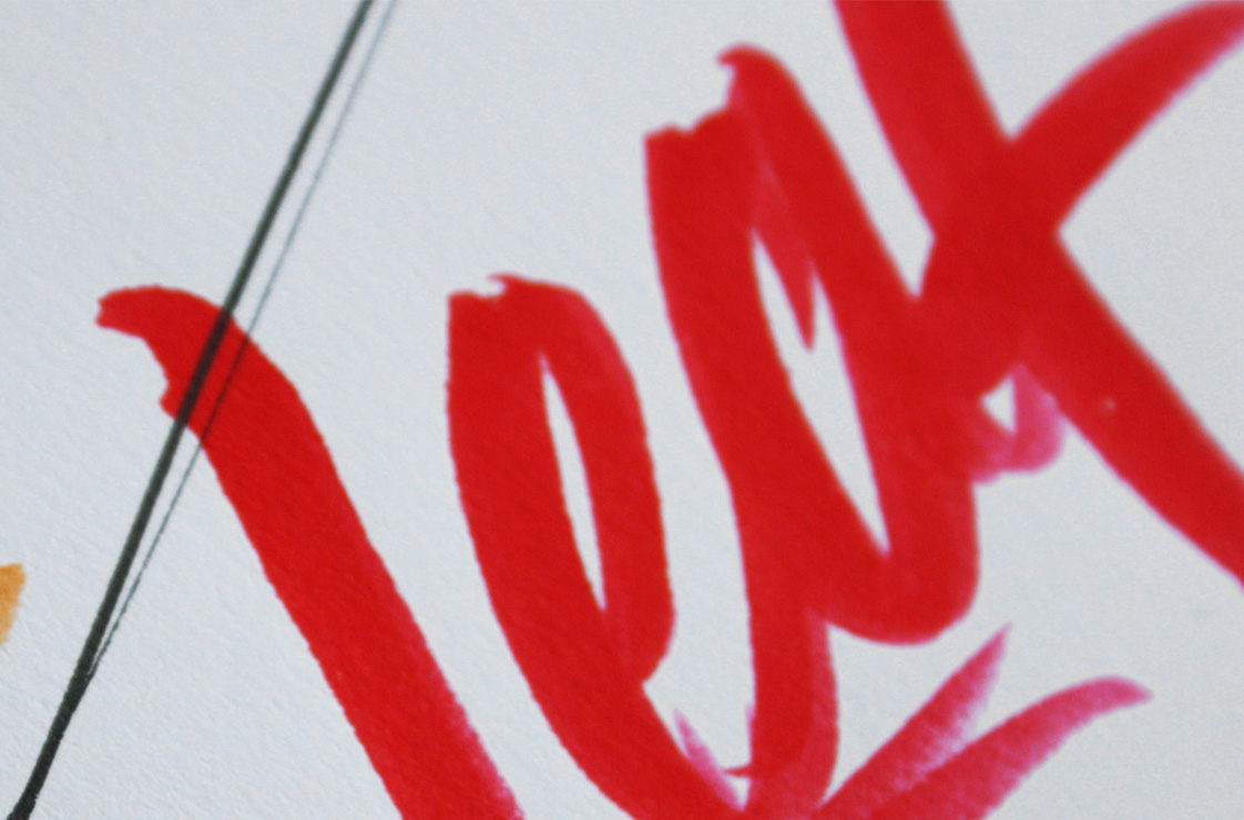
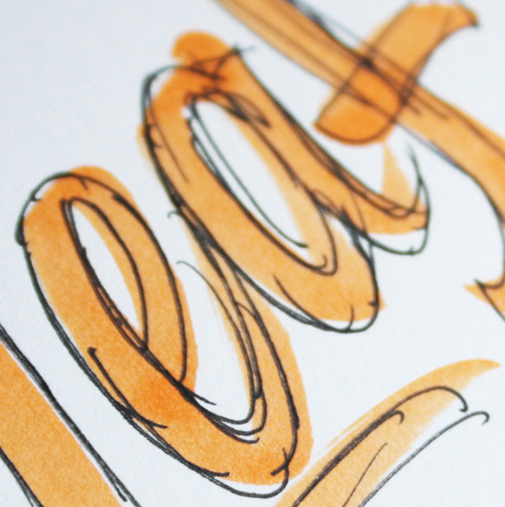
Above: Early rough scribbles using brush pens
Sketch Development
As we had an overall direction already established, the initial brush work looked at finding the right shapes for the individual letters as well as the right inclination, the precise weight and what details could be elaborated on.
The name being quite short, the plan was to use that as the main icon, so there was no need to specifically focus on the capital 'L' as a stand-alone element. This gave a little more freedom to the design and it was really interesting to play with extended proportions and things that would otherwise need to be reigned in for the proportions of an icon.
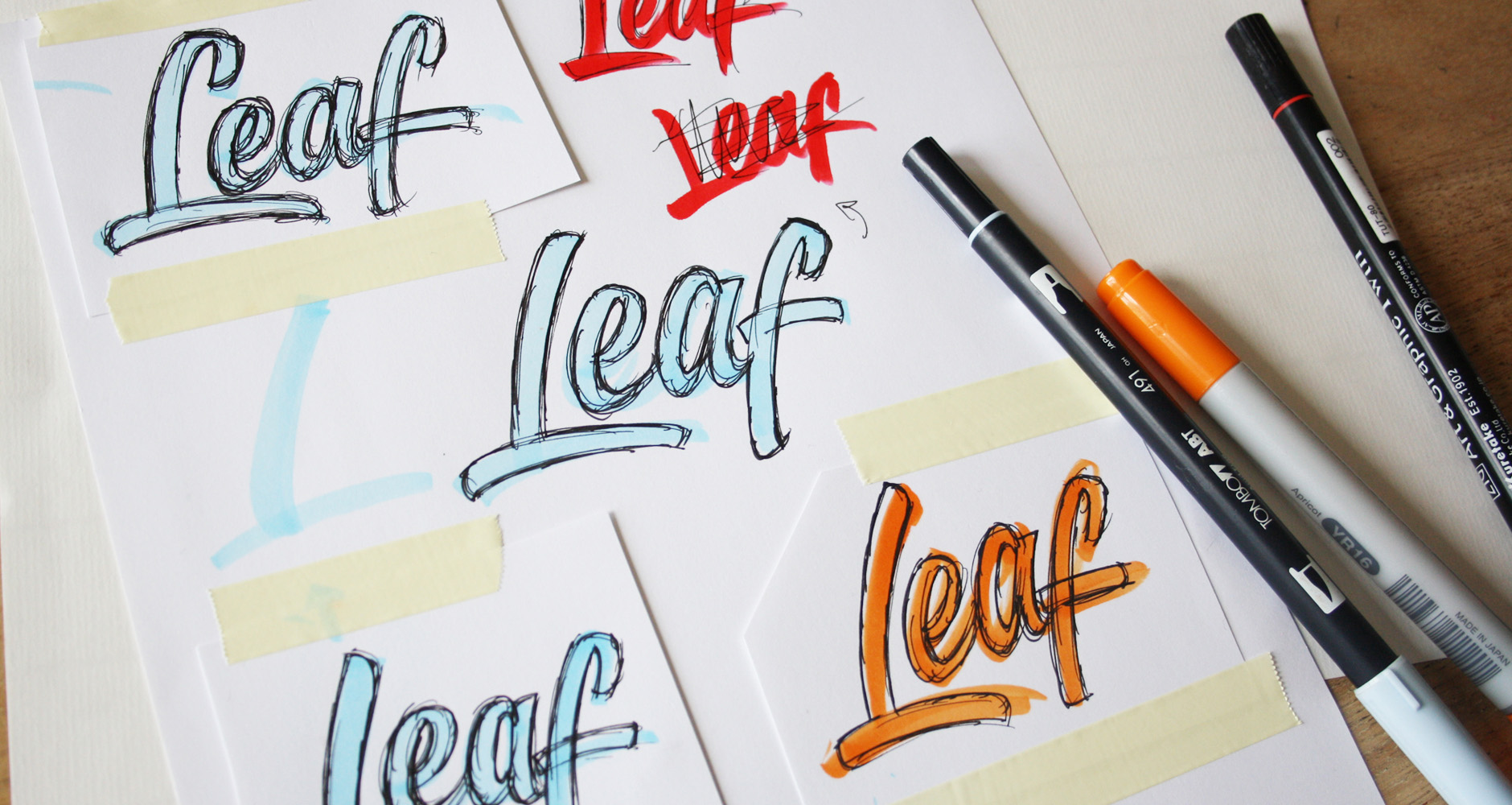
Above: Collecting a set of drafts to work from.
Concept Development
I aimed to maintain relatively condensed proportions so that the style would feel overall “sharp”, rather than rounded, as that tends to come across a little softer. I also worked to keep the brush strokes swift in terms of dynamics, with lines that push downwards rather than slower curves or swashes.
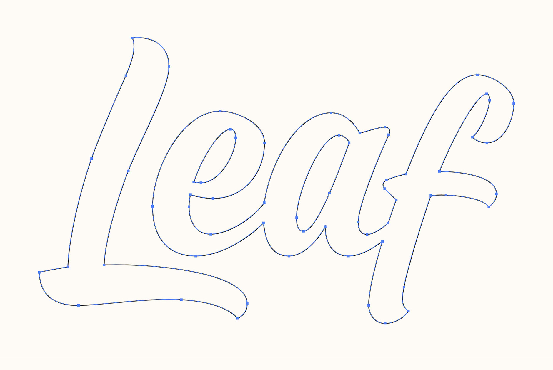
Working from scans of the rough drafts above, I put together a final edit that compiled the best parts of the rough versions. I then created the final sketch from that, which I used as a base for the digital version, refining things such as the exact positioning of the strokes (like the 'L' stem shown below).
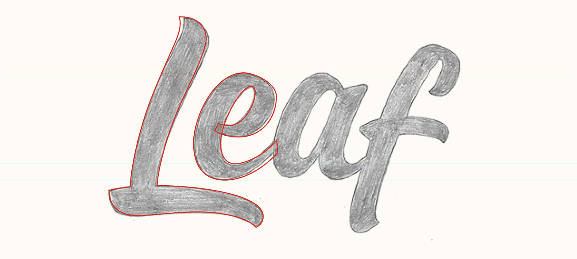
Above: Working screenshot from Illustrator.
Digital Version
The digital version followed the sketch quite closely and didn't need many changes besides adjusting details such as precise alignment, letterspacing and counter size. The lowercase “sits” within the ‘L’, saving space and also creating a nice distinctive aesthetic feature.
Above: Close up of the vector work.
Finalising
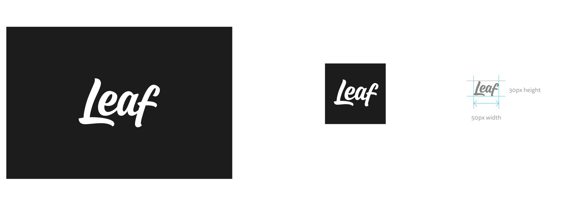
Once we were happy with the design, I tested it as white on black and at different sizes. The full logo is used in a square or circle container for the main icon and the lettering scales down comfortable to about 30px height.
Final Logo
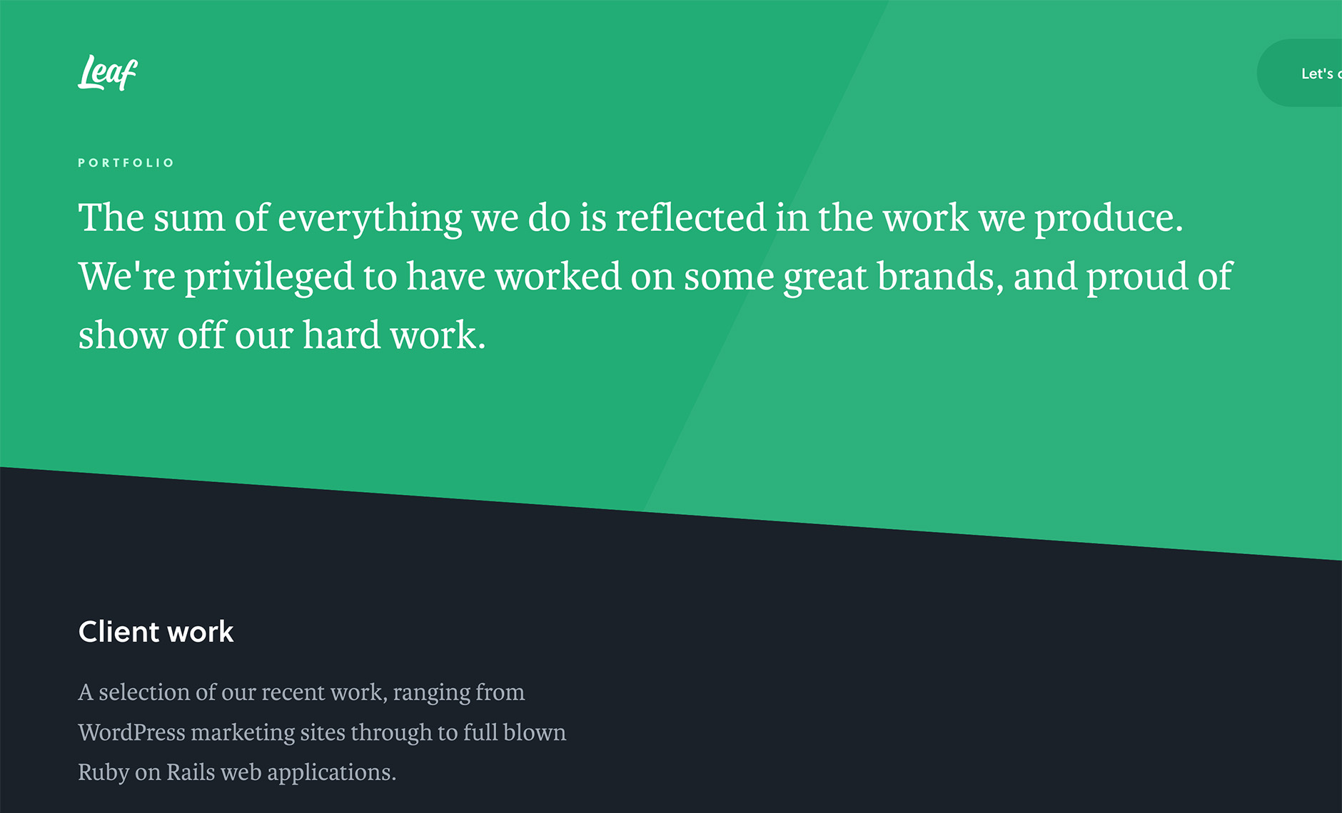
The logo is in use on the Leaf website as well as their social media accounts.