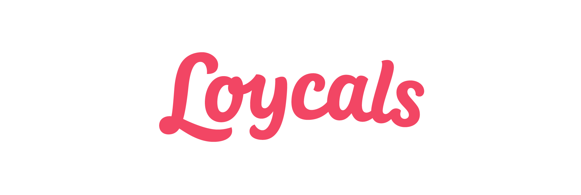
Loycals
Client: Loycals
Work done: Logotype design, custom lettering, brand typography
Custom Logotype
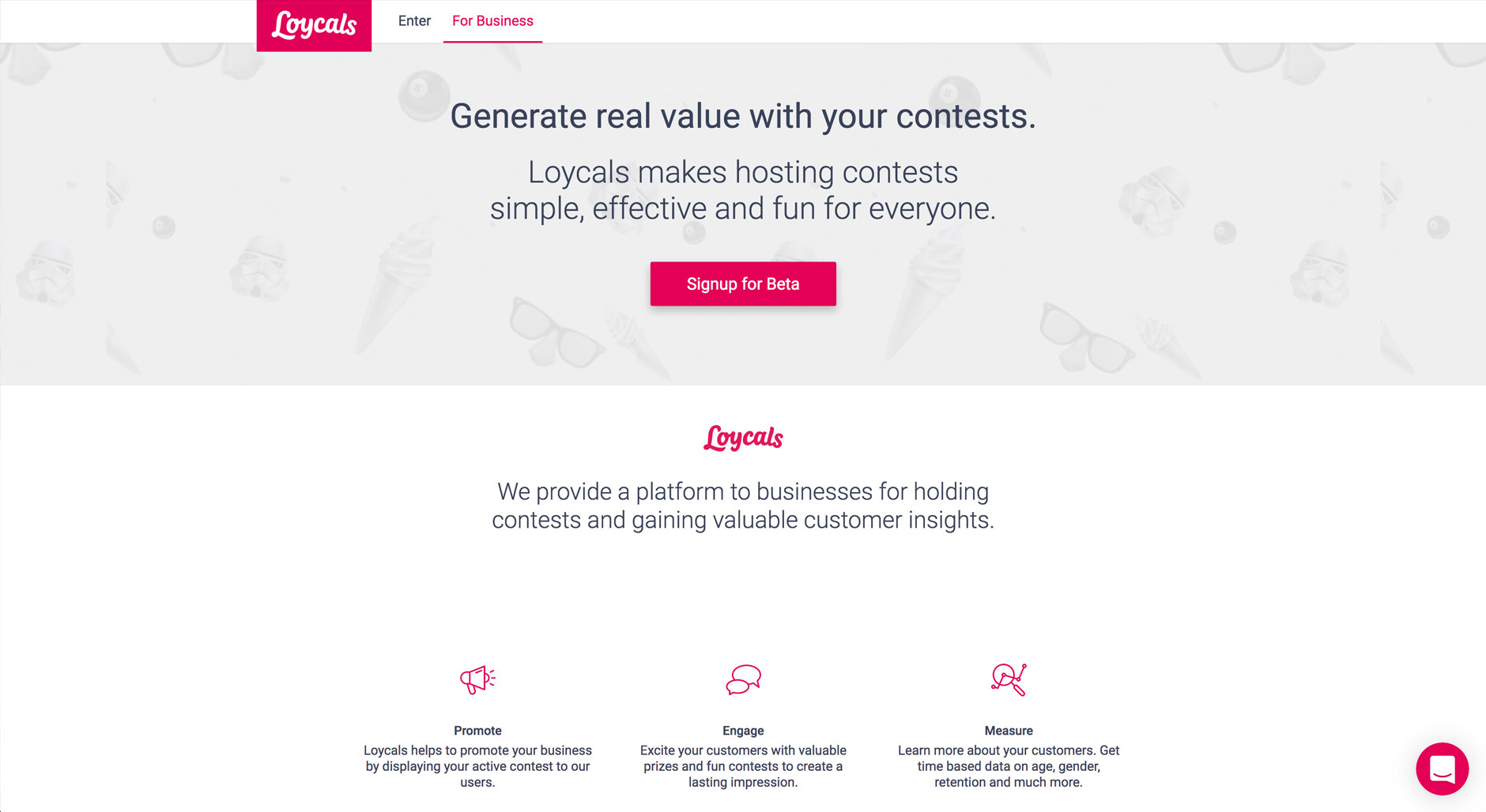
Loycals is a new application that hosts contests for guests to win prizes from local businesses, from festival and event passes to sports games and concert tickets. With its brand name stemming from a combinat of 'locals' and 'loyal', the hand lettered logotype was to encapsulate the fun, outgoing and social nature of the brand’s character, along with its highly user-friendly approach.
As well as the objectives and attributes of the brand, we also studied personas of potential users to have a mental image around which to create the design work. This was particularly helpful as we had already had established a modern script as right overall approach for the logotype, but needed to narrow down more specific characteristics. Height to width ratio was also an important consideration for the projected usage, as well as how to balance dynamics with functionality.
Above: Rough pen marks to start looking at shapes and letter interactions.
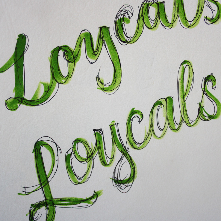
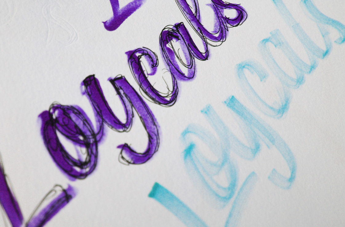
Sketch Development
Our design process started with a wider set of rough concepts, all within the same overall approach but exploring variations in baseline/composition, proportions, letter slant and variations in individual letterforms.
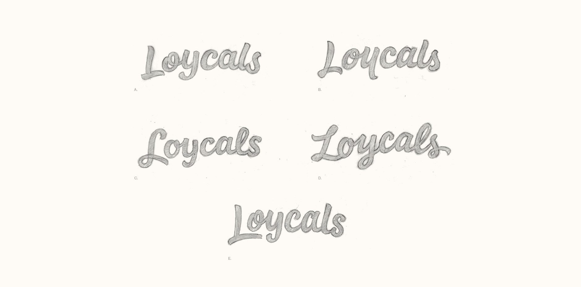
As it would double as the icon, the ‘L’ was particularly important and we looked at many variations to find the right balance between too swashy and too stiff. Some of the letters were easier to define – for instance, the ‘o’ with a closed loop was quite clearly better for functionality and clarity. With other letters such as the ‘a’, it was about negotiating shapes that had nice details vs ones that fit best with the overall style.
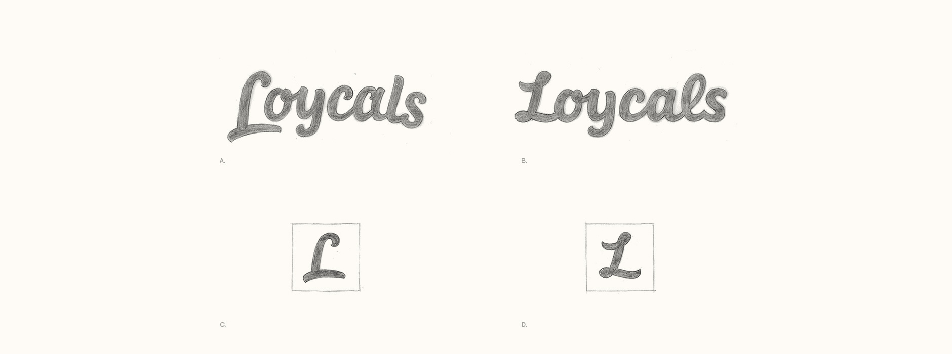
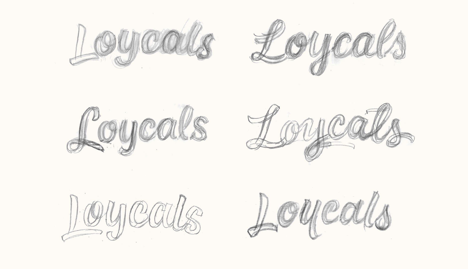
Final Sketch
The final concept combines two features from previous ‘L’ designs (a simple open top hook combined with a closed loop and extended lower swash) adapted into a stand-alone letter for the lowercase to ‘sit’ within. The lettering is set along a loosely arched baseline, just enough for the extra dynamism while still fitting within a horizontal, well contained shape.

Above: Final sketch concept, before refining and adjusting digitally.
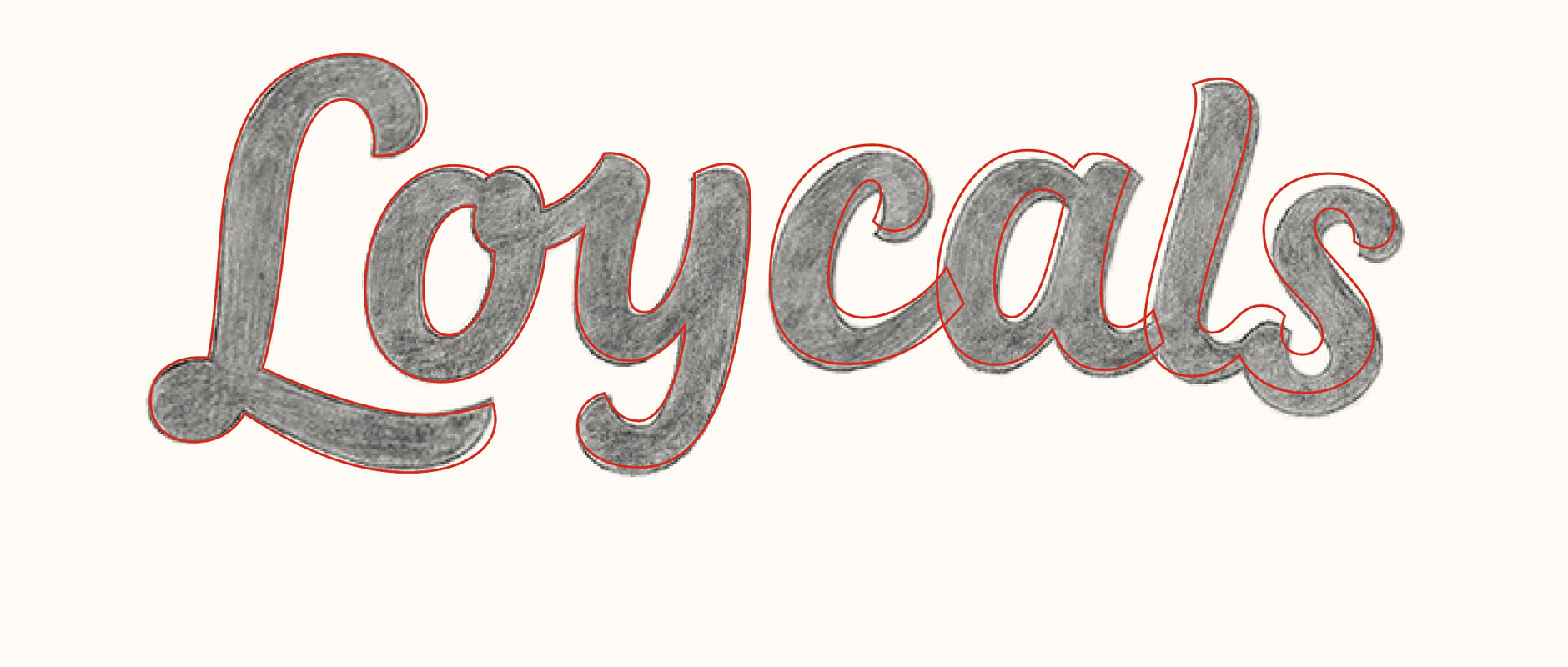
Digital Version
The initial vector work followed the sketch quite closely, with the main changes involving adjustments to the baseline arch and overall logo rotation.
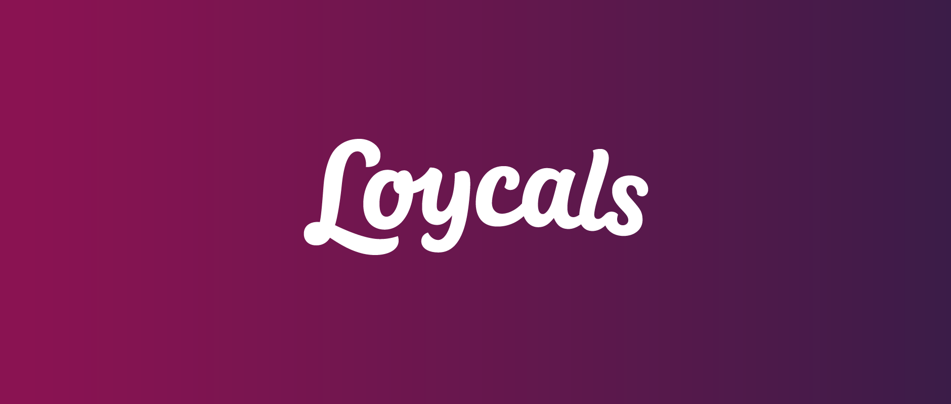
Above: Testing the logo on different backgrounds and colours being worked on by Loycals.
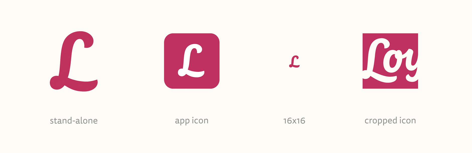
Stand-alone Initials
For the icon, the stand-alone ‘L’ was straightened up (mainly the lower swash) and widened in relation to its height, allowing it to fit more comfortably inside a square container. We also had an alternate cropped icon for bigger sizes and uses where it was important to have more of an identifying mark.
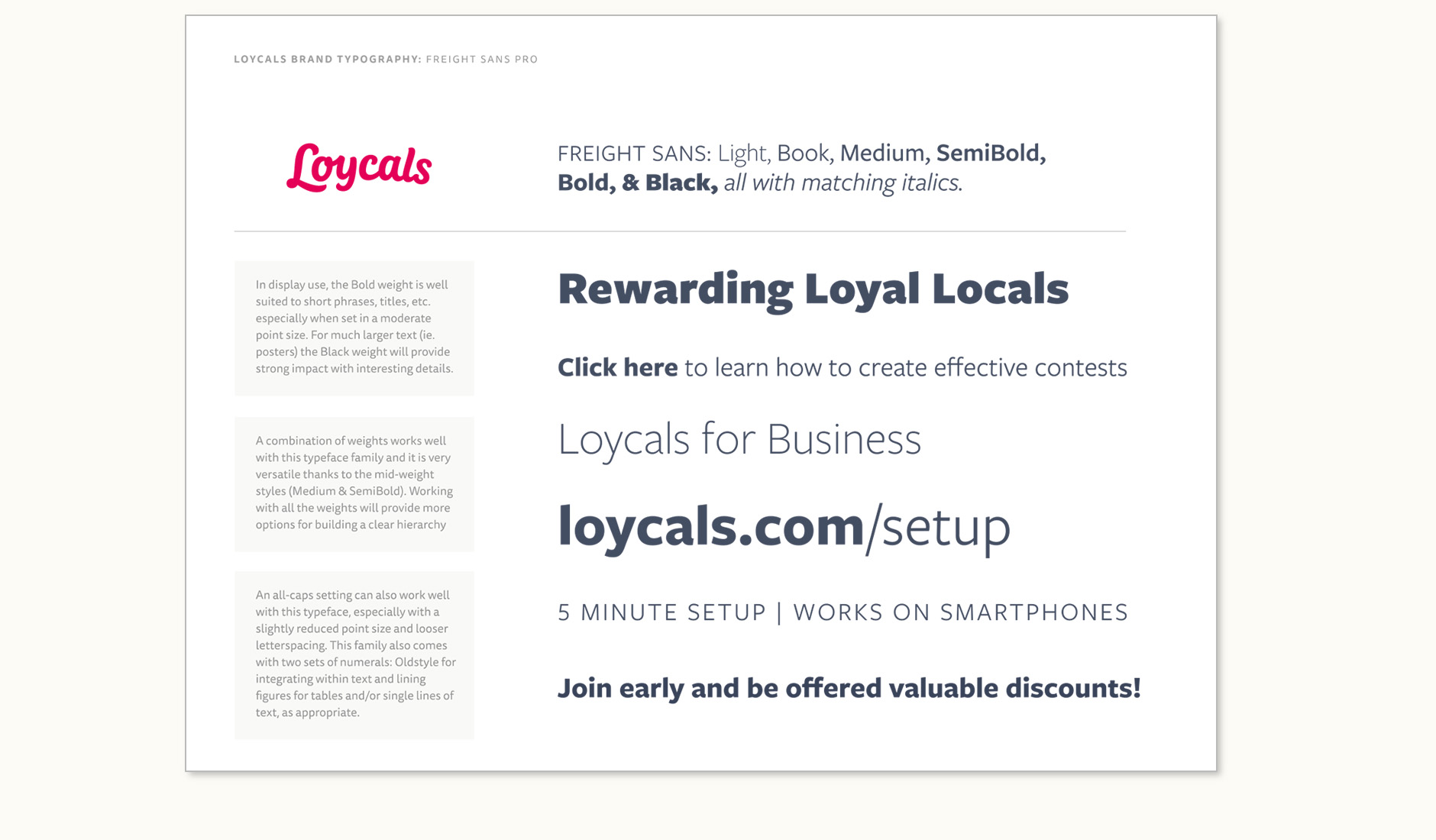
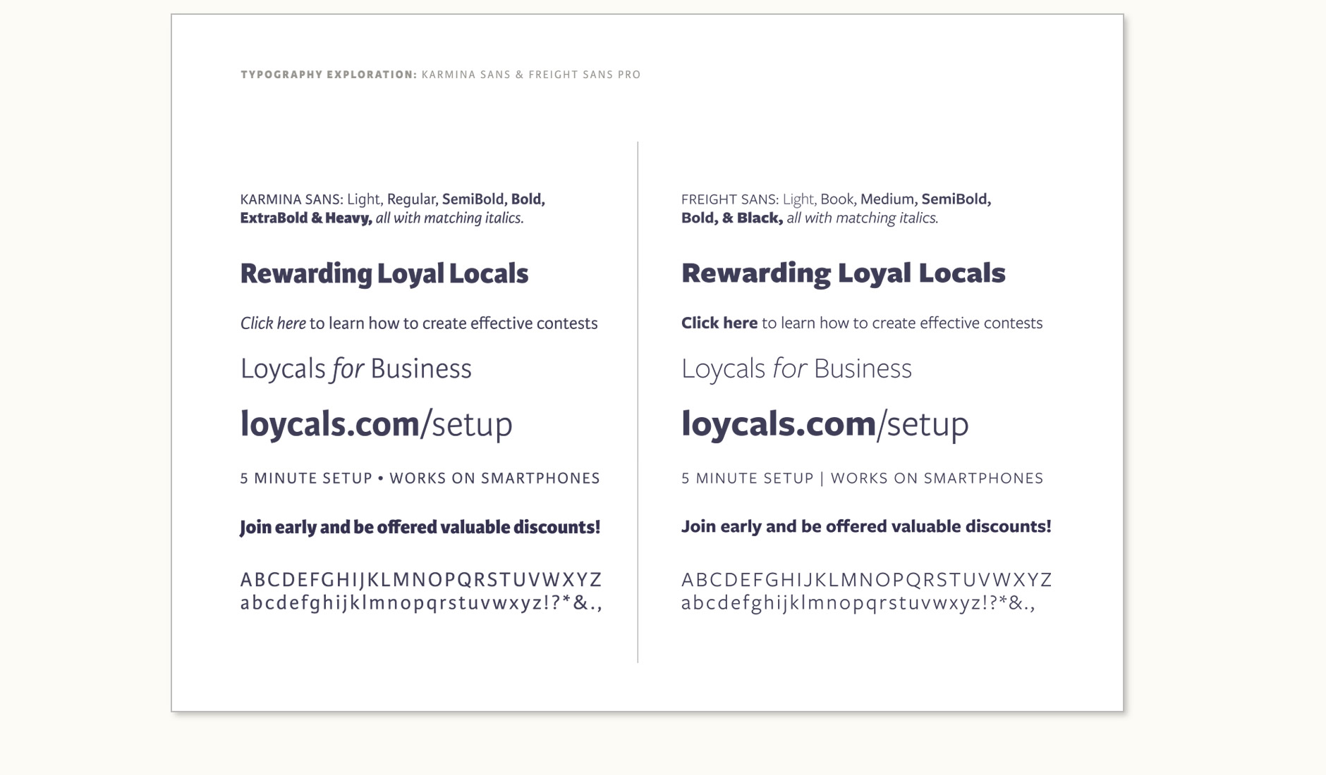
Brand Typefaces
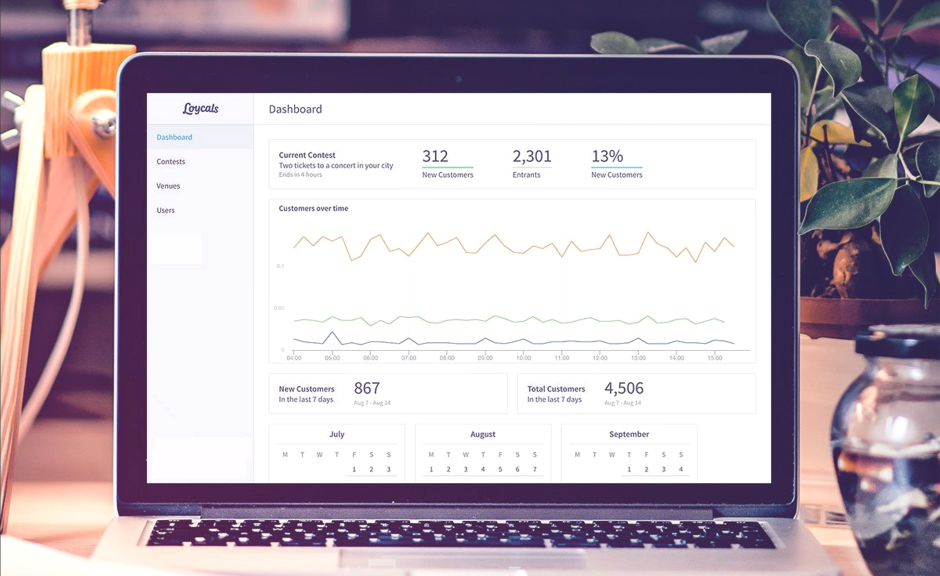
While we were testing and tweaking the logotype, we started talking about typefaces to be used across the app and website. Based on some screenshots of the user interface, we were able to define quite specific uses for the typography and test options directly in context. The final work focused on presenting the 2 best options, allowing the team to have a strong set of guidelines with which to continue the design work as part of the development, but also providing flexibility.
Final Work
The logotype is in use on the Loycals website and app, as well as on various print work such as cards, stickers, etc. Photographs below courtesy of Loycals.