Ludovic Ismael Photography
Client: Ludovic Ismael Photography
Work done: Logo-type design, custom lettering
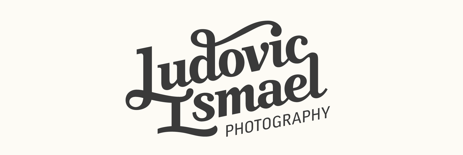
Custom Logo-type
Ludovic Ismael is a Paris-based photographer who works with fashion, portrait and travel photography and also has a sub-brand for wedding photography. With an upcoming website re-design in progress, Ludovic was looking for a new typographic logo that could be used consistently across different supports; not only on his website, but also printed materials, stamps, as an overlay on the photographs, etc.
Talking about how to evoke the character of Ludovic's work and approach, we agreed that it was essential to find the right harmony between elegance, structure and a subtly scripted, hand-crafted sensibility. Considering the projected usage of the logo, splitting up the design on 2 lines was important to allow for a contained visual shape and also allowed for some interesting possibilities in terms of letter connections. We also particularly liked the idea of using a slanted baseline to impart a sense of movement.
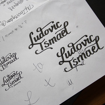
Initial Roughs
From our discussions, two logical directions started to become apparent: one which would draw from the classic refinment of serif faces and another which would be more organically script-based. Having experimented with the name in pen to get a feel for the letterforms and how they could interact, I moved onto pencil sketches quite quickly as there were a lot of details that needed to be considered from the early stages.
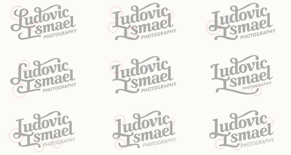
Above: Rough drafts for both concepts.
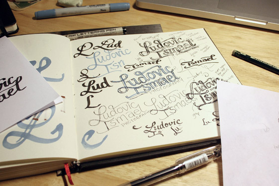
Concept Sketches
From the early drafts, I created rough photoshop mock ups to loosely fix up some of the major elements, test the "photography" sub-line properly, etc. These were then re-drawn as the final sketches. While both versions follow roughly the same principle in terms of composition, they explore different lettering treatments and possibilities for the initial letters.
The first concept is more linear, almost a cross between a heavy serif and a script. It uses a combination of straight serifs and rounded ball terminals and is quite compact as a visual shape. The second concept is more organic, with some subtle brush style terminals. WIth longer, more open swashes and curves, it also has more generous spacing overall.
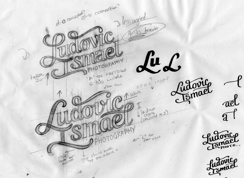
Above: Digitally corrected rough drafts (top) followed by the final sketches.
Vectoring & Further Exploration
Working with the first direction for its combination of sturdy, straight lines and distinctive curves, the next steps focused on refining the concept and exploring alternates for some of the details. The 'L-I' ligature in particular was the main focal point as it needed to maintain good legibility, a sense of movement and fit well with the style and alignment of the other characters. For the tagline, I initially used a simple place-holder which was later replaced with Ludovic's website typeface.
Above: Different stages of the logo-type, focusing particularly on the style and shape of the uppercase.
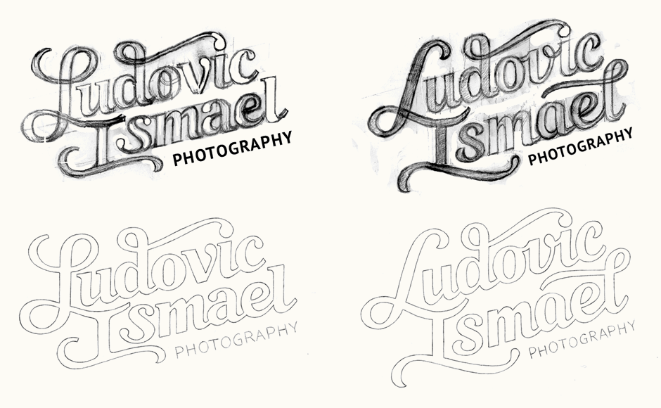
Finalising
Ultimately we went with a version of the 'L-I' that achieves a natural, flowing look while also remaining sturdy and not overly rounded. A circular version was also created for Ludovic to use as a stamp and particularly for the wedding photography branch of his website. Lastly, I also created a ".com" extension that can be integrated to use as watermark.
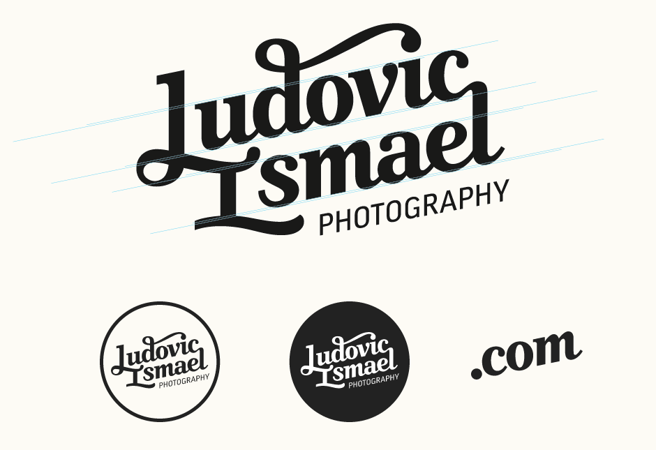
Above: Full logo after some final optical adjustments, accompanied by its secondary versions.
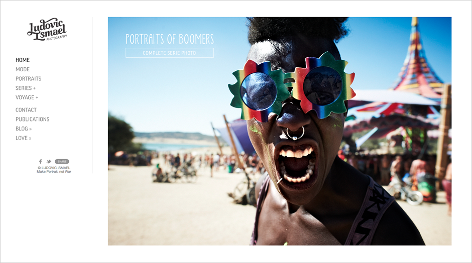
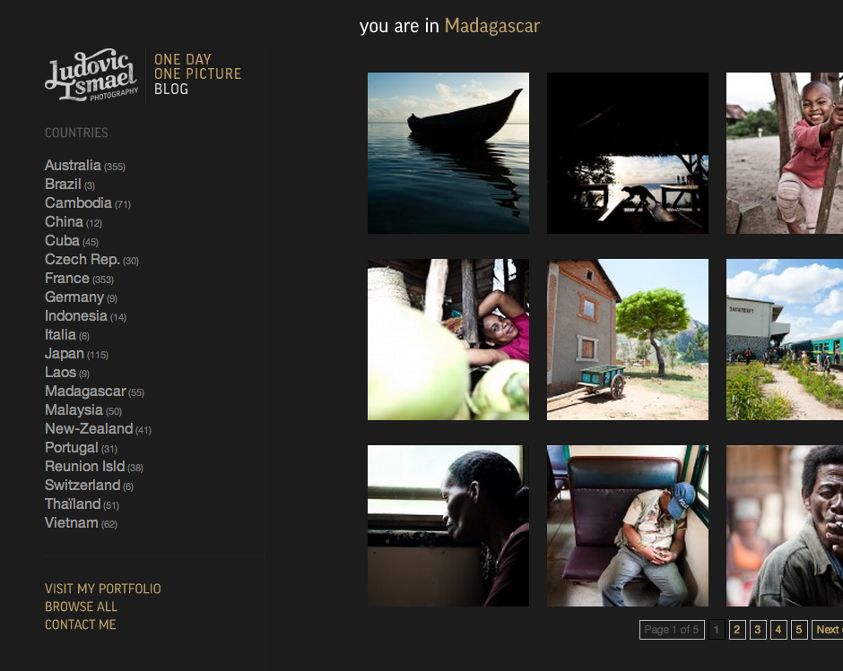
Final Design & Context
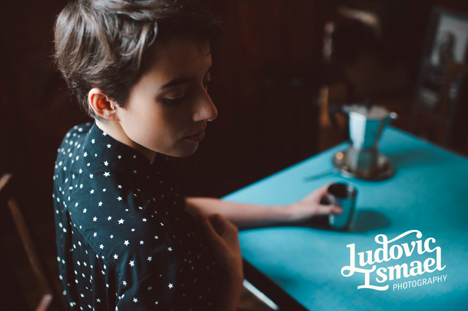
The final logotype can be seen on the new Ludovic Ismael Photography website and blog (screenshots below). Photograph below from Ludovic's Baruckello Lookbook series.
Ludovic Ismael:
As a Photographer & Art Director, my desire of a new fresh identity logo was really challenging but precise. I knew in which direction I wanted to go but I needed some guidelines and a real vision from a great graphic designer... And here comes Claire Coullon. I loved her portfolio and I had this good and confident feeling about our collaboration. I truly appreciated to work with Claire for many reasons, but one important thing was her professionalism and her approach of typography. The mix of our ideas grew up so fast that we came up with this great logo I love so much. One more thing I can say about Claire is beyond typography, she's an open-mind person who exchange and advises with talents. Thanks for everything!