Lulai
Client: Lulai
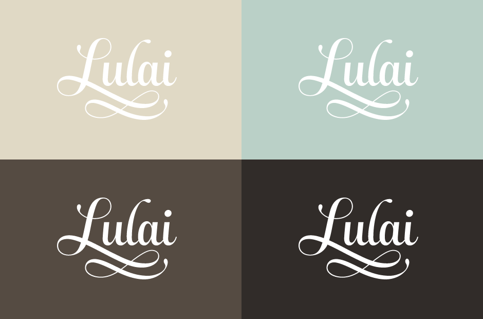
Work done: Logo-type design, custom lettering, colour exploration
Additional credit: Art direction by Motto LLC
Custom Logo-type
I was approached by design studio Motto to create a hand drawn logo-type for Lulai, a new brand of body care products. Charm, luxuriance and sophistication are central to the brand, whose products use only natural ingredients native to the South Pacific Islands. It was also important to evoke a soft and delicate sensibility, while ensuring the lettering remains simple and highly usable.
While discussing the projected uses of the logo and the environment it would be part of, we reviewed different lettering styles while focusing on a calligraphic, quite high-contrast approach with some distinctive swashes.
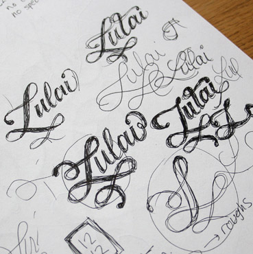
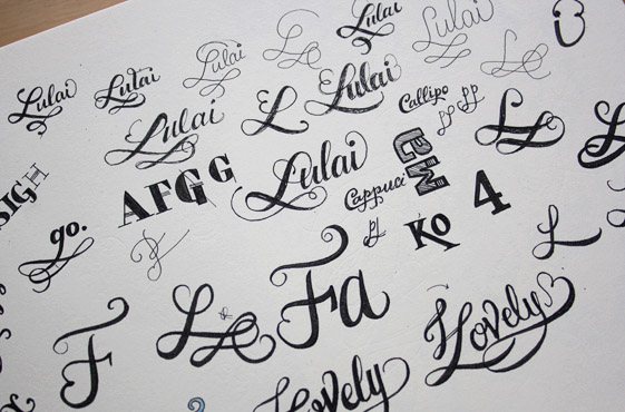
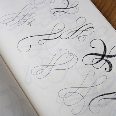
Above: Sketchbook pages experimenting with the letterforms, styling and swashes.
Concept Development
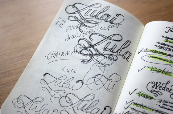
With the initial exploration, I focused on creating a design that captures the brand attributes and at the same time, experiments with the possibilities that the brief opens (particularly thinking about the 'L' as the focal point). Each version looks at different features such as swashes, overall shape, typographic weight, inclination, stroke terminals (tear drop, ball, straight, etc.), individual letters ('i', 'l'), etc. and how all of these affect the overall look in terms of balance, femininity, simplicity and elegance. An early set of rough drafts was progressively narrowed down to a final design.
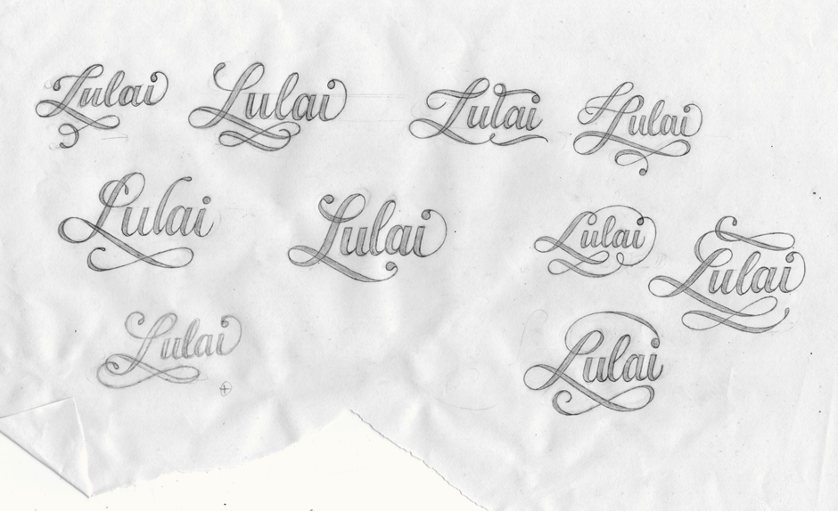
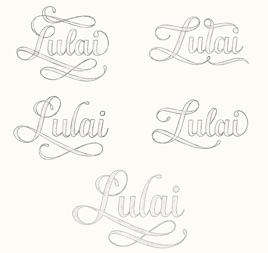
Above: Progression from a wide set of rough ideas narrowed down to one main direction.
Initial Vectoring
From a scan of the final sketch, I created the initial vector version in Illustrator. Notable changes at this stage included primarily adjustments to the 'L' loops (size, proportions and stroke contrast) in order to be more consistent with the thick to thin transition of the swashes and other characters. The lower swash is also more horizontally centered, improving the overall balance.
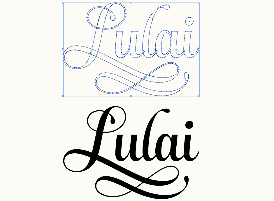
Above: Vector construction of the logo-type.
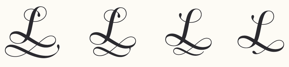
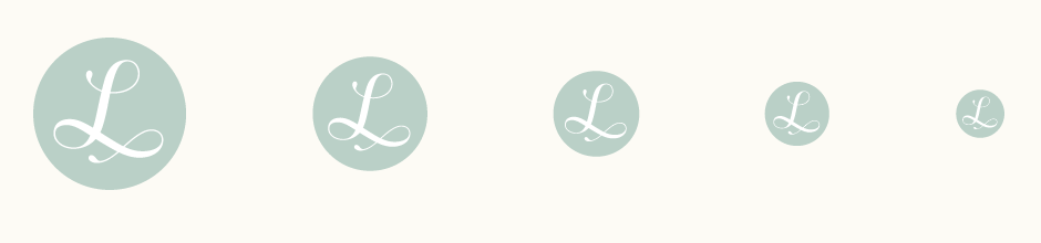
Icon Adaptation
We explored various possibilities for an alternate version that would feature the 'L' alone. An important consideration was how much of the full design it should retain and to what extent it needed to be simplified to remain recognisable. At this stage, the 'L' from the main logo was also revised to have a simpler upper loop. Ultimately, the simplest icon version was chosen (bottom right) for easy legibility, particularly when scaled down.
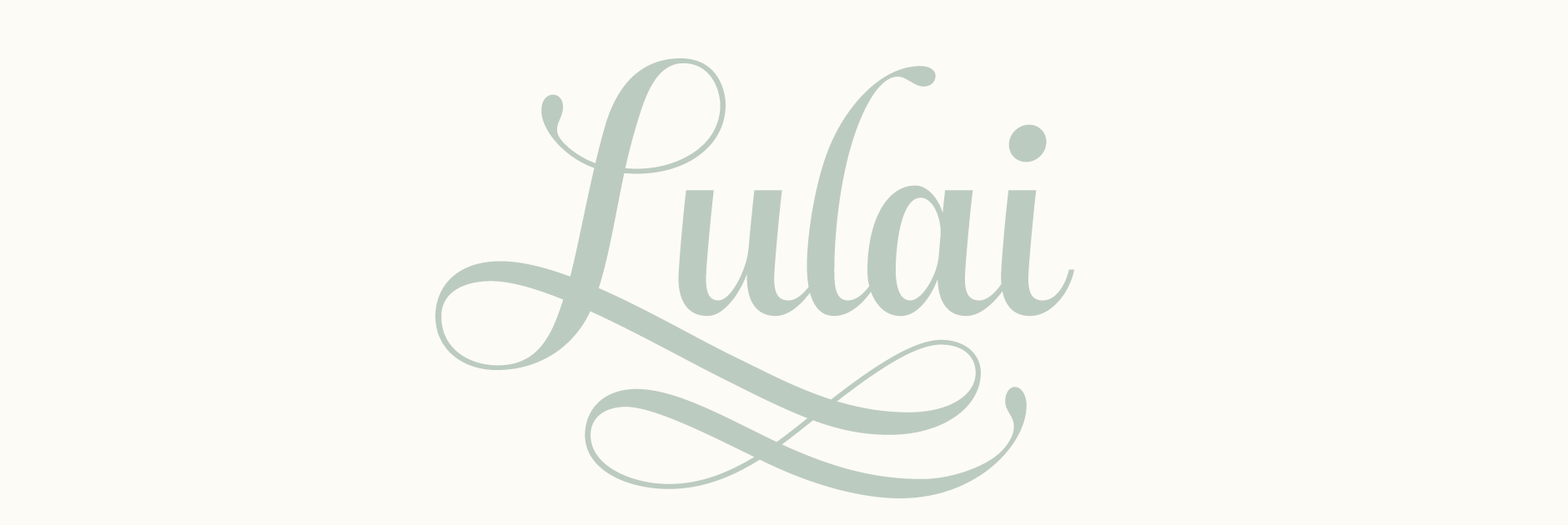
Final Logo
My final version of the logo, with minor adjustments to kerning and contrast. The logo currently in use by Lulai is an adaptation of one of my earlier drafts.