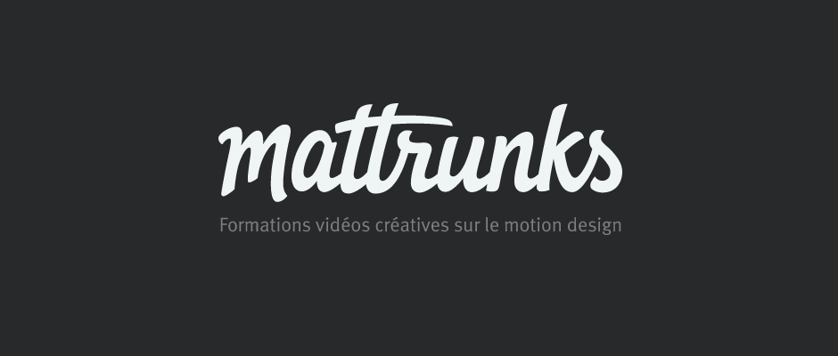
Mattrunks
Client: Mattrunks
Work done: Logo-type redesign, custom lettering
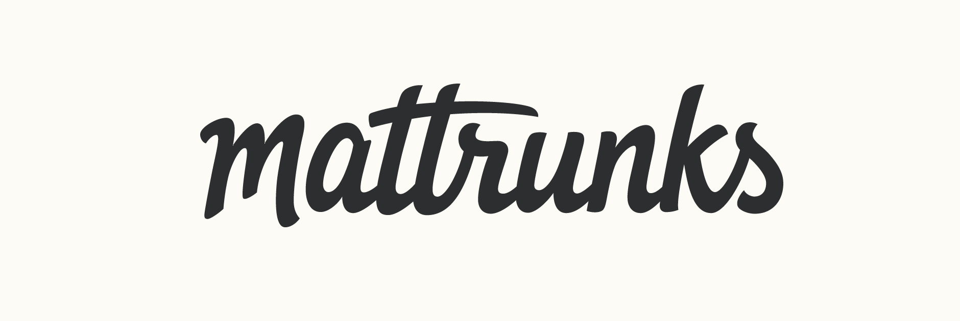
Custom logo-type
Custom type logo re-design for Mattrunks, a website based in France offering primarily video tutorials on motion design. Established in 2007, they were looking for a new logo to accompany an upcoming full website re-design. The aim was something dynamic, friendly and inviting that inspires confidence and professionalism. It also had to be quite compact, highly legible when at a small size in the site header and have an 'm' that could double as a separate icon.
Keeping in mind the dynamic, approachable aspect, I developed the initial drafts using mostly markers and heavier pens. The initial draft for the first concept (below left) was drawn with a wide Copic marker to get the rough shapes and movement, before re-done in pencil. The second concept (below right) was initially roughly drawn with a medium sized multiliner brush pen.
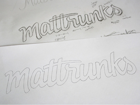
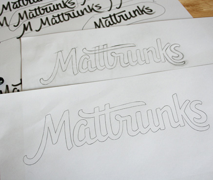
Above: Sketch progression for the two concept proposals.
Development
With the first concept a clear favourite, I then moved onto refining by looking for the areas that would need fixing or closer attention during the vectoring stage. Specific elements that were considered included spacing, stroke widths, stroke terminals (particularly on the vertical stems) and a possible alternate 'm'.
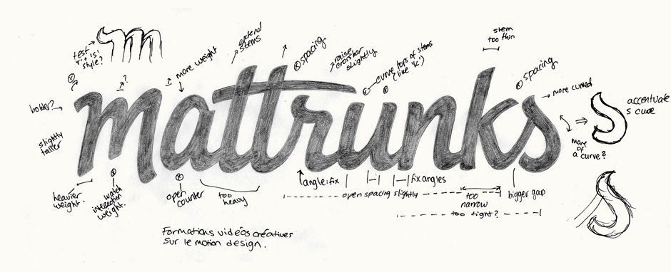
Above: Annotated final sketch with reminders for the next steps.
Vectoring & Refining
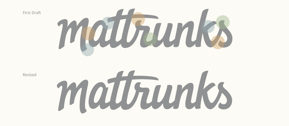
The first vector draft addressed the issues raised in the sketch, so the next step involved further refining to adjust all the details and fix any further bigger issues. At the same time, it was also important to retain the natural expressiveness of the letter shapes. Here, I primarily fixed the spacing, specific areas where letters interact (like 'a-t') and the shape of the 'r' and 's' for continuity. Areas with increased spacing are highlighted below in orange, adjusted interactions between specific pairs in blue and revised letter structure/shape in green.
Final Design
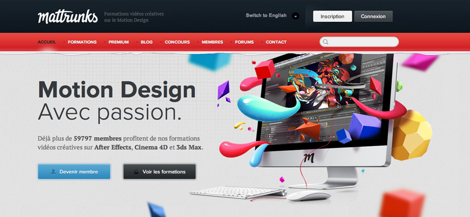
The logo is mostly used in white, grey and black tones with the stand-alone 'm' acting as the icon. See the logo live on the Mattrunks website and Facebook page. Website layout design by Colorz.