Osogrand
Client: Osogrand Clothing Co.
Work done: Logotype re-design, icon versions, custom lettering
Custom Logotype
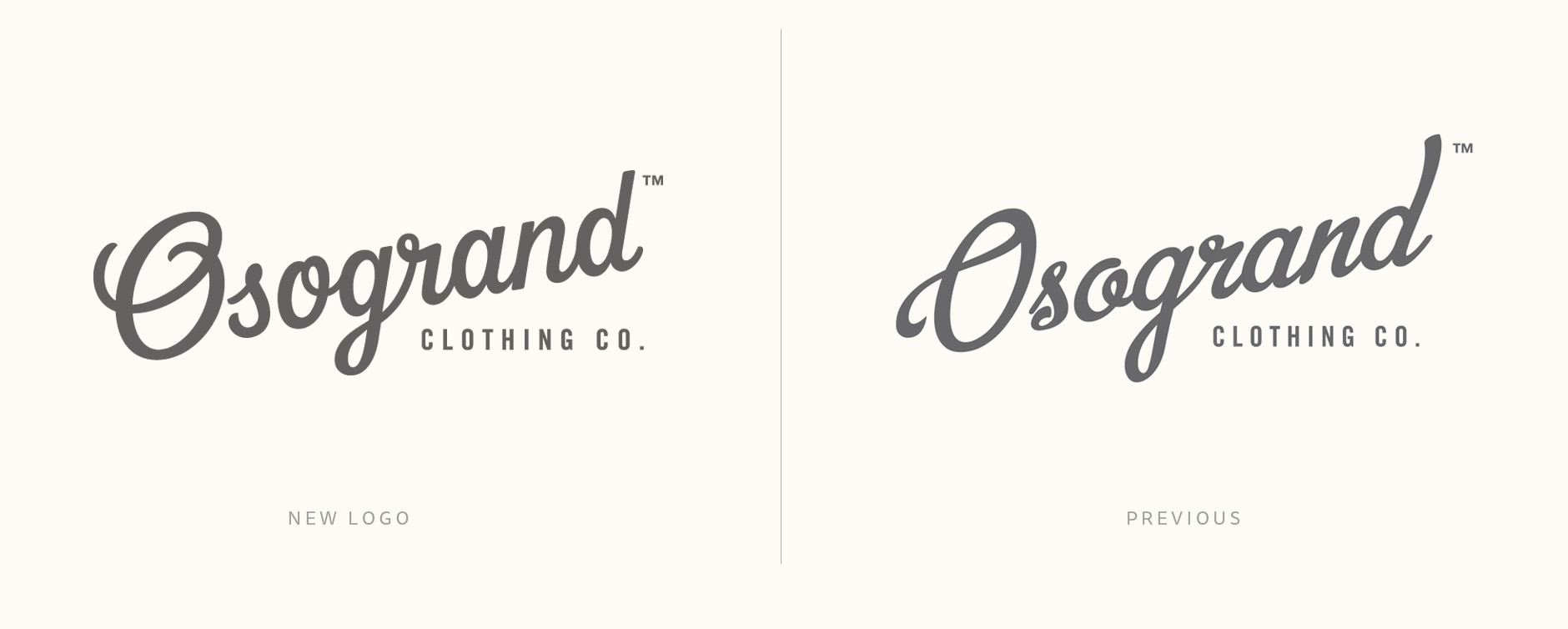
I was commissioned to work on a script logotype for Osogrand, a newly started clothing company out of Milwaukee and Nashville, USA. The team had established a loose direction for the logo and were looking to have a fully custom designed script drawn in an elegant, modern style. The full loog also needed to be able to translate to 2 shortened versions: 'Oso' and 'O'.
From a study and review of the brief and their previous exploration, the main characteristics we decided to work with was a slanted baseline, relatively light weight letters and a decent amount of stroke contrast. The biggest areas to work on were readability and proportions, which really affect functionality at small sizes (especially for tags and places where it would be embroidered).
Concept Development
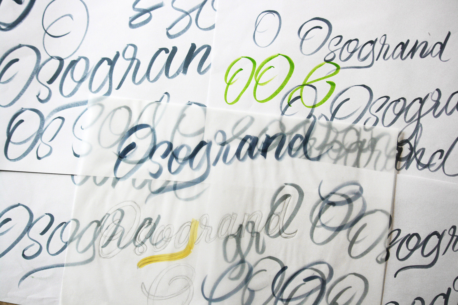
With a good idea of the kind of high level characteristics we were looking for, I then used a brush pen to very roughly write out the name over and over. At this early stage, I wasn't worrying at all about the weight, contrast or any kind of neatness but instead, just getting an idea of what kind of natural shapes emerge and how the letters flow together. Here, it also quickly becomes apparent what kind of decisions will need to be made: how to help the 'O' stand out, whether to connect all the lowercase, what to do with the 'g' descender, etc.
Eventually, I started to see what kind of solutions worked best and moved onto a rough pencil outline drawn using tracing paper over selected parts of the ink drafts. Using photoshop, I cleaned up the outline: straightening up the baseline, working on spacing, etc. (drawings below, top row). I then printed that copy out and used it to draw a more refined version. This was also fixed up digitally and here I also added guidelines to use for the final sketch (drawings below, bottom row).
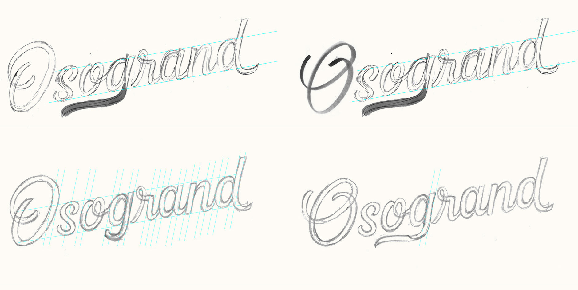
Above: Rough edits and progression of 2 alternatives (different 'O' and 'g').
Concept Development
I aimed to maintain relatively condensed proportions so that the style would feel overall “sharp”, rather than rounded, as that tends to come across a little softer. I also worked to keep the brush strokes swift in terms of dynamics, with lines that push downwards rather than slower curves or swashes.
Working from scans of the rough drafts above, I put together a final edit that compiled the best parts of the rough versions. I then created the final sketch from that, which I used as a base for the digital version, refining things such as the exact positioning of the strokes (like the 'L' stem shown below).

Above: 2 final sketch options.
Digital Version
Reviewing the sketches, we liked the more complex 'O' for its more balanced typographic colour in that it didn't leave a big white open space in the middle of the letter. For the 'g', we looked for a new solution that would connect it with the 'r' as the gap feels a bit out of place and a little unnatural compared to how it would be written out. I did a rough mockup in photoshop to use as a base for the vectoring, also shortening the final 'd' tail.
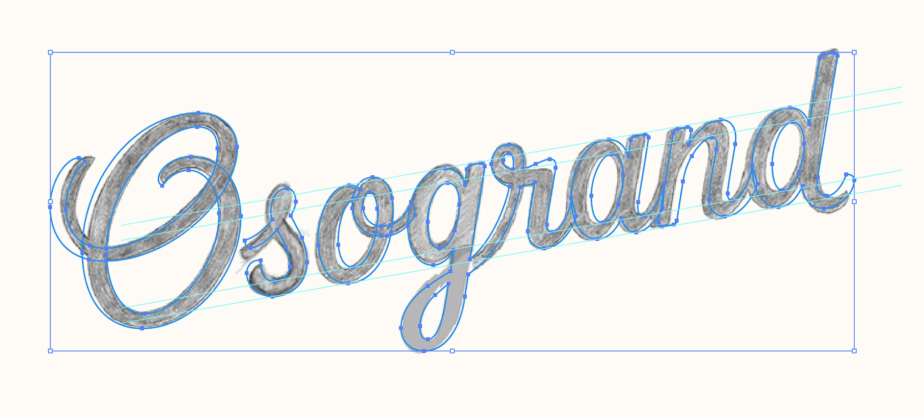
Above: Working screenshot from Illustrator.
Finalising
I also made two shortened versions of the logo, 'Oso' and a stand-alone 'O'. The Oso 'o' has an end tail to match the 'd' tail in the full logo as well as mirror the cap 'O' entrance stroke.
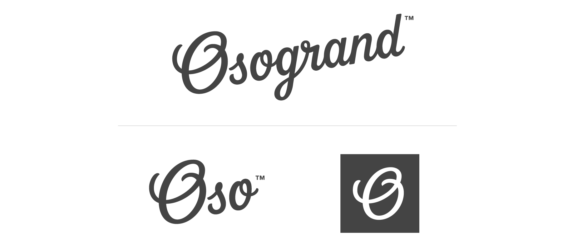
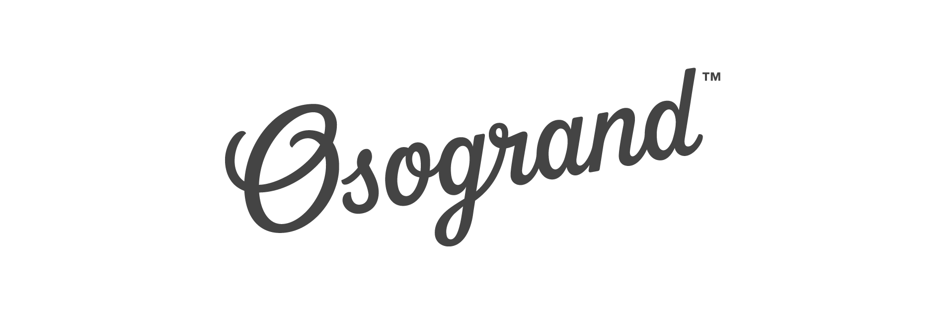
Final Logo
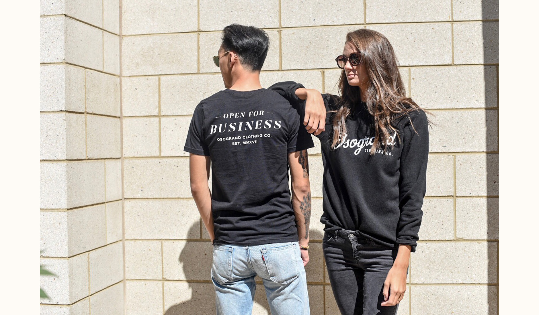
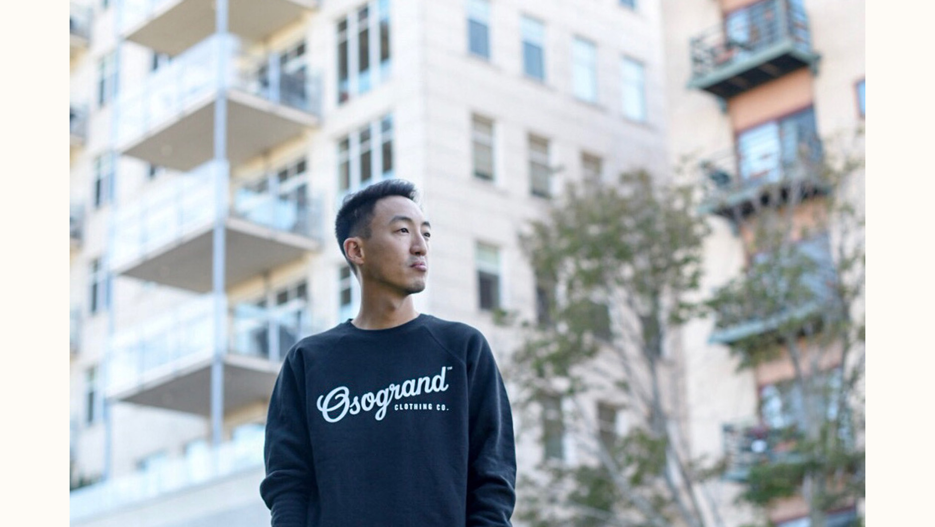
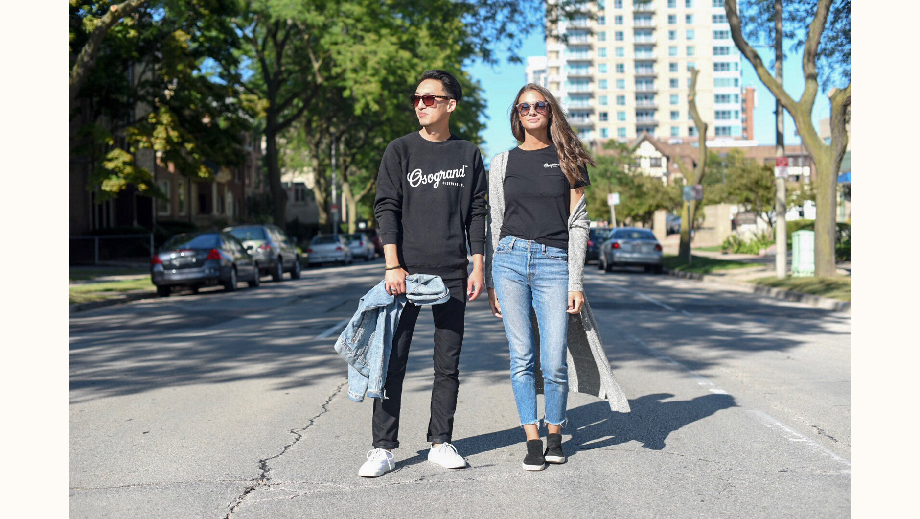
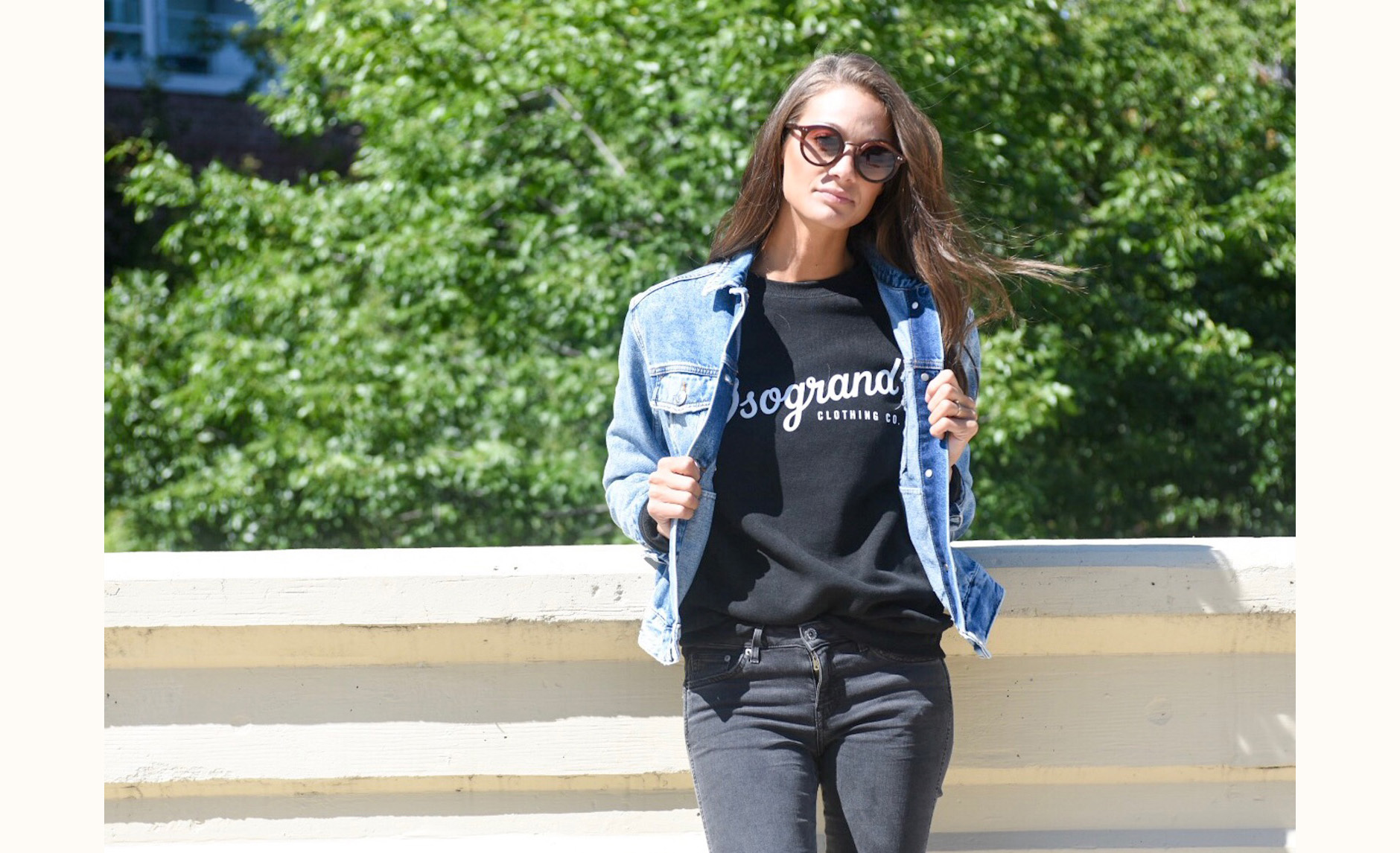
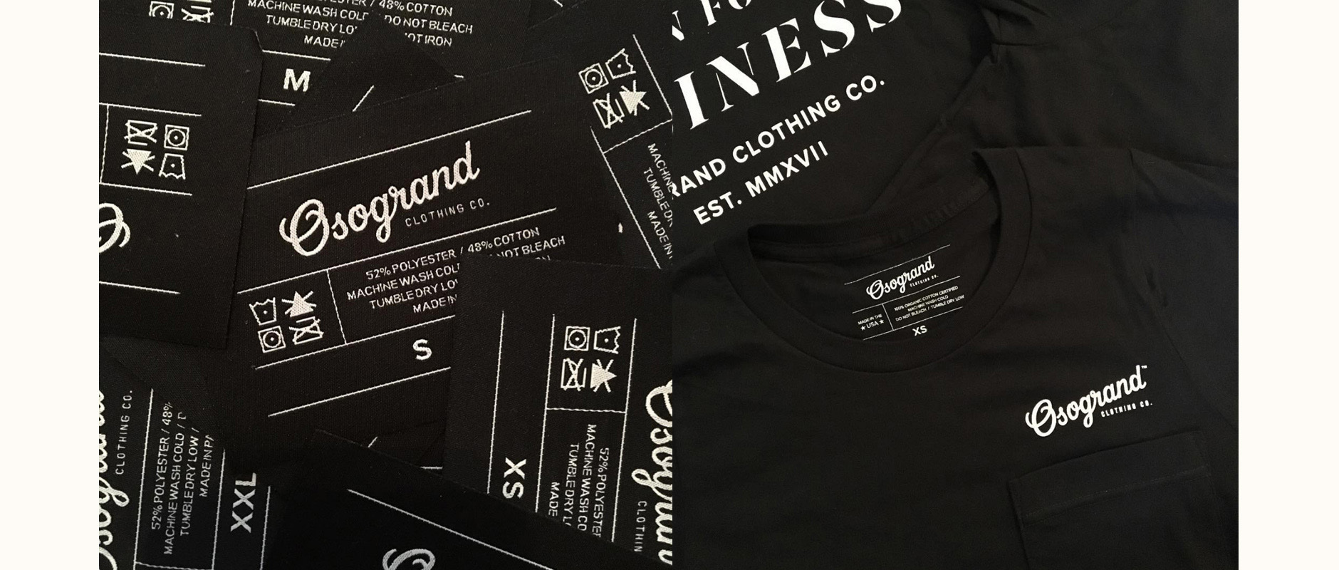
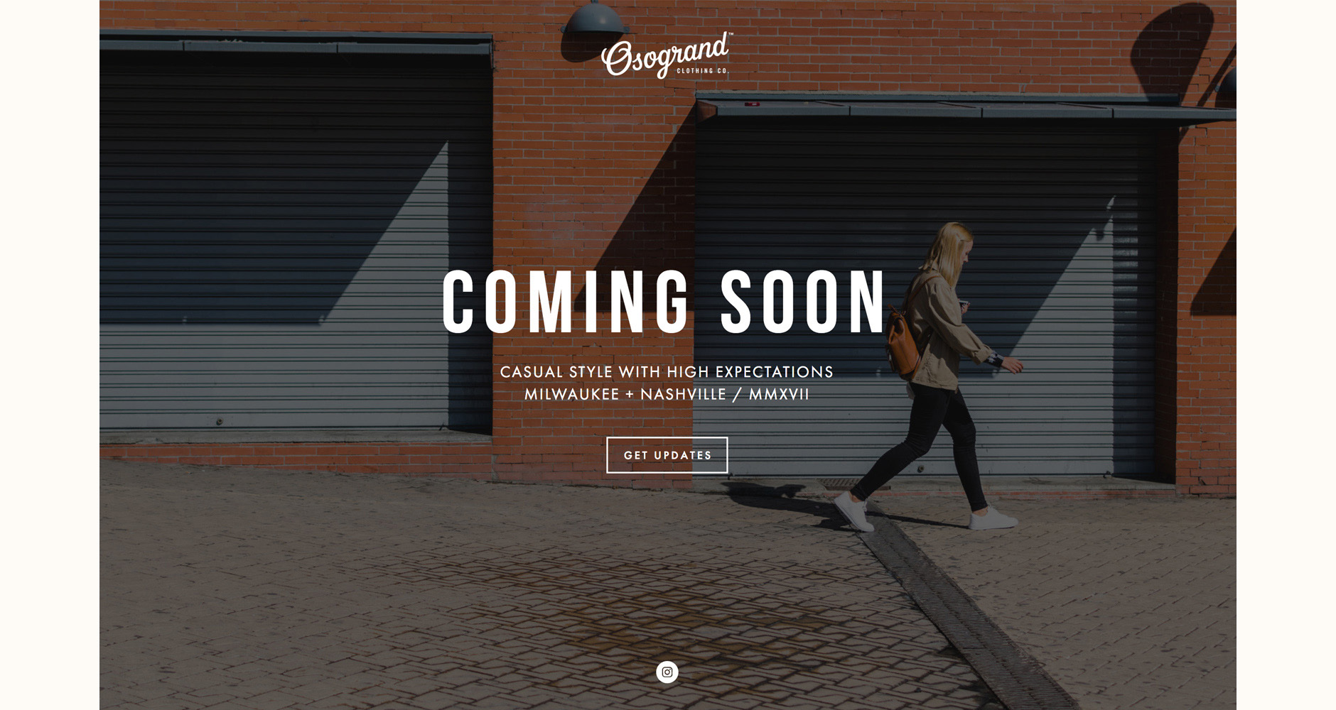
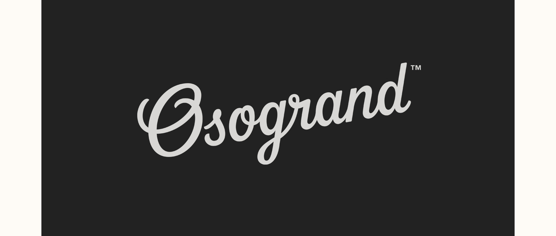
The logo is in use on the Osogrand Clothing Co. logo clothing, tags, website and social media.
