Purple Box
Client: Purple Box
Work done: Logo-type design, custom lettering, brand identity, print & packaging design
Brand Identity & Collateral
Purple Box is an upcoming subscription service based in Singapore that sends beauty samples to its members every month. Featuring deluxe brands hand picked by Purple Box specialists, its goal is to allow its customers to discover the best products most suited to them in a fun, easy and cost-effective way. Purple Box were looking for the development of a comprehensive visual branding, including a custom typography logo, supporting graphic elements, print and packaging design.
With the target audience being urban, professional women of a range of ages, the visual style needed to reflect a brand that is contemporary, stylish, confident, intelligent and optimistic with a strong sense of independence and individuality. It was also important to avoid looking girly or overly fancy.
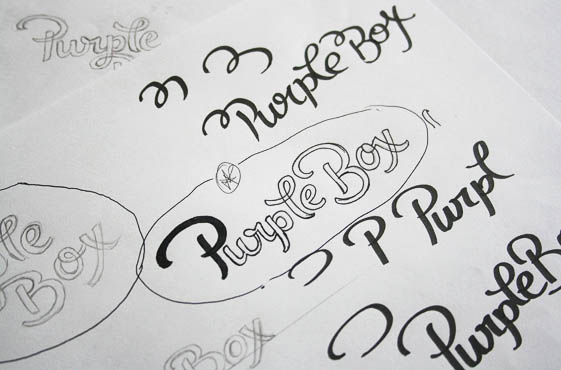
Above: Notes and rough idea development.
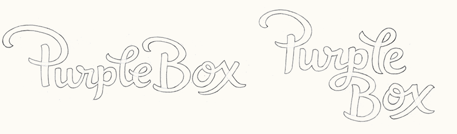
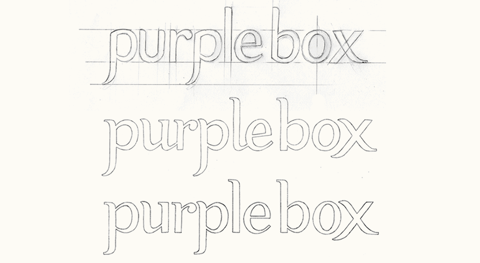
First Ideas
The first set of concepts I focused on was an upright script to create a stylish, modern and confident look without being too fancy or pretentious. The subtle brush style strokes and the baseline variations highlight the visual aspect of the words. I looked at ways to bring in unique details through specific letters pairs, such as 'o-x', as well as a strong balance across the design by maintaining similar shapes.
Above: Two composition variations for the first concept.
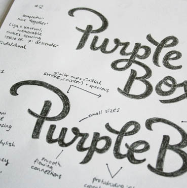
Further Development
Whilst visually interesting, the resulting designs were too youthful and casual to fully suit the target audience. Furthermore, it needed to be more sophisticated to accurately reflect the high end brands and deluxe samples included in the box. To better appeal to this sense of luxury and the intended target customers, I moved onto a more simple, clean and elegant style with a flat baseline to reflect a fresh, aspiring aesthetic. Straight, upright strokes impart a more structured feel and smooth, slow curves enhance the impression of elegance in a subtle way. A single case setting also helps to achieve a stronger sense of balance. I started looking at bringing in serifs and how to combine then with more organic curves in order to avoid appearing too classic.
Above: Progressive building of a single case design.
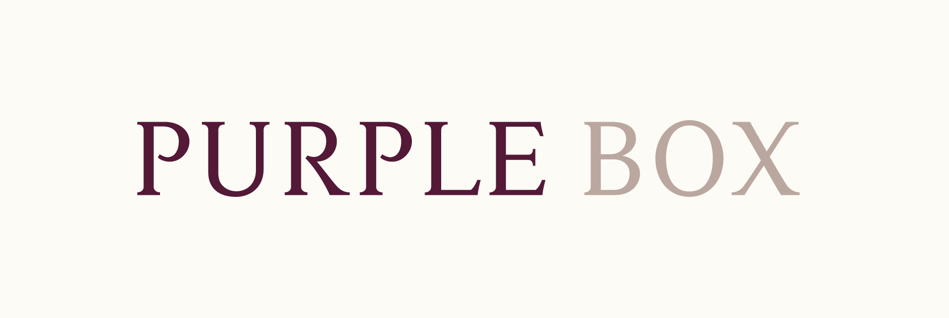
Final Concept
With the concepts moving in the right direction, we starting exploring all uppercase as an alternative, inspired by luxury fashion, beauty and hotel brands. The idea was simple, light lettering with a spacious, fresh and refined feel that featured discreet but recognisable details throughout.
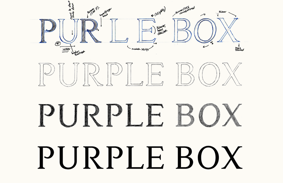
Above: Development of an all caps serif, from rough sketch to digital.
Refining & Finalising
Due to the style of the lettering and the intended look, quite a lot of refining was needed, as much with the individual letters as with the words as a whole. The loose spacing combined with the weight of the lines conveys an overall calm, fresh and contemporary appearance. The space between the two words is wide enough to clearly differentiate betweeen the two (a distinction which can also be enhanced through the use of colour), whilst not being so far apart as to create too much of a distracting gap within the main shape of the logo.
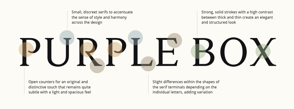
Above: Discussing the typographic details while refining the logo, always keeping in mind the brand goals, positioning and tone.
Colour Palette
The colour palette is an integral aspect of the Purple Box branding. The objective was to use the fact that purple is directly referenced in the company name to make the colour as recognizable as the brand itself. One concern was to make sure the resulting palette avoided looking too youthful or girly and that the main colour could be used to cover large areas without looking too bright or 'cute'.
With reference images including fruits like grapes and plums, I explored various deep, rich shades of purple all with different tones: blues, reds, browns... I was looking for something that had an immediate stylish and luxurious quality that while not too bright, was also quite dramatic. As supplementary colours, I wanted a light colour that could work as a background and an intermediate that could be used to differentiate the two words in the name. The final palette uses a dark, striking purple and two lighter tones that both have a warm, softer feel to compliment the primary colour.
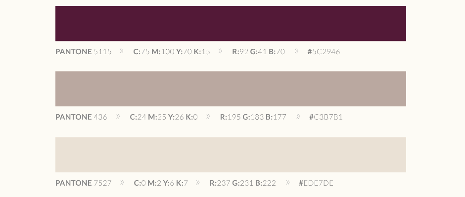
Above: Final colour swatches ensuring consistency across all applications.
Typography
The principal accompanying typeface needed to compliment the lettering of the logo as well as the company vision. In terms of functionality, it needed to work well both in print and on screen as well as at small sizes on business cards, etc. so I was specifically looking for an extensive font family with a range of styles. As the logo itself is typographical, I also wanted to avoid having to bring in different typefaces for headlines and body text so I looked for something that could work for both, while remaining visually interesting.
After looking at a number of options, the final choice was the Lato family by type designer Łukasz Dziedzic. It creates a nice contrast with the serif font of the logo and as a spacious, humanist sans serif typeface, it has a clean, contemporary and elegant feel which accentuates the overall branding. It also functions well for setting different types of text as it is discreet and unobtrusive at text sizes while also having distinctive details that become apparent when set in larger sizes and in different styles.
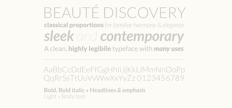
Above: Accompanying brand typeface.
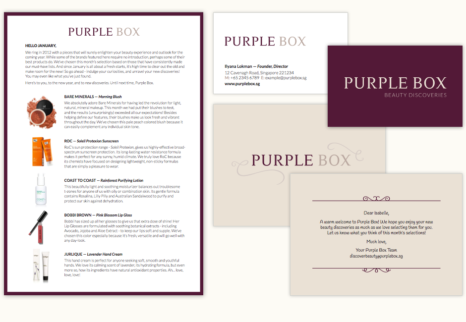
Brand Applications
With the main elements finalised, I developped the collateral materials and some additional elements to extend the branding. Starting with business cards, the work then involved the box packaging, including circular stickers and recommendations for inside packing materials, a welcome card in postcard format to be included in each box and an A5 double sided brochure.
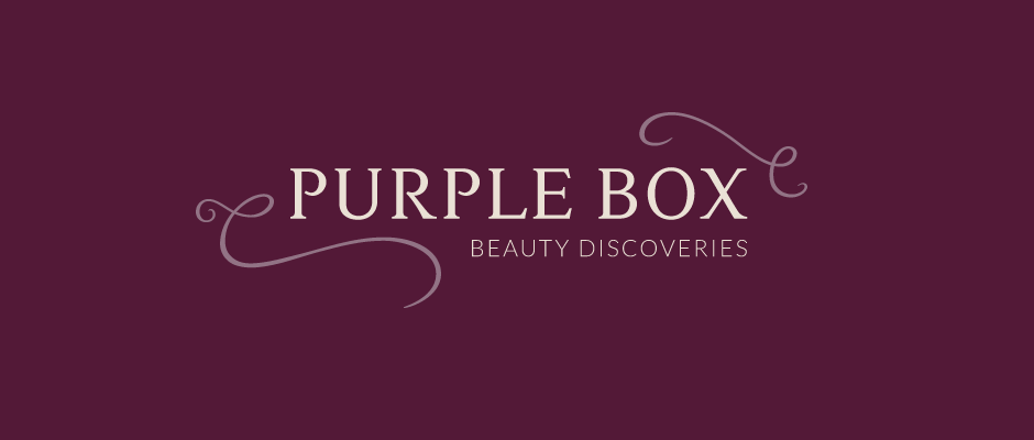
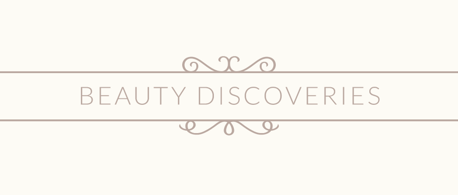
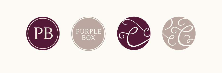
In keeping with the overall typographic approach, I designed some simple ornamental shapes to enhance the versatility of the brand. Inspired by typographic swashes, the two main shapes featured on the cover of the box help to enclose the name and tagline in a way that remains light, clean and airy. The secondary shape is a set of horizontal divider lines with some ornamental curves at the top and bottom inspired by decorative features and ornaments in serif typefaces.
The layout design of the brochure and welcome card needed to work as a template that could be easily updated monthly for varying amounts of information. Purple Box were also looking for a welcome card reminiscent of hand written notes, so the font Handlee by type designer Joe Prince was chosen to convey a friendly and personal touch. The rhythm and variations in the letterforms give the font an organic, personal quality whilst its overall spacious and clean nature fits the company's visual style.