Routes of Hope

Client: Tierra L. Dobry Foundation
Work done: Logo-type design, custom lettering, visual identity, pattern design
August 2011
Logotype and supporting materials for Routes of Hope, a fund-raising 5K race for a non profit organisation, the Tierra L. Dobry Foundation. The organisation was looking for some custom typography for the event name that would compliment the classic approach of their logo. The design needed to be inviting and compassionate, while remaining easily legible. Another requirement was that a small tag line could fit in somewhere near the bottom of the composition.
Once I had a good idea of the general style I was aiming for, I started directly with idea development - something calligraphic/script inspired, quite elegant but with a friendly feel. At this stage, I used a Pentel brush pen to allow the flow and dynamics to develop organically and also get good sense of where the stroke contrast naturally appears. From these early stages, I focused on the specific goals of the client and ways in which to bring in some of the key characteristics into the letterforms. With this project, I was going for an uplifting, positive feel so I played with softly rounded curves and a subtle upwards slant/direction.
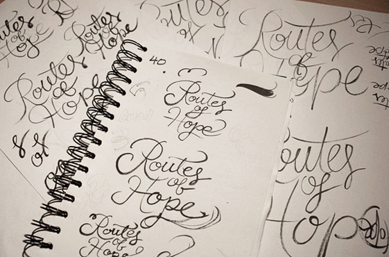
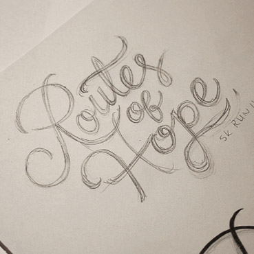
Above: Messy early drafts and the beginnings of the more refined concept.
Development
With an overall idea established, I moved onto pencil, loosely working from rough traces of the brush versions to maintain the same dynamics. Doing multiple pencil drawings, I tested different ideas and shapes for details like crossbars, swashes and the ends of strokes and considered how they affected the overall look and impression.
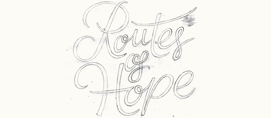
Above: Last outline pencil sketch before being digitised.
Testing & Refining
With a relatively neat sketch, the digital version was then created and refined accordingly: adjusting slants of individual letters, fixing inconsistent letter widths, irregular curves, kerning, positioning, etc. I also changed the ‘p’ as the idea I’d had in the original sketch looked out of place with the rest of the letters.
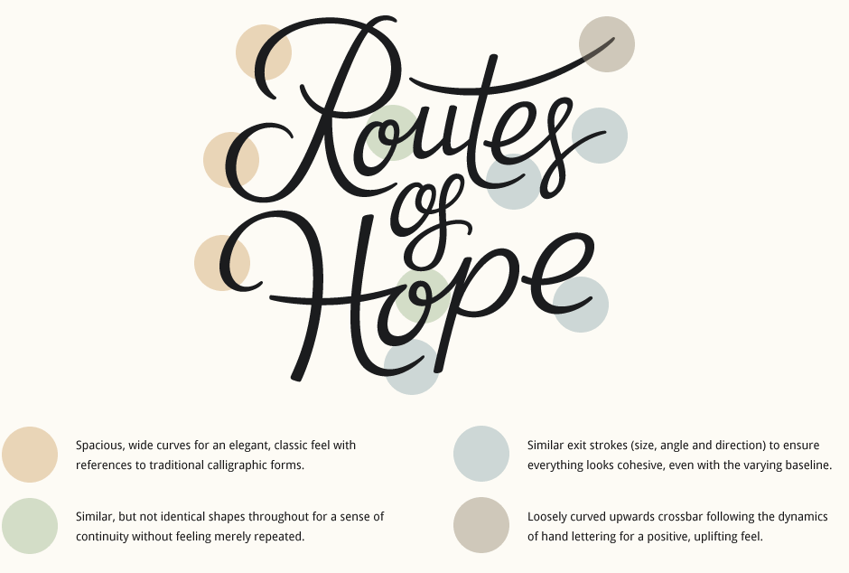
Final Logo
With the 'of' nestled in between the two main words, the final composition aims to create a relatively tightly knit piece that retains a natural, organic feel. The full colour scheme and further applications (signage, shirts, etc.) were developed by the organisation for the first event that took place in November 2011. Photographs below and more information for the upcoming October 2012 race can be found on the Tierra L. Dobry Foundation website.
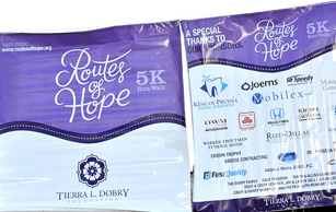
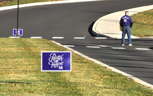
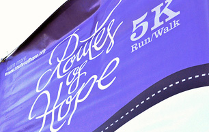
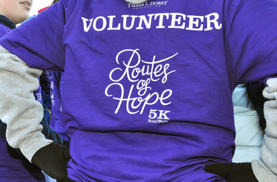
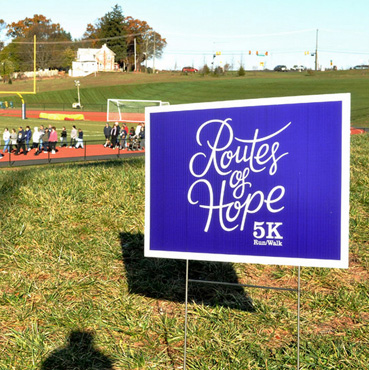
Above: Photographs of the first event, courtesy of the TLD foundation.
Supporting Graphics
In December 2011, the client approached me to develop a pattern design to use as part of the branding materials for the overall project. It was to incorporate various elements (a particular flower design and hearts as leaves) and needed to look cohesive with the Routes of Hope typography.
Starting with some research, I looked at different patterns from a myriad of sources: wallpaper, fabric, packaging, stationery, plates.. It was important that the main shape worked as well by itself as repeated and look natural in both situations. For the vine, I first drew the shapes using a brush pen as I had done with the lettering. This gave me a similar line quality, in terms of form, width and contrast. Once the ideas were narrowed down to a few designs, I brought the inked drafts into Photoshop to test them as patterns.
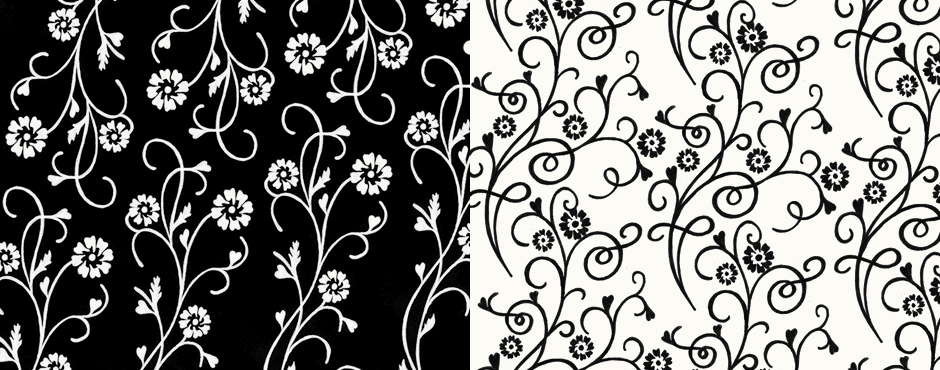
Above: Scans of the inked pattern, tested digitally across wider areas.
Vectoring & Refining
After some discussions with the client, revisions focused on creating a new shape for the flower while maintaining the symbolic elements that needed to be included. We also looked at how to better incorporate the hearts so that they felt more organic, re-drawing them individually so that each one flowed better next to its stem. When creating the digital version, I started with the vine first and refined its curves before moving on to the separate elements.
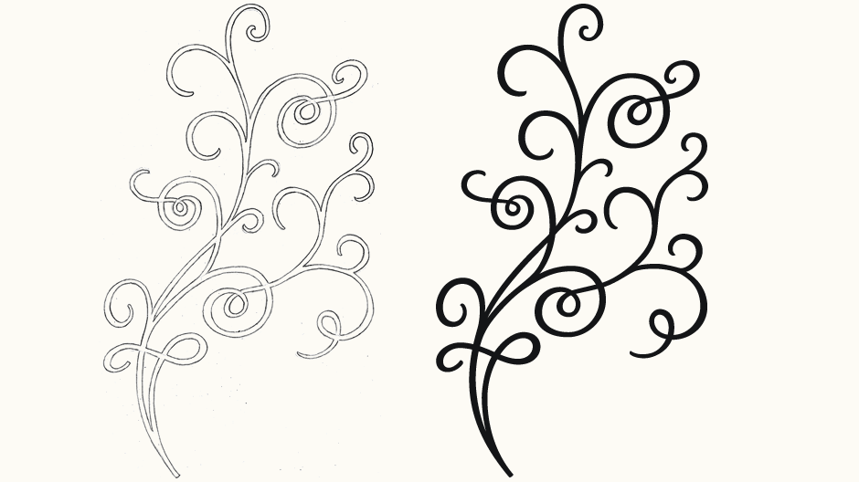
Above: Sketch of the single vine alongside its digital counterpart.
Final Design
The final pattern using the main branding colour scheme acts as a background to the logotype as well as other applications, both with additional elements and as a stand alone graphic.
Jerod Dobry, Brand Consultant:
The process was as smooth as her design - finalized with a work of art that help to beautify our 5K race and supporting materials! Claire does an outstanding job as always with designs that uplift!
