Runrun.it
Client: Runrun.it
Work done: Logotype redesign, custom lettering
Custom Logotype
Runrun.it is a professional time and task management tool. The logo they were using was typeset in the typeface Lobster and the team was looking for a custom logotype to replace it. We started by talking about the product itself and its audience, as well as the brand perception, values and visual style. To fit the clear organisation, communication and improved efficiency of the app, the logotype needed to have a high quality, fresh, modern feel that is inviting without being too informal.
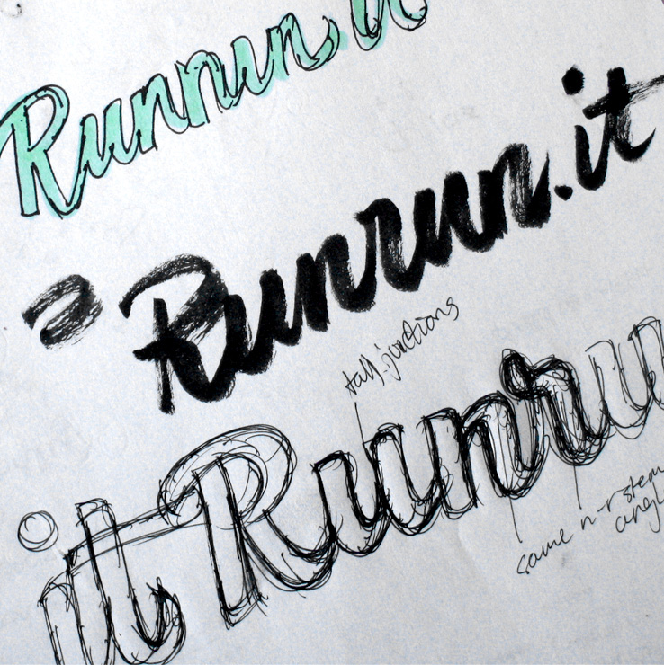
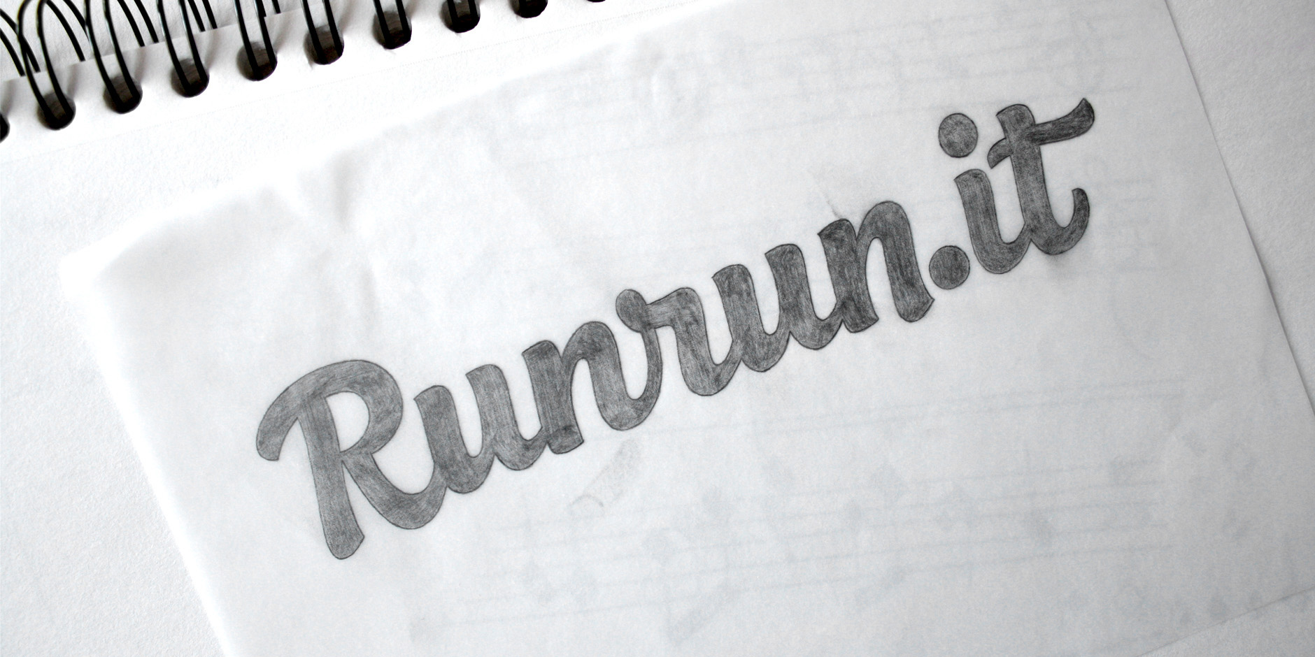
Above: Early draft sketches and ideas.
Logotype Study
I also did a review of the current logo, looking at what kind of features it had and what issues that could be addressed. Here, I started narrowing down ideas for the 2 concept proposals that we were going to explore: one that would be an evolution of the current logo and the other that would be more of a departure from it.
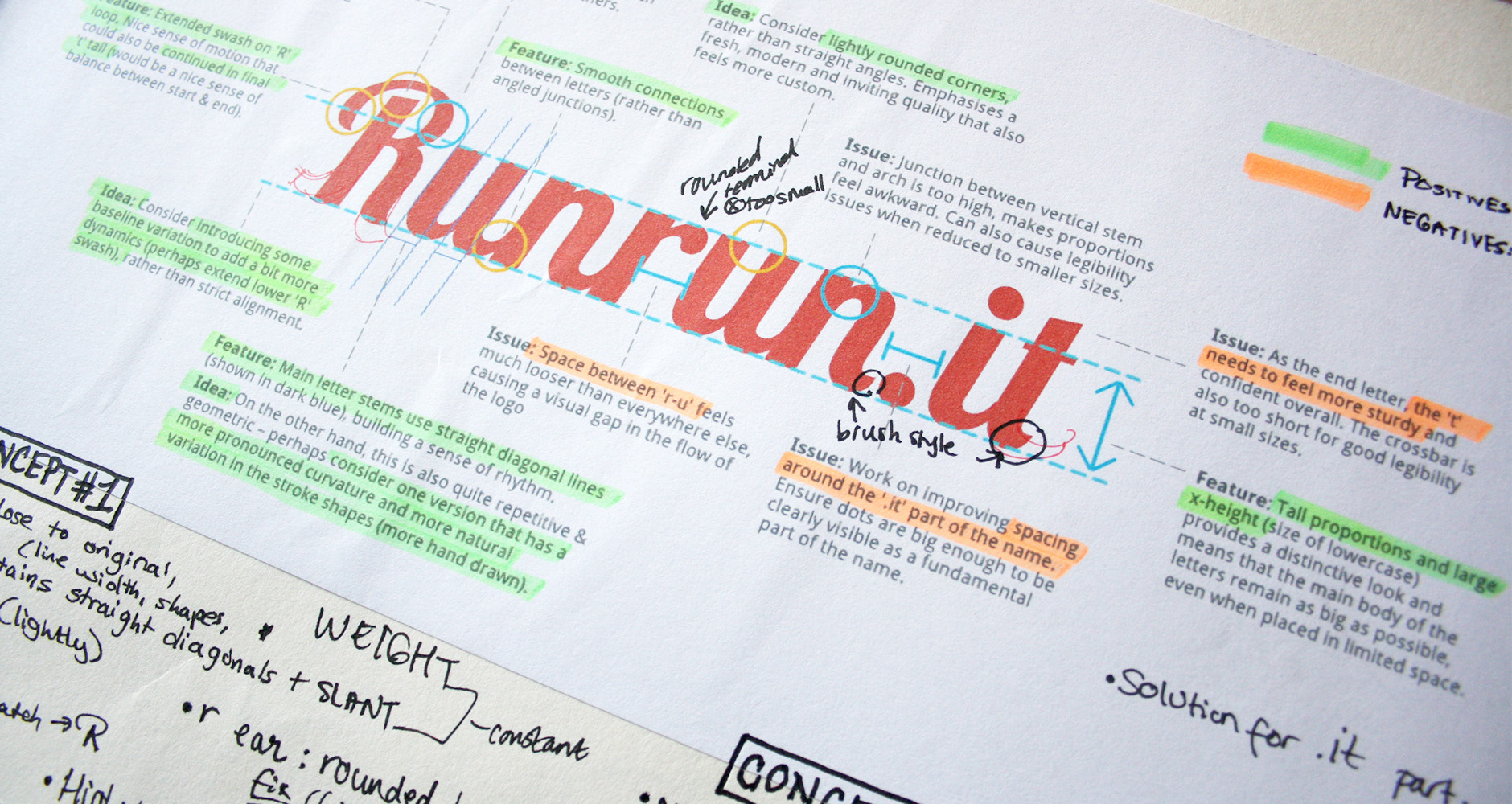
Above: Critique and thoughts on the original logo.
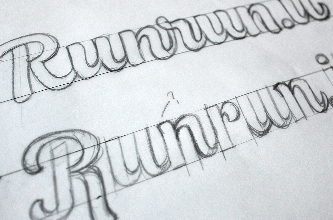
Final Sketch
The first concept (below, top) was the one that stayed closest to the original logo. It has a similar rhythm and consistency, but with more confortable proportions, more moderate contrast appropriate for a logo, softer angles and edges, etc. The second design (below, bottom) is a more flowing, organic style with more curvature in its stems and a more pronounced brush style.
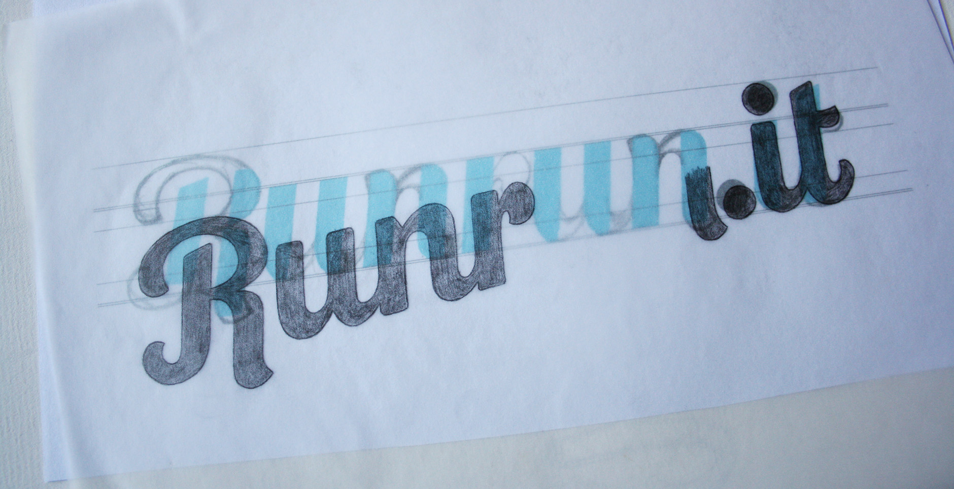
Above: Working on the concept sketches.
Digital Version
We quickly decided to move in the new direction, away from the previous logo. Main points of consideration focused on the 'R' and thinking of ways to make a little more distinct and then toning down the 't' swash to balance it out. New ideas included bringing in the 'R' idea from the first concept as well as separating it to see if it would help it stand out more.
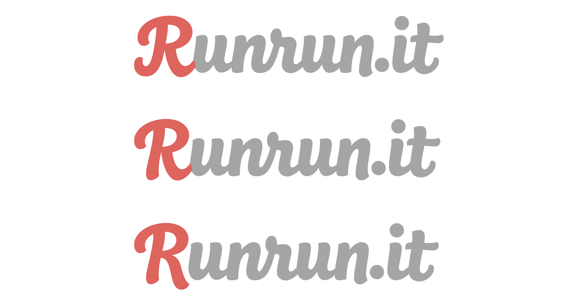
Above: Exploring different ideas for the 'R'.
'R' Icon Version
The final 'R' has a lightly extended right swash and dips below the baseline for a little extra prominence. I also spent some time working on the legibility of the 'r', in particular, playing with the size and shape of the closed loop as well as the angle of its junction to the following letter.
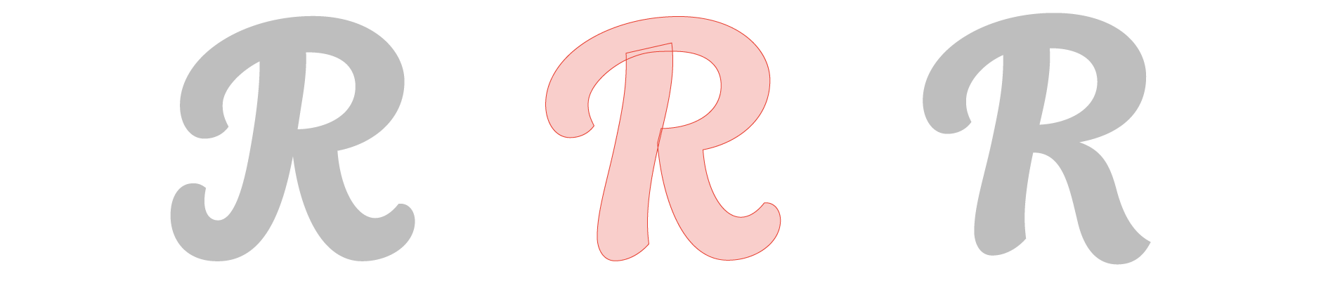
Above: Close-up of the vector shape construction.
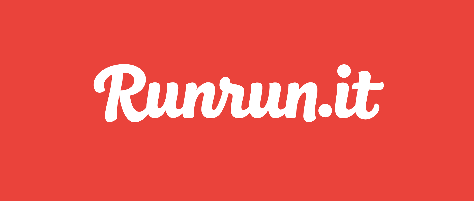
Final Logo
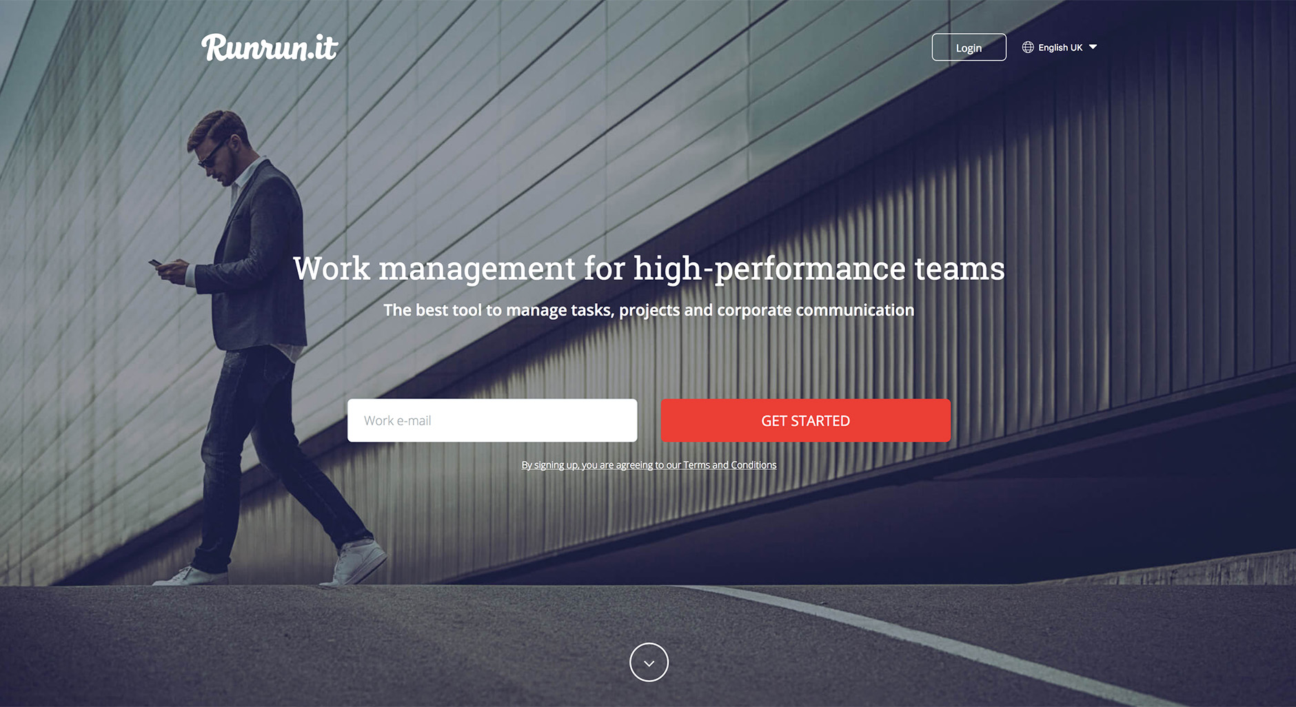
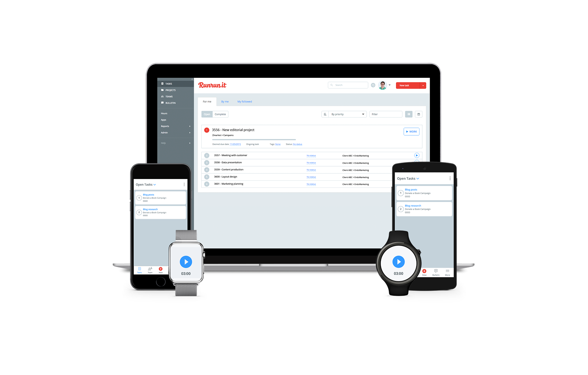
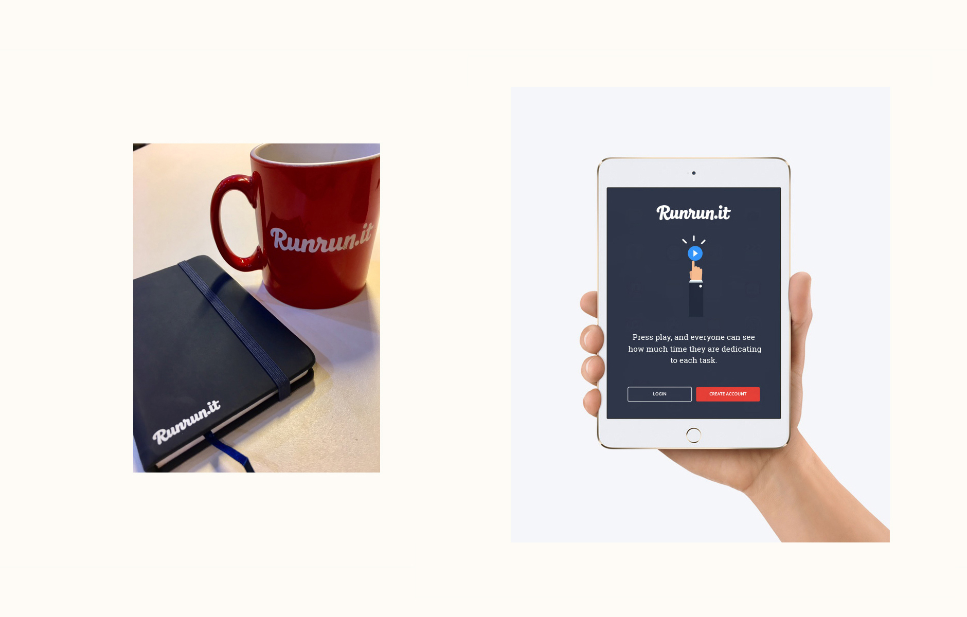
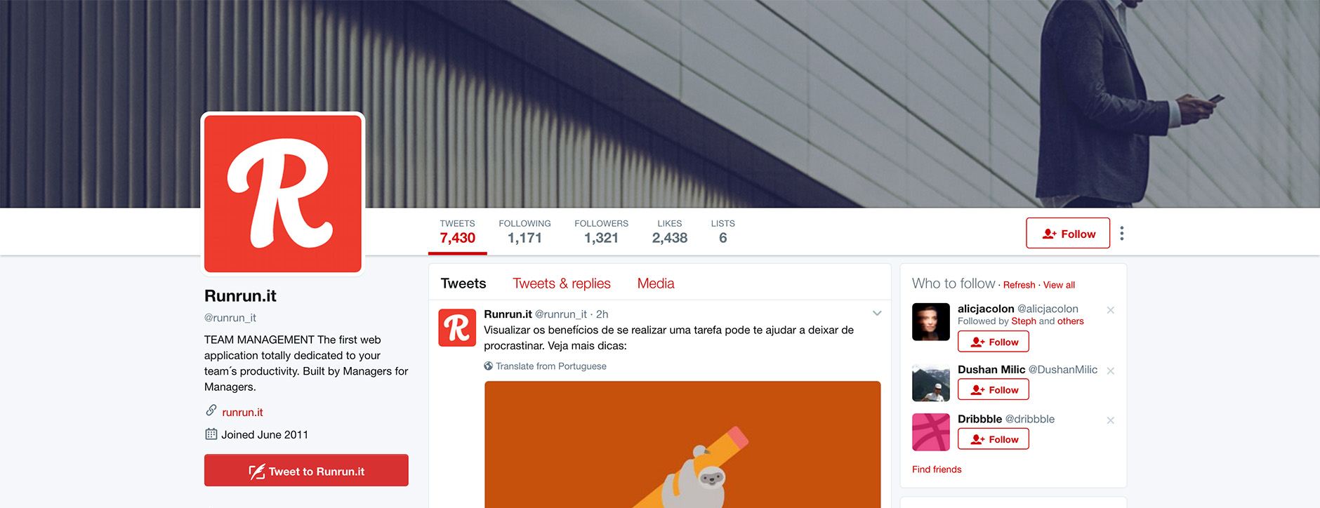
Below are some images of the logotype in use on the Runrun.it website and product. App design by Kaique Amorim.
Franklin Valadares, co-founder of Runrun.it:
“We found Claire on the Dribbble website and her work was exactly what we were looking for. We needed a typography specialist, an artist that could bring our branding values to reflect into our logo. The workflow was efficient, thoughtful and very professional. We're very happy with the final result and pleased to meet Claire for this job.”