SellSimple
Client: SellSimple
Work done: Logo-type design, custom lettering
Custom Logo-type
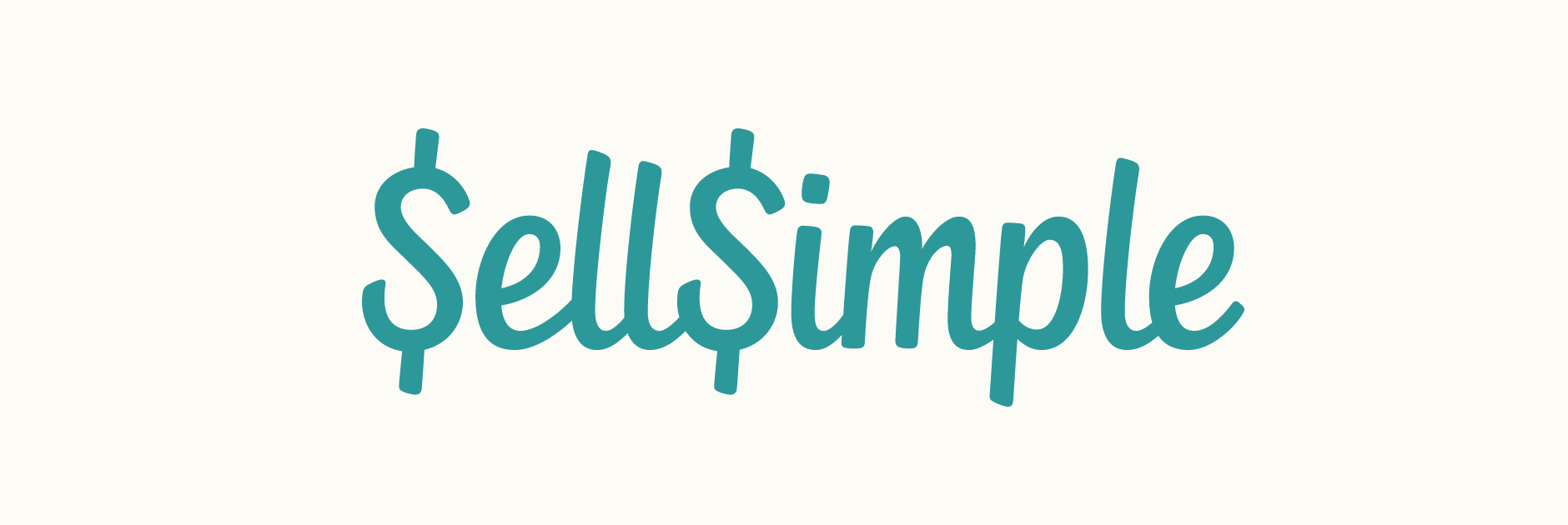
Custom typography logo design for SellSimple, a new web and mobile platform allowing you to easily sell and buy items in a simple, hassle-free way. The team were looking for a recognisable but clean script that would be very readable at small sizes as the mobile application was to be one of the primary uses. The S was to double as a $ sign and also function as the icon.
After roughly drawing out the words using a couple of different pens, I settled on a heavy brush tip marker as it formed a quite dynamic overall look. Keeping in mind the intended use, I kept quite a compact, very 'together' logo shape from the very beginning, as this would make it easier to place inside limited spaces (like the iPhone application header). The capital and ascender height don't extend too far past the lower case letters and the x-height is quite tall, preventing the letters from appearing too small or squished even when scaled down significantly.
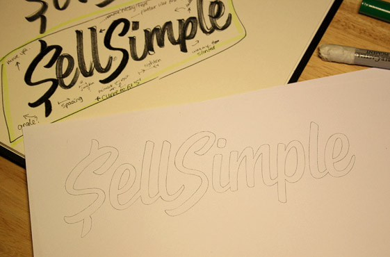
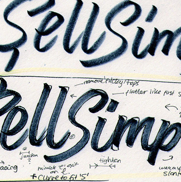
Above: Some of the marker drafts along with the initial pencil design.
Sketch & Revisions
The first version accentuated the custom drawn nature of the design through its individually designed letters across repeated characters (notably the 'S') and a distinctive connection between both words. Revisions focused on making both 'S's identical so that the icon could feature both initials and giving them a more vertically symmetrical shape. Consequently, the overall angle of the other letters was also adjusted to be more upright to match.
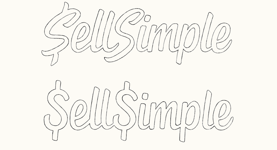
Above: Changes made from the first iteration to the revised concept.
Digital Version
With the revised sketch approved, vectoring was the next step. Adjusting the letters to relatively strict guidelines helped to accent a quite clean and balanced overall design that would remain clear and neat, even at widths below 100 pixels.
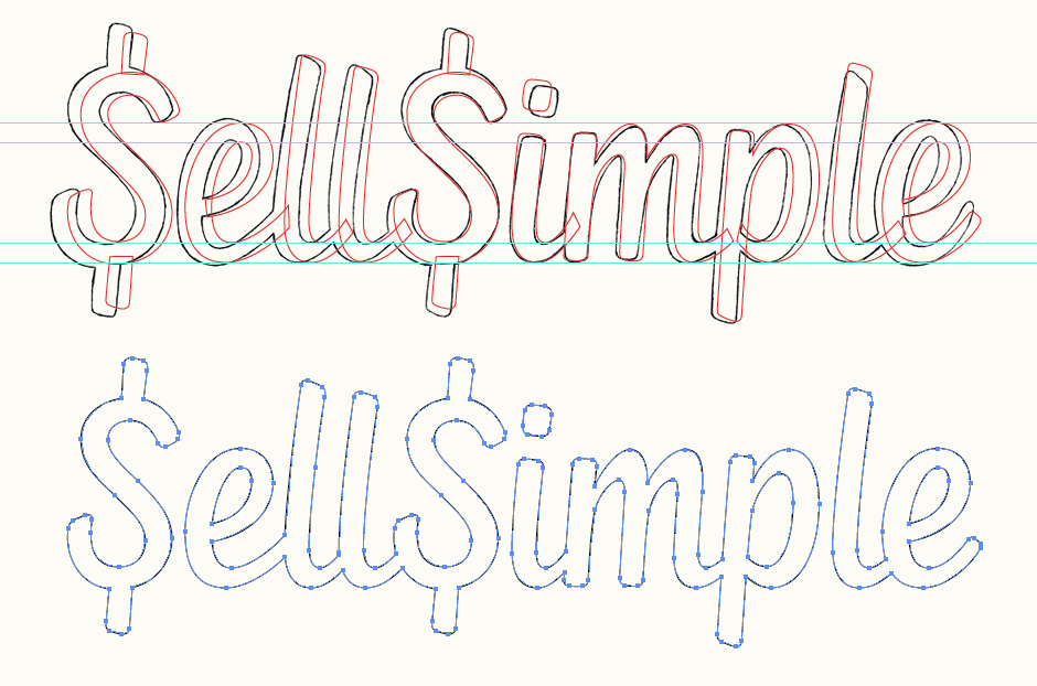
Above: Screenshots of the final sketch with the vectored outline and anchor point placement.
Icon Adaptation
When drawing the sketch, I had tested the 'S' pair to make certain that they would fit next to each other well and that the lower left curve wouldn't extend too far, potentially forcing a much wider gap between the top parts. The lightly rounded edges of the container square mirror the subtle rounded edges of the lettering.

Above: Progression of the double 'S' icon, from sketch form (far left) through to digital colour variations.
Final Logo
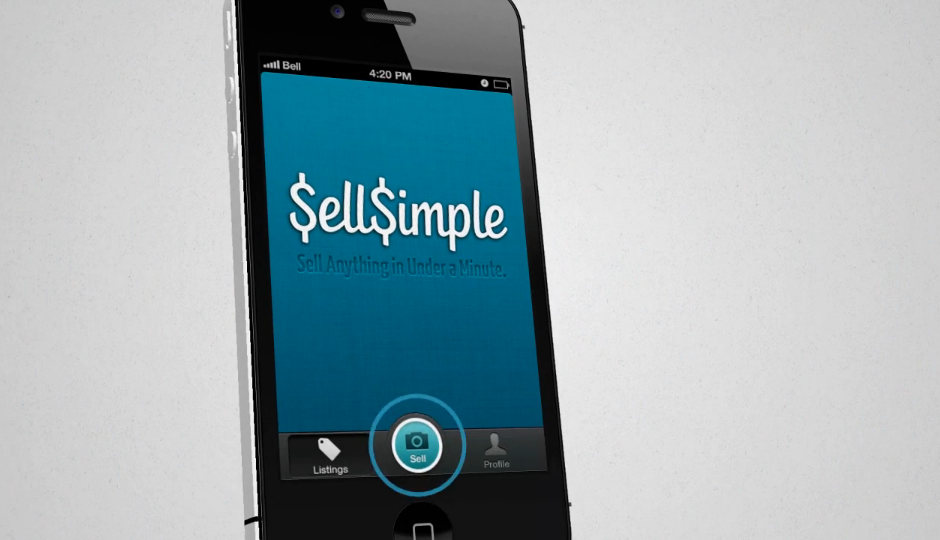
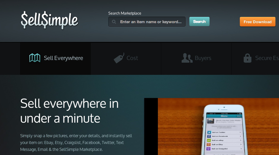
We also created two stylised versions of logo to emphasise a sense of coherence with the interface design in terms of visual treatment. Shown in use below in a screenshot of the SellSimple commercial and on the company website. All video and website work by the SellSimple team.

