Shopcaster

Client: Shopcaster
Work done: Logo-type design, custom lettering, colour exploration
Custom Logo-type
Custom typography script logo for Shopcaster, a Toronto-based online retail platform. For people who prefer to shop at local and independent retailers, Shopcaster allows sellers to easily show and sell their best products online. The company was interested in a re-design their logo as part of a new website launch and were looking for a custom lettered script that would appeal to a wide demographic. It was also important that the logo had its own character and hold up well at very small sizes for the website and mobile application header.
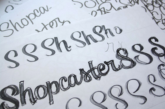
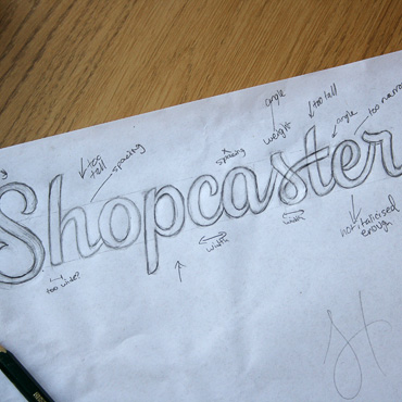
Above: Loosely caputring the gesturual qualities of the letterforms using a wide marker (left) and refining the pencil draft (right).
Rough Draft & Digital
After multiple rough versions using mostly Copic markers, I drew a pencil draft based on the best one, making some quick notes as to some of the major areas to fix digitally. An initial vectoring proved the sketch letters were too light, so I also increased the overall weight. The subtle brush-style stroke terminals (particularly evident on the ‘S’, which also functions as a stand-alone graphic) bring in an organic, friendly touch and unique elements such as the ‘s-t’ ligature add memorable details.


Above: Drawing used as the base for the digital version followed by a screenshot of the progression in FontLab Studio.
Further Development
The subsequent revisions focused on modifying the shape and height of the 'S' as well as adding various styles of 'o-p' links for better flow and similarly, a smoother 't-e' connection. The 'r' was also revised as we looked through a few options.
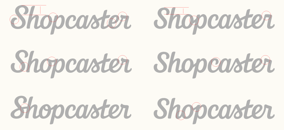
Above: Multiple variations going through and adjusting different details and proportions.
Icon & Colours
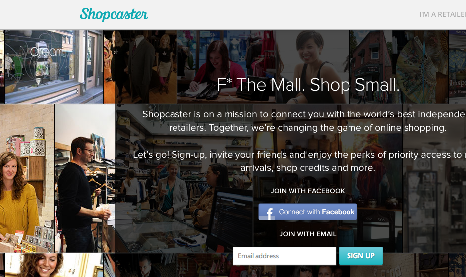
During the development, we also looked at various colour exploration, focusing on soft shades. The 'S' is also used in a circle as the website favicon and social media icon. The final logo can be seen on the Shopcaster website, screenshot shown below. All website work done by the Shopcaster team.
