Spoon

Client: Spoon
Work done: Logotype design, custom lettering, film feature
Custom Logotype
Spoon is an award-winning content agency with offices in Stockholm, Gothenburg, Malmö, Helsinki and Oslo. I worked with them to create a brush-style logotype as part of their re-brand. This was also really exciting as three of the Spoon team came to visit my studio in Bath to film a short documentary about the story behind the logo.
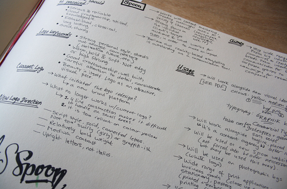
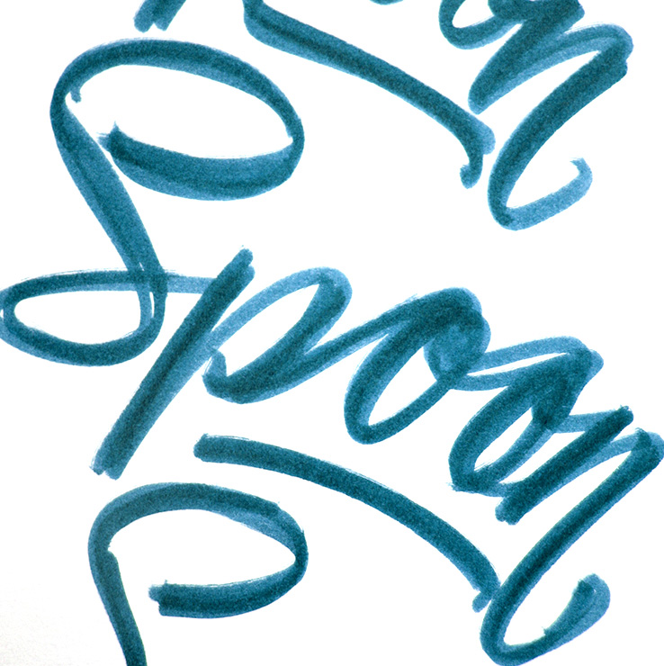
Above: An example of quick, few-second early shapes alongside some planning for the brief.
Concept Sketch Progression
Working from early rough scribbles, I started moving towards a more developed concept. As we had an overall style in mind, the sketch stages were about exploring variations within that and and pinpointing the details that would create the right impression.
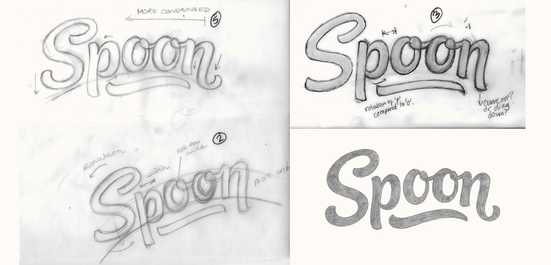
The first concept was a bit too friendly and too soft, due to the quite wide and very rounded nature of the letters. This revision focused on making the design a little more 'edgy', giving the lettering more of a sense of speed/swiftness in how they'd been drawn. I explored a more dramatic baseline, sharper, more condensed letterforms and a slight slant. We also talked about connecting the 'S-p' and the use of a swash to replace the underline.
This was getting closer, but the light italicisation combined with a few of the details (closed 'o' loops and so on) were making it a feel a little too dainty and it was lacking a sense of strength and confidence. The 'n' swash was also clashing with the arch of the baseline and leaving a gap.
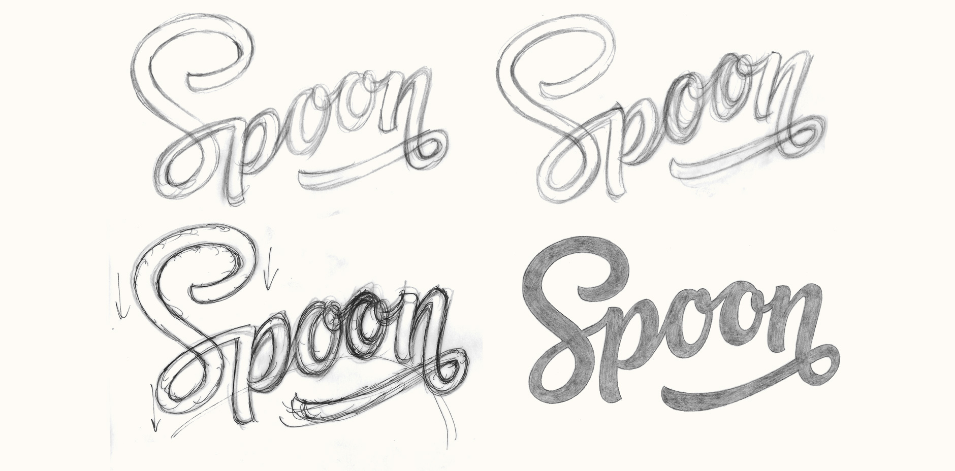
In the last set of exploration sketches below, the letters are more upright, a little bolder and little details have been simplified, like the 'S-p' connecting curve.
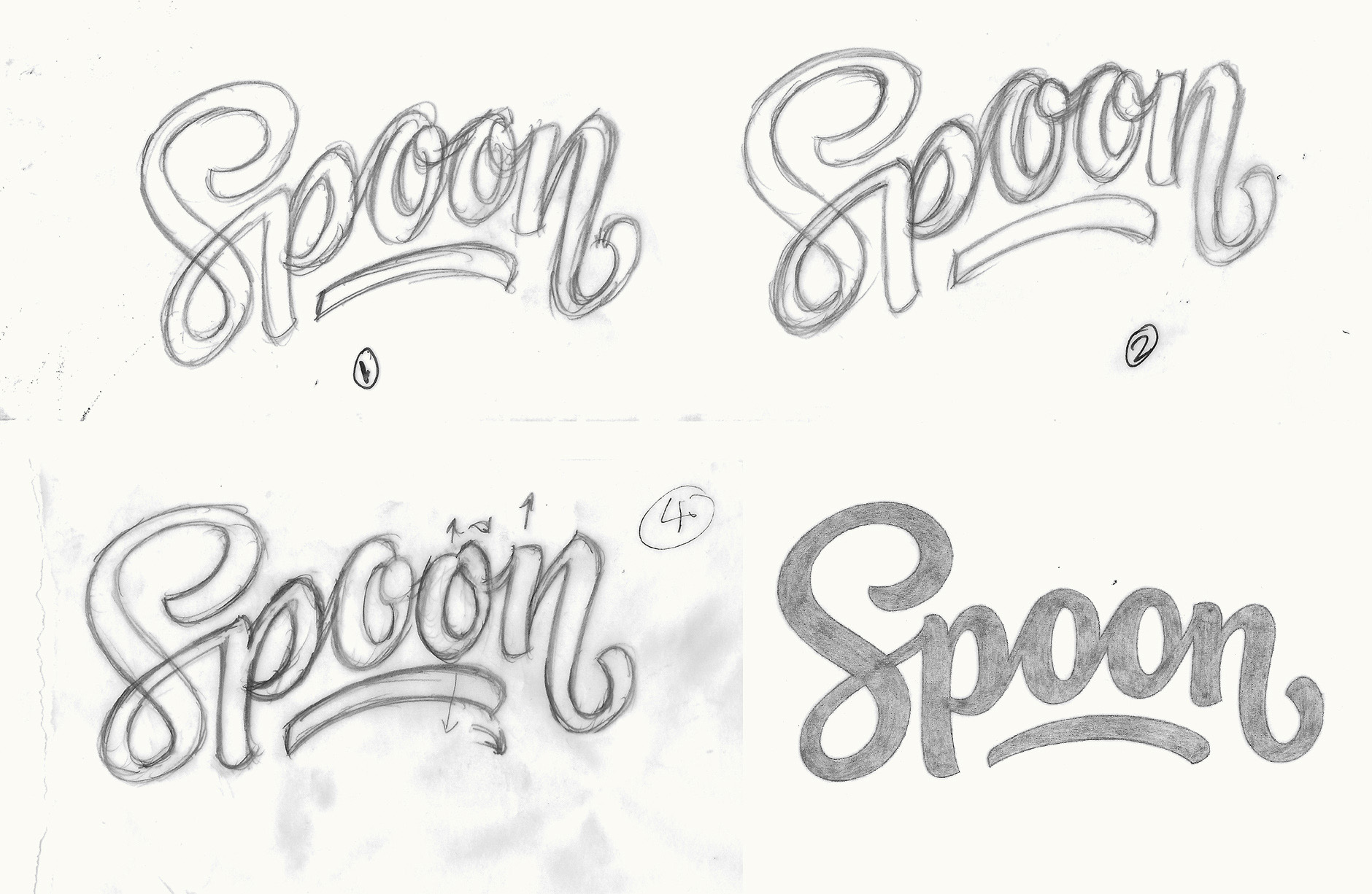
Above: Final sketch before vectoring.
Digitising and Refining
As we felt the last sketch was quite close, I moved onto the digital version and modified a few things from there. We'd removed the closed 'o' connection loops as we'd talked about how they looked like a pair of eyes, but then the double 'o' in the last sketch was a little dull so we brought them back and introduced more size and placement variation instead. The treatment of repeated letters in a custom logotype tends to play a big role, as they can often stand out as too mechanical if they're simply copy and pasted.
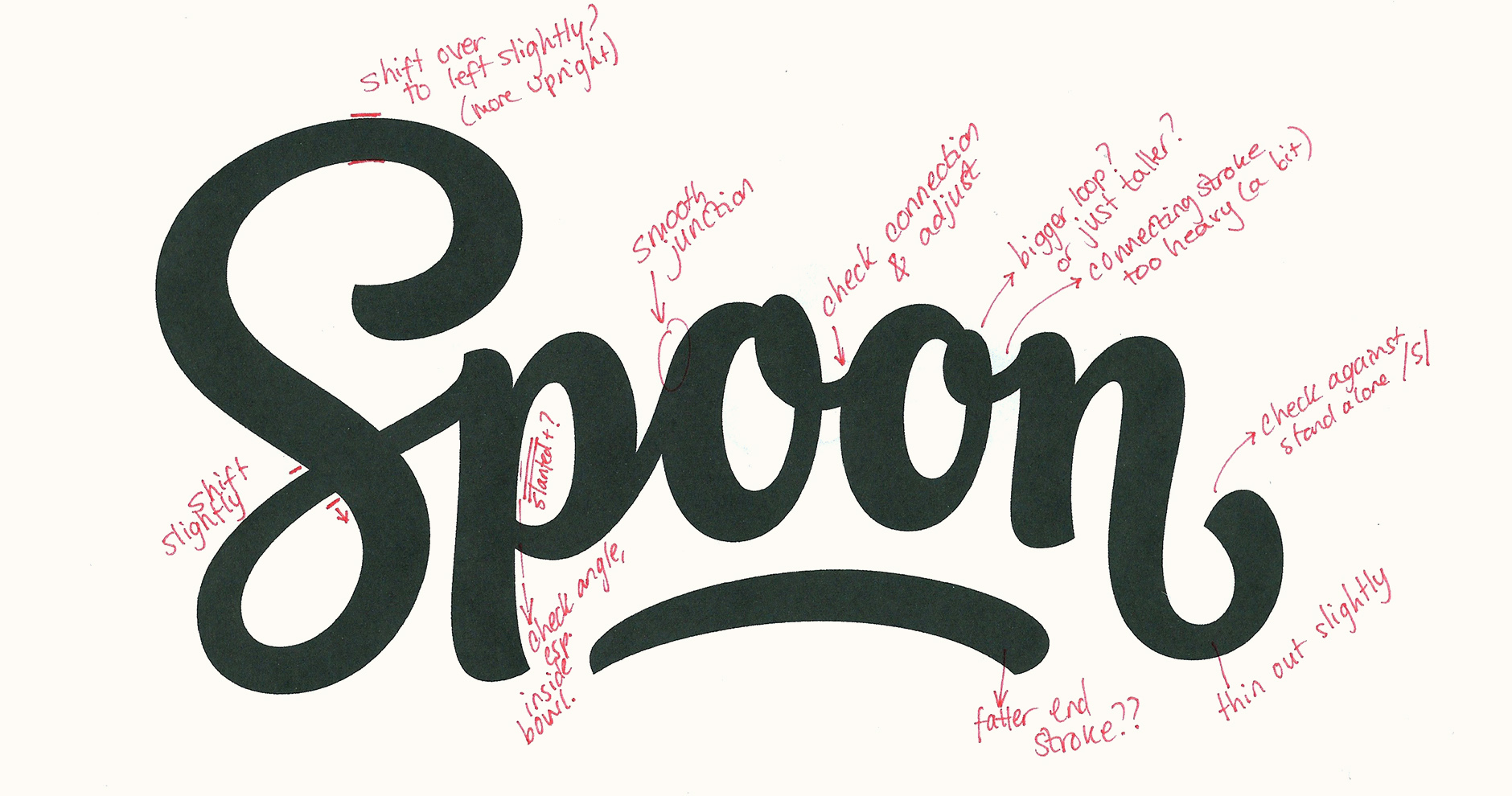
Above:
Icon Version
While working on the details of the lettering, we started looking at an initial letter icon version. Quite quickly we realised it wasn't conveying the same kind of effect as the full logo, as its connection to the 'p' contributed a lot to what was making it unique.
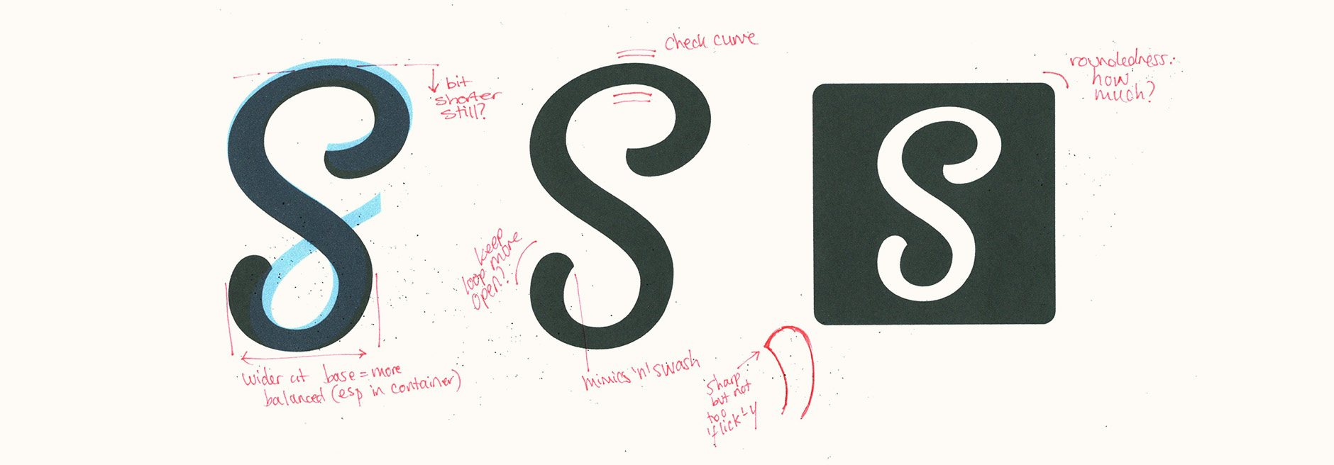
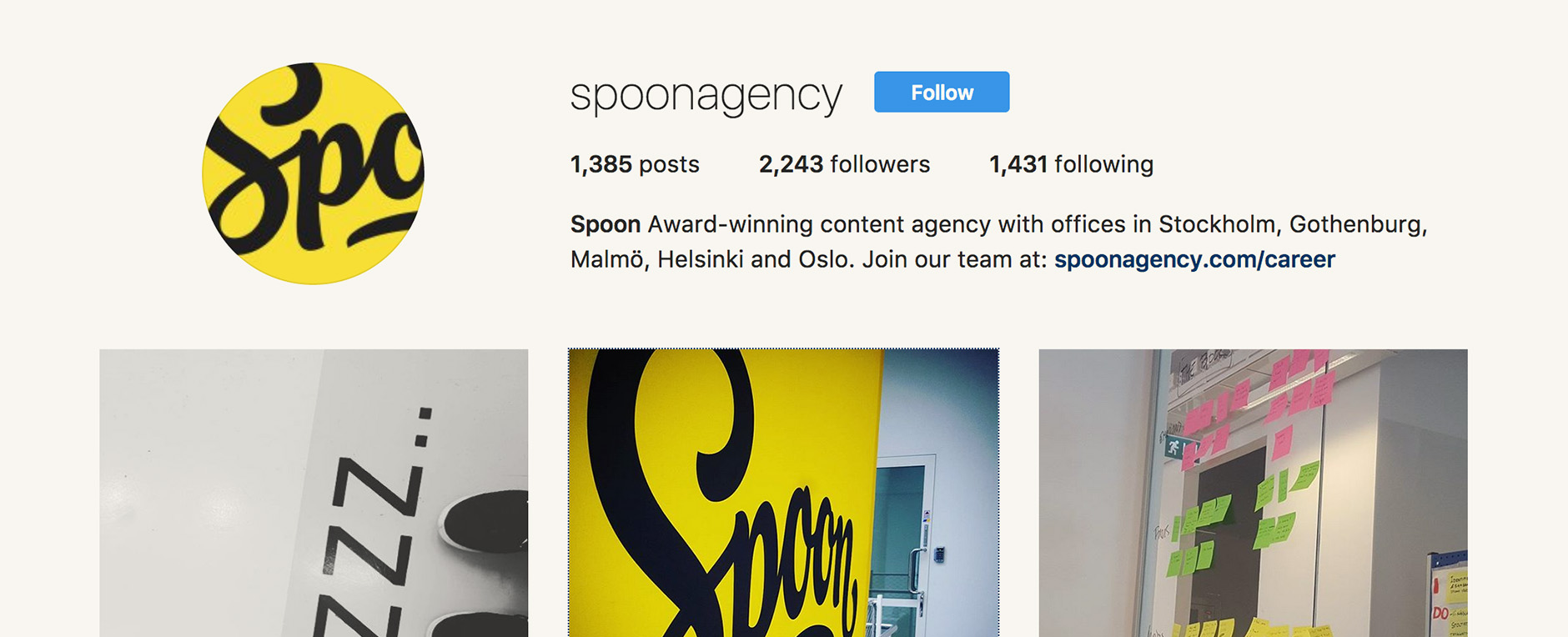
Instead, we opted for an icon that uses a cropped version of the first few letters of the logo, shown below in use on the Spoon Agency Instagram page:
Documentary
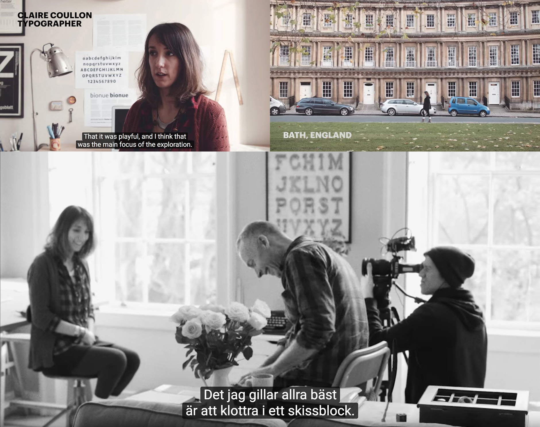
As part of the company's re-branding, Spoon wanted to put together a short documentary on the making of the logotype, the background behind the lettering and my work approach. 3 members of the team came to visit my studio in Bath for the day and we chatted about how I got into lettering, the process we went through, what kind of techniques and tools I use, how ideas emerge and progress, and so on. There's also a second film which focuses on the re-brand from Spoon's perspective, the background they were coming from and their side of the logo process. It was a wonderful way to wrap up the project and a great thing to be a part of!
Final logo
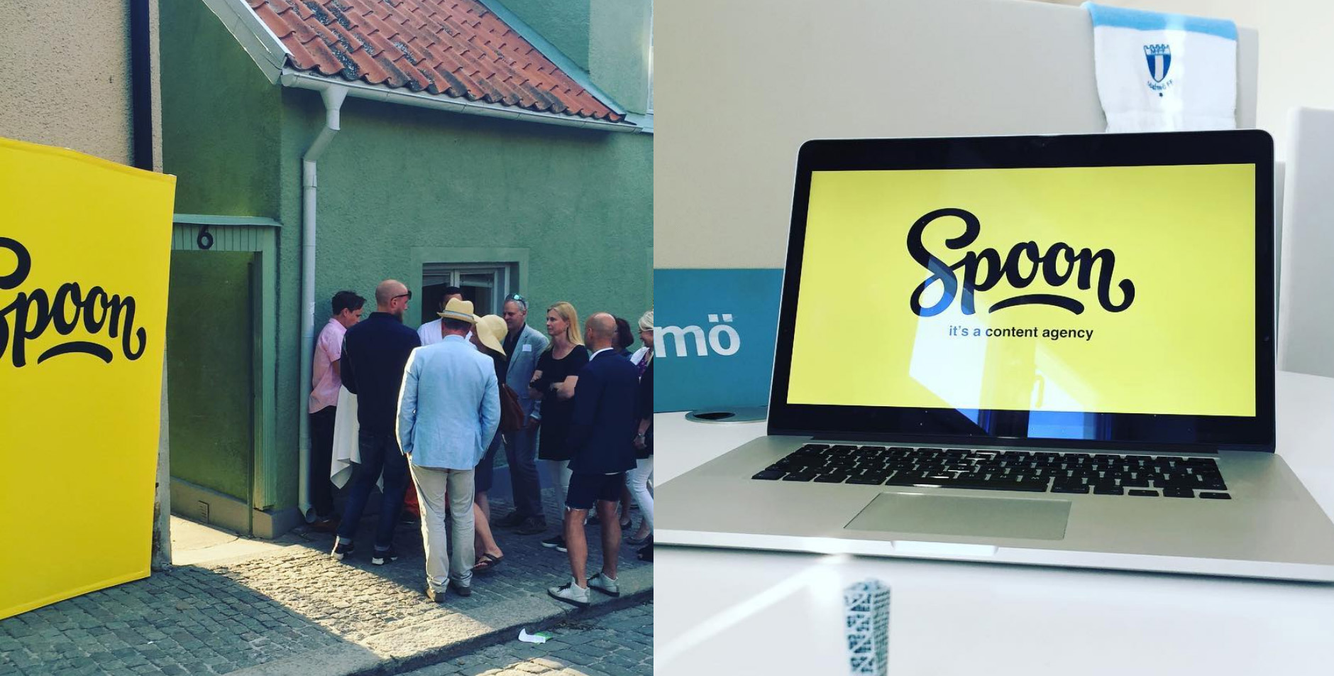
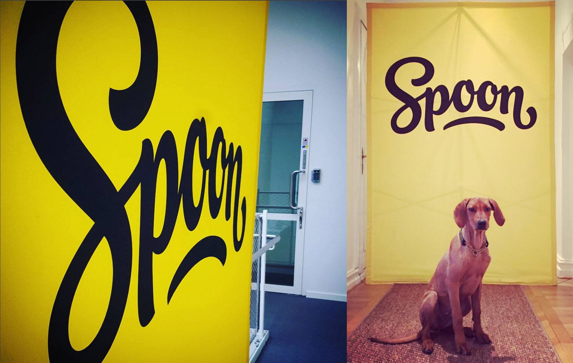
The logo is being used for plenty of fun uses from large-scale wall signage to bean bags to temporary tattoos. Photographs courtesy of the Spoon agency Instagram page.
David Linder, Creative Director at Spoon in Stockholm:
“Claire is an amazing artist with a wonderful craftsmanship and a great and attentive mind for what we were looking for. I have rarely worked with such a thoroughbred professional. The entire working process with Claire has been amazing, fun and very instructive.”
