Success is Sweetest
Client: Success is Sweetest
Work done: Logo-type design, custom lettering, colour exploration, supporting typographic visuals, website conceptualisation and layout design
Logo & Website layout
Success is Sweetest is a career and lifestyle coaching business based in New York City. Run by Janice Hoffmann, Success is Sweetest works with clients across a range of areas: creative, business, personal, etc. The goal for the new logo and website re-design was something different that would reflect the distinctive nature of Success is Sweetest and its clients.
In terms of visual style, the aim was to combine a sketchy, raw materials inspired feel with a bold & urban one. Including a touch of magic was an important element to consider, too. The client was interested in a typographic logo, so I used that as a starting point from which to develop the rest of the visual design.
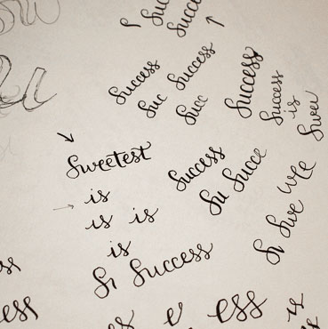
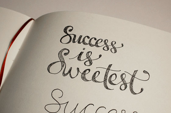
Above: Small ink drawings done with a quill followed by development with a regular pen.
Developing & Refining
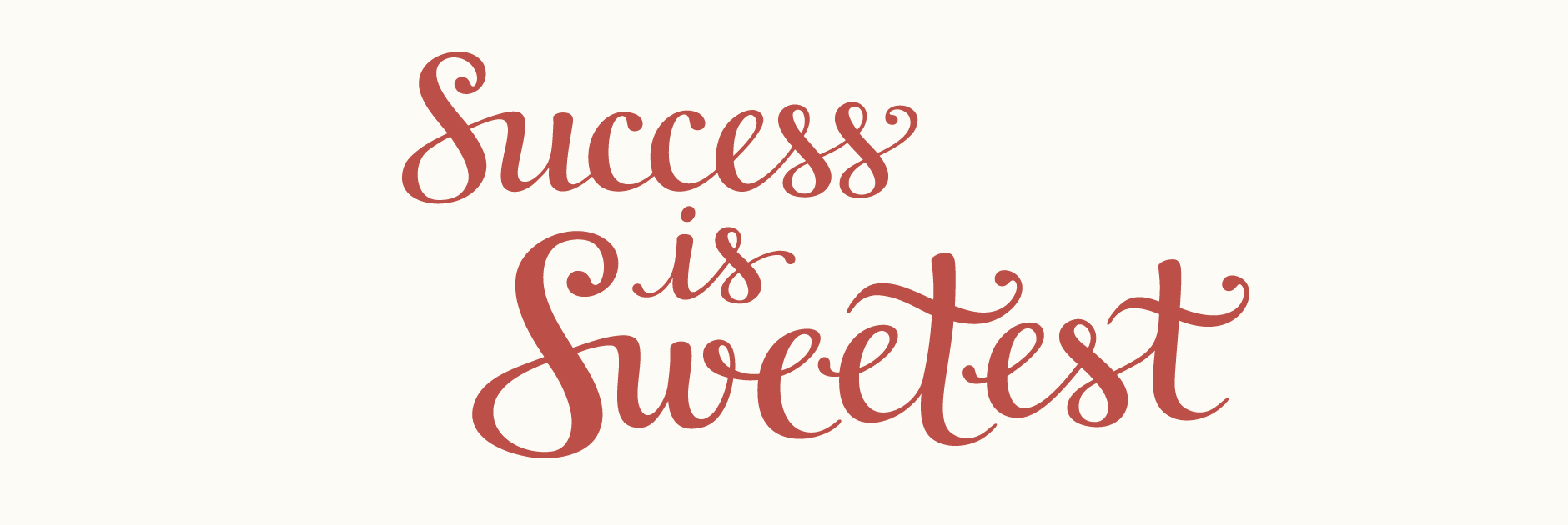
Various sketches led to the rough idea, which I then illustrated with a quill and ink in order to get the right flow and stroke contrasts. As the words feature many repeated letters, I looked at ways in which to handle them that looked cohesive without being simply duplicated. Differences within details such as end strokes, swashes, size, angle, crossbars, etc. bring in discreet variations that add to the natural and individual quality of the design. With both a stacked and horizontal version, the finished logo is elaborate, distinctive and slightly unusual.
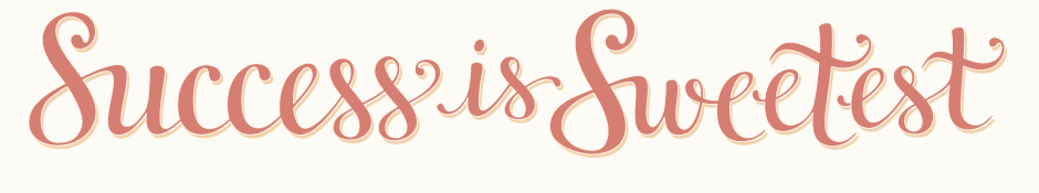
Above: Stylised version of the full logo-type.
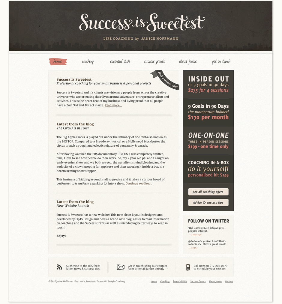
Website Design
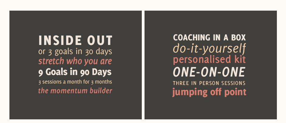
For the website layout, the focus was on bringing out a strong, simple urban feel. The texture, colour scheme and skyline illustration in the header serve to create a contrast with the curves of the logo as well as reinforce an urban atmosphere. Subtle rough textures maintain the raw materials aspect without being intrusive. Rather than photographs, the client was interested in typography based graphics in a strong and simple style, so I designed the coaching offers on the right in a composition inspired by typeface specimens.
Success is Sweetest is now managed by Janice using WordPress as the CMS platform. Read the client testimonial over on Op45.