Super Fantastico
Client: Super Fantastico Ltd
Work done: Logo-type design, custom lettering, colour exploration
Custom Logo-type
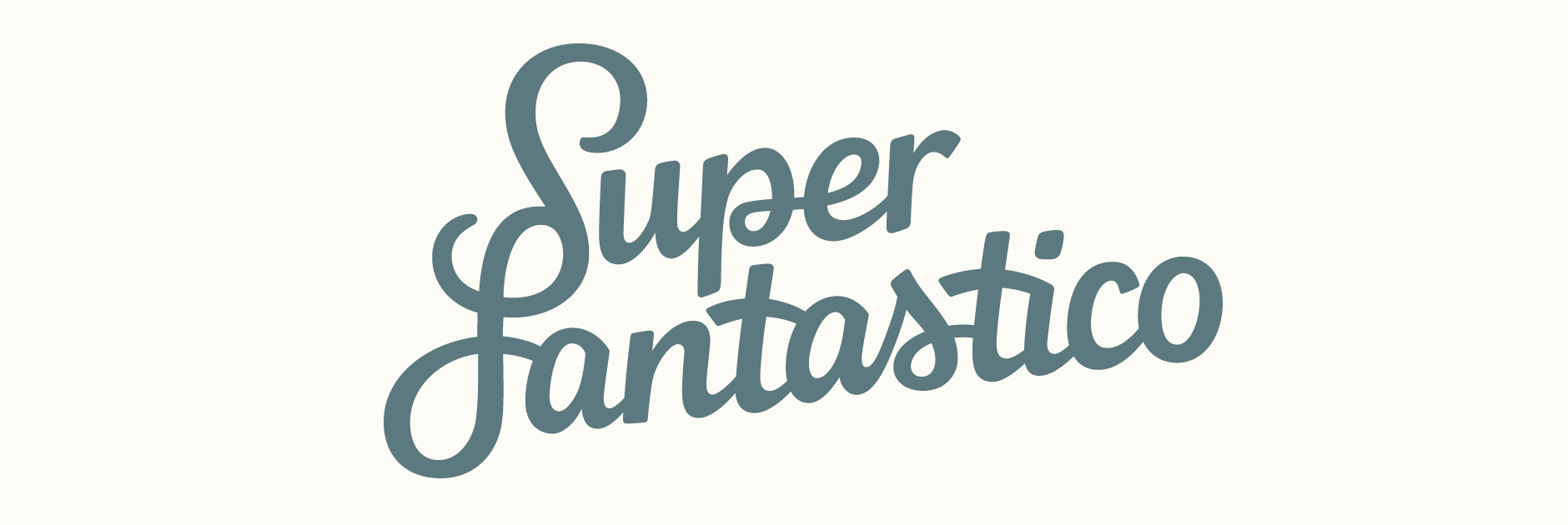
Custom typography logo for Super Fantastico Ltd, a small web design and development company based in the UK. The client had an initial concept in mind using a connecting 'S-F' and was looking for a script design based on handwritten forms with bold and simple letterforms.
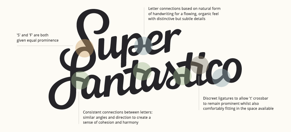
Based on this starting point, we discussed various options for the overall style, the two initial letters and how to impart the organic feel of hand drawn lettering whilst also maintaining an overall solid and clean aesthetic. As the client wanted to avoid decorative elements, it was also important to bring in some visually compelling forms within the structure of the letters themselves.
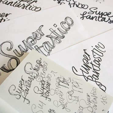
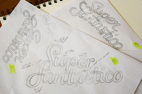
Above: Early sketches done on loose paper and in various sketchbooks.
Rough Drafts
From the initial rough drafts drawn with both thick pen and pencil, I started refining three variations that explored various options within an overall similar look. Details like stroke terminals (subtle brush-style, rounded, thin, sharp..), crossbars (above/aligned with the lowercase letters, extended, short, connected to following letters..) and overall baseline (incline, curve, angles..) all accentuate different characteristics and therefore contribute to varying impressions.
In all cases, I focused on compositions that allowed both words to fit naturally and gave equal prominence to both. These draft outlines were roughly revised on the computer to fix up major issues with spacing and positioning.
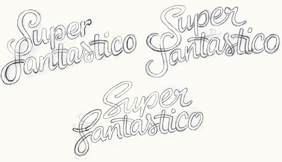
Above: First rough drafts scanned and adjusted digitally.
Concept Sketches
With the rough versions adjusted, these were then loosely traced before being refined and finalised as the main set of concept sketches. The three versions look at two different solutions for the 'S-F' as well as an alternate with both words completely separate. I also explored varying degrees of movement and dynamics within each one, from the first one which is upright and relatively structured to the last one which is fast and expressive.
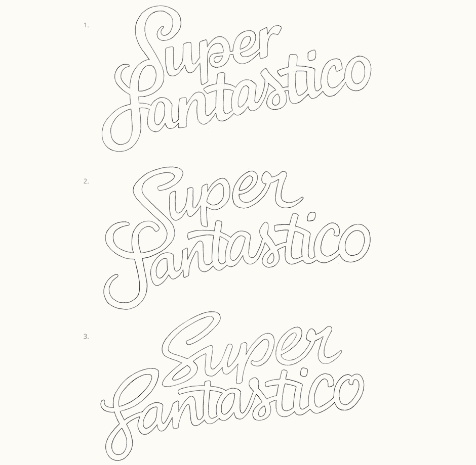
Developing & Refining
Working with the first concept for its overall solid impression, the casual, friendly nature of the letters and the small details within the design, I then moved onto some refining. The top inner loop of the 'S' was adjusted to have less of a swirl and the overall positioning was fixed to be more consistent.
Secondary Version
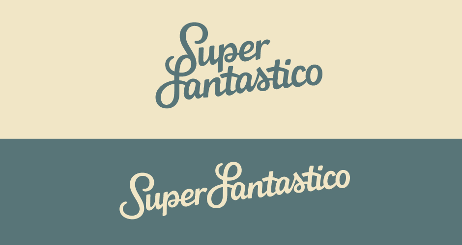
I also developed a single line version to suit different formats when a horizontal composition would be more appropriate. Here, I particularly focused on keeping the 'S' and 'F' in harmony with their joint shape in the primary design while also allowing them to function correctly as individual letters.

Colours
In terms of colours, I considered a range of combinations that best suited the objectives and style of the lettering. The dark blue square with white logo is used as the company favicon as it is clear and immediately eye-catching at a range of smaller sizes.

Final Logo
The two main final colours are a muted grey blue accompanied by a warm light sandy colour.
