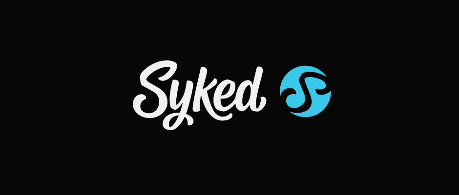
Syked
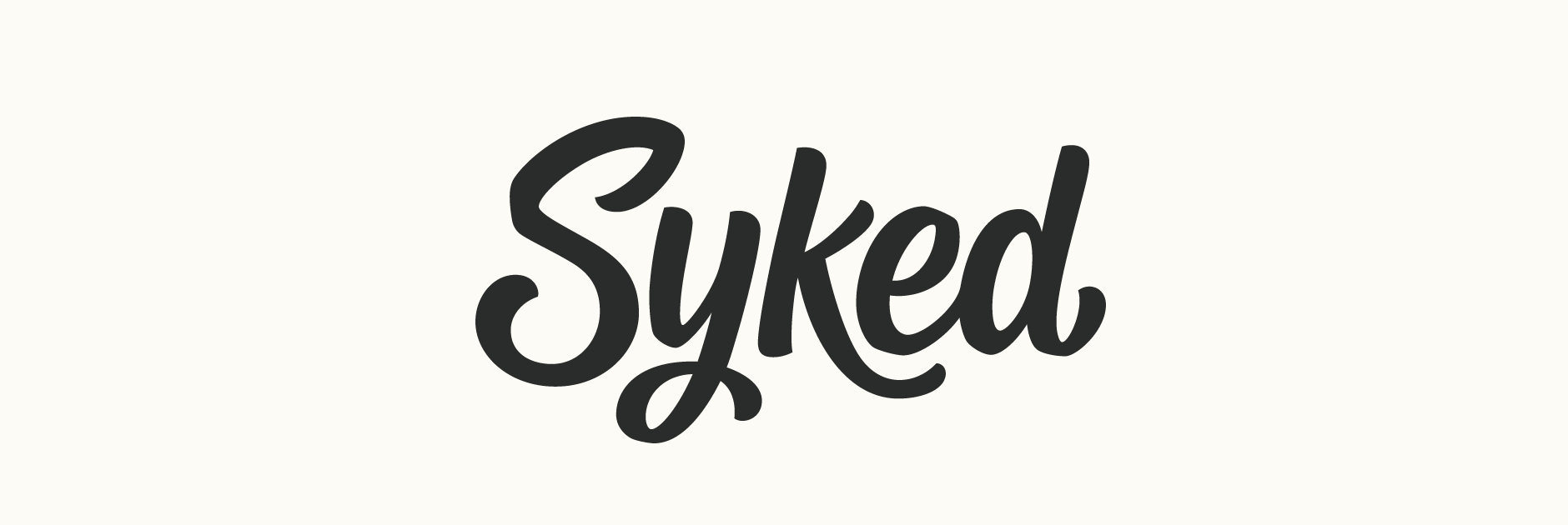
Client: Syked
Work done: Logo-type and mark, custom lettering, branding development
Logo & Branding Work
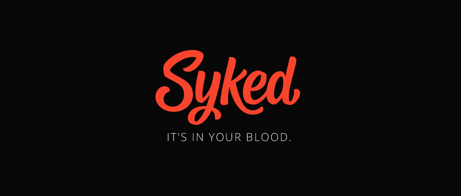
Syked is a new online clothing business with an emphasise on lifestyle and a sense of community. Energy, passion, excitement, confidence, strength, motivation and positivity are all central attributes to the brand, named after the idea of being "psyched". With the initial product line focusing on activewear and loungewear, it was also important to consider the possible expansion in future to a sub brand for smart casual and semi-formal wear.
As part of the visual identity, Syked were looking for some custom typography for the brand name along with a complementary logo-mark, ideally using an 'S' on its side to reference the infinity symbol (suggesting forward moving, no limits, etc.). Both elements will be used together as well as separately and there is a range of project uses: the company website, stationery, shipment packaging, products, banners, etc.
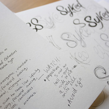
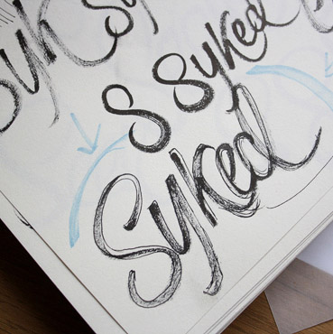
Above: Notes, brainstorming rough ideas and working on refining one direction.
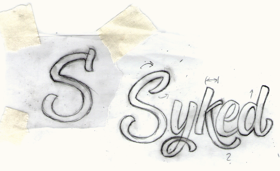
Initial Concept & Revisions
The first design below focuses on the relationship between the individual letters and how to present the word as a unique image. I was also looking to feature an 'S' that would really lend itself to a resemblance with the infinity symbol. Discussing the overall direction, we established that it was a little too round and static, without standing out enough. It was also agreed that a more unusual 'S' shape would have much greater potential and that it was ok for the infinity shape to be quite out of the ordinary. Studying the shape of this glyph in existing typefaces revealed how much this character could be manipulated while still being identifiable.
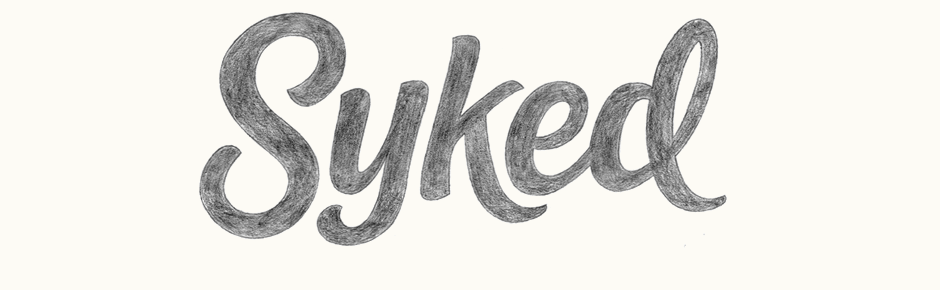
The revised design uses strokes with much more energetic dynamics and a more masculine overall feel. I also wanted to try a few things for the 'S' and test how it would work to have less symmetry between the upper and lower portions. The alternate 'S' has an extra stroke at its top which is based on the little brush 'flick' that one would see in calligraphic forms
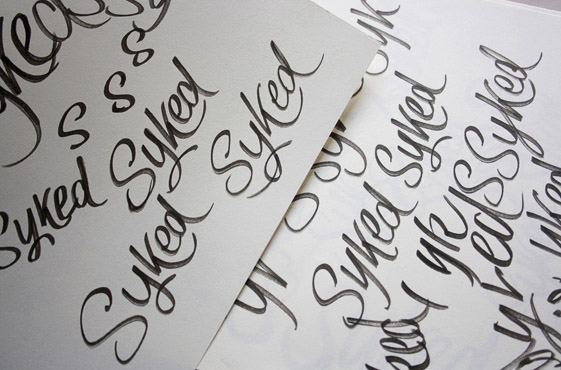
Above: Rough drafts and final sketches for the revised designs.
Logo-type Development
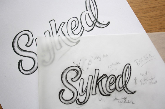
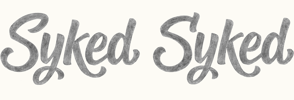
Moving forward with the main 'S' version, I had noted that the 'k' needed work and in particular, its interaction with the 'e'. To avoid having too much of a gap in between the pair, I changed the direction of the arm and revised the positioning of the swash so that it cradles the outer curve of the 'e'.
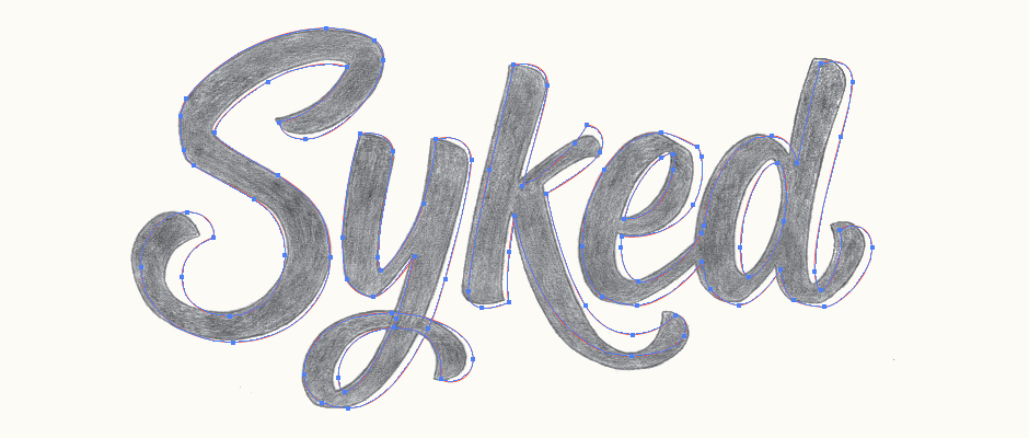
Above: The vector outline on top of the final sketch shows the various adjustments, notably kerning and the 'k' shape.
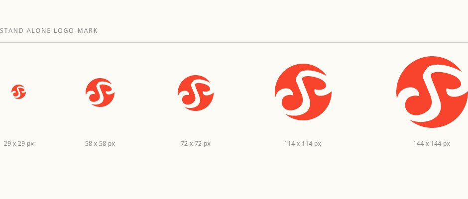
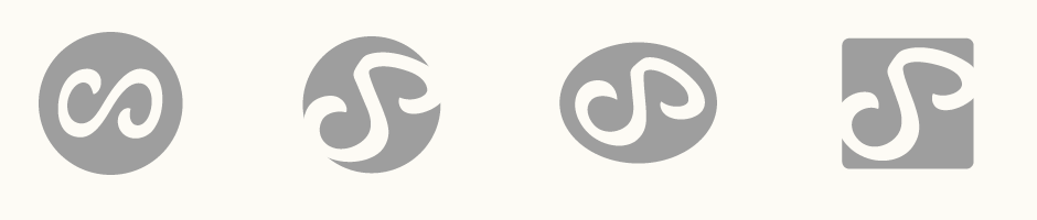
Logo-mark
The first version of the logo-mark (below left) was created from the main 'S' but significantly modified to differentiate it from the full name and clearly represent both the letter and the infinity symbol. However, we felt it was now too circular and not unique enough, with little potential for ownability.
An important part of the following progression was allowing the symbolism to be more subtle; something you could notice on second look, rather than an explicit representation. We reviewed some ideas that would be more dynamic and eye-catching by using different enclosure shapes, diagonal positioning and breaking the container's outline. I also brought back more of the original 'S' shape while adjusting its strokes to hint at the infinity mark.
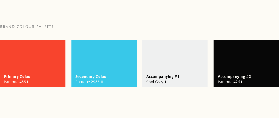
Colours
There were a few colours we were particularly looking to explore. Bright blue or green being an early favourite, exploring warmer tones was also relevant to express the brand personality: excitement, passion, courage, optimism, confidence. A blend of light blues and greens was one of the early ideas to set a fresh, contemporary and active-feeling tone. A combination of orange and red was another idea to capture the natural emotional response of these sorts of colours, while avoiding something that seemed too plain or common. A rich, warm yellow was a third idea, focusing on the fun and positive aspects.
Further development focused on generally making everything brighter, almost fluorscent, and with more contrast to conjure a more energetic, exciting feel.
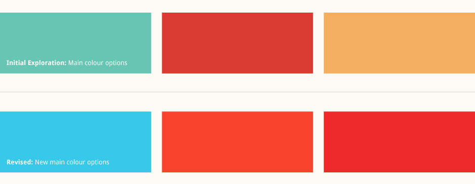
Above: Working on the colour palette to be brighter and fresher.
Final Designs
Summary of the final work below. The colours were carefully refined with both Pantone colour swatches and converted RGB values to ensure consistency across all the different platforms, from fabric printing to on-screen viewing. Syked are currently developing their products; more information coming soon.
Johannes Yau:
After months of back and forth with the previous designer and was told that our vision for our logo could not be done, we couldn't be more happy with Claire's professionalism. Not only did she understand exactly what we envisioned, she was also very open minded to our suggestions and addressing them promptly. Claire had no problems capturing the essence of our brand and bought it to live from the attention to detail of the calligraphic strokes of Syked and the mark, down to her ability to create unique colours. We can't wait to have our logo printed on all our products! We highly recommend her to anyone who's after a unique logo that speaks for itself.