Tactilize
Client: Tactilize
Work done: Logo-type design, custom lettering, branding, print design
Additional credit: iOS icon by Stephane Reverdy
May 2012
Logo, stationery and ongoing collaborative branding development for Tactilize, an iPad app publishing platform based in Paris and San Francisco. With a focus on high-end editorial projects, Tactilize is a system to create and publish iPad applications from a web interface. Tactilize were looking to develop their visual identity in a way that keeps the brand discreet but elegant and allows the focus to remain on their customers' content. The logo was to be purely typographic with a subtle yet distinctive look to convey a confident, quality feel.
Having discussed their initial ideas involving a prominent 't' crossbar and a cursive style 'l' and 'z' with loops, I worked on developing a couple of variants exploring these characteristics.
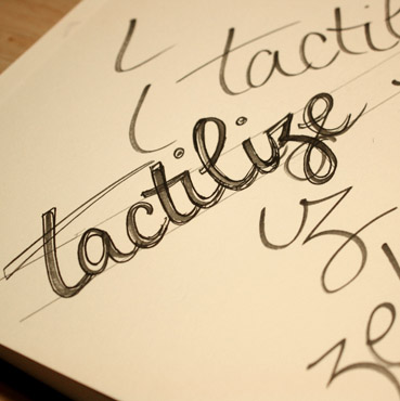
Above: Quick pen sketches to get the sense of movement and flow, before moving onto pencil.
Version #1
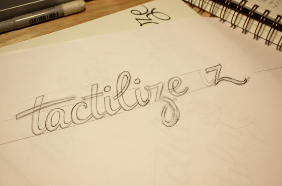
Once I had a very rough draft as an outline, this was scanned and adjusted digitally before being re-drawn and adjusted as a more refined sketch. This first version is on a relatively prominent incline which introduces a dynamic and elegant quality. Shapes are mirrored throughout (especially the 'l', 'z' and 'e' looks) for a sense of coherence. To make sure we weren't restricting ourselves with specific letter shapes, I also tested out some alternatives for the 'z'.
Above: Corrected rough draft (top) which was the basis for the refined version.
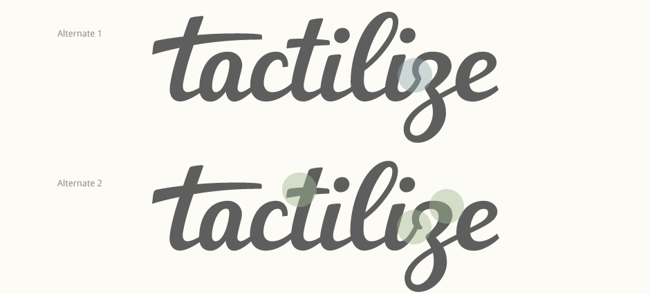
Version #2
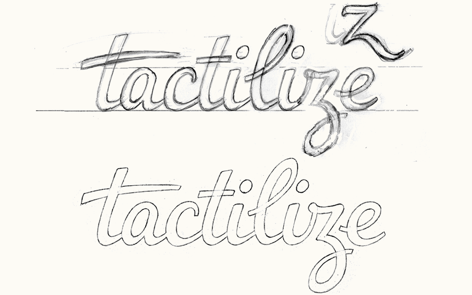
The second alternate is more upright and maintains distinctiveness and movement through its curves and unique characters. Details such as the conjoined 't-i', the 'c' and 'z' upper curves and the 'z-e' connection help to create a recognisable design all whilst remaining quite subtle.
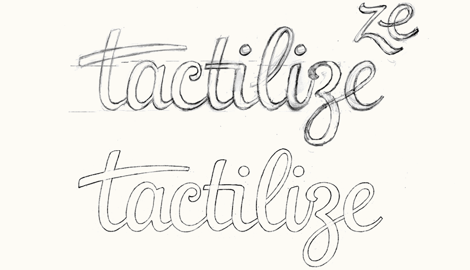
Above: Second version with an early idea for its alternate, non-cursive style 'z'.
Sketch Revisions
Based on group discussions, the logo was further developed by integrating elements from both initial versions. The lettering style was made bolder with a more prominent stroke contrast in order to give it a stronger impact and a more solid overall impression. The two 't' crossbars are more cohesive, with the second, smaller one almost acting as a continuation of the first. The 'z' was re-drawn based on the second version but with a simpler top curve, a characteristic also reflected in the 'c'.
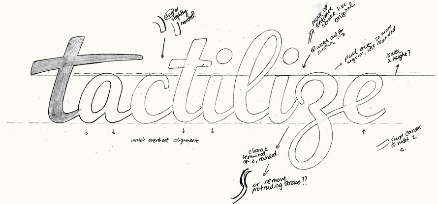
Above: Final sketch with notes and approximate guidelines before vectoring.
Development
The 'z' then became the main focus when working on the vector version as we wanted to make sure it was easily legible. I tested an alternate 'i-z' junction (below top) but ultimately the original with some adjustments proved best (below bottom). Rather than a straight edge as in the sketch, the left terminal of the upper 'z' curve was given a very slight rounded tip and made slightly less prominent. The upper counter was also revised to be less rounded. At this stage, I also fixed up the second 't' crossbar so that it flowed better following the first one.
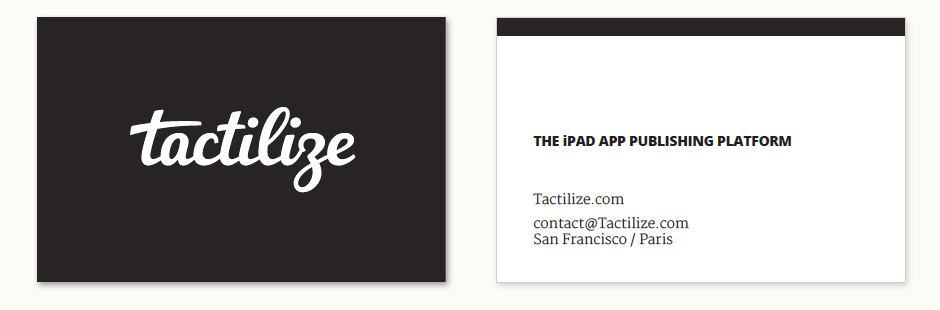
Stationery
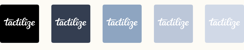
The goal with the business card design was to create a simple, spacious composition to reflect the nature of the brand. The horizontal bar on the contact side mirrors the website header and creates visual continuity between both sides of the card. Additional colour versions were also designed.
Colour Development
During the creation of the business cards, we started looking at possibilities for extending the primarily black and white colour palette. This early exploration focuses on extending some of the tones from the main upcoming illustration while also adding accent colours. The accompanying typeface is currently continued from the early design of the initial Tactilize website, but is currently also under consideration.
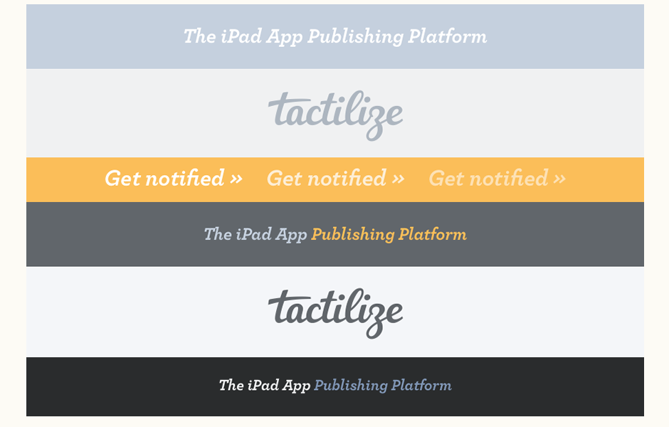
Final Design & Context
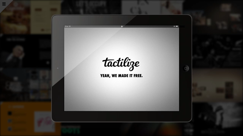
See the logo in use on the Tactilize website and video (screenshot shown below), incorporated into the iOS icon by Stephane Reverdy and featured on the company blog.