The Calm Gallery

Client: The Calm Gallery
Work done: Logo-type design, custom lettering, colour exploration
Custom Logo-type
Custom typography logo design for the re-brand of the The Calm Gallery. Run by Lucas and Hayley Lepola, the online gallery (previously called the Keep Calm Gallery) was established in 2007 and sells a wide selection of high quality art prints by artists, designers and print makers. They have a passion for beautiful typography so it was important to convey this through the logo itself, as well as a unique and timeless aesthetic. While it was best to set the composition on a primarily straight line for use in context, Lucas and Hayley were looking to make sure the hand drawn nature of the design was clearly recognisable through details like baseline variation and unique letter shapes.
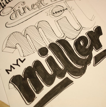
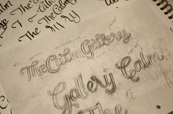
Based on what we'd talked about, I wrote out the name multiple times in sketchbooks and on scrap pieces of paper. When thinking about the double 'L', I remembered a miscellaneous doodle I'd done a few months ago (below left) which had an interesting solution and used this as a reference for one of the concepts. Once the roughs were done, I corrected the details, traced the outlines and drew the final sketches (below bottom).
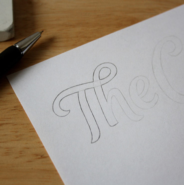
Concept Sketches
Two directions emerged as possible logo concepts: one with quite a prominent brush script style and the other, a little more formal while still being approachable and friendly.
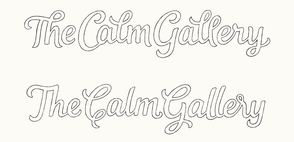
Above: Final proposal sketches for the two main concepts.
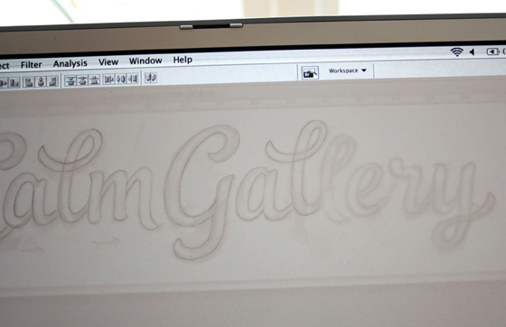
Initial Vector & Colours
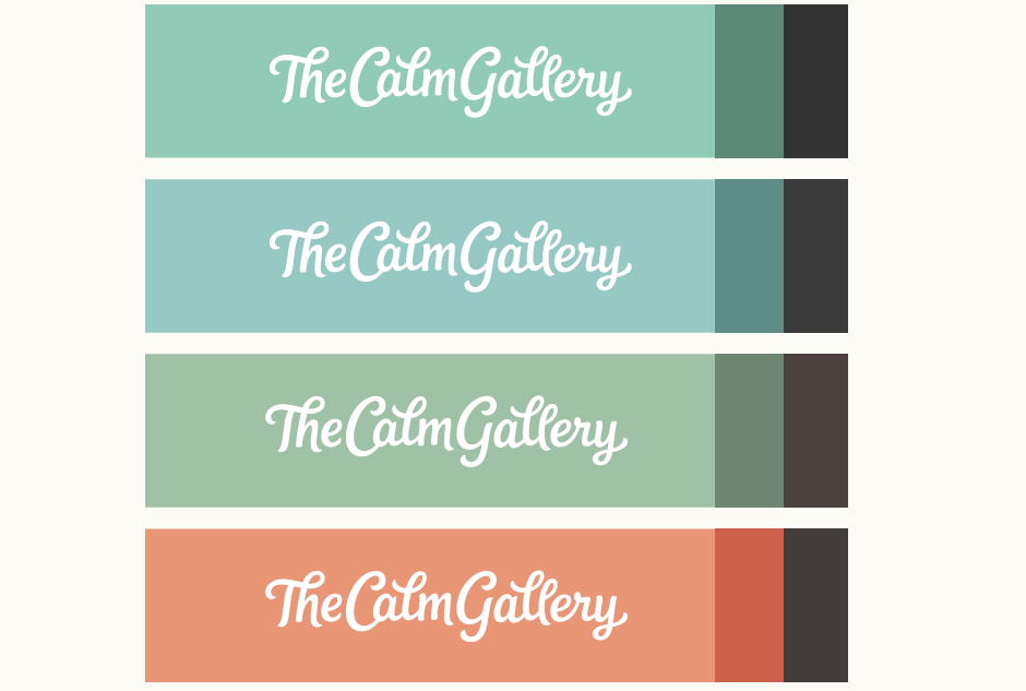
The first concept was an immediate favourite as it felt very natural to read the whole line, whereas the second concept draws considerable attention to the uppercase letters. Working from the sketch, I created the vector draft and we looked at some colour palettes. The website design Lucas and Hayley were working on used a light minty green (top) but they were interested in seeing some alternatives that might work better. At this stage, I also posted the logo as work in progress on Dribbble and made some final tweaks based on some suggestions, primarily to the overall spacing and proportions of the 'C' and 'G'.
Above: Testing the vector at smaller sizes on a reversed colour background helps to address any legibility or kerning issues.
Adaptations for Icon
As part of the initial proposal, I first adapted the 'C' to test its use as a potential icon (it is shorter than the version in the full logo, to make its proportions easier to use in container shapes). We then also looked at 'TCG' as it's more logical with regards to the name and ensures "The" remains equally important. Set in a square, one of the versions uses an outline as a frame reference.
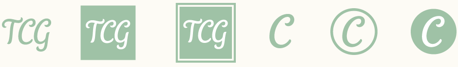
Above: Summary of the icon exploration.
Revisions & Final
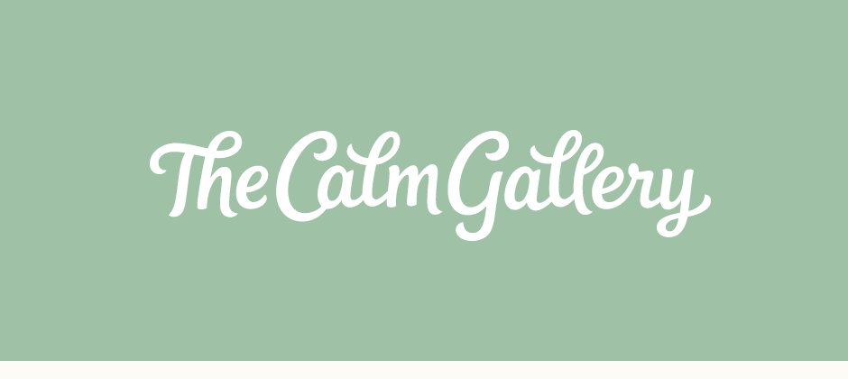
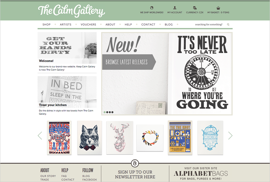
The finalised logo below using the new green colour palette. It's now in use on the updated The Calm Gallery website (screenshot below, web design by The Calm Gallery).
The Calm Gallery, Lucas & Hayley Lepola:
We really are delighted with the finished logo, icon and colours. Thank you so much for being such a pleasure to work with. We weren't sure about getting a logo designed for the new name, whether it might be difficult for someone to create something we were truly happy with. However, you were so understanding right from the first moment, we knew the logo was in safe hands. We couldn't have been more pleased with the process, your creativity and efficiency. We can't wait to start using the new logo!