Townsquare & Workshop
Client: Townsquare
Work done: Consultancy, logo-type design, custom typography
Design Consultancy & Custom Logo-type
I was contacted by Townsquare, a community funding portal based in San Francisco, who were initially in need of design consultancy. I worked with them to review and critique their existing logo which they felt was headed in the right direction but lacking in something that they needed help pointing out.
After my analysis of their existing logo, Townsquare asked me to implement the suggested changes into a re-worked logo. On completion we then worked on the creation of a completely new logo for their related brand, Workshop.
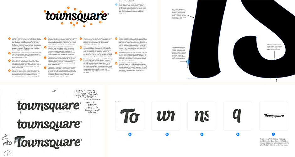
Above: A selection from the pages of my review for the old Townsquare logo.
Analysis of Existing Logo
My analysis took the form of a five page booklet critiquing both technical and aesthetic points of their logo which could be amended. Townsquare had a clear vision of how their brand should look and feel, so my review was as much a focus on how the design could be tightened up as it was an assessment of what changes would help to better fit the logo to this vision.
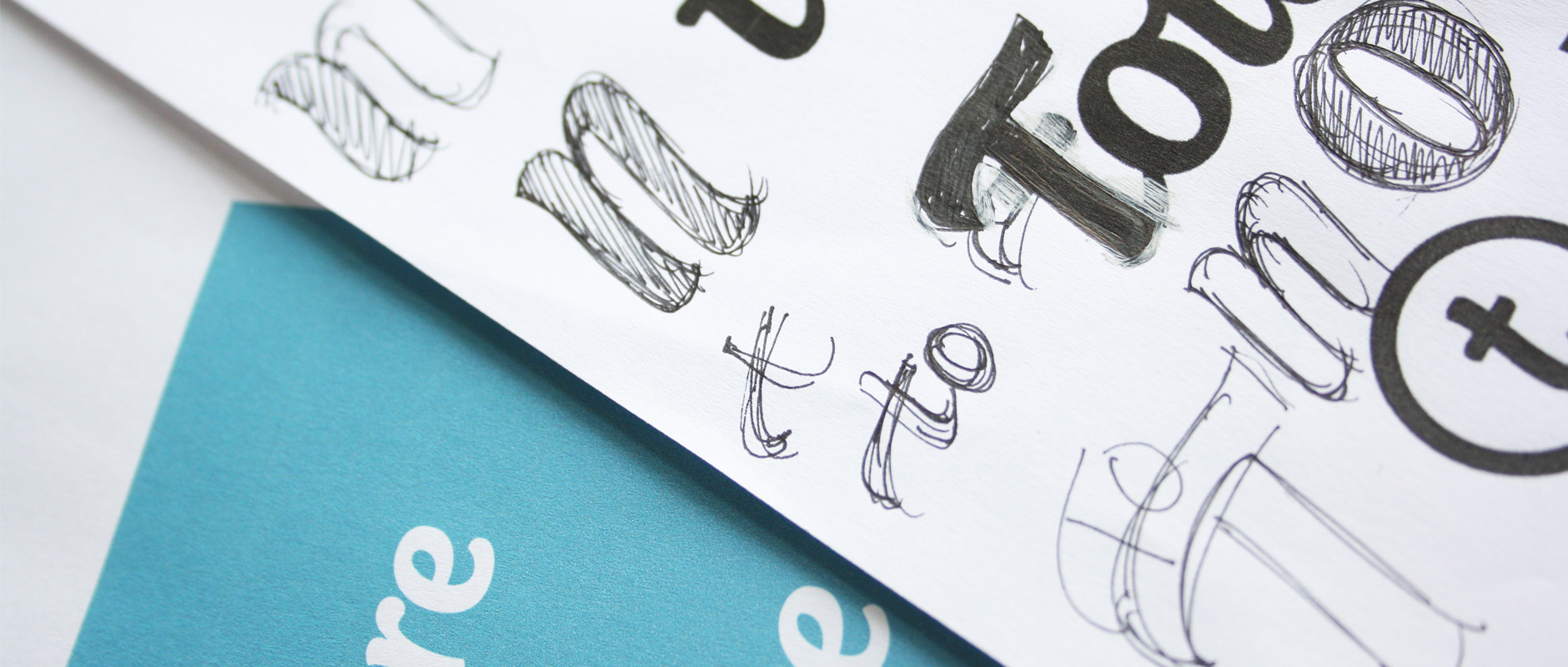
Above: Rough scribbled tests and ideas for the initial letter 't'.
Revised Logo
After the consultancy period, Townsquare asked me to put my analysis into effect and re-work their logo from scratch. An important point of discussion was the initial letter 'T', which had to have the right level of individuality so as to work alone as an icon as well as being an assimilated and congruous part of the whole logo. Their existing logo had also placed a strong emphasis on the letter 'Q' in the word 'Square' which felt unnatural and was drawing attention away from the initial 't' and reducing readability.
Under the guidelines I laid out in the consultancy work, I redrafted and created the new Townsquare logo from scratch. Starting with a hand brushed script was important to ensure that the form of the new logo would have an authentic natural flow. Particular attention was then paid to even contrast, consistent terminals, and logical connections. This achieved, in the end product, the careful balance of uniformity and casualness that Townsquare were looking for.
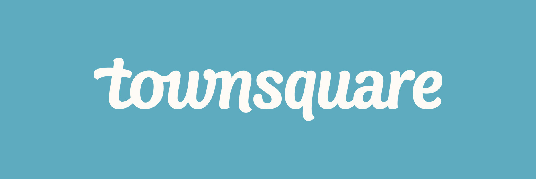
Above: The final Townsquare logo.
Initial
Working with the rough sketches and early rough scribbles formed during the analysis, it had been agreed that a lower-case 't' with a slightly extended crossbar had the right level of individuality as well as serving to lead the eye into the wordmark as a whole. The initial letter was provided in three forms for use in various situations: website favicon, business cards, background image, and other illustrations for which it would be needed.
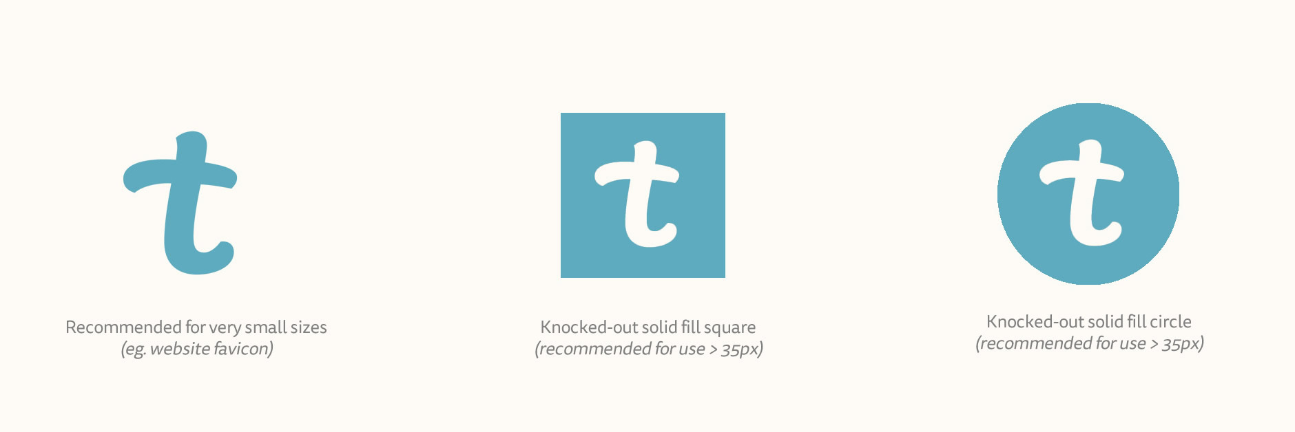
Above: The final initial set in three forms.
Workshop
Townsquare were also in need of a logo for their related brand Workshop. After the completion of the Townsquare logo, they were keen for me to create a wordmark logo for Workshop in the same spirit as the Townsquare logo, while being clearly a unique logo in itself rather than a direct copy of the form.
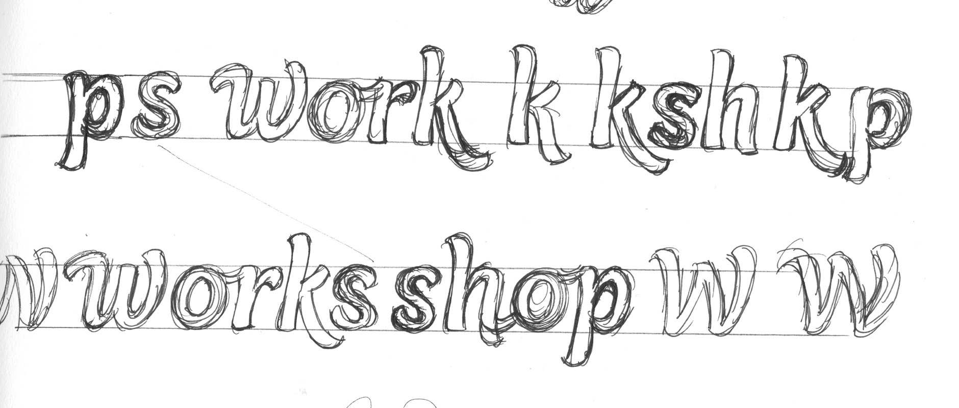
Above: Early rough sketches for the Workshop logo.
Sketch Development
Again, a brush script was employed with the same balance of contrast but this time a complete uniformity of foxtail brush terminals, rather than the balance with ball terminals in the Townsquare logo. Experiments were made in the sketch phase with the initial letter 'w', with one option mirroring the lead-in of the Townsquare 't' and another being a unique form.
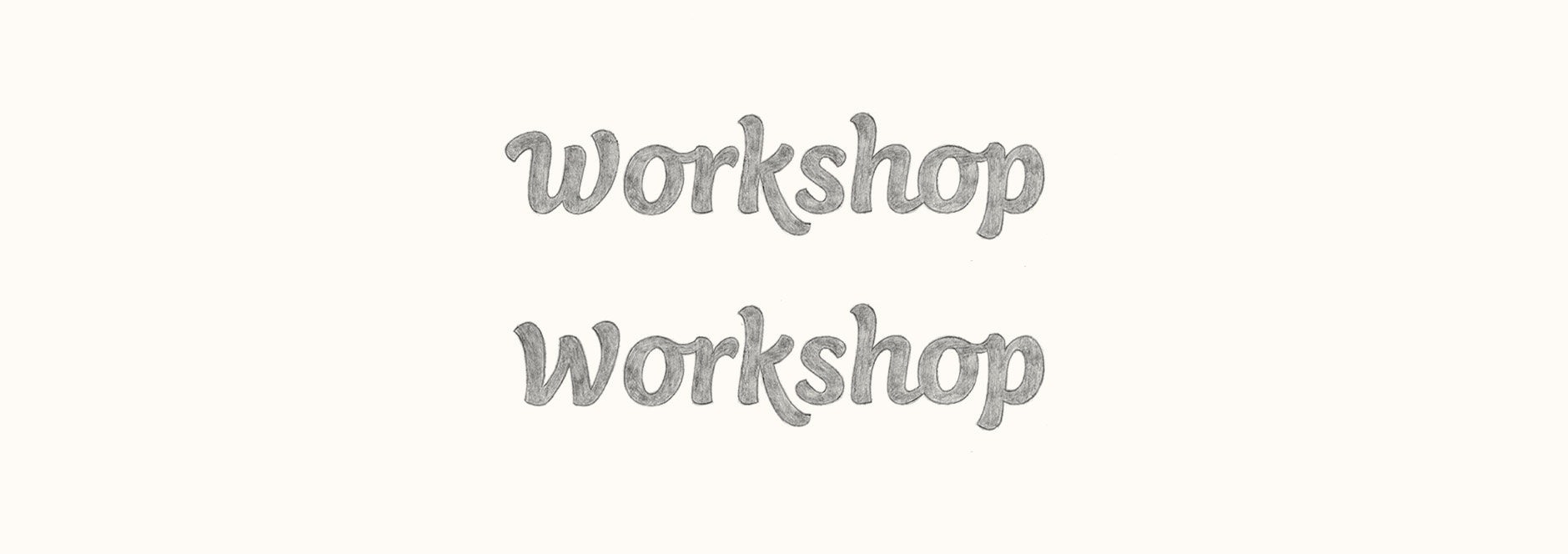
Above: Two sketch proposals for the Workshop logo, note the different 'w' options.
Digital
The final 'w' was a slight combination of both sketch proposals, replacing the lead-in swash from the first option with the foxtail terminal of the second option, while keeping the single central stem from the first option rather than the diagonal strokes in the second.
