Sans Serif — Unfinished
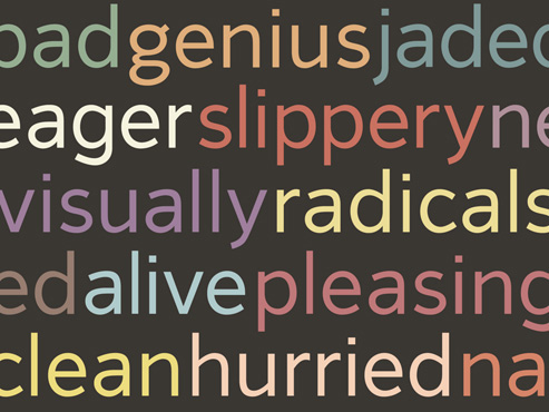
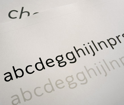
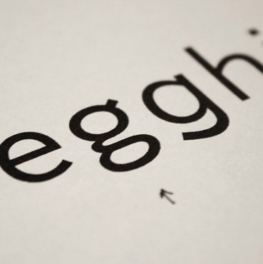
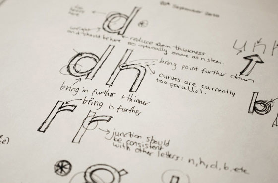
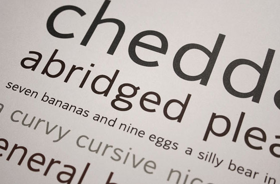
In the summer of 2010, I started a typeface based on an improved re-work of some earlier designs and I had been revising it on and off since then. The goal was a highly useable typeface; a clean, solid sans-serif with a distinctive character. The design incorporates humanist qualities to create an original, interesting feel that also remains clean and serious enough for use in a range of situations. I kept a focus on the flow of the letters together as much as individual letterforms as well as the white space inside and between the shapes. The large, open counters aid legibility and the individual elements of the letters are similar enough to maintain an overall cohesive look without being identical.
While I'm happy with overall look so far and it is/has been excellent practice, I think the intended use seems a little too quite generic and I don't feel it would add anything new to the many successful existing typefaces of a similar style. Currently, I'm planning some further brainstorming and research to develop an idea with a stronger concept and clearer purpose - something that's more suited to me. As typeface designer Jonathan Barnbrook wrote, "Drawing and releasing a typeface means you have shaped a new voice that is uniquely yours with which to speak to the world on your own terms."