Wilson & Smith
Client: Wilson & Smith
Work done: Logotype design, custom lettering, branding
Custom Logotype & Branding
I was approached by the founders of Wilson & Smith, a new US-based company offering professional software consulting services, to create a logotype for the brand. They were specifically interested in a hand-drawn logotype as a way to stand out against the typically very corporate and impersonal style of business of the industry. One of their main points was to specifically not look like a tech company but rather to have a very high quality, subtle and understated feel.
As we didn’t have a set starting point for the lettering, we started narrowing down the direction by working out which styles wouldn’t suit: for instance; an all caps serif would be too corporate, but a causal lowercase script would be too informal. One huge advantage of custom lettering is the ability to draw from across different styles to achieve the balance you’re looking for.
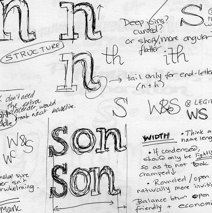
Above: Early notes and scribbles.
Concept Development
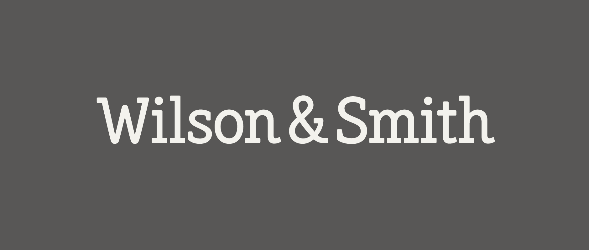
The design I developed featured a thin, monoplane slab serif for a light, fresh, spacious overall impression. Before working on any details, I used a skeleton outline to get the right shapes and proportions.
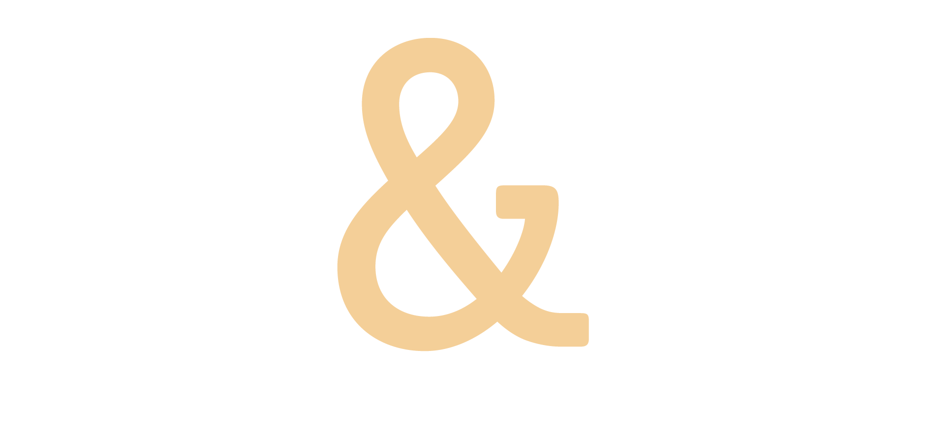
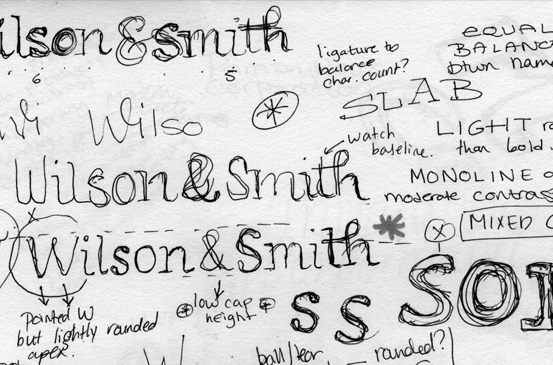
Then, I started fleshing out the details. The very low contrast is intended to be quite distinctive and push a contemporary, un-traditional feel while still appearing reliable. While this is always difficult to judge in sketch form, play with typographic features such as the rounded terminals on the 's's and the ampersand provide distinctive yet discreet details that don't detract from the overall simple look.
The 't-h' ligature was intended both to provide a balance to the initial 'W' and also balance out the fact that "Smith" has one less letter than "Wilson", as the ligature is visually busier than individual letters. I wasn't convinced by the execution though: it flows quite well naturally when drawn by hand, but taken out of that context and put in a more structured form, it looks quite forced and awkward.
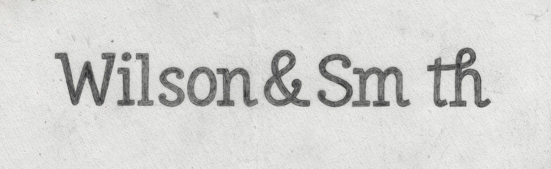
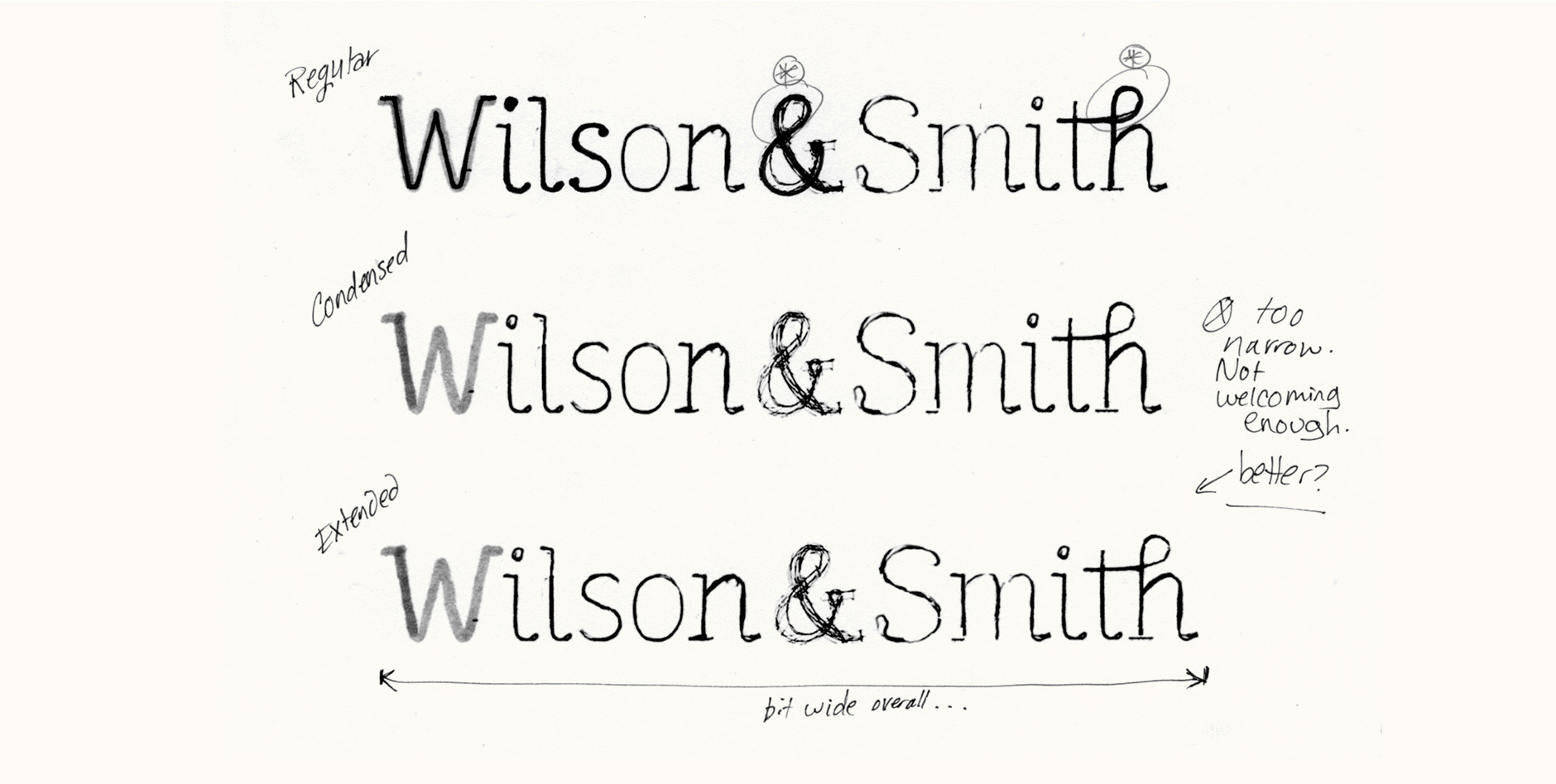
Above: Concept sketch progression.
Vectoring
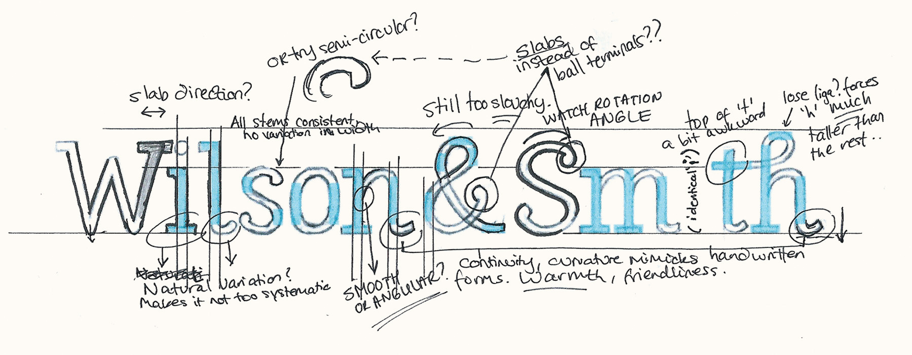
The main objective when digitising was to tighten up the overall look and make it a little more structured/serious. Some of this is a natural result of going from rough pencil lines to clean vector lines anyway, but I also reworked various details that were more the playful, rounded side. The working screenshot below shows the ball terminal on the ampersand becoming a slab and the 'S' terminals incorporating a straight angle.
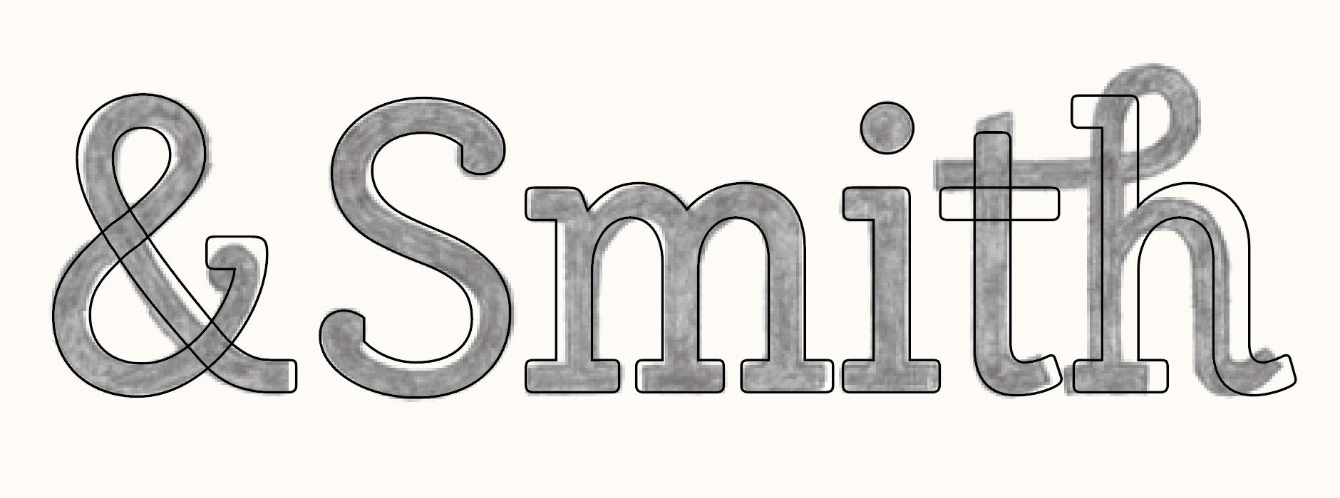
Above: Revisions from sketch to vector.
Refining
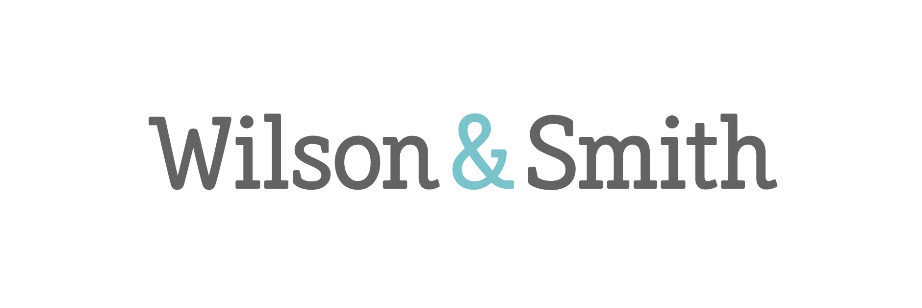
The 'S' was still standing out as a little too playful so after some research into other slab and serif typefaces, I did a different version with a slanted serif (new version shown below in blue, on top of original version in black).. Having an angled leftmost side that stands lower near the baseline also helps it stand more solidly in between the straight letters.

Icon and Colours
The icon was to use just the initials and I tried using different simple container shapes to see what would suit the letterspacing the best, since the whitespace on the sides of a 'W' and 'S' are quite different.
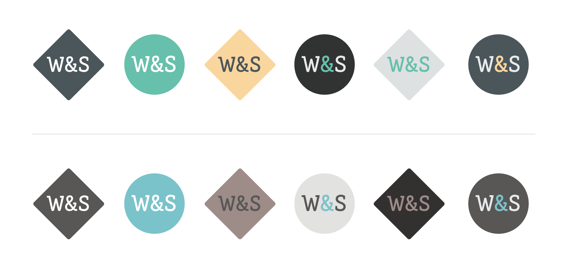
The initial set of colour exploration tested out quite varied palettes with a 1-2 brighter accent swatches accompanied by more neutral tones.
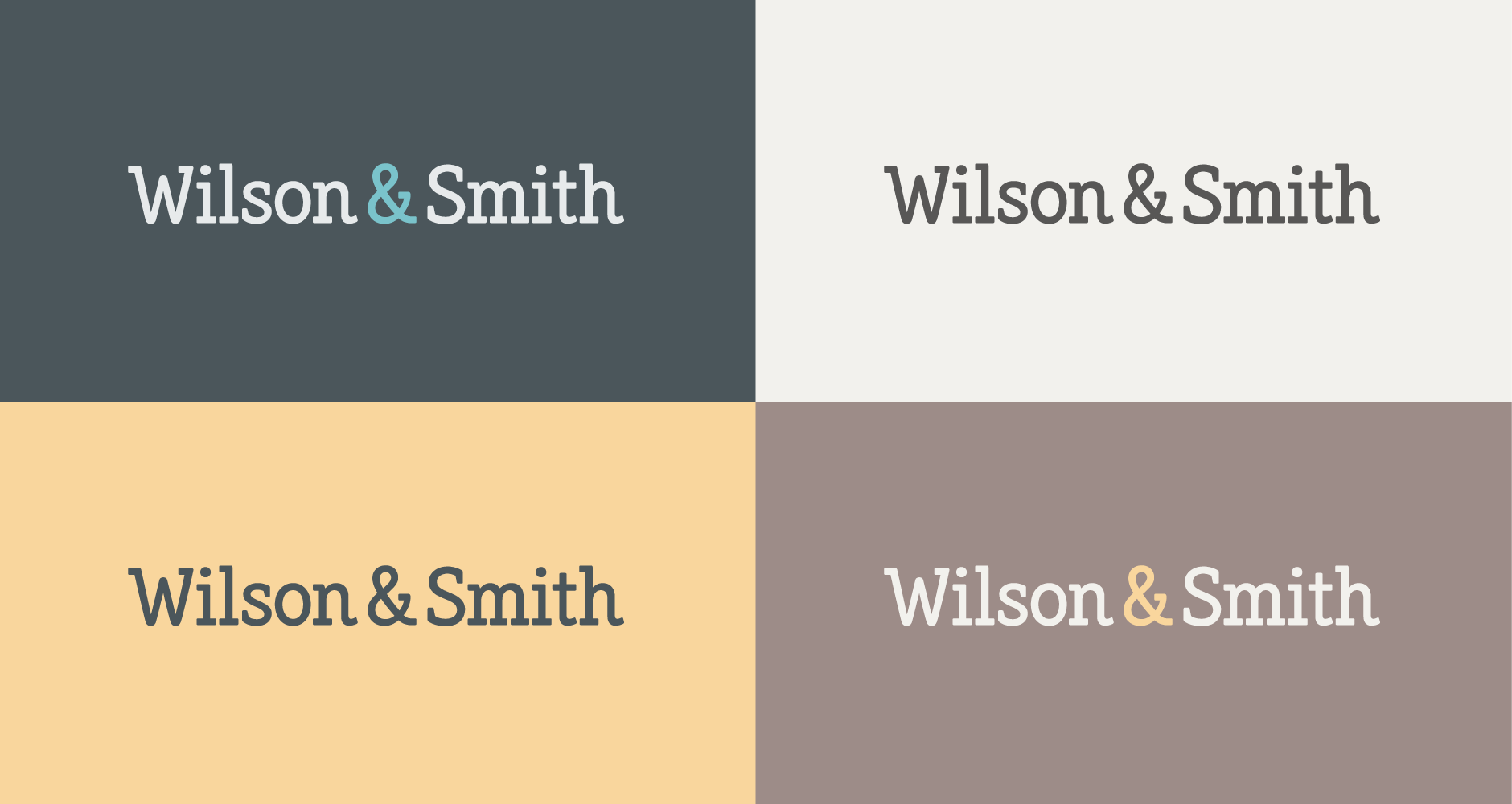
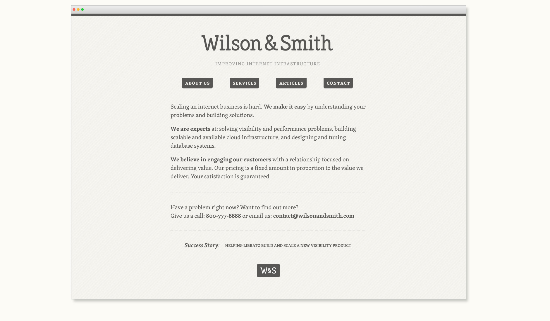
Final Work
Once the logo and icon work was finalised, I created a simple landing page design with a clear structure and calm colour scheme.