YPlan
Client: YPlan
Work done: Logo-type redesign, custom lettering, branding development, brand guidelines
Logo-type & Branding Work
Logo re-design and branding work for YPlan. Currently available in New York, San Francisco and London, with more cities coming soon, YPlan allows you to find and book the best events in town by browsing a specially curated shortlist. Our goal was to re-design the logotype using fully custom lettering in order to reflect both the spontaneous, fun personality of the brand and its high quality, established nature.
We started off looking at the existing brand and discussing & refining the brief, while also studying the existing logo and its limitations. As well as the conceptual goals, another important aspect we were looking at was functionality. The new logo needed to have improved proportions to make it easier to use in different sized areas, without needing too much width or height. The 'Y' also needed to work equally well as a strong, stand-alone element and be instantly recognisable.
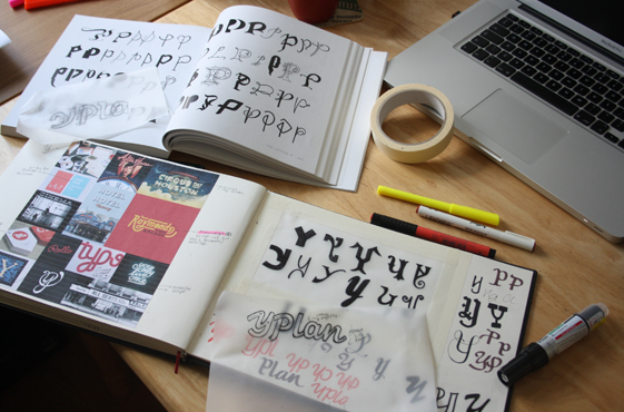
Above: Working on the design brief, strategy and analysis of the previous logo, followed by research and early sketching.
Strategy & Exploration
In order to help find the right direction for the logotype, we decided to explore 2 concepts: one that would build on the current logo but re-work it following our analysis, and a second one that would explore a brand new approach. We planned out the strategy for both approaches in detail, talking about things like logo width, the 'Y-P' interaction, the 'P-l' kerning, overall roundedness vs. angles, stroke contrast, cap height and descender length, inclination, etc.
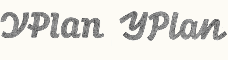
The first concept aims for something narrower and more contained than the original. There is more contrast within the letters themselves, bringing more warmth into the design while still retaining the overall geometric, solid feel. The corners are lightly rounded throughout, building on the friendly, approachable aspect. The extensions on the 'l' and 'n' cut off at the same angle as the overall inclination, something that's also mirrored in the tails of the lowercase.
With the second design, I was drawing influences from across different styles and references: hand writing, sans serif typefaces, theatre signs, neon signage, etc. At the same time, the lettering is executed in a way that feels modern, solid and trustworthy. I used an almost monoline weight in order to avoid something decorative, dainty or traditional.
Difficulties here involved the 'Y-P' and the 'P-l', heightened by the fact that the lowercase is all connected. I tried to solve this by incorporating a strong sense of curvature and the hand-made into the capitals, so that they matched in terms of dynamics. I also worked a lot on the final 'n' leg to act as a reflection of the initial 'Y' stroke, helping to balance the start and end of the word.
Above: Progressively building both concepts at the same time, rather than one by one.
Sketch Proposals & Progression
Both concept sketches were reviewed at different sizes, on reverse backgrounds and with their 'Y's as stand-alone characters. With its sturdy, bold, structured letterforms combined with personal, hand-drawn touches, we felt the first concept was the closest representation of the brand and the balance we were looking for. We then focused on the 'Y' in order to improve its legibility and recognisability as an image.
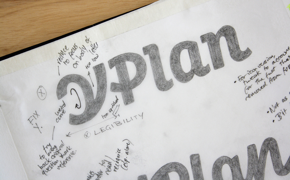
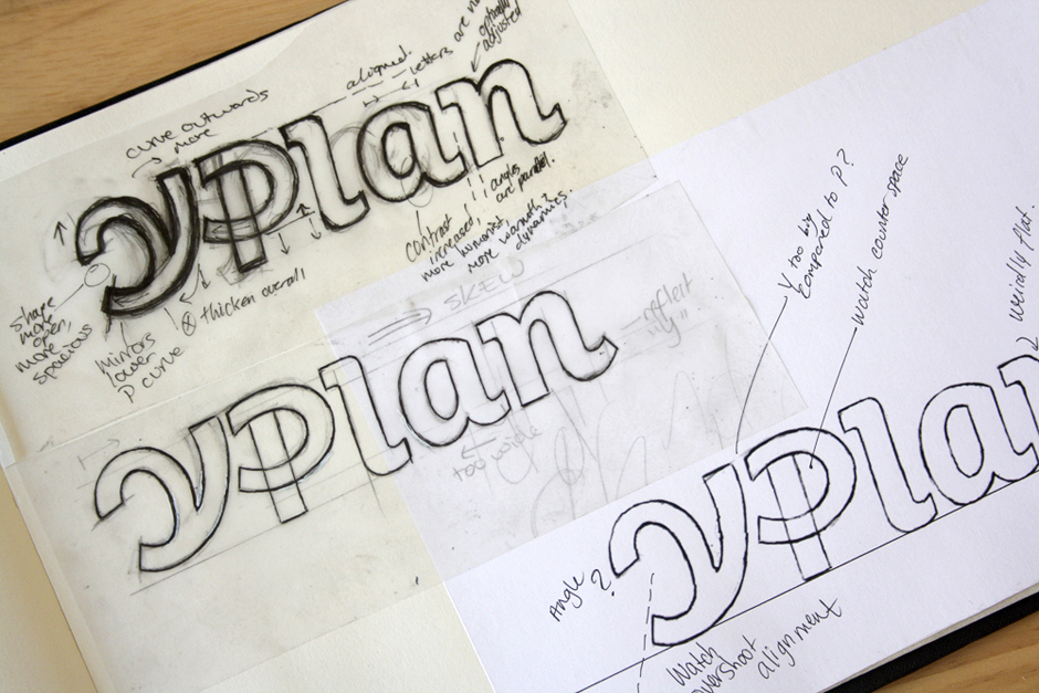
Above: The two sketch proposals and notes for improvement.
Focusing on the 'Y'
We tried various possibilities for the 'Y', each one more or less different than both the very original 'Y' and the one from the first sketch. I started focusing in on the details: smoother curves, refined corners, depth of the 'v' portion, alignment with relation to 'Plan', cut-off angles at the ends of strokes, how much to extend and/or curve the left loop, etc.
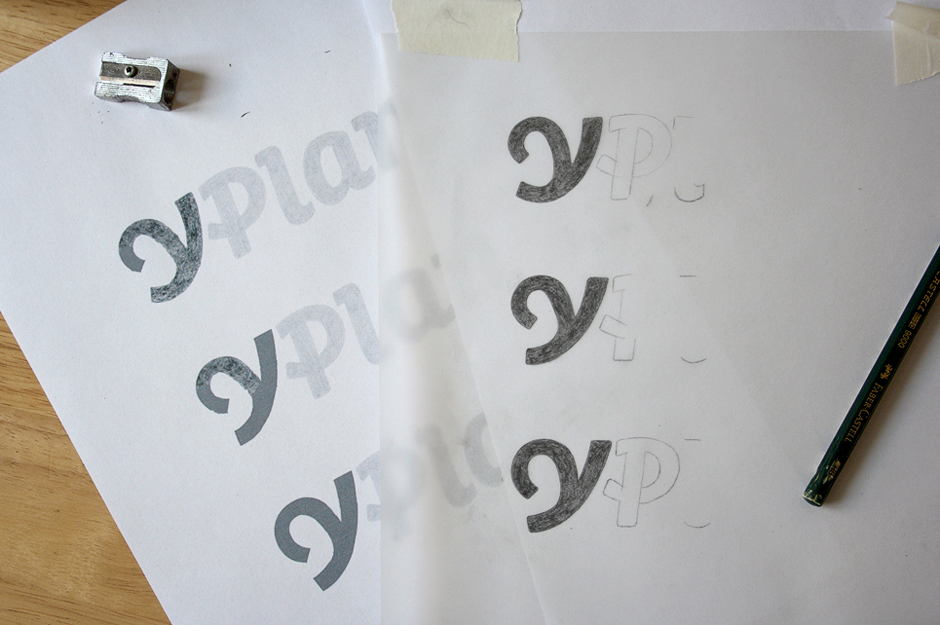
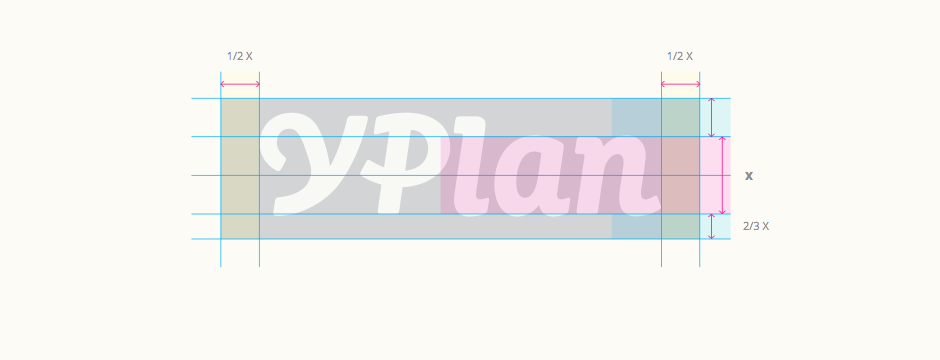
Ultimately, we went with the version that had the more defined straight-edge stem for the left side (version #3 below). This has the advantage of maintaining a stronger, clearer structure that allows the focus to remain on the main body of the letter itself, without losing its nice, distinctive curve.
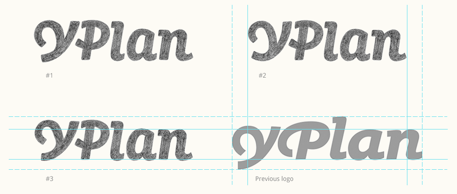
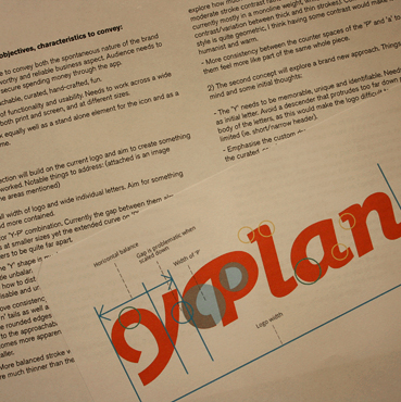
Above: New 'Y' options alongside previous logo. Solid and dashed lines show the more economical proportions of the new design compared to the previous one.
Digital Work
From the final sketch, I moved onto the digital version with its more carefully drawn curves, alignments and stroke widths. This was combined with a tagline, testing out different options for accompanying typefaces.
Above: Working board for the first digital steps.
Details
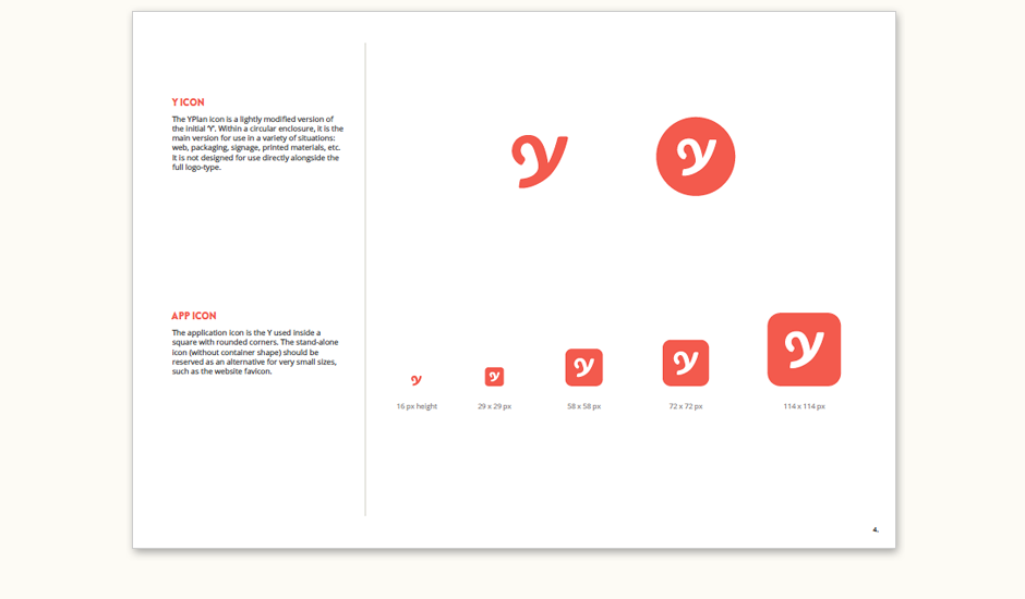
The 'Y' was further refined digitally, as seemingly small changes play a big part in how well the lettering works. This allowed us to compare the results of minor adjustments to details such as the width of the overall letter and its individual strokes. I tested both how the variations affected the logo as a whole (especially at small sizes) and as the stand-alone icon (at very small sizes and in different container shapes).
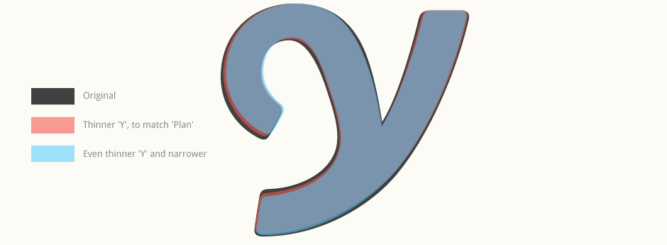
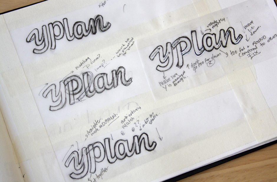
Above: Tweaking the weight and strokes of the 'Y', testing it at different sizes as part of the full logo and alone.
Colour Exploration
For the colours, we explored the continuation of the existing brand colours as well as some new options. The idea was to have one main colour accompanied by an equally bright and vibrant secondary colour – not necessarily for use right alongside each other, but to complement each other in the overall environment. Each set was then joined by a range of supporting colours so that there were many different combinations that could work together for various elements.
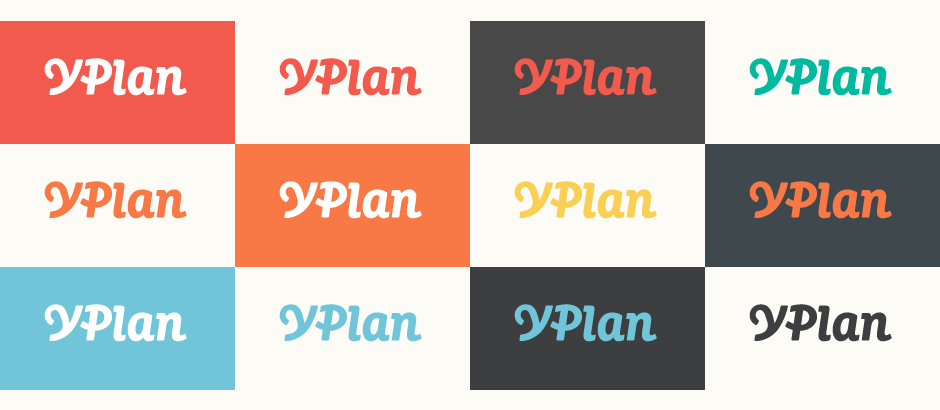
Above: Each horizontal line shows a different potential set.
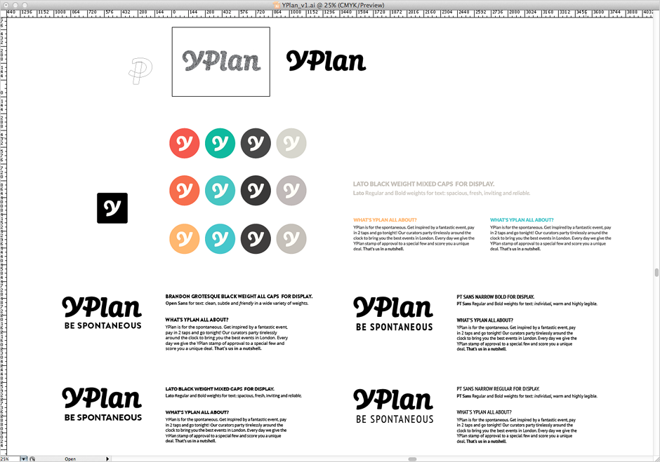
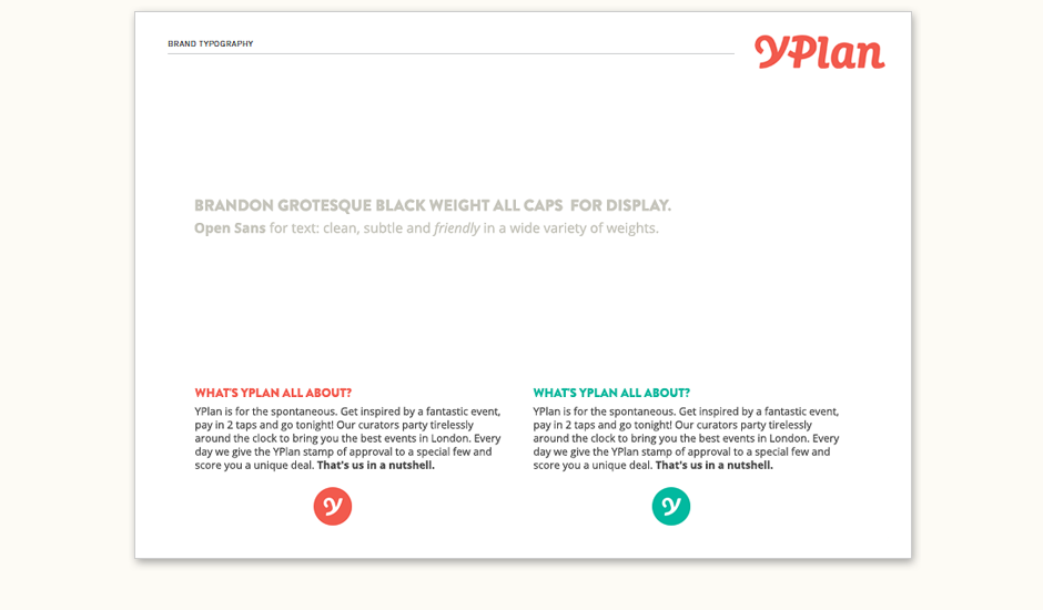
Typography
The "Be Spontaneous" tagline was an ideal length for the logotype. Working with our display typeface, Brandon Grotesque in its Heavy weight, we tried different settings and placements. The final composition features loosely tracked all caps, centered below the logo (a tagline alignment that matched the logo width proved too big and intrusive).
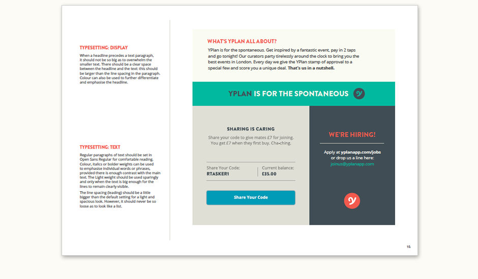
Above: Tagline work and typeface specifications, followed by a page from the brand guidelines about typesetting recommendations.
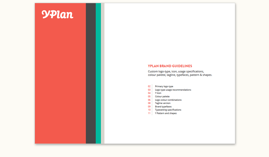
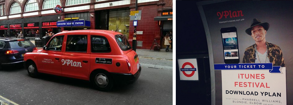
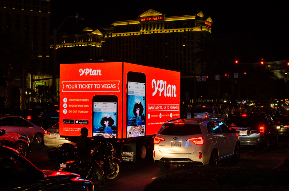
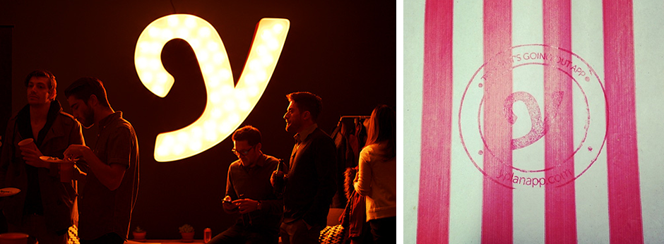
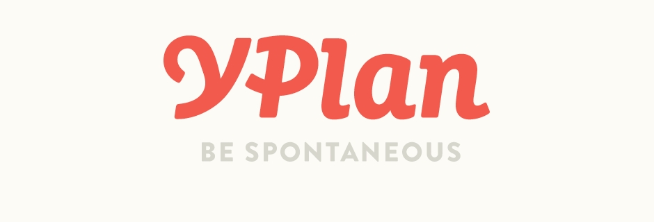
Final Work
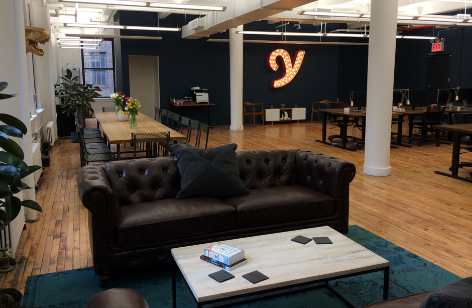
Once we were happy with the finalised logotype, colours and typography, I designed a brand guidelines document exploring all the different design elements and specifications. The logo is also in use on a wide range of materials, from a 3D illuminated 'Y' in the New York offices, to the London tube and taxi signage, to billboards in Las Vegas. (Las Vegas ad below designed by Julie Dyer).
Find out more about YPlan and download the latest version here.