Yurn It
Client: Bentley Technologies
Work done: Logo-type design, custom lettering, colour exploration
Custom Logo-type
Custom lettering for Yurn.it, an upcoming e-commerce website. With the name playing on the word "yearn", it's a platform that invites users to create a profile board collecting items they're interested in buying. Envisioned as a place that's a pleasure to spend time on, the brand needed to impart a sense of delight, beauty, desire and elegance and appeal to a primarily female audience. It was also important to reflect a high quality design ethic and a subtly confident look.
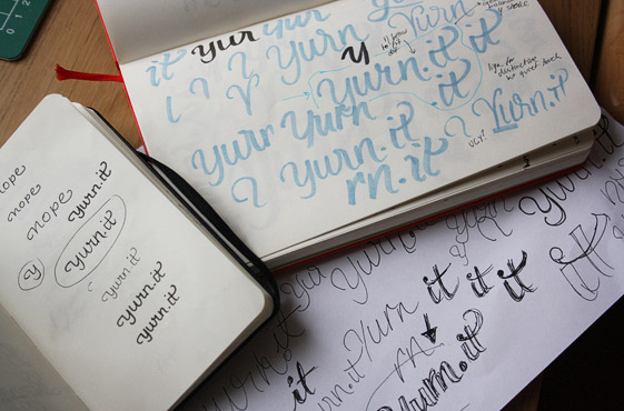
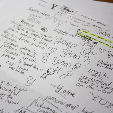
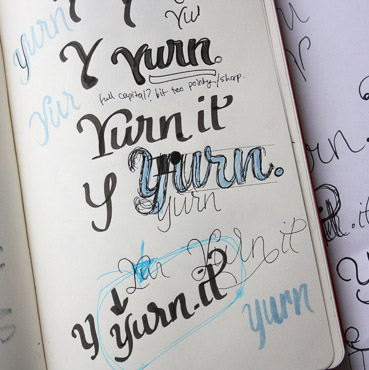
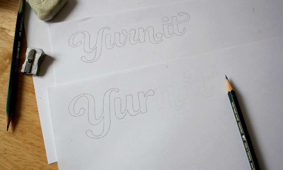
Above: Early scribbles, notes while discussing the brief and starting to flesh out more specific directions.
Initial Sketches
The primary objective of the initial rough drafts was to pinpoint the desired balance of characteristics evoked in the brief. Working within the overall stylistic approach we had discussed, I expored different typographic features to convey varying degrees of casual vs. formal, ornamental vs. subdued, accessible vs. luxurious, etc. in order to find what aesthetic is most appropriate to the company goals.
In addition the the lettering treatment, another major consideration was the set up of the name with the dot in between the two parts. I looked at ways in which this dot could be well integrated within the letters, along with some ideas for a subtle 'i-t' ligature.
We also reviewed a few options for the case-setting and the pros and cons of each, ultimately settling on a 'Y' that is clearly an uppercase letter. This avoids any confusion when referencing the name and makes upholding consistency easier, as this capitalisation would be the standard approach anyway.
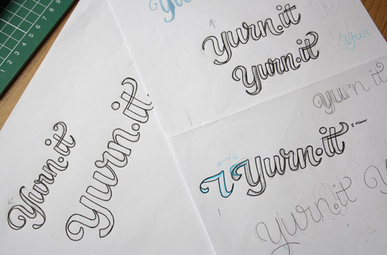
Above: I refined the ideas down to four variations, the first of which led to the main concept.
Revisions
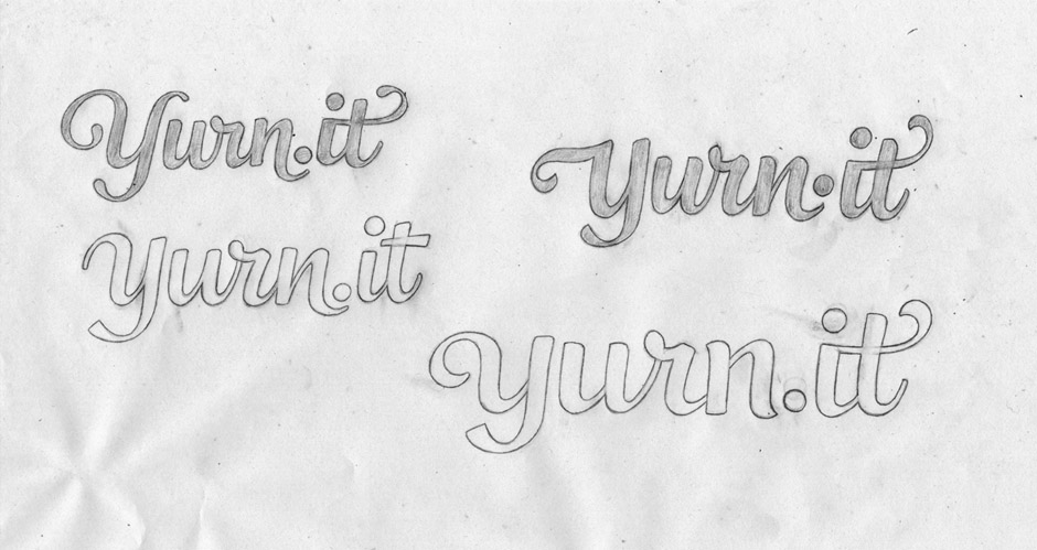
One of the main issues that arose from the first sketches was that the 'u-r' could be mistaken for a 'w' followed by an 'i' without its dot. Considering the company ame uses an unfamiliar and unusual spelling, the human eye has a tendency to search for a familiar word first, therefore making this possible "win" confusion more problematic. While I had tried to address this by refining the original 'r' to clearly differentiate it from an 'i', we felt that a more definite solution would be to use an non cursive style 'r' instead.
I brought in a rounded terminal to the hook of the new 'r', emphasising some continuity with the 'Y'. I also adjusted the angle of the 'u-r' connection to be flatter and therefore more clearly distinct from the inner curve of the 'u'.
Above: Working on the revised sketch with the non cursive 'r'.
Vectoring
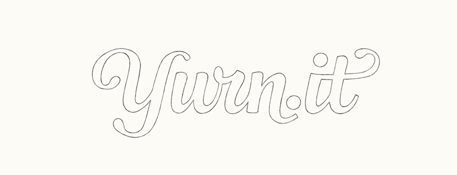
The digital version didn't veer too far from the final sketch, with adjustments to the inclination, kerning and a few curve shapes being the main changes.
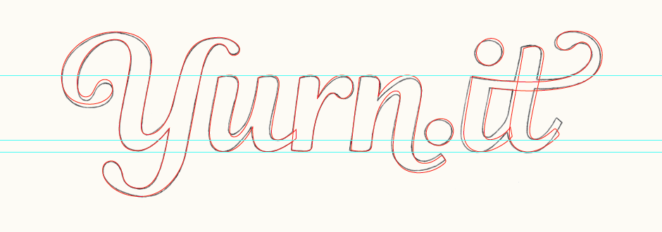
Above: Vector outline drawn over the sketch.
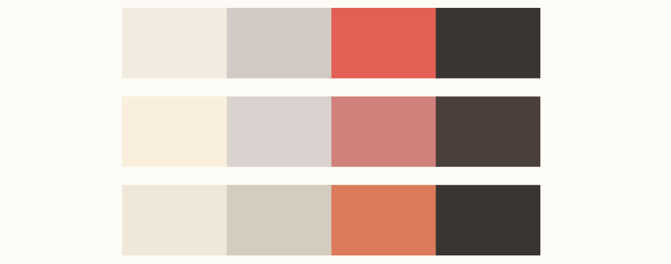
Colours
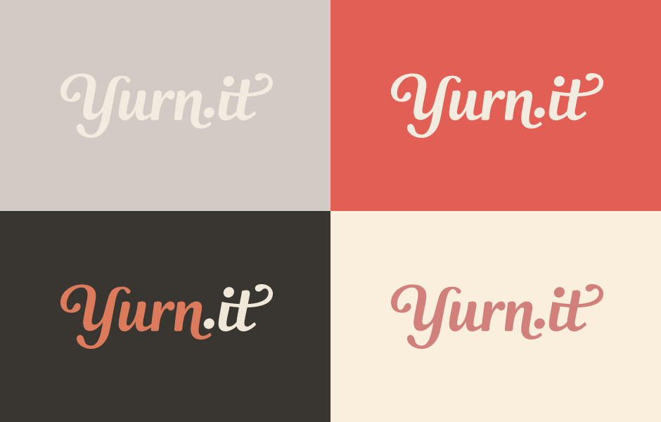
We looked at colours quite early on in the process, focusing on tones that are subtle and not too bright in order to impart a warm, engaging and friendly impression that builds on the emotions evoked by the logo. The second colour scheme is probably the most feminine of the three, but in all cases I tried to avoid palettes that felt too girly and remained elegant. Ultimately, final colours are to be refined as part of the upcoming website design.
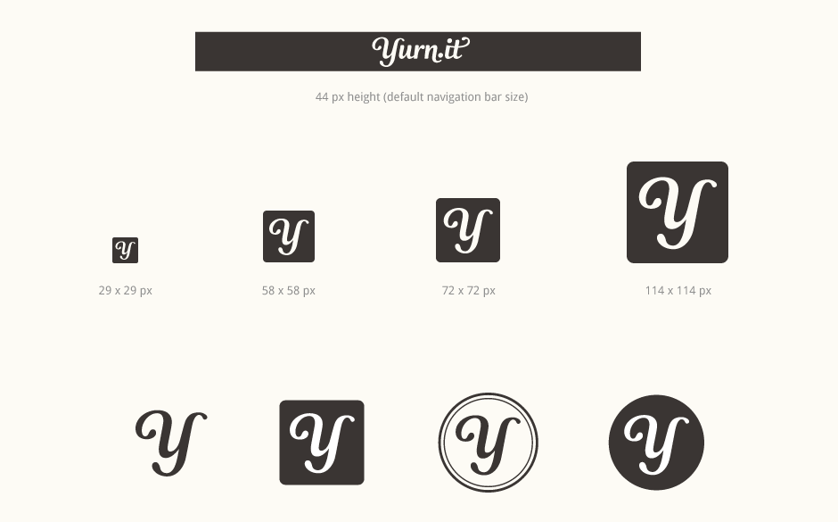
Sizing & Icons
While the logo's projected use had of course been addressed back in the initial discovery stages, specific tests were done during the digital development. This not only allows for a better visualisation of the logo in real-life contexts, but also helps me correct and refine any kerning issues, stroke weights, etc.
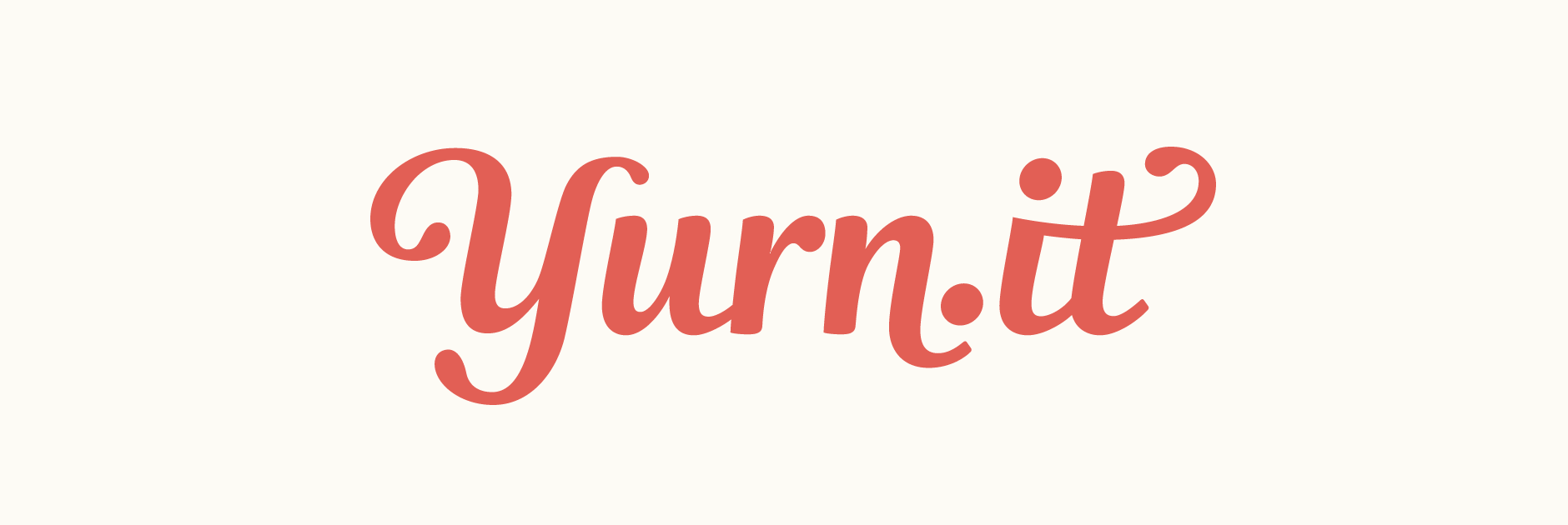
Final Logo
The final logo applied to some of the colour combinations. The use of two colours directly within the lettering helps to emphasise how the name is read.