Wesow
Client: Wesow
Work done: Logo-type design, custom lettering, colour exploration
Custom Logo-type
Custom typography logo design for Wesow, an upcoming project by a sibling duo based in the UK and France. Wesow will be an e-commerce website selling small mixtures of organic and fair trade food products to be nicely packaged and delivered to customers. The name was to be set in an all lowercase format and in a script-like style.
When mapping out early ideas, I focused on the repetition of the 'w's and how they could be used to create a visual shape with a clearly defined start and finish. Similarly, the 's' was also an interesting element as being very much at the center of the design, it could be used as a good focal point.
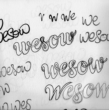
Above: Focusing on overall word shape and letter dynamics rather than any details.
Concept #1
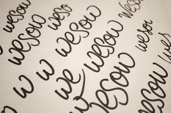
The first, quite italicised version aims for a dynamic and refined effect. There's heavy contrast between thick and thin strokes to create a distinguishable and eye-catching look. The sense of movement and flow is also emphasised through the fully connected characters.
Above: Multiple light, loose pencil lines are roughly outlined with ink to form the rough draft (top). This is then corrected digitally before being re-drawn as the final sketch.
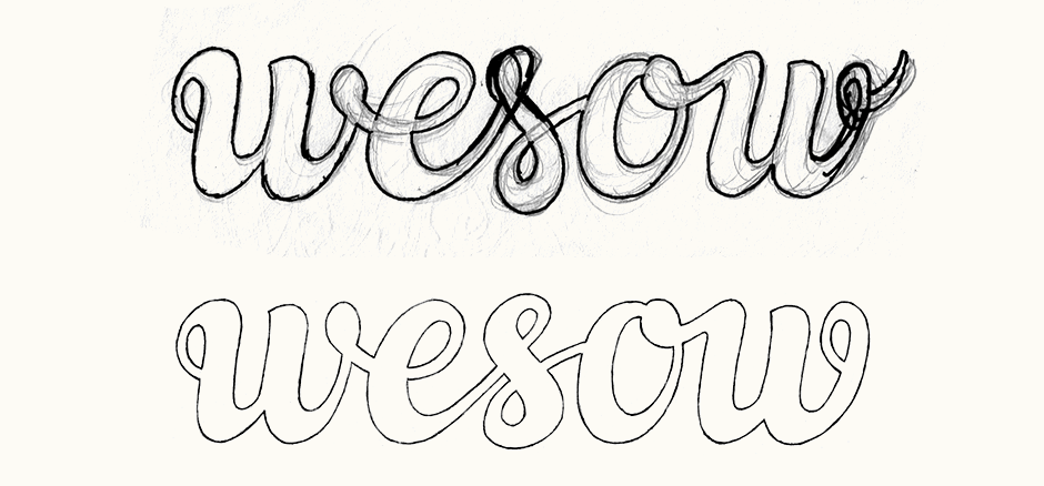
Concept #2
While more upright, the curves and character shapes of the second proposal allow it to preserve an organic, flowing and unique aesthetic. Details such as the 'w' and 'o' loops as well as the round terminals of the 's' help to create a design that it is memorable and recognisable without being boisterous. A sense of symmetry between start and finish is suggested by the very start and end 'w' strokes.
Above: The rough draft for this concept was much closer to its final sketch rendition, needing mostly positioning and spacing adjustments.
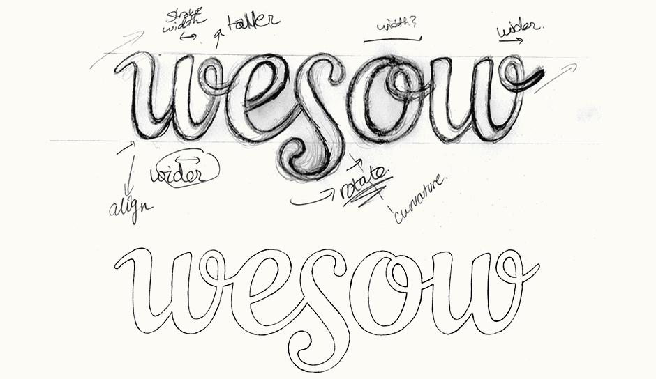
Revisions & Vectoring
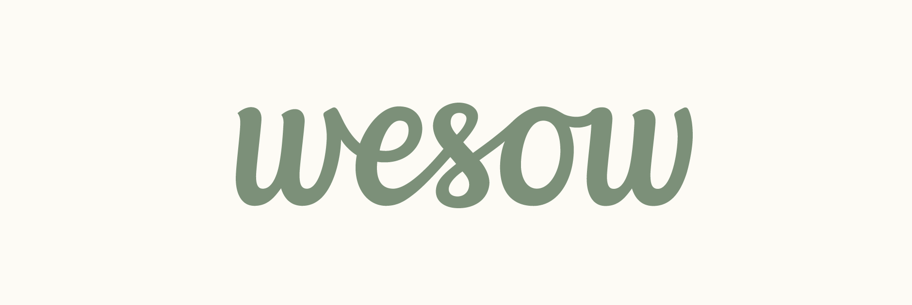
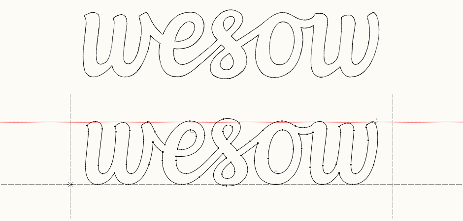
The chosen direction was the first one, with revisions aiming to simplify the overall shapes and increase harmony throughout the strokes, while also allowing the 's' to stand out as the slightly more distinctive focal point. I gave the design a more consistent line weight and looked at ways to keep natural connections between letters without the use of loops/rounded shapes. Final approved sketch below followed by the vector version in FontLab Studio.
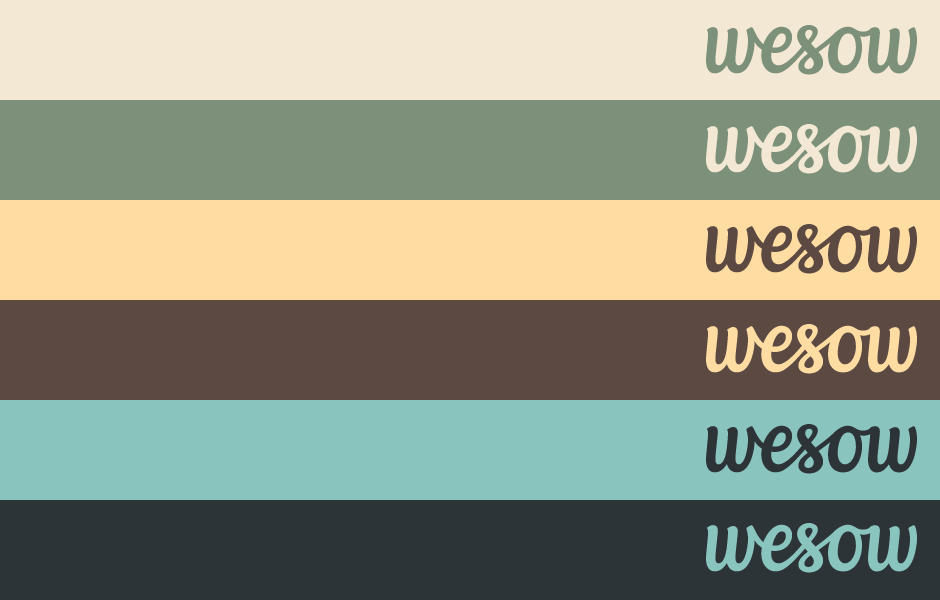
Colours
Colour palette exploration revolved around natural, lightly muted shades for an organic, earthy feel to complement and place emphasis on the subject.
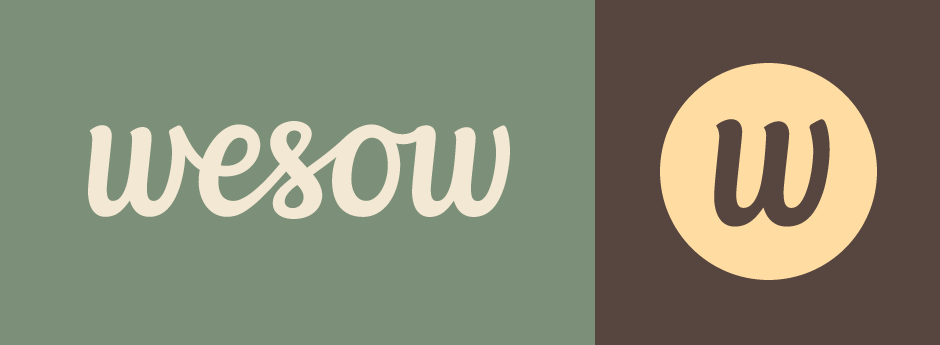
Final Logo
The completed logo along with a separate 'w' to use as the icon.